Stock Market in Stalemate
We had a great Seminar, but were concerned for all those who suffered in the wake of Hurricane Sandy, and for those who were delayed in getting home safely given the plane cancellations.
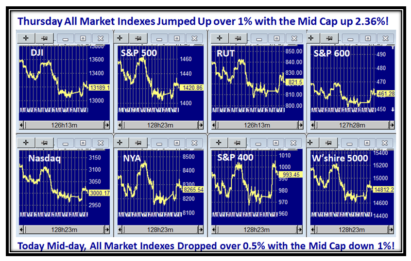
Now that the Jobs Report is out, I felt I would give you an early read of what I covered on this score at the bottom of this blog note with regard to the Economic Recovery as seen through the statistics of the past ten years. That will come at the bottom of this Blog Note. First, let me give you the usual summary slides which bring us all up to date including my latest friend sitting in India who signed up for a Free Trial of the HGSI Software, much of which is used to show my way of attacking Fear and Greed and staying on the right side of the Market. It is coming up to noon here on the West Coast, so this snapshot is taken around then:
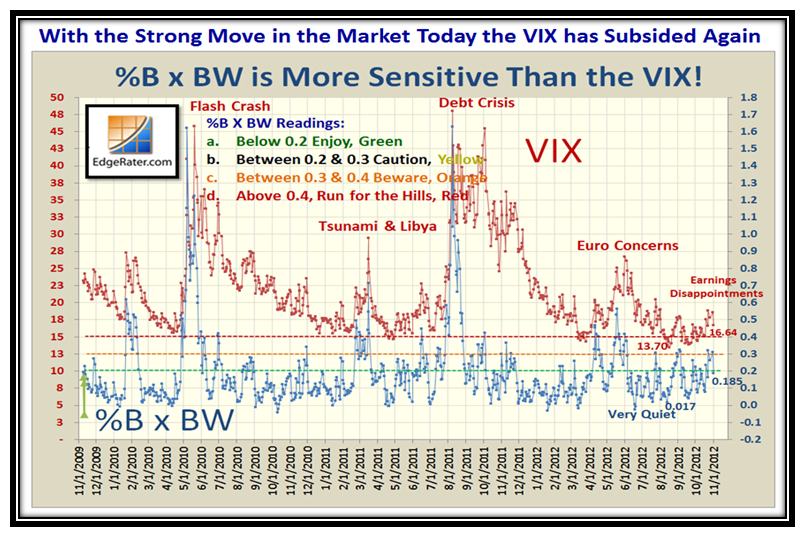
These next several slides are snapshots for the close on Thursday, including the VIX which went dormant again:
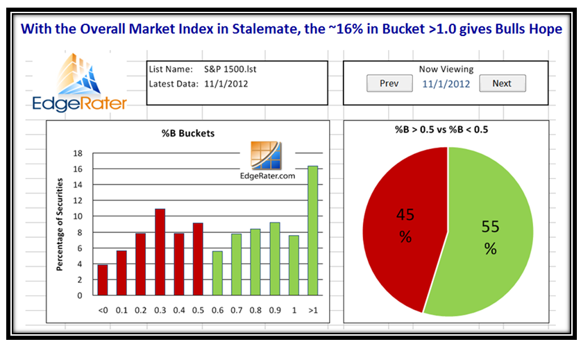
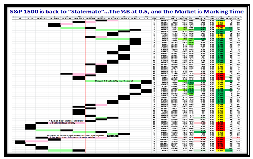
We can quickly see that Thursday produced a two buckets up day (Little Kahuna) for many Indexes and we are back to Stalemate, with a strong move of 16% of the S&P 1500 overbought and above the Upper Bollinger Band:
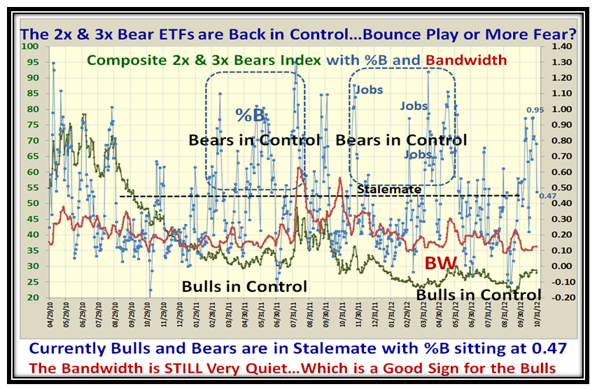
With the strong move yesterday, the 2x & 3x Bears ETFs confirm we have moved back up to Stalemate and the Bandwidth is still very quiet which is a good sign for the Bulls:
…And more of the same confirming the Stalemate with %B for the S&P 1500 at 0.42:
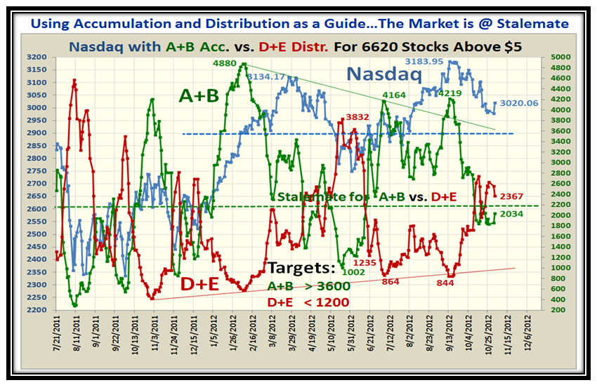
Likewise, the Accumulation A+B versus the Distribution D+E is at the same spot of Stalemate…net-net, the Market is Marking time waiting for some more exciting news such as the Election Results next week:
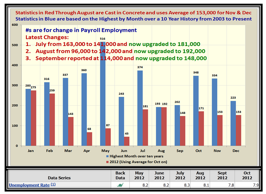
Now for the new and exciting stuff of my analysis which attempts to establish the Stake in the Ground and Measuring Rods for when we can expect to see the first glimmer of Hope through the eyes of the Monthly Jobs Report, which I have already shown you several times during the last few months with a warning to watch out for the expected Volatility in the U.S. Stock Market depending on the Results on the First Friday of every month. Note that I have also added the Unemployment Rate:
As you will recall, I purposely decided to show the best month for the past ten years of history as provided by the Bureau of Labor Statistics. We have learned that the numbers are not cast in concrete until two months of updates have gone by and the swings in adjustments can be wild up and down, as shown on the chart! We have also learned that on the day of announcement, two factors are important as to which way the Market views the results…i.e., Jobs can be poor but if Unemployment rates are down as we had last month, the Market responded positively!
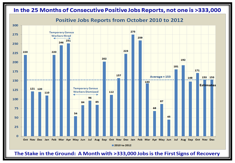
You will note that there are seven occasions where the jobs report exceeded 300,000, and that seemed a decent target to look for as the months progress. We have not seen one so far in the 25 months of CONSECUTIVE Positive Reports as I show in the second last chart below.
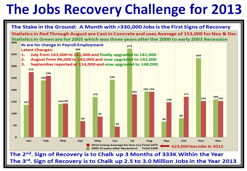
To take this analysis further and make it more meaningful to relating to recovery in recessions, it became obvious to me that the proper benchmark would be the Year 2005 which produced the best overall results during the “Days of Wine and Roses”. That was 2&3/4 years after the bottom of the Market in March of 2003. Now don’t all shout at once: “But Ian, the recession this time was much deeper and was an ~48% drop in the Black Swan we suffered in 2008.” Right on, so I have DISCOUNTED all of 2009 AND 2010, and start the count from 2011 and 2012 and so the statistics for 2013 would be a fair comparison, as shown below:
I have shown you the three yardsticks that must be met in the year 2013 to feel that we are on the road to Economic Recovery. This cuts through all the spin from the spinmeisters. Mind you, we still have the adjustments that take place for the past two months, but beggars can’t be choosers as I did NOT want to use anything but the OFFICIAL Labor statistics as a Guide. The beauty of this approach is that we will always be aware of the near term volatility on each first Friday of the month, and at the same time have reasonable yardsticks for the whole year next year while enhancing and protecting our precious nest eggs. We certainly do not want to see the 401K’s turn into 401 Kegs which I wrote about with tongue in cheek a few years ago. I had over 5,300 hits in one day on my blog, and you might enjoy looking at what I wrote on October 8, 2008. I take comfort that all I have taught you is to know how to measure Fear and Greed and sniff them out before they happen to Stay on the Right Side of the Market and Protect your well-earned nest egg. In return I have made lasting friendships of those who support Ron and I.
Now let’s look at the last chart which shows the 25 consecutive positive months since October 2010:
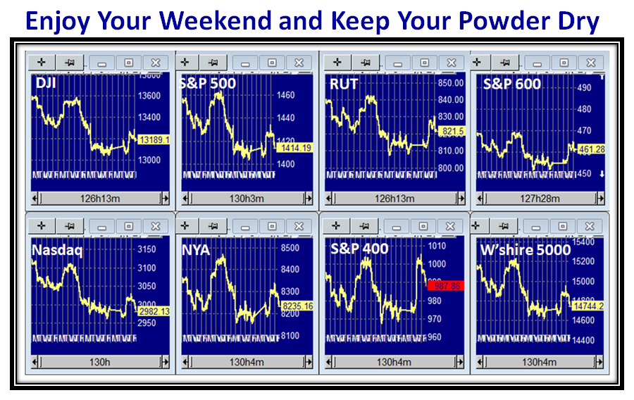
I see the bell just rang for the Market Close and the Indexes have given up most of what they gained on Thursday…not a surprise:
Best Regards,
Ian.
 Ian Woodward's Investing Blog
