Ian Woodward's Investing Blog

Archive for the ‘Market Analysis’ Category

Stock Market: Floodgates Open or Bounce Back?

Saturday, November 10th, 2012

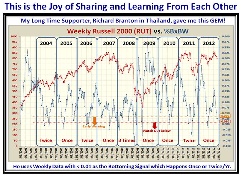
I wonder how many of you read the “Comments” section at the bottom of the Blog Notes?  Here is one just two weeks ago from a loyal supporter, Richard Branton in sunny Thailand, who sent me this gem of an idea while I was in the process of feverishly preparing for the Seminar.  This blog note is a follow up to his note and my response on October 25 which I am copying verbatim for your convenience, below the Caption:

RichardB Says: October 25th, 2012 at 10:29 am

Hi Ian   I’m not sure if you’ve looked at this (I bet you have!) but the weekly %B*BW on the Russell 2000 shows some fairly distinct peeks and troughs going back to at least 2004. %B*BW falls below 0.01 once (or occasionally twice) per year virtually every year, almost like clockwork. The peaks and troughs reach very similar levels, albeit higher peaks since 2009 after the huge volatility of 2008/9. Turndowns from peaks sometimes “lead” prices, but there is an obvious correlation (as I suppose is to be expected). This becomes even more obvious if you add a short moving average.

Since mid September I’ve been watching the most recent turndown and it’s going to be interesting to see if %B*BW falls to or below 0.01 sometime before January. In my own trading I sometimes get too focused on daily price action so I’ve found your work on %B*BW invaluable to making me look at the weekly picture in order to put the daily picture in context. I’ve found the %B and %B*BW extremes on the dailies also seem to fit fairly snugly within these larger cycles, and along with some other indictors, it’s also helped put pullbacks within a downtrend in a better context. I plan to do some more work on this.

Anyway, I just wanted to say thanks again for sharing your thoughts and experiences so generously. I started reading your blog and using HGSI from the first few weeks of my trading and they been a tremendous aid to learning to “become my own expert”.   Thank you very much!  from Thailand

Ian Says: October 25th, 2012 at 5:27 pm   Many thanks Richard for the great feedback. As the saying goes “There are no flies on You!” We do watch the RUT closely, but your beady eyes spied something that had not fully registered with me: “%B*BW falls below 0.01 once (or occasionally twice) per year virtually every year, almost like clockwork.” We reached 0.000 yesterday and are back to 0.006 tonight, so not out of the woods yet.   All the best to you and yours,   Ian.

Now that I have recovered from the exhilarating Seminar, I went back to study what Richard said and he has found us a gem!  Not only can we watch the VIX with %B x BW, but also the Russell 2000 (RUT), which works almost like clockwork and is so infrequent that it’s an extremely good signal.  I will be preparing the November Newsletter this week and will include this piece for us to discuss at the Roundtable the following week.

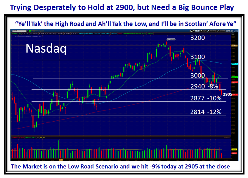
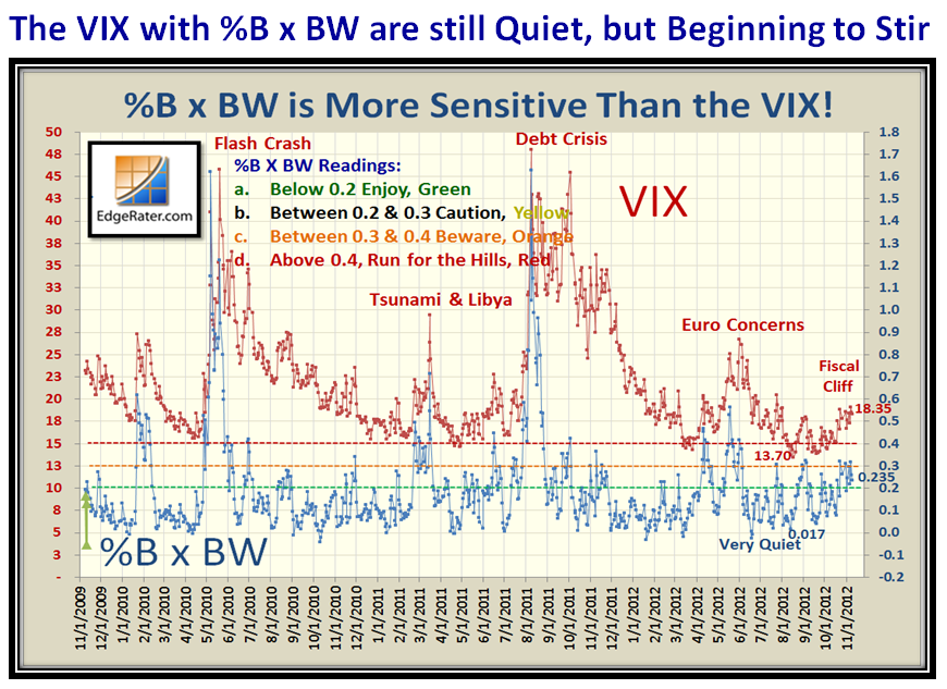
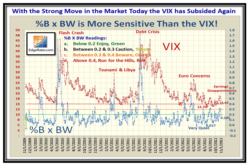
Let’s start with the familiar picture of the Nasdaq, followed by the VIX and the %B x BW, i.e., the Woody Indicator:

…Although the VIX and Woody Indicator are still on the quiet side, they are beginning to stir, but not quite volatile enough for floodgate action:

Now we have Richard’s GEM which shows that we can not only get confirmation that things are a trifle tight to the downside, but also a measure of when the floodgates open and how close we are to it happening by using the Woody Indicator with the Russell 2000 (RUT).  The beauty of what he has discovered is that this signal occurs very infrequently but at least once or twice a year, and we are mighty close to the second time right now.  As he explains above, he used WEEKLY Data as I have reconstructed below:

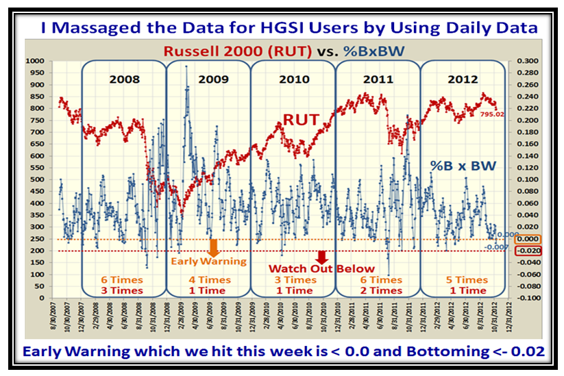
To do the same thing on a DAILY Basis so that HGSI and EdgeRater users can follow along, I have converted the picture to a Daily View below:

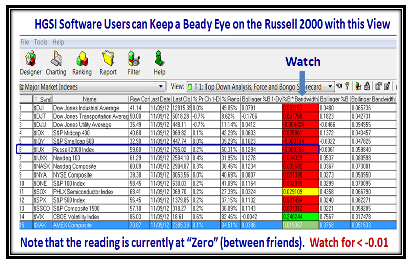
The warning sign is right there…we hit -0.007 on Thursday and moved back up to 0.000 on Friday…close enough for nail-biting time.

Now I know that those who do not want to waste time going through all this mumbo jumbo…yet believe it is “GOOD STUFF”, here is a simple way for you to watch the results by using the Warehouse View in HGSI and look for %B x BW to go negative to below 0.0 for starters.  With this view we can see the RUT along with many of the other Major Indexes I feature from time to time:

How about “Three Cheers” for Richard Branton sitting out in Sunny Thailand for the gem he has given us and which we can create in EdgeRater and then cap it off with the simple way to follow this for the earliest warning signs in HGSI as I show above.

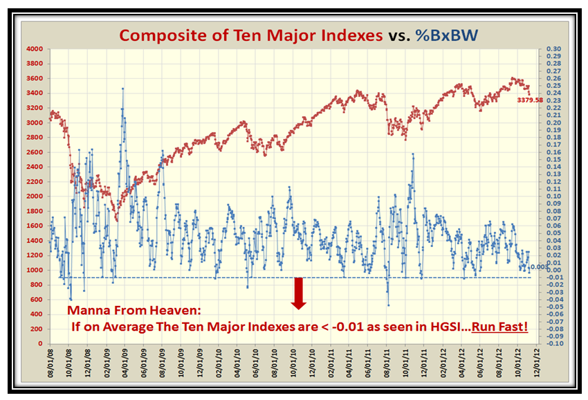
Now I know you are clamoring for more and want “Jam on it”, so here is the last point to top all of this off.  I have drawn a picture for the Composite Average of the ten Market Indexes and  if they (on Average) breakdown below -0.01 Run for the Hills!

I know times are tough, but you can’t say I don’t keep you on the right side of the Market between Fear and Greed.  If this Composite shoots up above 0.04 (say), we had a big boune play and the danger has passed for now!  Give us some encouragement with your feedback!

Best Regards,

Ian.

Stock Market: Index Cliff

Wednesday, November 7th, 2012

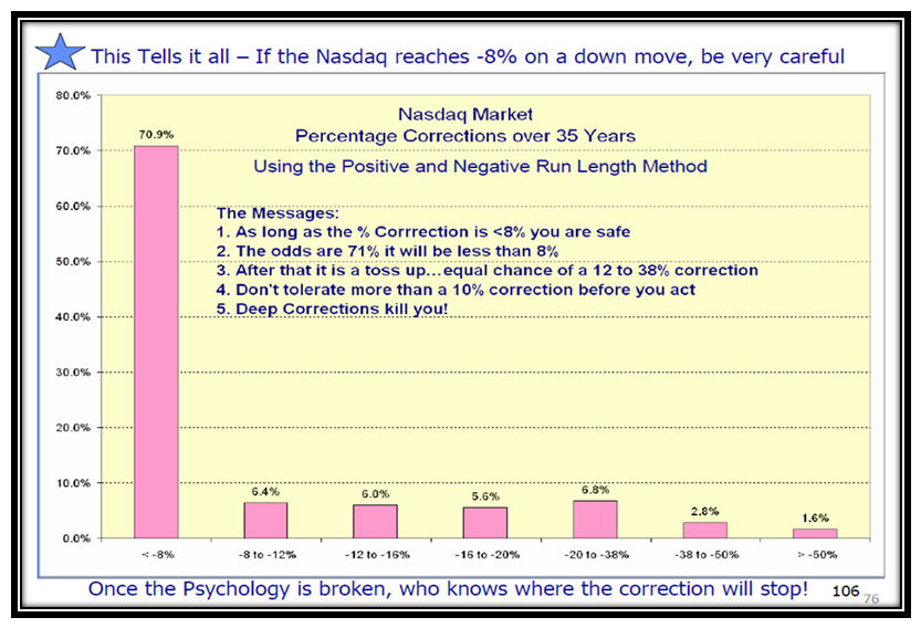
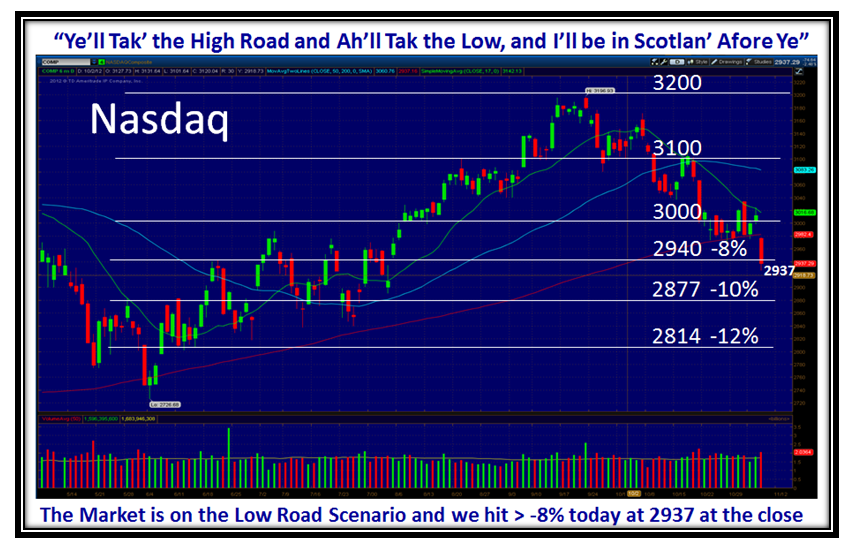
We talk about the Fiscal Cliff, but that is not until January 1, 2013.  However, we have reached the Market Index Cliff of -8% today, and the “Rot” is setting in.  Your Nest Egg is far more important, and the next seven weeks seem to be very critical to you than any Fiscal Cliff; so put in safety measures to buffer any downside surprises.

Fiscal Cliffs make good talking points, but don’t be surprised if they “Kick the Can” down the road one more time, but if you have paid attention to my blog notes, OUR Nest Eggs are sitting on the edge of a cliff as ALL the cushion is deflated NOW!  This Stock Market MUST produce a strong Bounce Play soon to get the Nasdaq back up above 3000 in a hurry.

Here is the research I did many moons ago and is self explanatory…we have reached the Market Index Cliff.  Be thankful that the Volume today, though heavy, was not excessive ala Flood Gates Open full bore:

So for now, unless there is a surprising big Bounce Play, I say “Goodbye Piccadilly, Farewell Leicester Square”…watch out once the panic starts and we head into Capitulation:

The Nasdaq broke 2940 today…it must hold here and get back up above 3000 quickly:

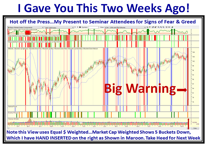
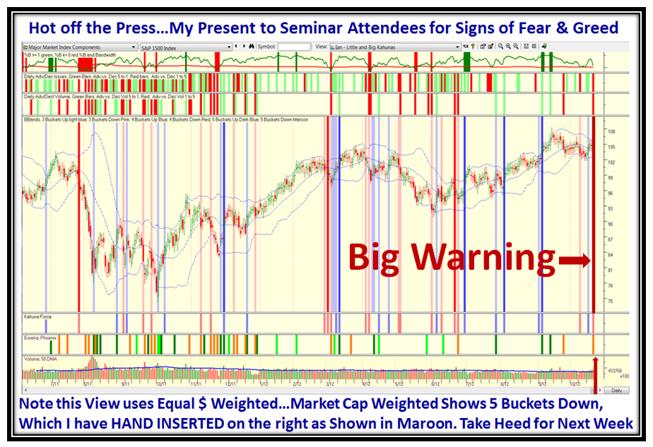
I am pleased that the process worked as you will recall I gave you a “Big Warning” two weeks ago, and I hope you listened:

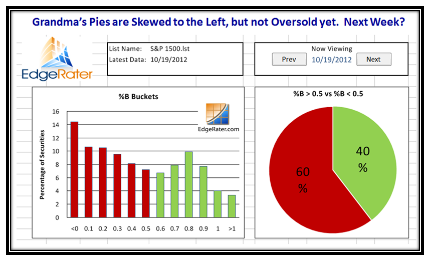
…And finally, here is the go to picture to understand that five buckets down should not be taken lightly:

The best of luck in these turbulent times, and make sure your Nest Egg is Hard Boiled and you have taken appropriate action to protect your life savings.

Ian.

Stock Market in Stalemate

Friday, November 2nd, 2012

We had a great Seminar, but were concerned for all those who suffered in the wake of Hurricane Sandy, and for those who were delayed in getting home safely given the plane cancellations.

Now that the Jobs Report is out, I felt I would give you an early read of what I covered on this score at the bottom of this blog note with regard to the Economic Recovery as seen through the statistics of the past ten years.  That will come at the bottom of this Blog Note.  First, let me give you the usual summary slides which bring us all up to date including my latest friend sitting in India who signed up for a Free Trial of the HGSI Software, much of which is used to show my way of attacking Fear and Greed and staying on the right side of the Market.  It is coming up to noon here on the West Coast, so this snapshot is taken around then:

These next several slides are snapshots for the close on Thursday, including the VIX which went dormant again:

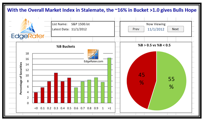
We can quickly see that Thursday produced a two buckets up day (Little Kahuna) for many Indexes and we are back to Stalemate, with a strong move of 16% of the S&P 1500 overbought and above the Upper Bollinger Band:

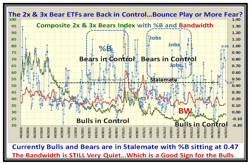
With the strong move yesterday, the 2x & 3x Bears ETFs confirm we have moved back up to Stalemate and the Bandwidth is still very quiet which is a good sign for the Bulls:

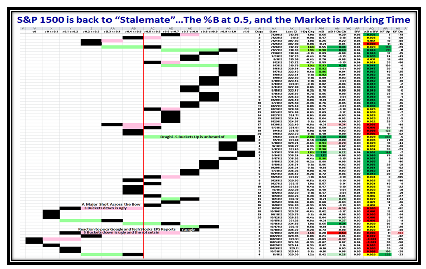
…And more of the same confirming the Stalemate with %B for the S&P 1500 at 0.42:

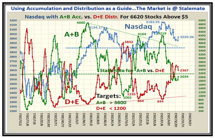
Likewise, the Accumulation A+B versus the Distribution D+E is at the same spot of Stalemate…net-net, the Market is Marking time waiting for some more exciting news such as the Election Results next week:

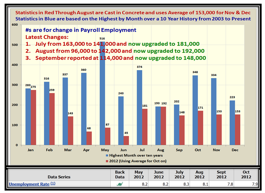
Now for the new and exciting stuff of my analysis which attempts to establish the Stake in the Ground and Measuring Rods for when we can expect to see the first glimmer of Hope through the eyes of the Monthly Jobs Report, which I have already shown you several times during the last few months with a warning to watch out for the expected Volatility in the U.S. Stock Market depending on the Results on the First Friday of every month.  Note that I have also added the Unemployment Rate:

As you will recall, I purposely decided to show the best month for the past ten years of history as provided by the Bureau of Labor Statistics.  We have learned that the numbers are not cast in concrete until two months of updates have gone by and the swings in adjustments can be wild up and down, as shown on the chart!  We have also learned that on the day of announcement, two factors are important as to which way the Market views the results…i.e., Jobs can be poor but if Unemployment rates are down as we had last month, the Market responded positively!

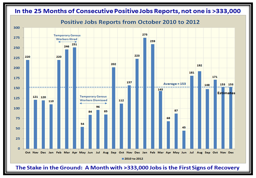
You will note that there are seven occasions where the jobs report exceeded 300,000, and that seemed a decent target to look for as the months progress.  We have not seen one so far in the 25 months of CONSECUTIVE Positive Reports as I show in the second last chart below.

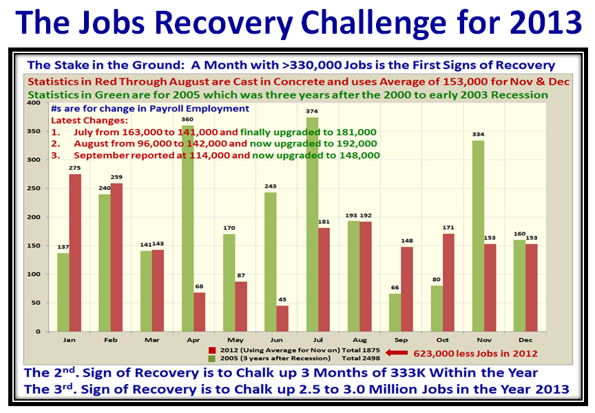
To take this analysis further and make it more meaningful to relating to recovery in recessions, it became obvious to me that the proper benchmark would be the Year 2005 which produced the best overall results during the “Days of Wine and Roses”.  That was 2&3/4 years after the bottom of the Market in March of 2003.  Now don’t all shout at once:  “But Ian, the recession this time was much deeper and was an ~48% drop in the Black Swan we suffered in 2008.”  Right on, so I have DISCOUNTED all of 2009 AND 2010, and start the count from 2011 and 2012 and so the statistics for 2013 would be a fair comparison, as shown below:

I have shown you the three yardsticks that must be met in the year 2013 to feel that we are on the road to Economic Recovery.  This cuts through all the spin from the spinmeisters.  Mind you, we still have the adjustments that take place for the past two months, but beggars can’t be choosers as I did NOT want to use anything but the OFFICIAL Labor statistics as a Guide.  The beauty of this approach is that we will always be aware of the near term volatility on each first Friday of the month, and at the same time have reasonable yardsticks for the whole year next year while enhancing and protecting our precious nest eggs.  We certainly do not want to see the 401K’s turn into 401 Kegs which I wrote about with tongue in cheek a few years ago.  I had over 5,300 hits in one day on my blog, and you might enjoy looking at what I wrote on October 8, 2008.  I take comfort that all I have taught you is to know how to measure Fear and Greed and sniff them out before they happen to Stay on the Right Side of the Market and Protect your well-earned nest egg.  In return I have made lasting friendships of those who support Ron and I.

Now let’s look at the last chart which shows the 25 consecutive positive months since October 2010:

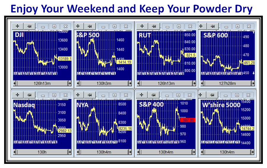
I see the bell just rang for the Market Close and the Indexes have given up most of what they gained on Thursday…not a surprise:

Best Regards,

Ian.

Stock Market: Bears are Dancing Again

Sunday, October 21st, 2012

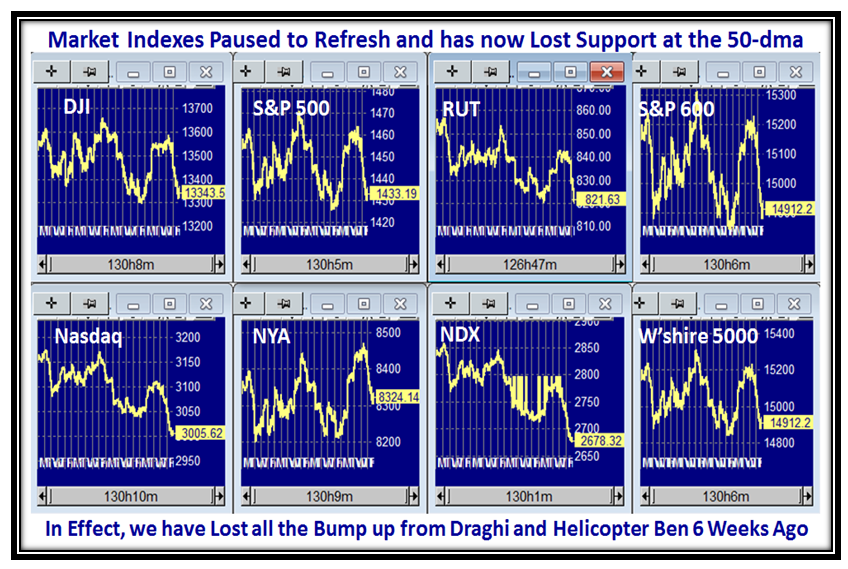
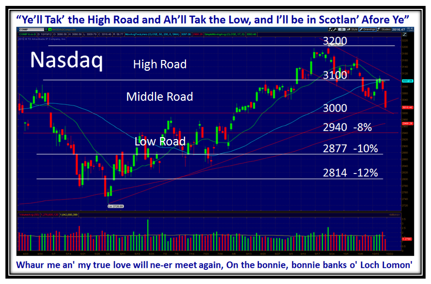
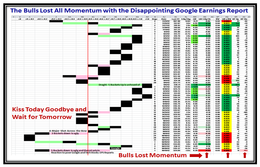
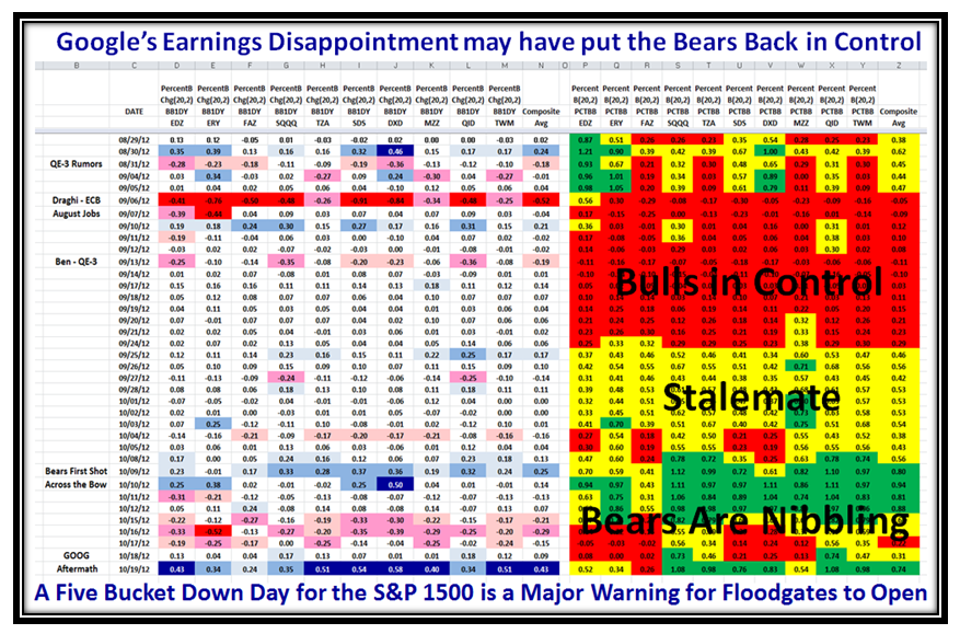
I see the Tom-Toms are beating loudest again in Thailand and my good friends in Qatar looking for more information after the Major Five Bucket Down Day we had on Friday which took a Bite out of GOOG for a disappointing Earnings Report among others such as IBM and McDonalds.  Net-net we are back in the doldrums and the Bears are in Control for the moment.  Next week is critical to see whether we have a Bounce Play or trot on down further to test the mighty important line in the sand of the -8% Mark on all Indexes from their recent Highs.

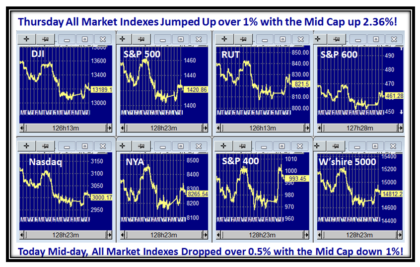
Here is the usual picture I give you of the Market Indexes which are all droopy:

…And here is the Roadmap for the High, Middle and Low Road Scenarios while doing a Highland Fling for my good friend Mike MacDonald:

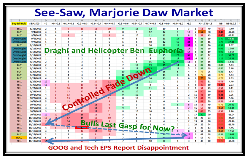
In a matter of one month, we have moved from Irrational Exuberance being overbought from the euphoria of Draghi and Q-E 3 to being down in the dumps through the phase of Stalemate as you will see from these various charts:

…And here’s the See-Saw, Marjorie Daw Picture:

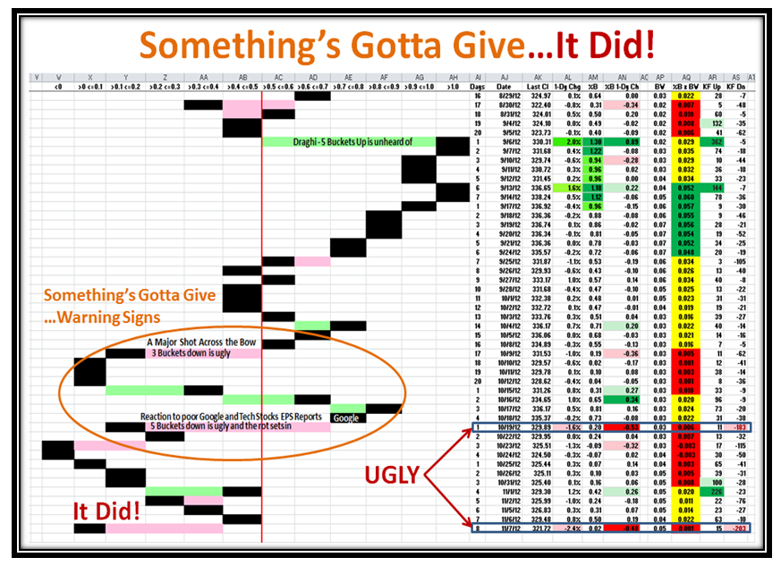
Here is that Five Bucket Down Warning I gave you.  It may snap back or it can drag you down next week:

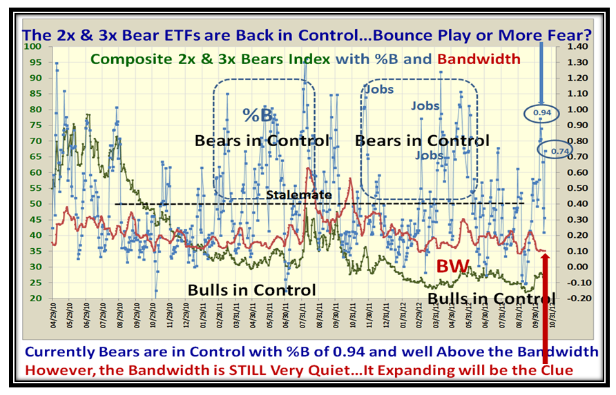
You folks who are into this stuff with a vengeance are already on top of the 2x & 3x Bears Picture which looks ominous:

…And here is the twin picture.  There is some hope for the Bulls as the BANDWIDTH is still quiet, and if things break to the downside, this will be the first clue as it will jump up fast.

Well, we are down to the last week before the Seminar and we will be well into it this time a week from now.  As a sneak preview for the people who will be attending Bob Meagher helped me develop this next slide which we will cover at the seminar.  It shows the history of 3, 4, and 5 Bucket skips either up or down and gives ample warning of Fear, Hope and Greed.  The bottom line is that next week is nail biting time and it may turn out to be a fizzle, and then again your job is to preserve your nest egg…which is what I have taught you for these past twenty years!

Best Regards and thanks for all your support,

Ian.

Stock Market: Late Breaking News

Sunday, October 14th, 2012

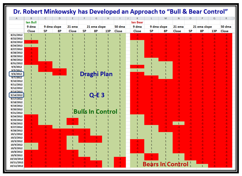
My good friend, Dr. Robert Minkowsky whom I have known from the days of wine and roses back in 1994 when I first gave a seminar for Telescan in San Francisco has built on the 2x & 3x Bull and Bear Set of ETFs we use in EdgeRater to know who has control.  He is a big believer in “slope analysis” to give an early feel for which way the wind is blowing and has presented his findings in a simple depiction which gives you the feel in an instant:

Best Regards,

Ian.

Copyright © 2007-2010 Ian Woodward
Disclaimer: Commentaries on this Blog are not to be construed as recommendations to buy or sell the market and/or specific securites. The consumer of the information is responsible for their own investment decisions.