Ian Woodward's Investing Blog

Archive for the ‘Market Analysis’ Category

Stock Market Windsock: Anemic!

Sunday, November 20th, 2011

It goes without saying that the events of the past week have turned this recent Rally to Anemic:

Continuing with the recent theme on the blog of %B x BW, allow me a little sentiment with this picture:

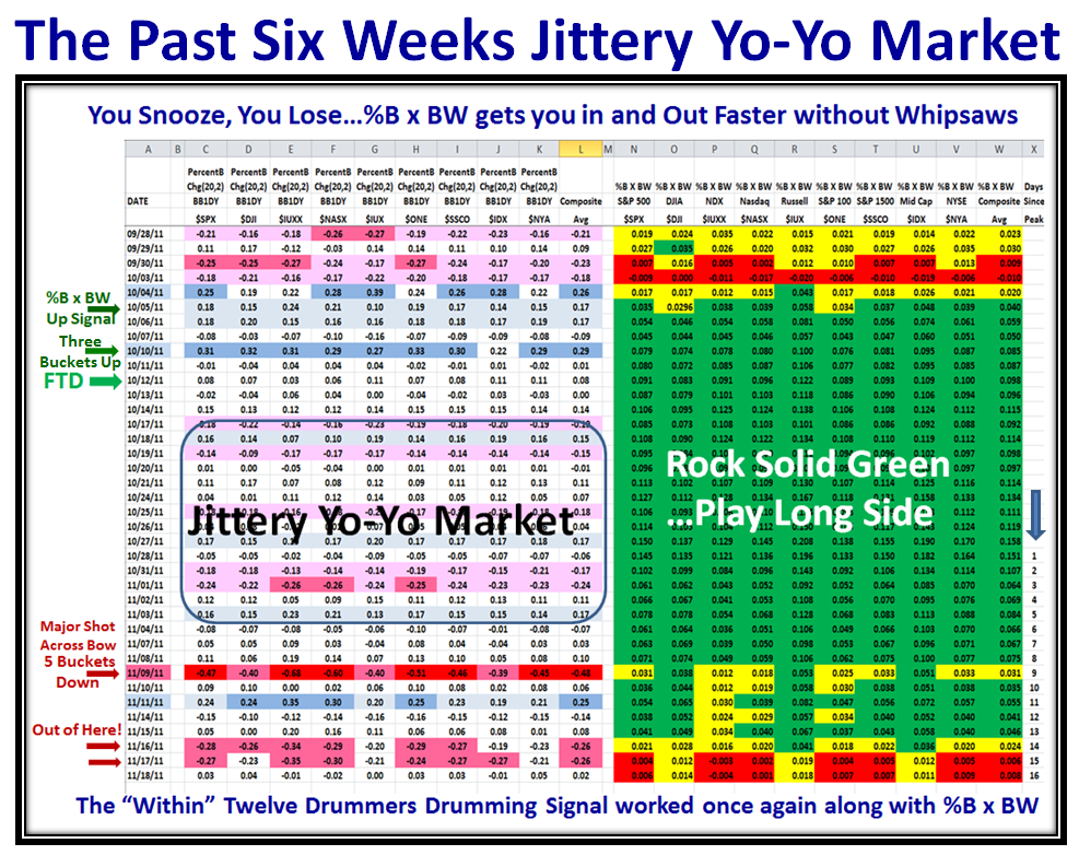
Here are the recent results picking up from the last Blog Note, which shows the Process is working very well:

The Five Buckets down on 11/09/2011 turned the %B x BW to mostly yellow, nine days from the Market High, and despite an oversold bounce two days later, it was not enough to stave off the rot that had set in, and 11/16/2011 and 11/17/2011 cooked the rally to “Market in Correction”.  The Process got you in 4 to 5 days early and did the same on the way out.  Note the eight days of a Jittery Yo-Yo Market which would drive most to nightmares, but the technique kept you in until the true major warning sign of FIVE Buckets Down.  That Rule is Golden!  Take it to the Bank.  Likewise 3 Buckets up together with Eurekas and Kahunas within a week has proven solid for a Fresh Rally provided %B x BW is also Green as seen above.

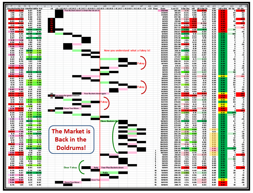
Here is the corresponding picture that you are now familiar with, which shows the Market is very weak:

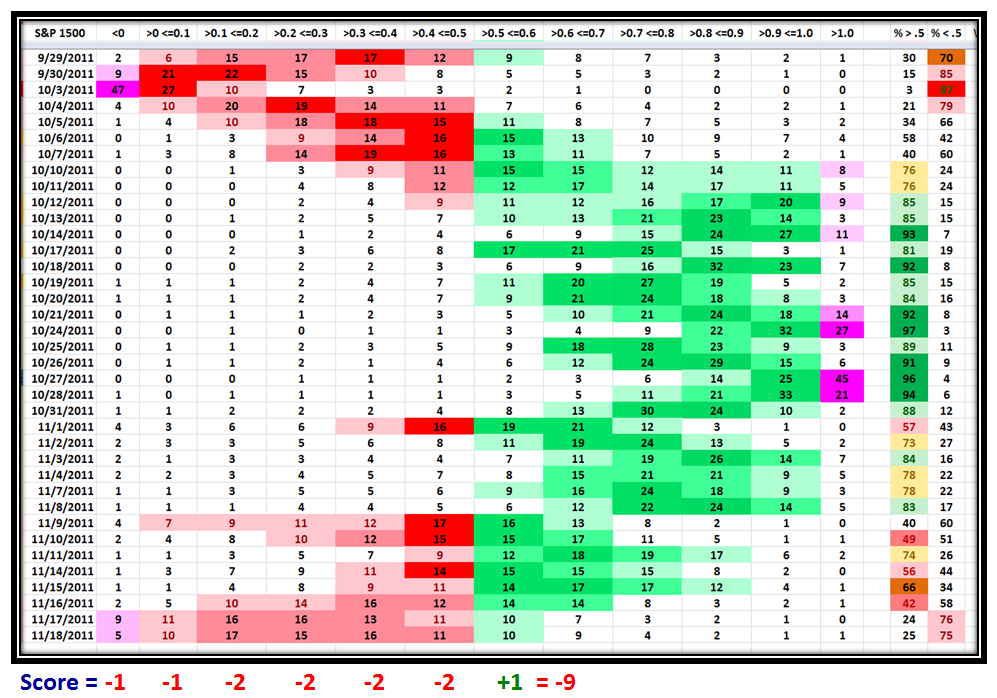
…And here are the %’s in each Bucket for the S&P 1500 with Color Coding to emphasize strength and weakness, which shows the score is -9:

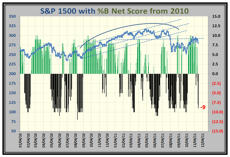
The Score of -9 confirms the Anemic State of the Market, and here is what it means relative to past history.  Note that when the score is this low, it has a struggle to recover any time soon:

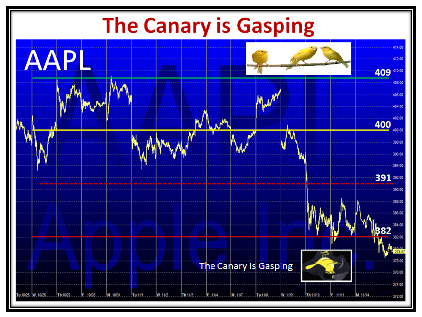
Let’s not forget the chief Canary AAPL, which is Gasping at this stage:

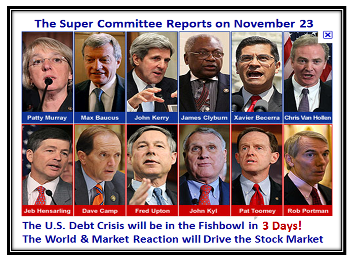
So What?…I don’t have to remind you that the Supercommittee of 12 have a deadline this coming Wednesday, and they are deadlocked.

Keep your Powder Dry! With Best Wishes for a Very Happy Thanksgiving from the HGSI Team,  Ian:


You Snooze, You Lose…Update

Thursday, November 10th, 2011

Ian,

The new charts and bigger size was very helpful to see the tools in action.  Would it be possible to update with 11-10-2011 data to see the change we got today with the market moving back up?

Thanks,

Jim

Have a heart, Jim, but in the spirit of answering you, here is just one chart updated.  If you had any idea of how long it takes me to do this stuff, I’m sure you would not want me to sit up late tonight.

In my last note I said that the %B x BW changed to just two yellow, with NDX and Nasdaq staying Yellow, but the S&P 100 changed back to Green.  You can see the change above.

Good luck, Ian.

Stock Market: You Snooze You Lose

Thursday, November 10th, 2011

Last night I gave you my latest results of the research I have done using %B x Bandwidth, and it seems that the picture I left you with was too small to understand since it is not enough to trust, but one must verify.  The hour was late and all I got was one response to what I believe is breaking new ground.  However, I see my friends from Qatar are taking note!  Be that as it may, I repeat…You snooze, you lose.

My good friend Chris White has provided me with the tools to show you why I have confidence using his EdgeRater Product, where he does the whole kit and kaboodle for you in a Template.  It doesn’t get any easier and you judge for yourself as I unfold this good stuff step by step as to whether between my work and his tools we may make and save you money by keeping you on the right side of the market…more so than most:

Now to address the one response I got today, which I appreciate:

Ian,
Thank you for your timely blogs to help us stay sane in this crazy market. I increased the size of your last chart in the blog as much as I could (twice) but still cant read the numbers ( 21″ monitor) and what it is saying. Is there any way to blow that up and resend it? Thanks, Bob

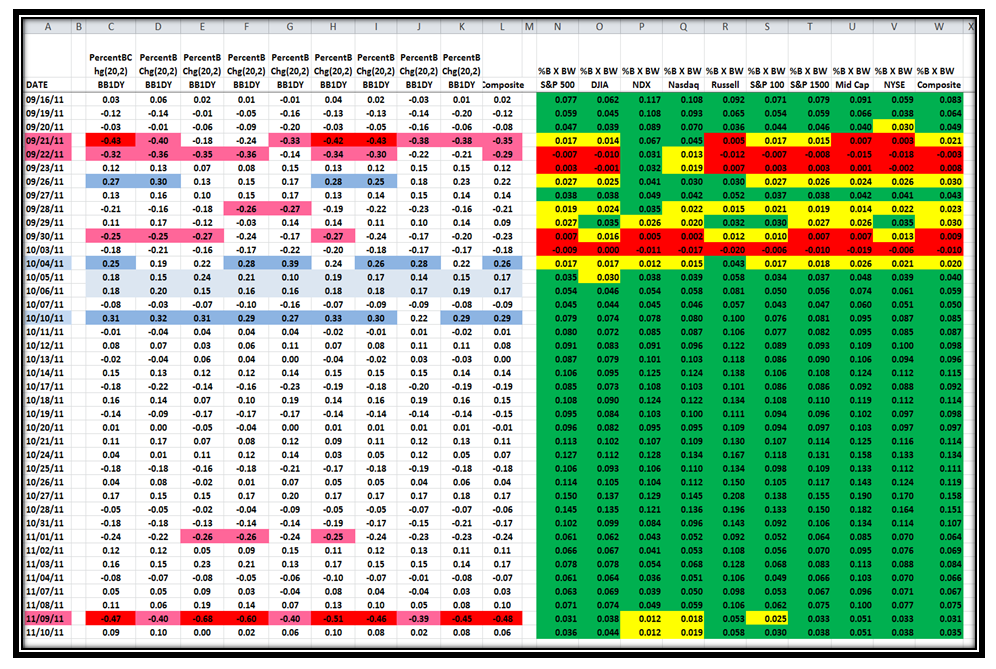
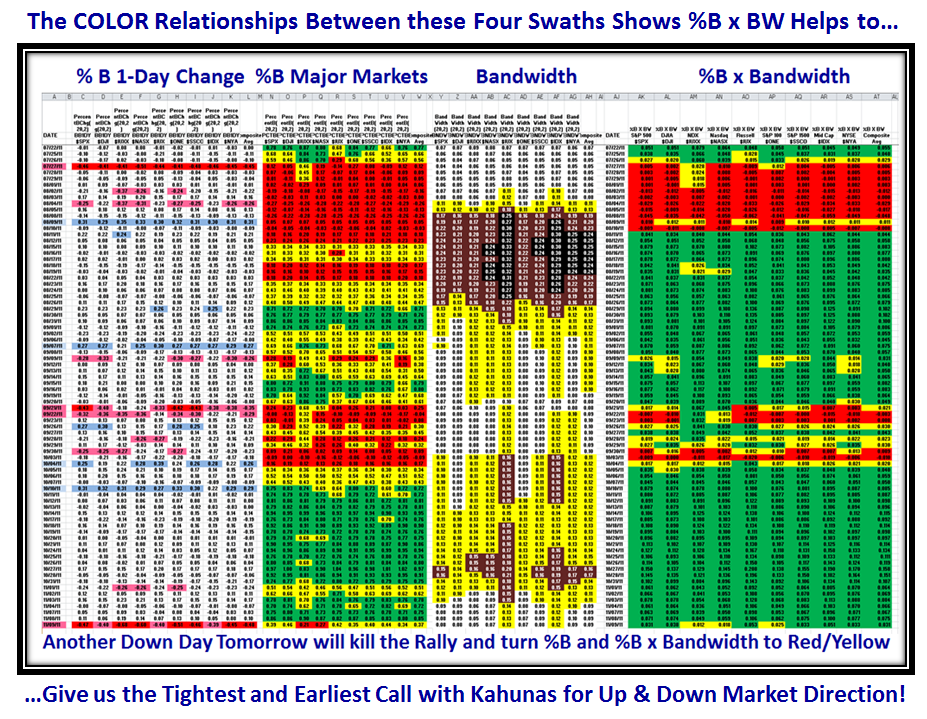
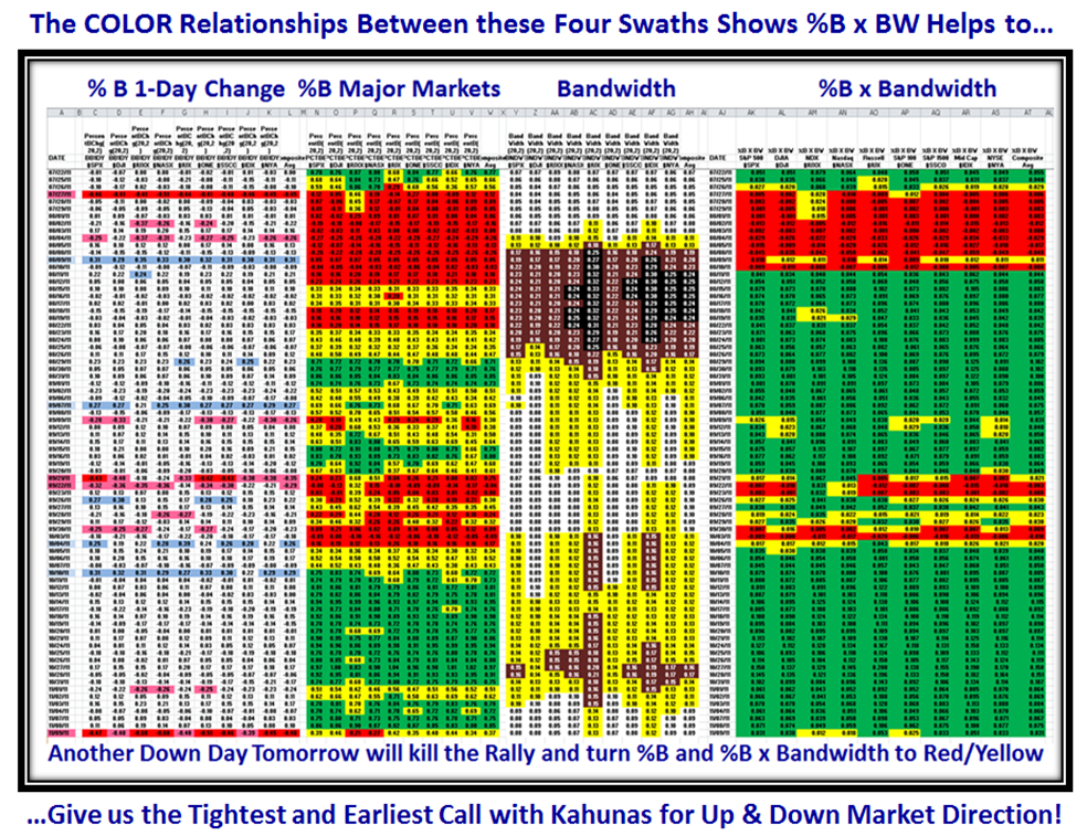
Bob, your wish is my command.  Here is a step by step view of the four swaths, starting with the original with all four scrunched together to give you a general view as I did late last night, and then the “Real Proof in the Pudding” or the “So What?” is the fifth swath of %Gain from the day of the Signal.  This first chart showing all four swaths was intended to give you a general view of the inter-relationships, and maintains continuity for you from last night’s blog note:
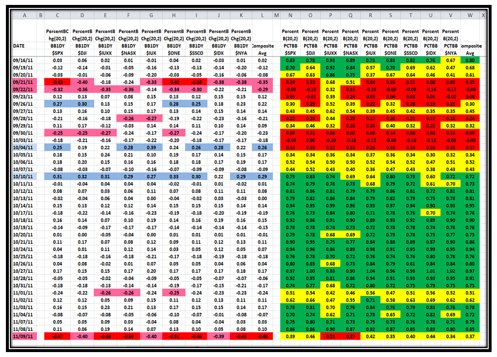
Now here are the first two Swaths, %B 1-Day Change and %B, and hopefully you can read the numbers this time, when you click on the chart itself which will give you a bigger picture.  Note that when we see a string of Kahunas down or up, as we see on 09/21/2011 and 10/10/2011, respectively, %B essentially changes color in unison
Next we have Swaths 3 and 4, Bandwidth and %B x BW:
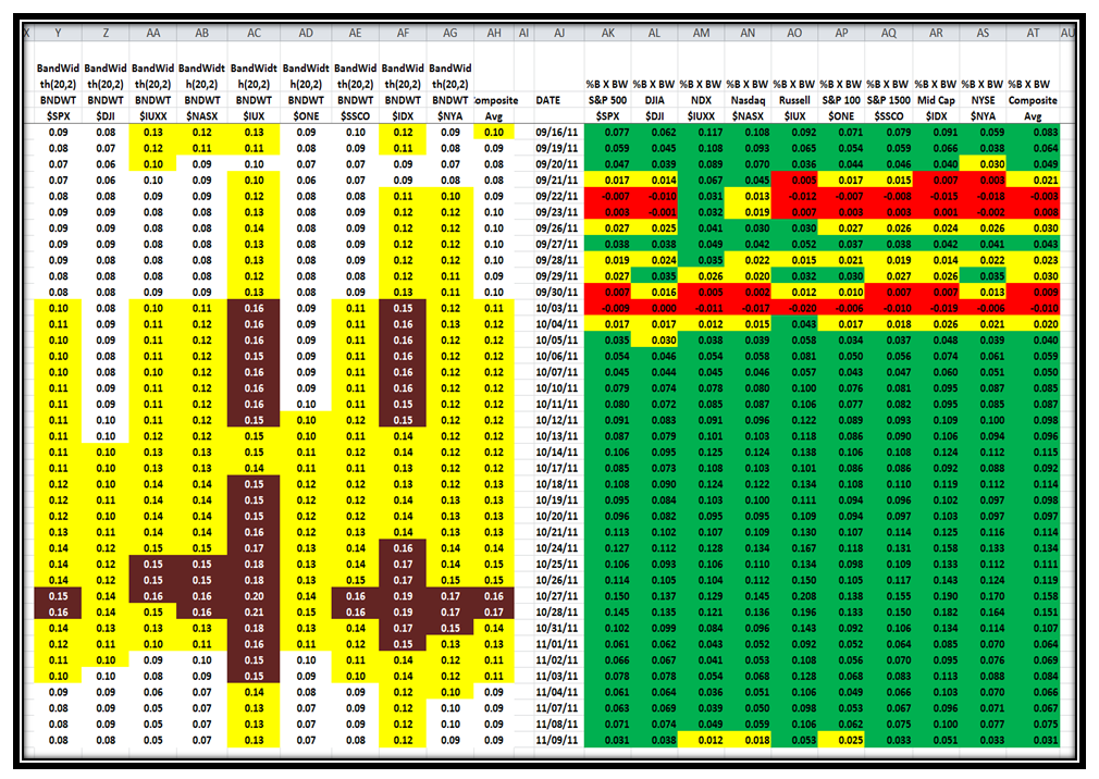
If we look at the last line, we see that Bandwidth had mainly the same readings and identical Conditional Color Formatting, while %B x Bandwidth showed that three numbers changed from Green to Yellow, signaling a caution but no major change, implying that although we had a 4&1/2 bucket drop in most Indexes in %B, the Rally was not yet dead!  I have not updated the chart for today’s readings, but as you would expect given that it was a ho-hum positive day the colors for %B x BW improved to just two “yellows” for the NDX and Nasdaq, while the S&P 100 came back to “green”.  I am not for one minute suggesting that the Market is not on shaky ground, which it is, but it is still not dead!

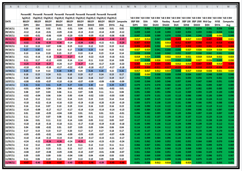
Next, just to prolong the agony, since this is the first time I am walking you through the logic, I show Swath 1 and 4, %B 1-Day Change and %B x BW.  However, you will note that this time I have colored the swaths for 10/05/2011 and 10/06/2011 with a light blue just to draw your attention that although there were no Kahunas on those days, the momentum was still impressive with what I would call 2/3rd. of a Kahuna on both days…remember that a Kahuna is 0.24.  In other words we see three days in a row with strong Momentum from 10/04 to 10/06, which resulted in %B x BW changing color to “Green”, implying that the signal that recovery with a New Rally was confirmed on 10/05/2011.  Obviously by 10/10/2011 when we had another strong swath of Kahunas, the %B x BW was sitting with four days of solid green.  Please understand that the Follow Through Day was not signalled until 10/12/2011 which was two days later.
You might well be asking when does this process signal that the market has turned back to a Bear Market or that the Rally is dead…I would want to see at least six of the Market Indexes turn to Yellow/Red for %B x BW.  Likewise, I am equally sure that you are saying “So What?”  The answer is on the next swath which shows the %B x BW together with the actual Index close prices, which comes back to my opening picture of “You Snooze, You Lose!”
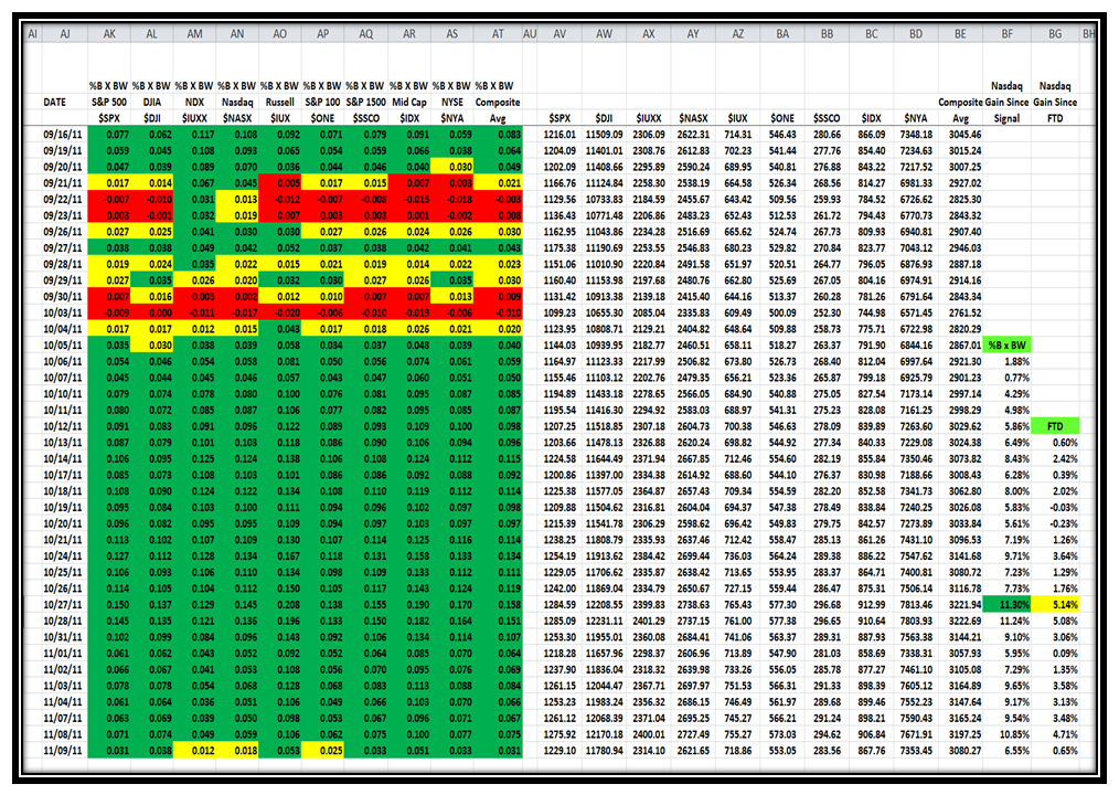
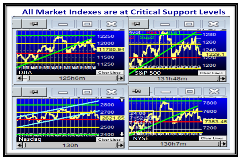
The So What is that with the process I have shown you you stood to double your gains at the peak, between friends, over the FTD system.  Yes, of course, the Market is under pressure…it ought to be after a ~5 Bucket drop and it will take good news out of Europe and momentum buying from the Large Players or we head down into the doldrums.  I have always taught you to watch the Canaries in the Coal Mine and my charts of four Market Indexes in the previous Blog gave you the picture that we are flirting with the lower support levels too close for comfort.  But, for tonight to round this blog note off, let’s just look at the “Go To Canary”, AAPL, and you will see that it is Gasping and nearly out for the count!
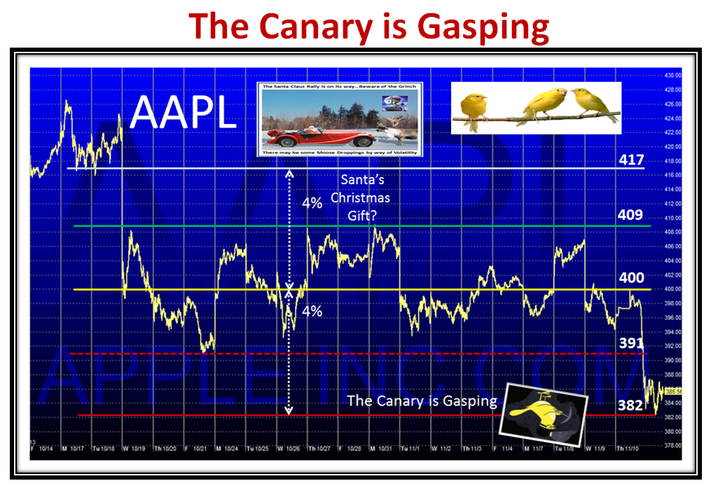
So there you have it.  We will see how useful this is going forward.  We are at a critical point, but not yet out for the count!

Best Regards, Ian.

Get the “Edge” with %B x Bandwidth!

Wednesday, November 9th, 2011

With the Yo-Yo Market we have tolerated these last several months, I feel that No Longer do we need the Blind leading the Blind for Short & Long Term Market Direction.

With the Help of Chris White, the CEO of EdgeRater, we now have a Template that will make life a lot easier with the introduction of a new gem which I have conjured up to find an “Edge” with %B x Bandwidth.  We will need to watch this phenomenon to be absolutely certain, but on a Day like today, there is no better time than now to introduce this new concept.  I will save that gem till the last chart in this note, but thank Chris for this improvement in the EdgeRater Template for Major Market Indexes, which makes life easy for EdgeRater and HGSI Software Users:

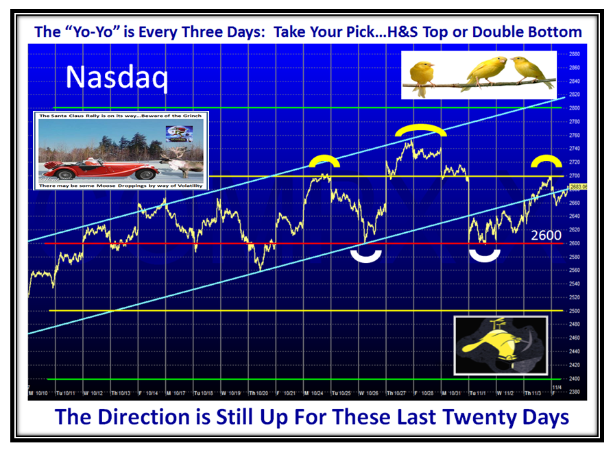
But, let’s first take a look at the hairy edge the Market Indexes are at given a huge down day from the Italy debacle.  They are all within a hairs breadth of breaking the Major Support level I described in an earlier Blog Note.

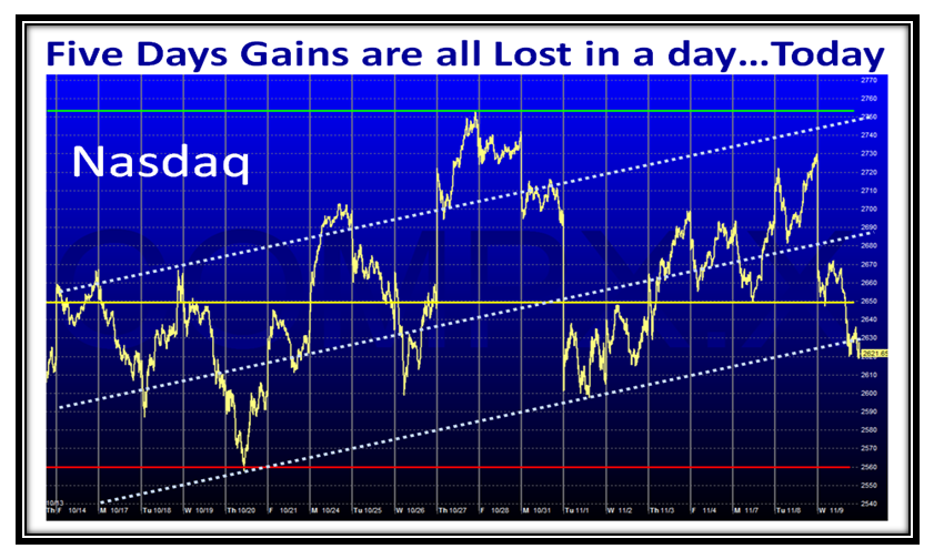
If we zero in on the Nasdaq, we see that the previous five days gains were all wiped out by today’s major drop:

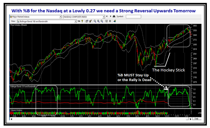
The Nasdaq along with the other Indexes took a major dumming today, ending up with a %B of 0.27…precariously low:

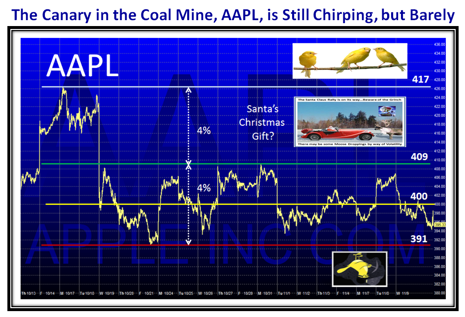
When things get really rough, always turn to the “Go To Canary” in the Coal Mine…AAPL:

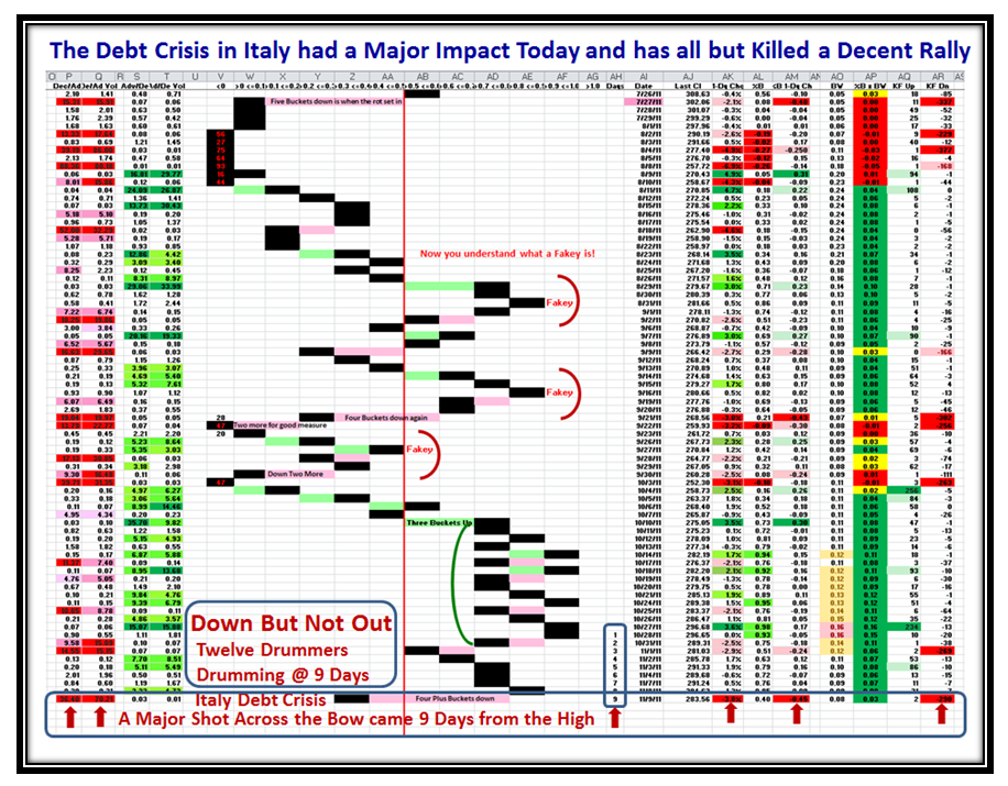
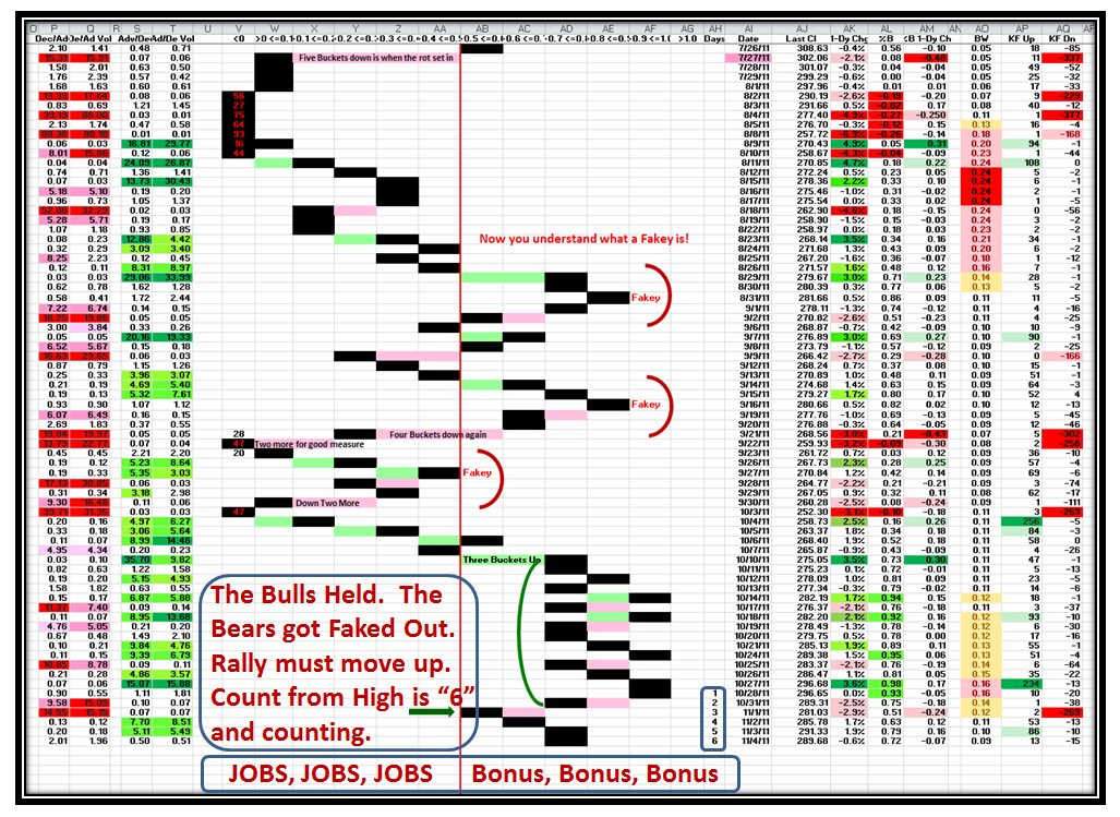
This next chart shows the Four Plus Buckets down we suffered today.  Please Note all the Red Arrows at the Bottom of the Chart.  So far we have had nine days from the high, so the Signal of “within 12 days that the Drummers are drumming” for an expected correction seems to have come through once again.

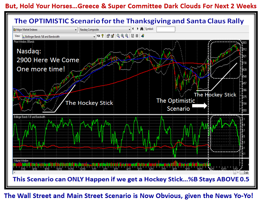
The Hockey Stick formation has formed so far, but it is obvious it is in jeapordy and tomorrow will determine whether %B breaks down through the bandwidth or can hold and return to its original glory of staying above the Middle Bollinger Band, with %B >0.5:

…And last but not least, here is the chart I promised you at the beginning.  Study it well and let’s follow what transpires:

Many thanks to Chris White for this Template which makes life easy to follow with regard to Market Direction with hopefully the earliest calls both up and down.  Note the Kahunas on the Left in Red and Blue coupled with the change in color with %B x Bandwidth on the right hand swath for the earliest calls.

Best Regards, Ian.

Stock Market: Bonuses vs Jobs

Saturday, November 5th, 2011

With the Constant Yo-Yo we are tolerating of three to four days up and down in the Stock Market these days, the only worthwhile Game Plan is to play it both ways to that tune.  The Large Players don’t want to see this Market fall right now, especially when they can taste their bonuses.  Yet the Global status of the Debt Crisis pokes its head up every few days to trot the market down.

Seasonality suggests we now look forward to the Thanksgiving and Santa Claus Rally, and that is not a bridge too far.  However, the Greek and Super Committee gang of twelve provide the current dark clouds to potentially spoil the fun.

The Bucket Brigade is still flying high to keep you on the right side of the Market since the Rally began.  The twelve Drummers Drumming Scenario is half way with a count of six.  For those who do not recall, the market will break %B 0.5, or the Middle Bollinger Band or the 20-dma line…take your pick, usually within twelve days.  When the internals are this strong, any correction is short lived unless there is a Major Surprise of negative news.  We are back in safe territory sitting with %B of the S&P 1500 at 0.72, so we have a decent cushion.  We want to see the Index trot up higher and beat the recent 0.98 reading on 10/27/2011 for the count to get reset.  I’m sure you know how to read this chart by now…Arms ratios on the Left, Bollinger in the Middle and W&B on the right, but the latest “Good Stuff” is in Red circled in Blue :

So here is the Game Plan for the OPTIMISTIC Scenario that takes us into the New Year.  In a couple of words “Hockey Stick”:

Net-net:  As long as %B for all the Indexes, of which the S&P 1500 is a typical Surrogate, stays above 0.5 and preferably 0.7 the Rally is safe and we head into a Santa Claus Rally.

Best Regards, Ian.


Copyright © 2007-2010 Ian Woodward
Disclaimer: Commentaries on this Blog are not to be construed as recommendations to buy or sell the market and/or specific securites. The consumer of the information is responsible for their own investment decisions.