Ian Woodward's Investing Blog

Archive for the ‘Market Analysis’ Category

Stock Market: The Party’s Over for Now

Saturday, August 20th, 2011

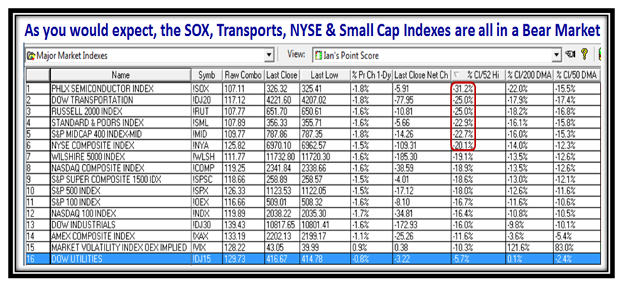
I don’t have to remind you that the Party is Over for now as many Market Indexes are already into Bear Market Territory of over 20% down from their highs, and most others are knocking at the door sitting at around -18% down.  My faith in the Sloshing Buckets or Bucketology as I call it continues to grow , if for no other reason than we are constantly understanding the volatility it presents to us and coupled with other indicators we use we get a feel for which way the wind is blowing.

…And here in one snapshot is the proof that the Market Indexes are all laboring:

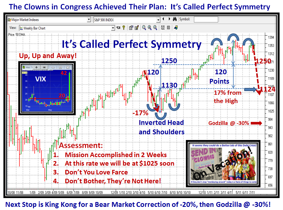
The Perfect Symmetry Plan I showed you three weeks ago is now complete, and we are faced with this Market going down even further.  It will take a while to work the VIX down once again from these highs above 40, so don’t expect a true Rally any time soon.  1025 on the S&P 500 is certainly on the cards:

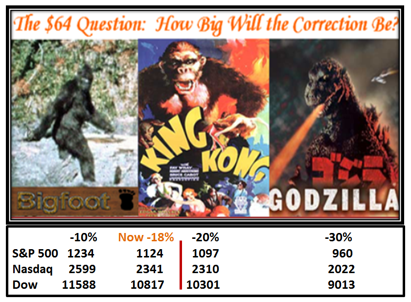
…And here is the picture for Big Foot, King Kong, and Godzilla, the HGSI Barometer I showed you a few notes ago:

It’s important that I repeat these next two slides to maintain continuity with what I show is the precarious situation we are in to drive home our predicament:

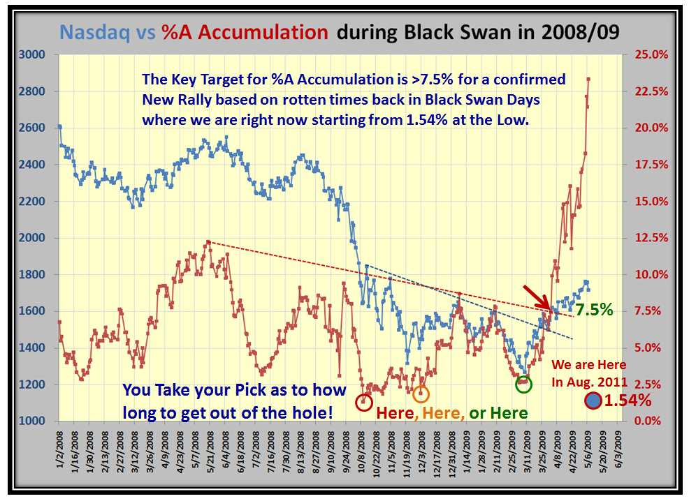
This next chart is the real eye-opener as I challenged you to identify where we stand relative to Black Swan days and as the days go by, it looks like we have a lot more to endure…not only in terms of the US Economy which is confirmed as being stagnant, but also the Worldwide situation which has consumed them:

I’m not suggesting we dive a total of 57% as we did in 2008, but we could at least trot down to 30% to 35% which would be a double down from here.  The following chart is an old faithful and I know it keeps you focused on where we stand on the Market Indexes:

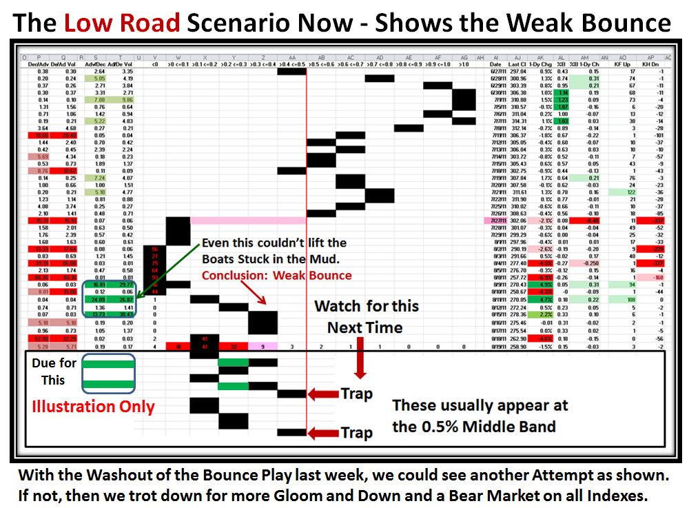
If we are fortunate to have a Relief Bounce Play next week, I show you how it “MIGHT” happen, but the main thing to watch out for is a Trap if and when the S&P 1500 trots back up to the 50:50 red line as I explained in my last blog:

We are just two months away from the October 22 to 24 Seminar and we believe it will be a good time for you to brush up on the New Release for the HGSI software due a month from now; and prepare for the next Market Rally when we should know when to crawl out of our foxholes, and take advantage of the big opportunity for those interested in the Longer term move to the upside.  Meanwhile, there is plenty of opportnuity on playing both sides of the market if you are nimble.   Please drop me a line at Ian@highgrowthstock.com if you intend to come.

Best regards, Ian.


Stock Market: Yo-Yo Players Only Need Apply!

Wednesday, August 17th, 2011

I don’t have to rub it in as to what the Stock Market has done to the 401-K’s turning to 401-Kegs, but it seems only Yo-Yo Players who love intra-day volatility need apply to have fun in this market:

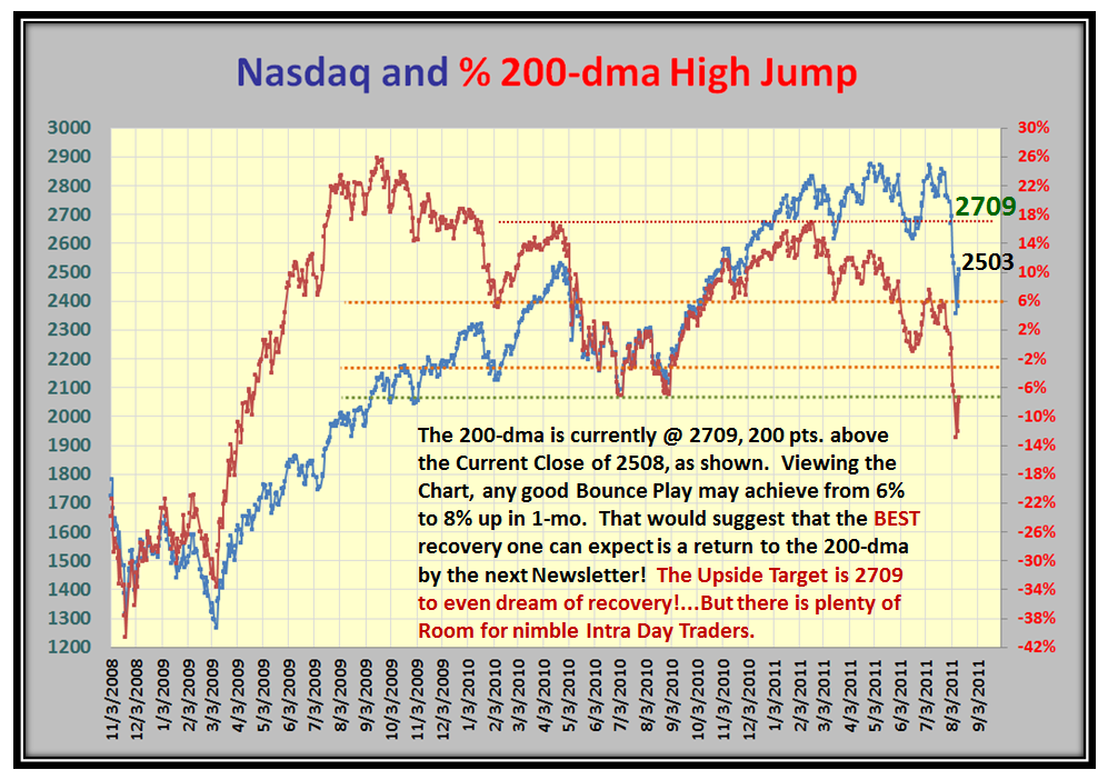
If you don’t believe me, here are some charts to ponder over which show that we have rivaled both Flash Crash and Black Swan times before.  Feast your eyes on the High Jump for Starters:

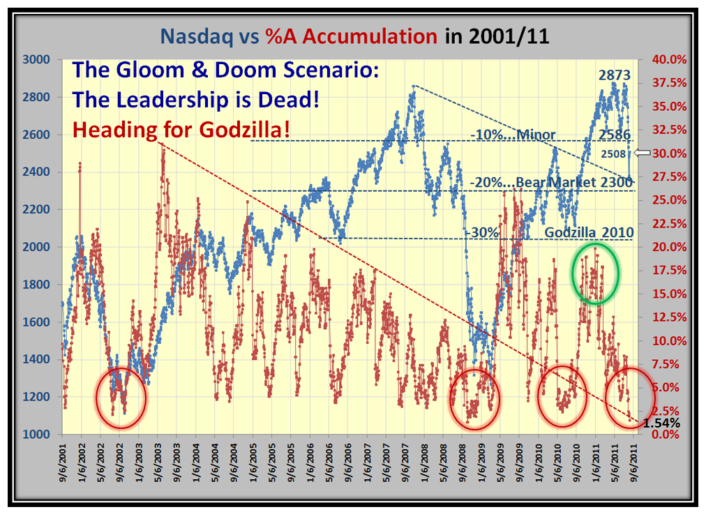
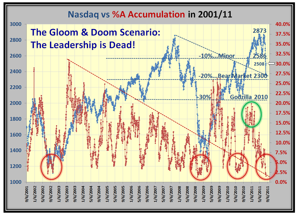
Now let’s look at the Gloom and Doom Scenario, the “A” Accumulation Leadership.  What Leadership you ask?

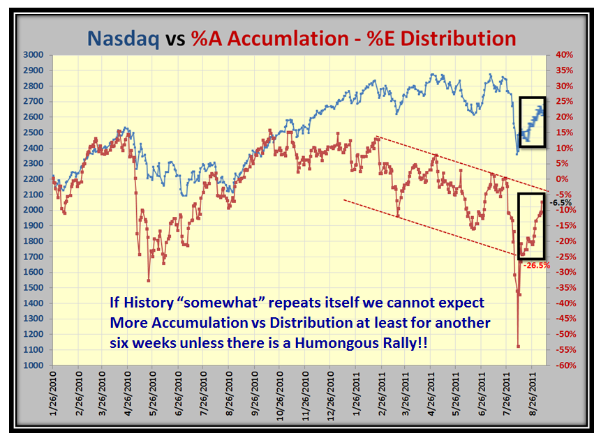
I hear a lot of wishful thinking about “V” Bottoms…I say past history shows that is wishful thinking when there is no Leadership.  You judge for yourself:

Here is a new twist on the same theme…compare the %A Accumulation minus the %E Distribution…My friend Jerry Samet pays a lot of attention to this one:

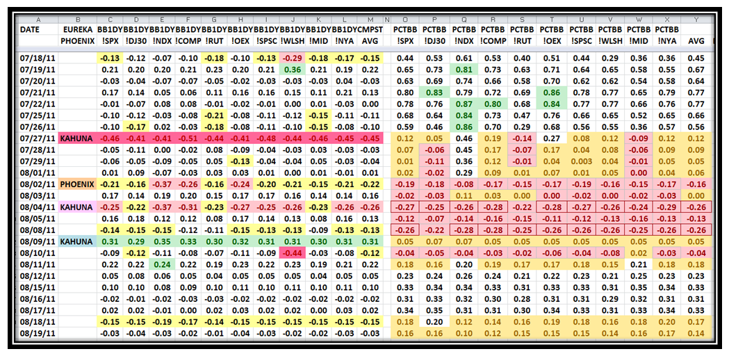
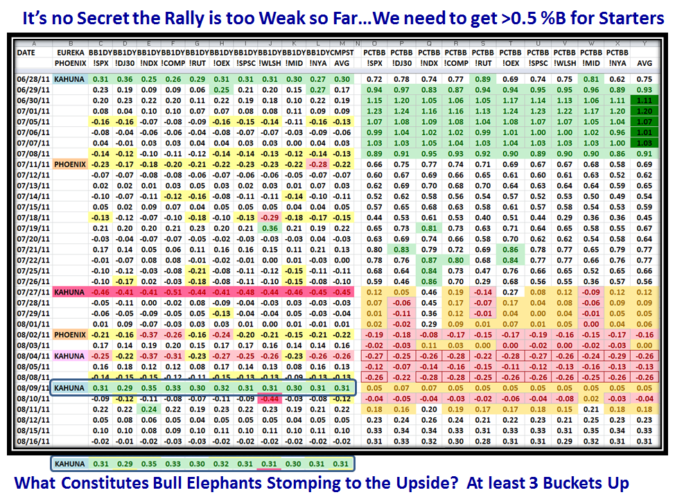
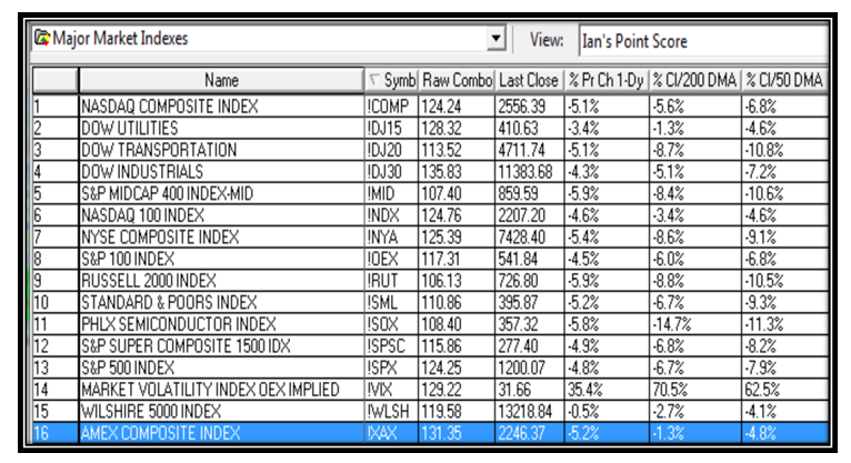
So let’s look at where all the Major Market Indicies stand.  As of yesteday’s close they were all hovering around 0.3 %B, far too weak.  You and I can dabble around if we choose, but until we see the Bull Elephant Institutions Stomping around to the Upside (or for that matter the Downside), all the rest is nothing but biding time for some big news to swing this market one way or another.  You learnt it here first…you need 3 Buckets up in one day to even start to get excited.  Alternatively watch for 4 Buckets down in one day for the Downside as shown on 07/27/11, which started to kill this market:

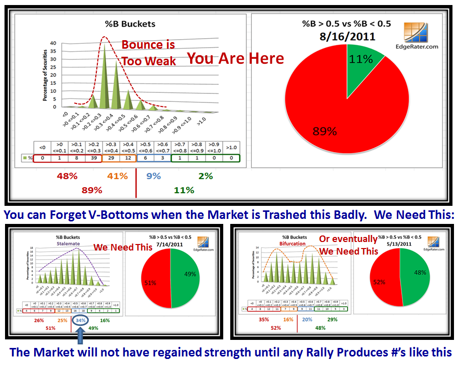
I’m sure you know that Grandma’s Pies are a trifle moldy, and I am suggesting we need a couple of alternatives to the upside before we even think we have a Rally in the making.  We need one or two small steps for Grandma before we can see one giant leap for the Market.  Net-net we need 50:50 for starters:

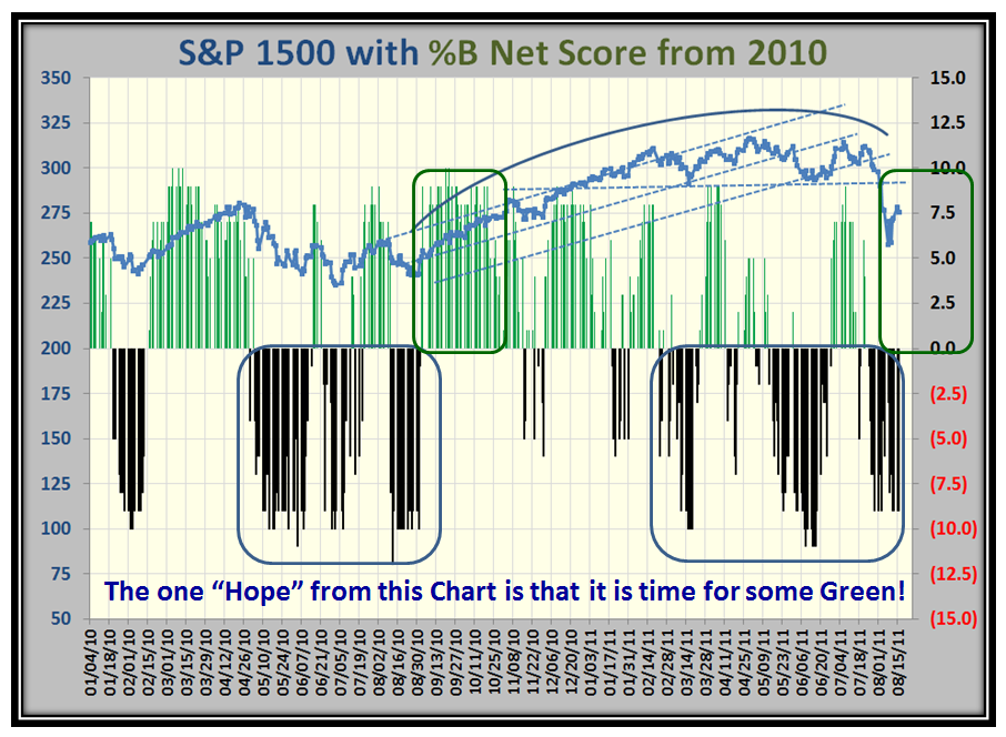
Another way to measure some relief is to see positive Scores in the Bucket Brigade domain, as it has been negative for three cycles in a row as shown by this next chart and it is time to see some Green appear on the chart soon, which will at least move the buckets north of 0.5%!

So there you have it…not a very rosie picture, but you would have it as I see it rather than sugar coated.

Have a Happy!  Ian.


Stock Market: Quick Glance Barometer

Tuesday, August 9th, 2011

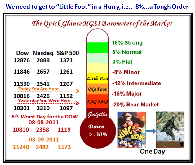
With the Major Market Indexes all sitting at around -18% down or worse, I felt it might be worthwhile to give you the Quick Glance HGSI barometer of the Market.  Yesterday King Kong ruled, but fortunately with today’s sparkling Bounce Play essentially in the last hour we are back to Big Foot!  Enjoy:

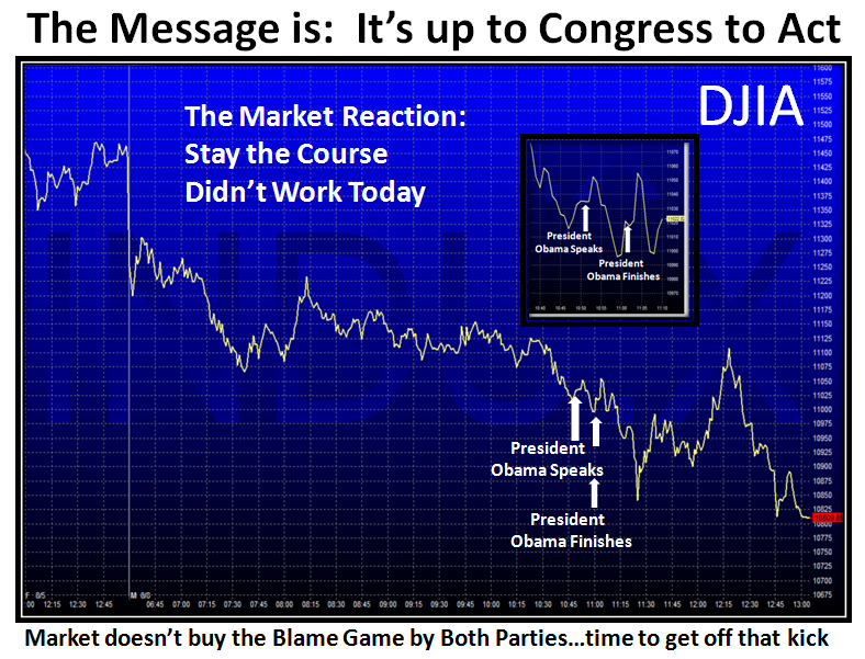
But let’s backtrack to yesterday when the DOW suffered the 6th worst day, where the mood after the Investors had a chance to digest the downgrade of the Credit Rating to AAa over the weekend and left a sour taste and a gloom and doom mood, with investors unloading their securities en masse.  Even President Obama’s assurances to stay the course could not turn the mood around as shown by the next two charts:

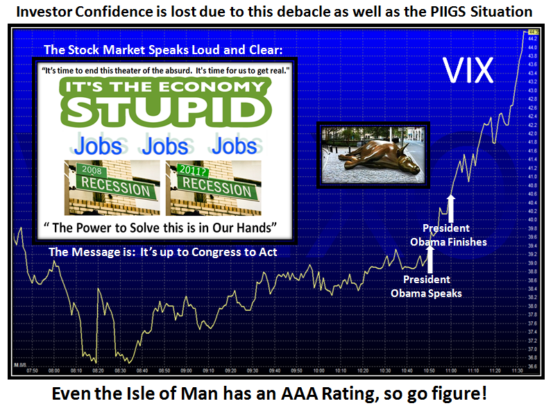
The VIX showed that Volatility was back as it hit over 40 again in a hurry and then some:

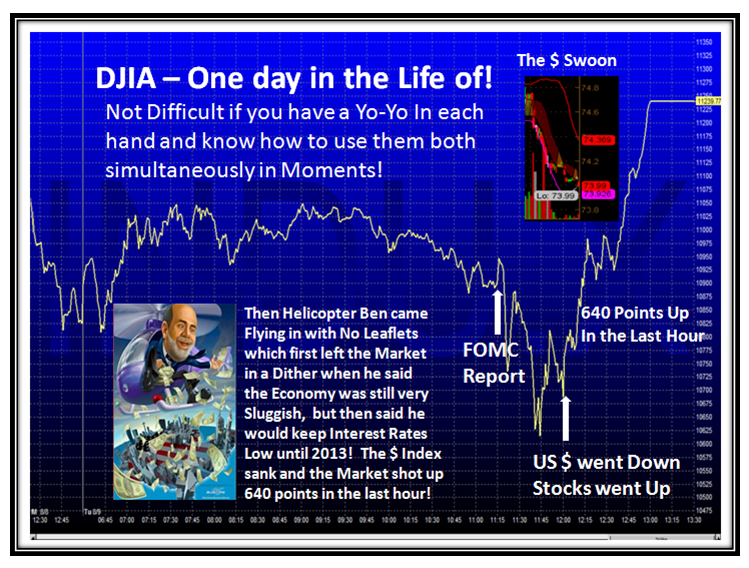
…And then Helicopter Ben appeared today with the FOMC Report with bad news regarding the Recovery of the Economy being slow and therefore more pain for the populace with regard to Jobs.  At first, this sobering news took the market down, but then the re-assuring message was that the intention is to keep Interest Rates low for the next two years.  No leaflets were dropped ala the prospects of a Q-E 3.  However, on second thoughts by the market, the reaction was to take the Dollar Index down and consequently, Stocks took off and our man at the FED became the hero instead of the goat!  Go figure.

In any event this helped “usuns” to breathe a sigh of relief at least in seeing the much expected and touted Bounce Play materialize like a Yo-Yo to drive the Market up for a respectable gain of around 5% all around for most Indexes for the day.

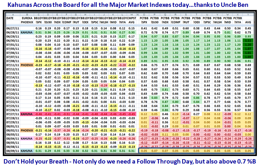
So with the strong Bounce Play, all Market Indexes enjoyed Little Kahunas up today as shown by the next chart.  But cast your beady eyes over to the bottom right hand side of the chart to realize we are still only at the 0.05 level on %B, i.e., just inside the Lower Bollinger Band…so don’t get too excited yet.  Of course we can expect the usual discussions from our friendly Financial Newspaper that this was a turn-around day and we should next look for the Follow Through Day (FTD) to suggest we have a Market in Recovery.  Let me remind you to go back and study the last two charts of the previous blog note to realize that Rome wasn’t built in a day, and you should be alert for the booby traps which invariably occur at the expected resistance points, be it with Fibonacci, Cycles, or just plain support and resistance levels.

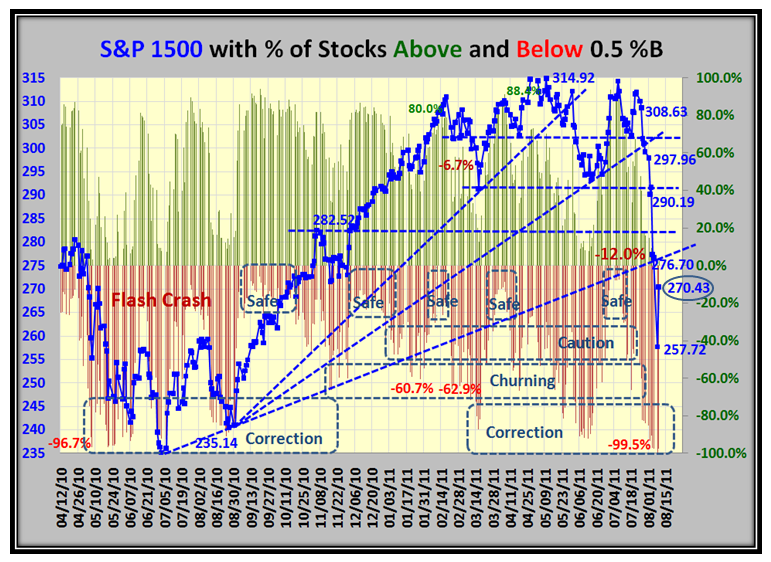
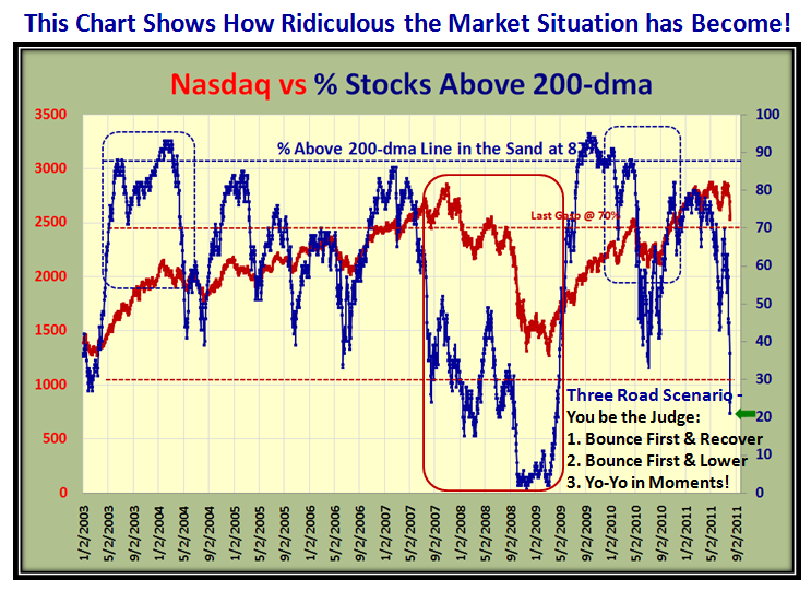
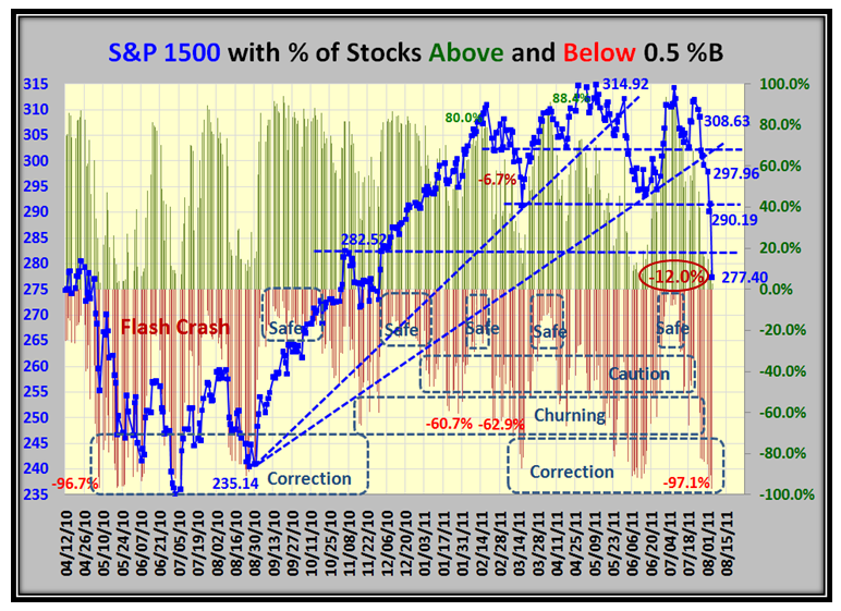
So having looked at %B for the Indexes, now let’s see what the % of stocks above and below 0.5%B looks like at this stage of the game…disaster:

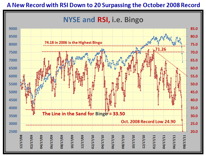
Now then, let’s see the extent of the damage with the likes of RSI, which gives us a measure for “Bingo” using the NYSE.  The picture speaks for itself and as you would expect, we reached the lowest level yet recorded during this period since Black Swan days in October 2008, beating it down by a college mile:

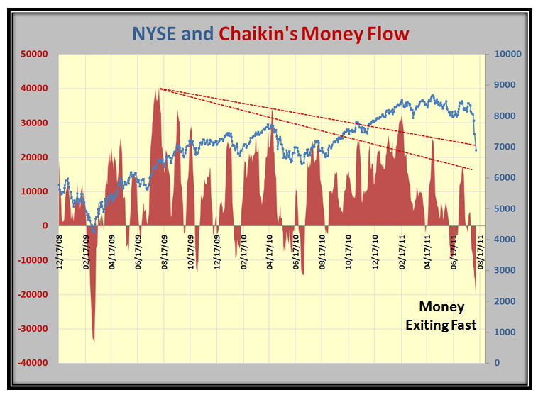
…And as you would expect, Money is flowing out of the Market fast:

More of the same:

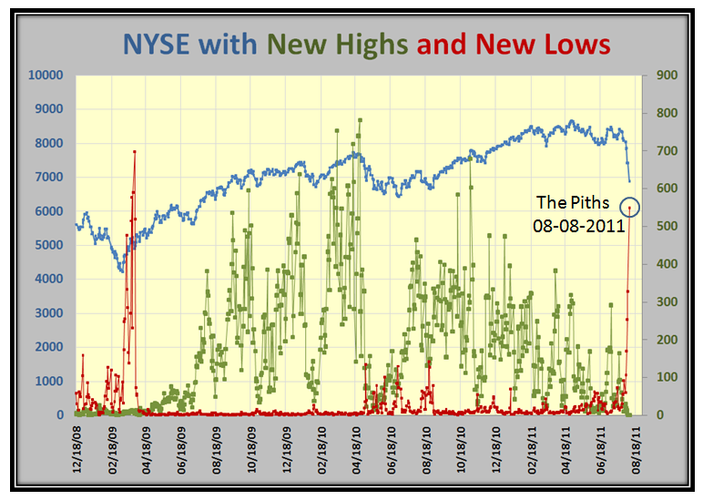
…And as you would expect, the New Lows are now reaching to the stars:

So there you have it.  Type 1&2 Traders sharpen up your Yo-Yo skills and Types 3&4 relax in the sun.

Best regards, Ian.


Credit Rating Downgraded Dampens the Bounce Play

Saturday, August 6th, 2011

It’s no news that the Stock Market is already in the toilet, but now even the chance of a decent Bounce Play from a very Oversold Market is overshadowed by the US Credit Rating being downgraded to AAa.  In any event, Markets seldom recover from V Bottom’s unless they start from less than Minor Corrections of-8%, and that invariably when the market is starting fresh rallies and not going through the topping process we have seen for the past four months.  We have only to go back to the Flash Crash of 05/04/2010 to see that with a similar oversold situation it took several attempts and “fakey’s” to finally get out of the mire after four months by 09/01/2010.

My good friend David Steckler suggested I make a Headline change to the Picture below…so with tongue in cheek, his wish is my command!  See if you can spot it, but with what appears to be ahead of us this week, it fits the bill:

Many of you have responded to encourage me to keep up the good work and so I felt I should capture this moment in history to show you the value of what I see in using Bucketology to “Harness the Market with %B” at this critical juncture.  Here is a synopsis of what I believe are the key values:

The concept of Bucketology, i.e., dividing the range of Bollinger Bands %B into 12 slices and measuring the number and/or Percentage of stocks that sit in each slice or Bucket as we call it for an Index, a User Group of Stocks or ETF’s,  lends itself very well to my insistence of having three scenarios as a Market Plan and then letting the Market tell us which road it is on…the High, Middle or Low Road.  Numbers are fine, but a Picture is worth a thousand words and when one can have both, life becomes far easier to manage the analysis and synthesis of the Market:

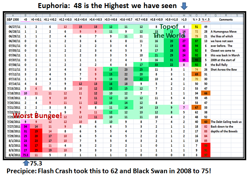
I use the S&P 1500 as the basis for most of my analysis, but as you well know I also use ten key Market Indexes in my work.  I have updated the following chart right up to yesterday so that you can see how the numbers change as the days roll by.  The color coding of red and green gives you the quick demarcation between below and above the Middle Bollinger Bands of 0.5, respectively.  The numbers in this case are the % of S&P 1500 stocks that sit in each bucket on that day, as the Market ebbs and flows back and forth in its cycles from low to high and back again:
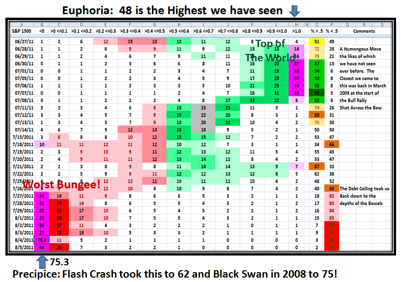
These extremes are seldom seen especially when we were at the highest momentum ever recorded on July 1 with stocks above the Upper Bollinger Band of >1.0 and the % of stocks reaching a peak three trading days later on July 7th. with a Score of 95 for Stocks above 0.5%B.  Just one month later we find the Market down in the bowels of despair, with yet another record of 75.3% of stocks with %B <0, below the Lower Bollinger Band.  It doesn’t take two seconds to see that the Markets are totally trashed by “Grandma’s Pies” and the numbers side by side:
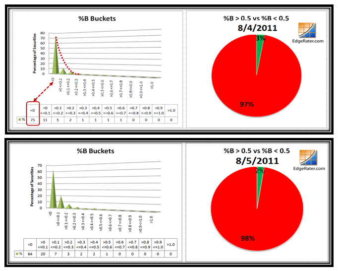
As we well know, Friday gave moment traders fits and starts with the moment to moment swings in the direction and magnitude of the moves all day, particularly on the Dow Jones Industrial Averages.  Although there were attempts all day to produce a Bounce Play, it can be chalked up as a pip-squeak although there was some movement from <0 to bucket >0 <0.1 with 75% to 64%, respectively, by bottom-fishers buying beaten down stocks.

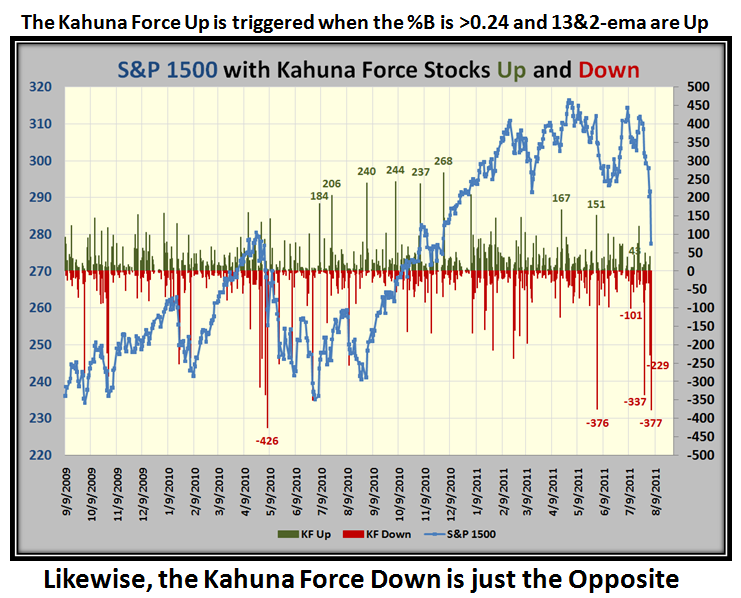
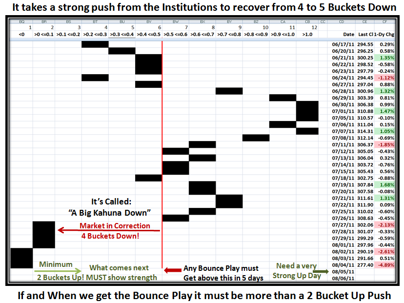
Sad to say that the news at the weekend of the downgrading of US Credit Rating by Standard and Poors will add more turmoil and pressure to the markets and could even squash any immediate attempt to give a decent Bounce Play with good momentum.  Here for the record are the Kahunas both up and down for the last three and a half years.  The message is at the top of the chart, but for emphasis it is worth repeating…Note that 4 to 6 Buckets Down signals a major change in Market Sentiment, and that it is most unlikely the Market will recover anytime soon:
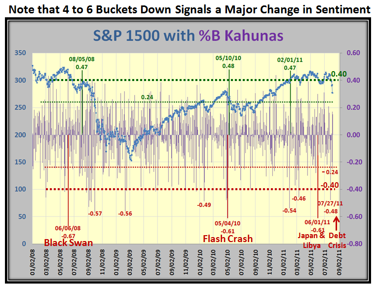
Please understand that there are two types of %B you should track…one related to bucketology for the Stocks in an Index as I have shown above in several different charts, and the other the %B of the Entire Index for the S&P 1500.  They are different and as I have shown you many times before on this blog the difference betwen the two, which I call the “Purple Chart” is very illuminating.

The next two charts relate to %B of the S&P 1500, one for the Flash Crash and the other right now for the Debt Crisis comparison:
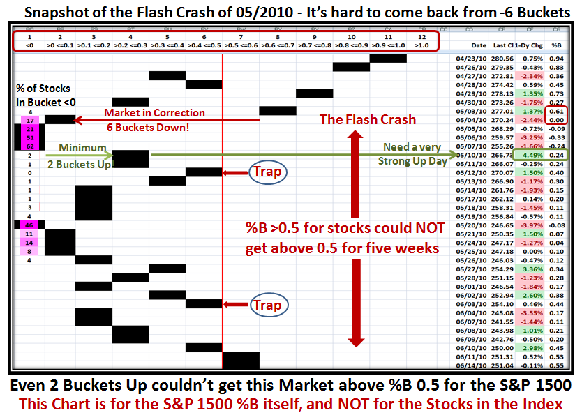
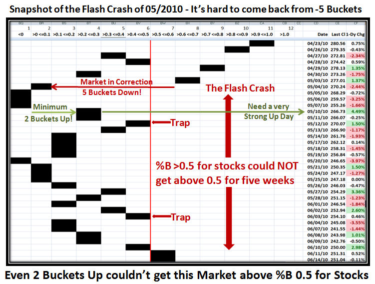
I have updated the chart I showed previously, and point you to the last column which shows the %B reading for each day.  You will note that the Flash Crash took us from a reading of 0.61 to 0.00 in one day…in other words a six bucket drop, which is depicted by the Black bars dropping from and to their respective buckets.

The second thing to note is that I have superimposed the % of stocks in the first column.  Note that immediately after the 62% of stocks on 05/07/2010, the very next strong up day lifted all stocks to give just a meager 2% in that column with a 4.49% gain in the S&P 1500 Price.  You will also notice that within three days the %B had risen to 0.40, and immediately fell back, essentially with very little lift off…a TRAP!  It didn’t take but six trading days before the Index was down in the dumpster.  Also note that the second attempt also found itself trapped and as I mentioned before it took several Fakey’s before we had a fresh rally starting on 09/01/2010.

This next chart shows the pertinent flow for this recent peak and valley we are currently in.   The chart shows the key PROBLEM with nearly FIVE Buckets down from 07/26/2011 to 07/27/2011 for %B of the Bollinger Bands, in ONE Day.  It was a humongous drop and was the signal to get out fast! That is tantamount to the Institutions and the Herd trampling over each other to get out of the Exits.
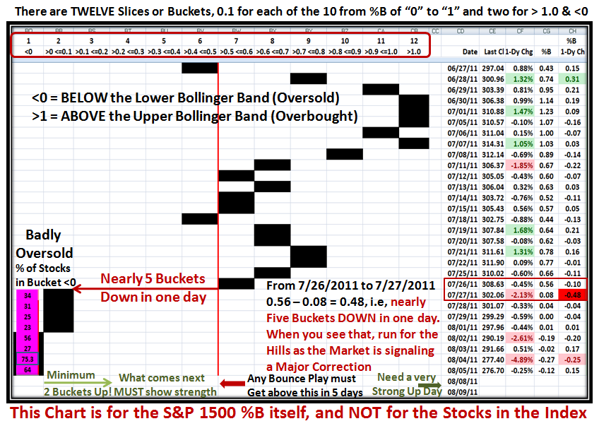
Likewise, you need a decent number of bucket skips to the upside to ensure you have the momentum and the wind at your back.  However when the Market is trashed as it is now with 75.3% of all S&P 1500 stocks sitting <0, below the lower Bollinger Band, the tide is completely out and all boats are stuck in the mud until there is a sea change in the EMOTIONS of the Market, with the tide coming back in and the wind at your back to raise all boats.  It takes several attempts to get back to a normal market, and so you must expect TRAPS along the way as I showed in the similar Chart for the Flash Crash.  It is most unlikely we will get a “V Bottom” with the market so badly trashed.

So there you have it all in one place as to how the Bucketology concept provides the instantaneous reaction to Market Fluctuations, and that it brings into focus of what to expect in the Ebb and Flow of the Market at its extremes for useful clues to call you to action.

Best Regards, Ian.

Stock Market: Biggest Bungee Jump Yet on %B Below “0”!

Thursday, August 4th, 2011

The hour is late and I can see that there are a lot of you giving me support for my work, but I am now in overload.  Anyway, this may help some of you tomorrow to have an update tonight of exactly where we sit with regard to the Market.  There are several messages in the following dozen charts so you will have to plough through them carefully.  Moment traders are even finding it hard to stay on the right side of the market.

Of course there are many with ants in their pants who are itching to catch the bounce play, but be careful you don’t get cut by the falling knife syndrome:, especially as we have the jobs report tomorrow:

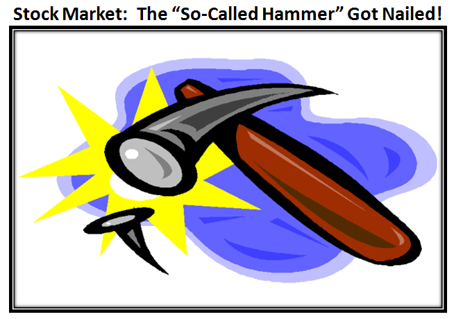
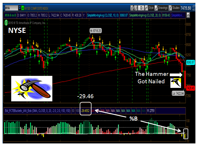
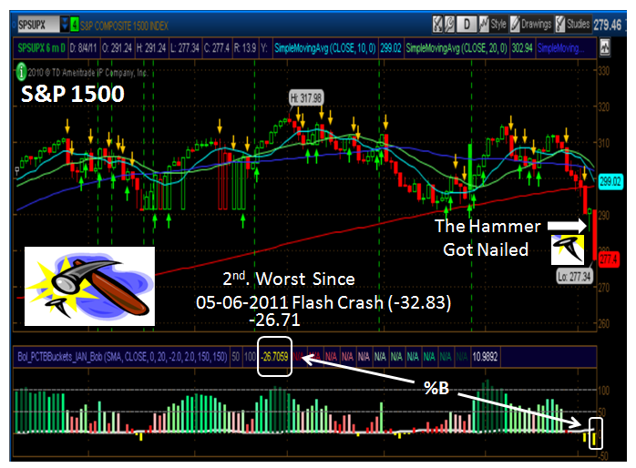
I couldn’t resist another picture to capture what was a technical point gone haywire when the “hammer got nailed” today:

…And here are two examples to show you what I mean using the NYSE and S&P 1500 Indexes, respectively:

These low numbers are seldom seen for %B, so make a note for the future:

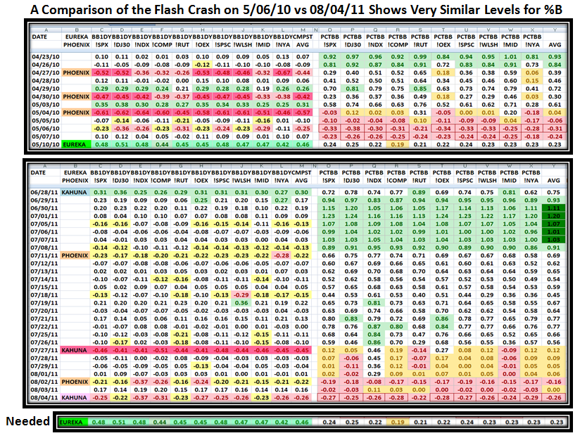
Always use a Stake in the Ground and a Measuring Rod:  Here is a Comparison of the Flash Crash and Now.  It doesn’t take two minutes to realize that when a market is this oversold the Bounce Play is around the corner, but it has to be robust to lift the Market off the bottom:

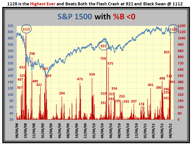
Now this chart is an eye-opener…The number of S&P 1500 stocks with %B <0 is the highest on record…so that will give you a feel for how deep this correction is at already, although it is only down ~12% or Intermdiate Correction level:

Here is a new one for you…Ron and I call it the Kahuna Force, and the criteria is explained on the chart below:

This next chart is a favorite of ours and shows that again we are as oversold as the Flash Crash numbers and are -12% down from the high:

…And this chart confirms the biggest Bungee Jump on record, surpassing both the Flash Crash and Black Swan:

When we have a 4 or 5 Bucket down day, it always sets the stage for a Correction.  However the return path is slow so be careful not to be caught in a Fakey as shown in this Flash Crash slow come back that produced several traps along the way.

…And here is where we stand right now.  Don’t forget we have the Jobs Report tomorrow:

The challenge to fight the resistance is a lot tougher after today as we can see from this next chart.  It shows the distance from the 200 and 50-dma and since few Bounce Plays provide more than about a 5% up move within 5 to 7 trading days, we can set the immediate targets to get over these natural resistance levels that all Technicians watch.  In addition, if you put up Fibonacci levels from the Recent Base Low around 9/01/2010 you will see that we are right at the 50% level, so use that as a guide both up and down from there:

I like to have your feedback so spend a moment and make a comment if you find this of value to you.  Better yet, tell your friends to visit my blog!

Best Regards, Ian.


Copyright © 2007-2010 Ian Woodward
Disclaimer: Commentaries on this Blog are not to be construed as recommendations to buy or sell the market and/or specific securites. The consumer of the information is responsible for their own investment decisions.