Ian Woodward's Investing Blog

Archive for the ‘Market Analysis’ Category

Cock-a-doodle-doo…What a Difference a Day Makes!

Tuesday, October 5th, 2010


Question from Hsin who was concerned about the weakness in the NDX these past few days as shown by the %B being down at 0.58:  Does it mean the larger the drop in the NDX, the higher it bounces?

Hi Hsin:

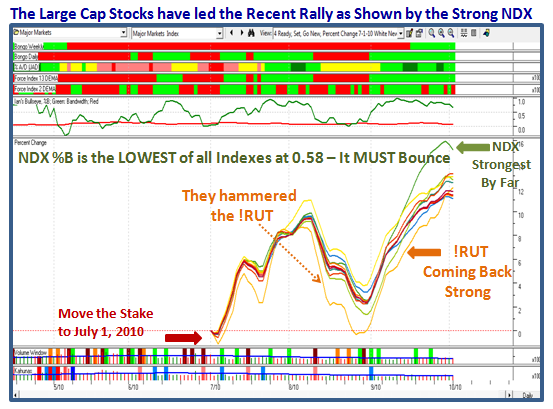
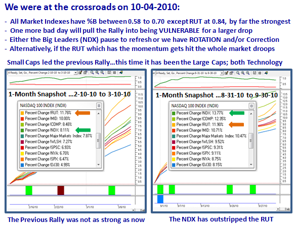
By all means watch the %B, but ALWAYS Understand “From Whence the Market Index Came”.  To illustrate what I mean you must look at the most recent Base Low (The Stake in the Ground) and the extent of the move to get perspective on whether the NDX remains the Leader, pauses to refresh, or dies and drags everything else with it:

1.  The NDX has been the leader over all the other Indexes…hence we have seen the Large Caps the dominant leaders the past month.

2.  Notice it has been hit the hardest the last three days…and so the %B is the weakest of the bunch.

3.  Therefore, it is natural that it should be the worst based on very short term measurements with %B at only 0.58.

4.  However, it is therefore at the crossroads…another bad day can throw it into the dumpster and the rot sets in.

5.  That leads to one of three scenarios:

    a.  It bounces back and gets back above 0.70 in a hurry, in which case the Rally continues

    b.  Because it was so strong it pauses to refresh further but not into the dirt (i.e, stays above 0.4ish)…the RUT picks up the leadership

    c.  It dies and the Rally is over and all markets head down…Leadership is lost

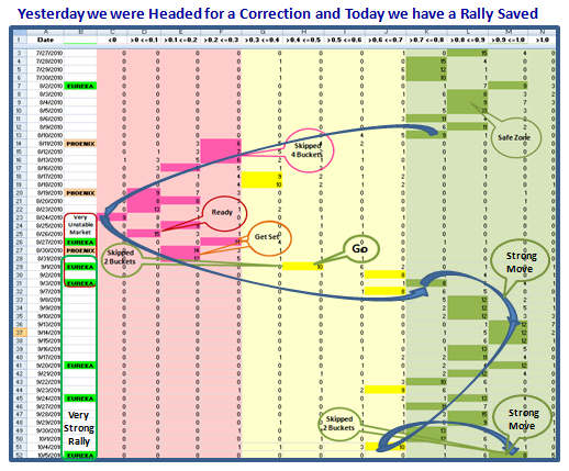
    d.  The measuring rod will be the number of Buckets the Indexes Skip from here…since most dropped at least one today.

The bottom line is watch the NDX and the RUT…If both die, this market is dead.  If the RUT stays strong there’s hope.

What a Difference a Day Makes…24 little hours! 

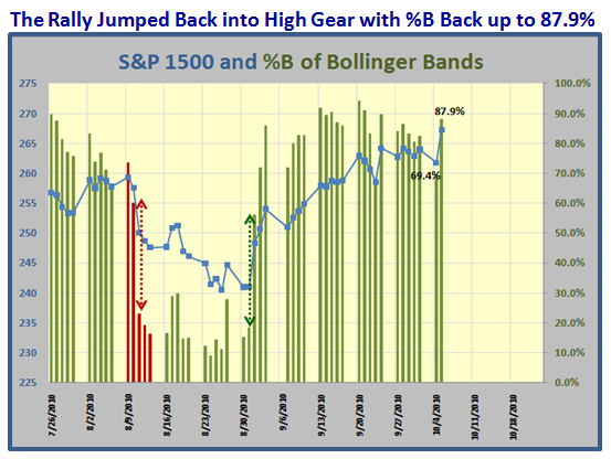
The following Charts say it all…you have seen them before and the recovery today leaves us in a strong rally:

Best Regards, Ian.

Off to the Races or Left at the Post?

Saturday, September 25th, 2010

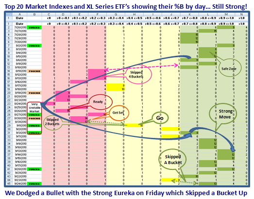
I don’t often start with a Caveat, but I sense we have the makings of a decent rally.  However, as you well know, tricky as this market is, it can turn on a dime and fade next week.  We dodged a bullet on Friday when we had a very strong 2% move in most markets which triggered the fourth Eureka in this past month.  So enjoy the information below and use it as you see fit:


You are familiar with the following chart, but I thought you would like to see what has transpired with the Index of the Top 20 Market Indexes and XL Series ETF’s since last I posted this chart.  Note how it dipped into the “Yellow” zone on Thursday, but shot right back up on Friday back into the “Green” zone by skipping a bucket in the process. 

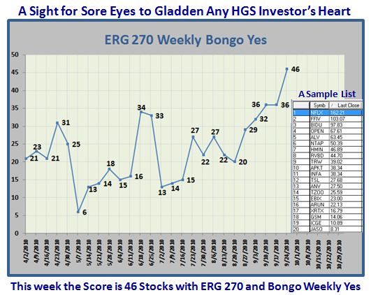
In the course of this recent rally we have had three days when the S&P 1500 had over 300 stocks with %B >1.0…the Upper Bollinger Band (BB).  That is 20% of the stocks and is an indication of confirming the strength of the move.  In addition we now show that the number of stocks with a strong ERG of 270 and higher recorded 46 stocks for those that also have a strong Bongo Weekly, i.e., Green.  I show a sample list of the types of stocks that are leading the Market:

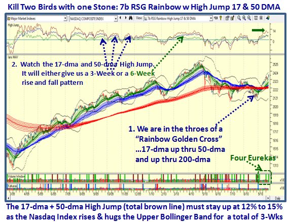
We will soon know if this Rally has some stuffing by keeping an eye on two important items.

1.  The first is that we are at a critical juncture in terms of the Rainbow Charts for the swat of moving averages around the 17-dma, 50-dma and 200-dma, as depicted by the green, blue and red “waves” respectively.  Note how they are about to go through the 200-dma to produce a Golden Cross.

2.  If we look at the High Jump for the 17-dma and 50-dma together we can see that current reading is at around 13% above.  We need to watch if this Index can stay up for either 3 or 6 weeks to give assurance that the Index continues to hug the Upper BB as it goes up:

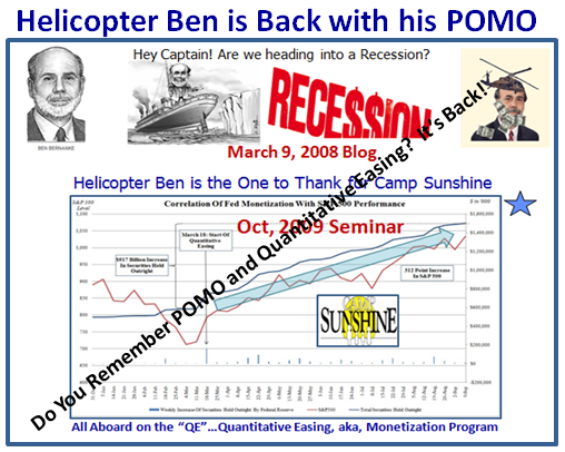
Now I am sure you are wondering what has caused the sudden change in the mood of the Stock Market when it seemed inevitable that we were headed down into a further Bear Market of 20% down with gloom and doom of a double dip Recession.  It will not be a surprise to you that the Fed has started up the Quantitative Easing (QE) one more time with what is called Permanent Open market Operations (POMO).  You remember the following chart which I have used back in 2008 and then again when POMO was introduced in October 2009 to explain the real reason for why we had such a remarkable rally through 2009:


It will also not surprise you that the fresh start on POMO began on August 17, 2010 just a couple of weeks before the fresh rally took off.  The graph shows there was a nine month hiatus and the pumping of liquidity is off and running…the big winky-winky of the week:

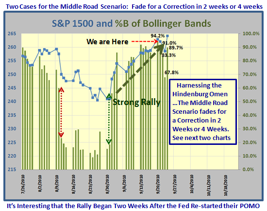
Now let’s review the bidding in the “Harnessing the Hindenburg Omen” saga which I started a few notes back, and remind you that Scenario 1, the Low Road is defunct and we are now on the Middle Road, Scenario #2.  Here is where we currently stand:

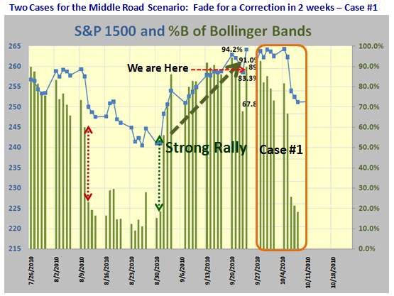
Case #1 which may peter out in a couple of weeks takes us into early October.  Since %B for the S&P 1500 is back up at 89.7% (0.897), the Market has a fighting chance of staying up for the next week and then trailing off as depicted below.  It is meant as a pictorial of what to expect and by no means am I soothsayer:

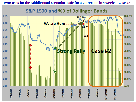
…And here is Case #2 which extends the rally into the 3rd week of October, just before the Seminar: 

I’m sure you get the idea of what I am inferring as this would take us close to the 40 days or so since the last Hindenburg Omen fired.  Let’s see what transpires.

Best regards, Ian.

Harnessing the Hindenburg Omen – Part 2

Tuesday, September 21st, 2010


An appreciation from Paul, whom I have known for 15 years:

Ian, Your work with %B is simply marvelous! The new ability to use the Spectrum Analysis for %B outstanding!

Quick question, where did the term “buckets” come from?  I know how and why you slice things, but the origin of the “buckets” term baffles me.  Perhaps I missed the origin in a news letter or blog post.

Hi Paul:

Thanks for the feedback on %B which has moved the bar a notch higher.  Here are the Golden Rules:

1.  Having sliced things you put them in boxes or buckets.
2.  Having used Boxes before with the nine box matrix which you learned about 15 years ago, we put these %B slices into buckets, <0, >0 <-0.1, >-0.2 <-0.2, etc.
3.  The two most important are <0 and >1.0…they tell you whether the tide is out and all boats are stuck in the mud or the tide is in and all boats have risen to the point we are overbought.
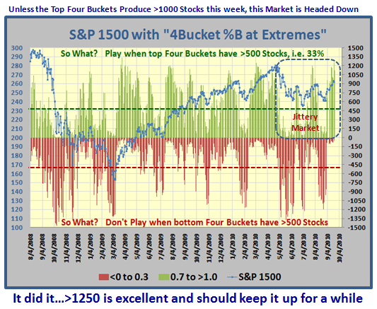
4.  Use it with the S&P 1500 and you won’t go far wrong.  Any reading for %B >1.0 above 300 (i.e. 20% of the stocks) is good especially if it repeats itself frequently to prove the rally is still strong.  Anything for a one day reading of %B>1.0 above 500 is rare and tells you that the Market is topping and within 12-15 days you should see it fall.

5.  If you want to know the strength of the move, compare those in buckets >0.7 to those <0.3!
6.  Bottom line:  Think and sing “Ebb-Tide”.

Normally in the Days of Wine and Roses, with breakouts like yesterday, we would be off to the races and expect that it was the signal for a long and decent rally.  After all we have had three Eurekas with the last one triggered on yesterday.  Again if you trot back to March of 2009, we would be cheering and saying that at long last we have come out of the gloom and doom of 2008 and starting a new rally.  However, just look at the yin-yang today…that’s life in a jittery market.

Whether this is a continuation of the new Bull Rally or a Bull Rally in a Consolidation Phase of a 17-year Locust like Bear Market I leave to the pundits.  What caused the sudden euphoria?  Yesterday’s news by the pundits that the GREAT Recession was behind us in June of 2009!  Yet one in seven are still without a job.  Hence the jittery market we live in, and that is what matters.  Seven years from now we will look back and say “You see, the Locusts do count in this Investing Business!” 

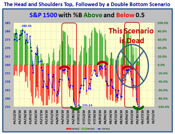
But who cares?   This is not 2003, or 2007 or for that matter 2009.  We are in the midst of harnessing the Hindenburg Omen Scenario which I covered with three roads in my last blog of September 5th.   Don’t tell me you didn’t take stock of it…Here is the picture to remind you of the current state of affairs in a Jittery Market.  It’s called the 20-day, 30-day and 40-day cycle (trading days) as shown below.  The logic being that as each scenario is past in its trading days, the less the likelihood of that wretched beast the Hindenburg Omen poking its head up.  Go back and read that blog, because that is the path we are on:

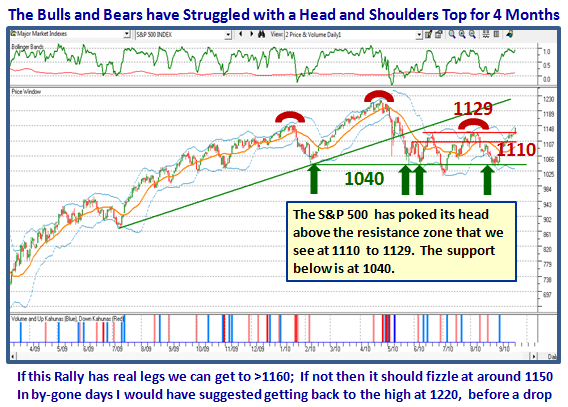
So where do we stand right now.  Not difficult;  After four months of a Bull-Bear fight, the Bulls have it for now:

…And where have we come from and where are we headed in relation to %B and Buckets:

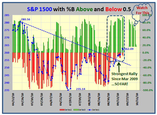
…And how do we confirm that this rally is currently as strong as March 2009?  The evidence is three >300 days with %B Bucket >1.0 and the Current %B of the S&P 1500 these last two days up at 94.2% and 91.0%, respectively, which is very strong.  In addition, we have had three Eureka Signals in the last three weeks which are essential at the start of a fresh rally.    Therefore the Low Road Scenario for the Hindenburg Omen Harnessing is dead:

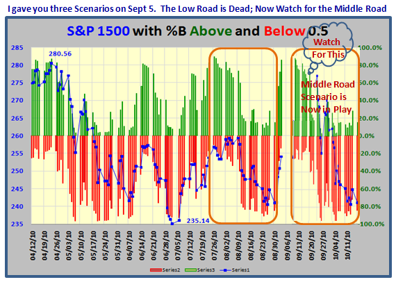
Now look for the Middle Road Scenario to happen…don’t know when and hence I have included a gap before it begins to fall.  When that will happen is in the lap of the gods. The two snapshots show what to expect, but from a timing standpoint given we don’t have an utter collapse,  this should play out around the Mid-term Election timeframe:

 But, as I have shown you, keep an eye out for when the stocks of the S&P 1500 top four buckets, i.e. >0.7 drop below 500 and those below 0.3 increase above 500! The longer it stays up, the Middle Road Scenario eventually gives way to the High Road Scenario.  But let’s stay focused on the Middle Road for now.  If it plays out, then it should bottom around the time of the Mid-Term Election:

 Of course the Market is extended, but extended can get more extended until it dies.  %B gives us the early warning signs usually before it does.  You will learn all of this at the seminar in four weeks time.  Hurry, hurry, hurry and sign up!

Best Regards, Ian.

Harnessing the Possibility of a Hindenburg Omen Crash

Sunday, September 5th, 2010

Two weeks ago the Internet was abuzz with all the chatter on the Hindenburg Omen (HO), and now that everyone has weighed in, including Jim Miekka the inventor of the signal, it is time to harness the potential mystery of the ticking time bomb.  I am not going to bore you with all that has been said on this blog and others during the past two weeks, but to bring out my Stakes in the Ground and Measuring Rods and give you the Low, Middle and High Road Scenarios to establish a Game Plan.

               

For this particular Blog Note, let me accept three critical points that are now sitting on the latest version of Wikipedia, which by the way has been through a lot of changes in these last two weeks.   Please try http://en.wikipedia.org/wiki/Hindenburg_Omen for all the latest details:

1.  From historical data, the probability of a move greater than 5% to the downside after a confirmed Hindenburg Omen was 77%, and usually takes place within the next forty days.

2.   The probability of a panic sellout was 41%, and the probability of a major stock market crash was 24%.  Though the Omen does not have a 100% success rate, every NYSE crash since 1985 has been preceded by a Hindenburg Omen.  Conversely, 76% of the time no crash has occurred.

3.  The Omen’s creator, Jim Miekka, considered the Omen officially triggered on August 12, 2010 and confirmed on Friday on August 20, 2010, according to the Wall Street Journal.

There couldn’t be a better time to put a box around these facts to establish whether we will have a Minor Correction, an Intermediate Correction or a Major Bear Market Correction within the 40 days since August 20, 2010.   There are three other factors that have consumed the Emotions of the Market based on past history and the coming events in the next 60 Calendar Days, i.e., approximately 45 Trading Days:

1.  The Presidential Cycle History of  where the 2nd Half of the 2nd. Year is the most vulnerable

2.  The fanning of the flames for the pros and cons of a Double Dip Recession

3.  The Mid-Term Election which is due in about 60 Calendar Days, which fits ideally when the clock runs out on the Hindenburg Omen as mentioned in the very first item of stakes in the ground.

As you well know, I have been constantly raising the bar on understanding the value of using John Bollinger’s %B in mapping the ebb and flow of the Market.  I felt this was an ideal opportunity to test my skills at establishing the Low, Middle and High Road Scenario using the work I have done.  For those who are newbies at this stuff, here are three nuggets to take to the bank in giving you eyes in the back of your head to gauge which way the wind is blowing:  “At your back, then attack…if in your face, disgrace if you don’t take defensive action.”

1.  The uniform and CONSISTENT rapid movement of %B as it ebbs and flows with the Market Indexes, ETFs and Stocks alike as I have demonstrated numerous times on this blog and in the Newsletter.

2.  The strong Line in the Sand between strong and weak hands as %B sits above or below 0.5…the Middle Bollinger Band assuming 20 periods and 2 standard deviations as the general rule.

3.  My latest invention of slicing %B into 12 Buckets as explained previously and the ability to immediately spot strength or weakness as % B “skips Buckets”.  I will again demonstrate the value from what has transpired just this past two weeks while all this song and dance about the HO has persisted.

For continuity, let me start with the standard Benchmark of Golden Dates for Rallies this past 18 months:
Now let me bring back the results of the 20 Standard Market Indexes and XL Series ETFs I use to gauge whether the market is moving up or down and particularly with what degree of strength or weakness.  Here are the 20 Items: !COMP; !DJ30; !MID; !NDX; !NYA; !RUT; !SPSC; !SPX; !WLSH; FXI; IFB; XLB; XLE; XLF; XLI; XLK; XLP; XLU; XLV; XLY:
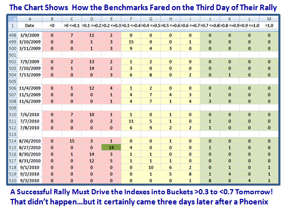
The chart may be a trifle difficult to read, but please don’t write telling me so as the message is on the top and bottom of the charts, and that is the focus, especially as you cannot reproduce all this stuff nor do I want you to.  Now let’s brighten it up for you to follow exactly what the messages were this past month:
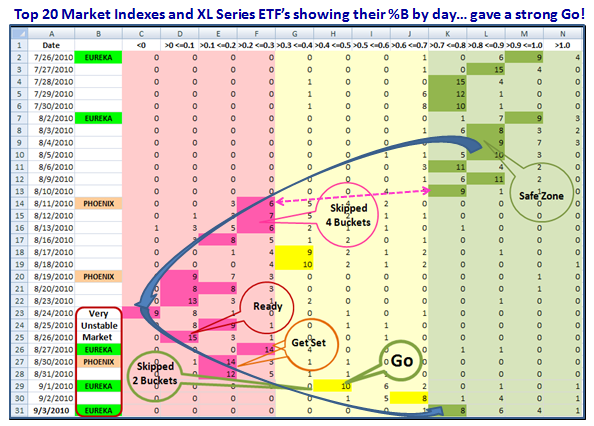
Let’s understand step by step what the messages are:

1.  With two Eurekas on 7/26/10 and 8/2/10, respectively, the Indexes sat in the Safe Green Zone.

2.  Then on August 11th, the cave fell in and there were rumblings of a Hindenburg Omen on that date but conceded it was close and no cigar, followed by one which most asserted occurred on August 12th, as mentioned above.

3.  It wasn’t any surprise to me as the preponderence of the Indexes skipped FOUR Buckets on the 11th coupled with the Phoenix Impulse Signal as shown.

4.  The Indexes tried to bounce back but then crashed with the second Phoenix signal on the 19th August, only to find we had a follow up Hindenburg Omen on the 20th, one day later.  Obviously not a coincidence when the Market was now turning from Bullish to Bearish and hence New Highs kept dropping while New Lows had risen to meet the HO requirements.

5.  When it hit bottom on 8/24/10, the question at that time was the party over or was the Market so oversold that a rally attempt was forthcoming, and true to form it turned out to be the latter.

6.  I show the Ready, Set, Go criteria as the Indexes blossomed by skipping two buckets to the upside on 9/01/10, coupled with an Eureka, and followed up with yet another one to close out for the Labor Day Holiday this past Friday.  We are now back in the Safe Zone, but do we endure another Fakey of a Bull Trap, or do we move out with gusto this time?

As my good friend Aloha Mike Scott reminds me “A few days and we have gone from gloom and doom to bloom and boom. That doesn’t feel quite right.  Tip toeing in and nervous as a cat.”  He was also the one to suggest we dust off the old Low, Middle and High Road Scenarios, so let’s give that a whirl:

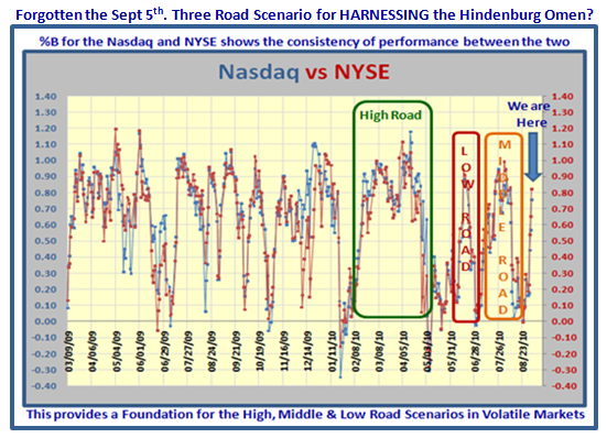
Over the course of the last 18 months, I have driven home the fact that %B is one of the most CONSISTENT Indicators across the entire database, be it Market Indexes, ETFs or Stocks.   But here yet again is that picture showing the Volatility of the Market we have endured, but also I now show you the comparison between the Nasdaq and the NYSE.  This is going to be a long blog note, so take it from me that the chart patterns are essentially the same whether one uses the Nasdaq, the NYSE, the S&P 1500, or the Russell 2000, or most any other Major Market Index or ETF you choose to use.
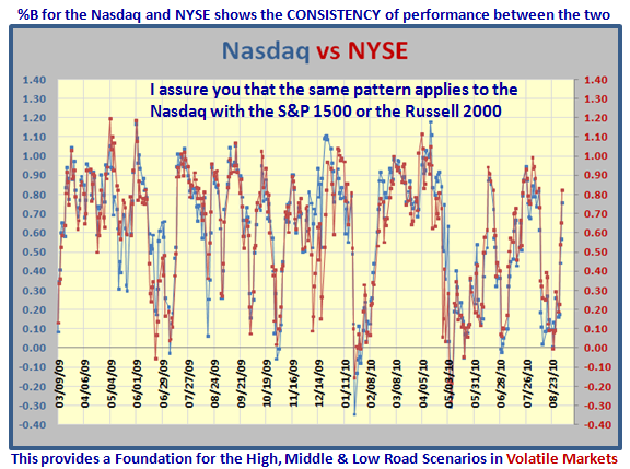
“So What, you ask?”  Right before our very eyes we have experienced in the last 6 months, the High Road, The Low Road (Fakey, Bull Trap) and the Middle Road Scenarios, and here they are circled for you:
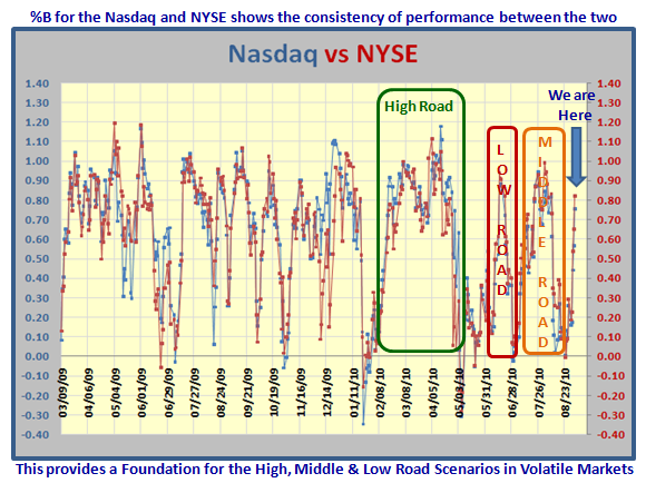
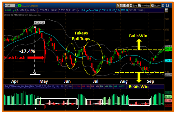
So, let’s start with the Low Road Scenario which is shown below and suggests we dive within a matter of ten trading days based on the June Fakey and Bull Trap.  I have copied and pasted that phase onto the current status to show what the picture would look like for the Low Road Scenario.
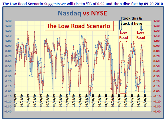
The beauty of the approach is that we don’t have long to wait to prove that the market is behaving so unstable that after two Eurekas we are back in the doldrums of presumably more instability with Phoenix Impulses firing yet again.  I suggest we should know before this month is out and is in keeping with September invariably being the worst month of the year, when the big boys will be back in full force from the Hamptons after the summer vacations. 

If all of this is true, then expect to see us trot a little higher on the %B bandwagon for a very few days in the “Safe Zone” above 0.7, and then peak and trundle on down for the next ten days or so.  Just count the red dots if you don’t believe me.  In addition, the expectancy is that there will be no further Eureka signals and certainly we should see a Phoenix in this timeframe.  This implies that there was no follow through by the Bulls, and we had essentially bounced from an oversold situation.  Also, expect a sudden drop in %B with “Bucket Skipping” to the downside.
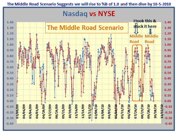
I have used the same process of copy and paste, and to cut a long story short we should dive by early October.  For us to see a decent rally of at least 20 trading days we should see more confirming Eurekas to drive and hold the majority of the Indexes in the Safe Green Zone of 0.7 to >1.0.  This Scenario implies an unusual Rally through most of September.  Understand that this Scenario closely matches the time period for the HO to clock up a major drop as we would be well into 32 trading days by October 5.  To be on the safe side add another week, and the HO mumbo jumbo is History or there will be all sorts of gloom and doom by October 12 that this is indeed a magic potion!  We would be less than three weeks away from the Mid-term Elections.  Note that Bucket Skipping will quickly signal the downfall.
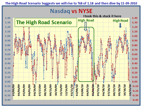
As we see from the caption at the top we will stay above the golden 0.6 level on the %B for all of two months and then dive, (I didn’t say die) around the Mid-term Election time, which would imply that the Market did not like the results!  In all we should see a powerful move with three more Eurekas in quick succession similar to that of the Benchmark of March 2009.  This should sustain the Rally in the Green Zone for at least two months.  Though there will be dips, the majority of the Indexes must stay well above 0.6 and certainly above 0.5.  

Now, most of you cannot or do not want to do all of this detail to stay on top of what I have produced.  I don’t expect you to.  However, I am sure I have woken you up to at least check on a daily basis where %B sits on your HGSI Charting Module for the NYSE and the Nasdaq.  I trust you like the logic of what I have shown you to stay one step ahead of the skittishness of the Market.  There are no tricks up my sleeve, as you have lived through all of this for the past 18 months and survived. 

Last but not least, if you don’t watch for Skipping Buckets and taken defensive action if %B falls below 0.5 then you have learned nothing out of all of this.  Just use your wc chart in the Charting Module and open up your “Data Window” and you will see that the current reading for %B is a healthy 0.8198!
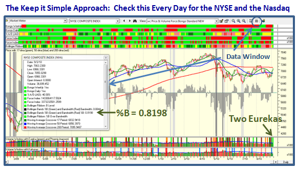
The message is that the Three Road Scenario I have outlined above gives us the heads up to manage the gloom and doom of the Hindenburg Omen, the 2nd half of the 2nd year of the Presidential Cycle, and all the kerfuffle of a Double Dip Recession with a Game Plan that makes sense using Bucket Skipping with %B.   Now let the Market tell us which Scenario it is on within the limits of 10, 20 and 40 trading days!   If we do, then chalk one up for Jim Miekka.  Anything past that timeframe and the HO is history, especially if we don’t see a Major Fall in the Market.

Have a Good Labor Day, and put the Seminar high on the Things to Do List as we have only 6&1/2 weeks to go!  Please don’t leave your reservations until the last minute, as the Hotel Rooms must be booked and reasonable airfares reserved by around now.

Best Regards, Ian

Is a Market Rally on the Cards?

Sunday, August 29th, 2010

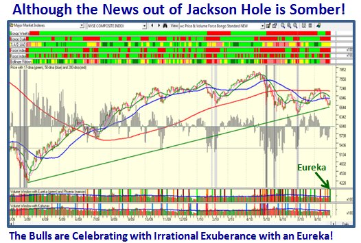
It seems it doesn’t take much to cause Irrational Exuberance these days with an Eureka at the close on Friday despite the somber news out of the Fed Meeting in Jackson Hole.  I have captured the headlines from Market Watch in the Chart below:


The chart below shows we had a strong Eureka Signal accompanied by most Market Indexes showing Price gains of >1.5%:

We have had a lot of negative news of late with the Market badly oversold so that it was no surprise that we had a “relief” bounce play, and dare I suggest we could have the start of a Rally:


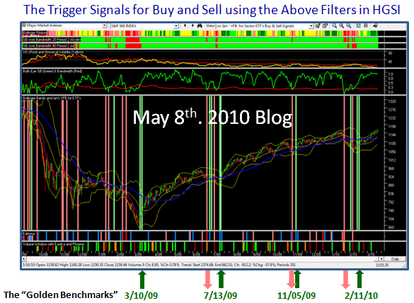
There is a glimmer of hope for a follow through tomorrow given that Friday was a strong up day.  You will recall that I showed you back in the May 8, 2010 Blog the golden dates we use as benchmarks for proven rallies using %B of the Bollinger Bands.  Here is that chart to remind you:
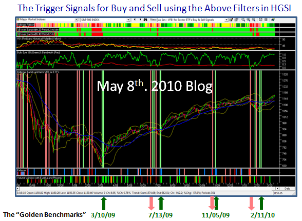
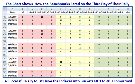
Using Chris White’s handy-dandy EdgeRater Software, I was able to pluck the statistics of what transpired with the twenty Major Market Indexes and the usual X series ETFs during those crucial days before and after there was a strong signal that the Market was in Rally mode.

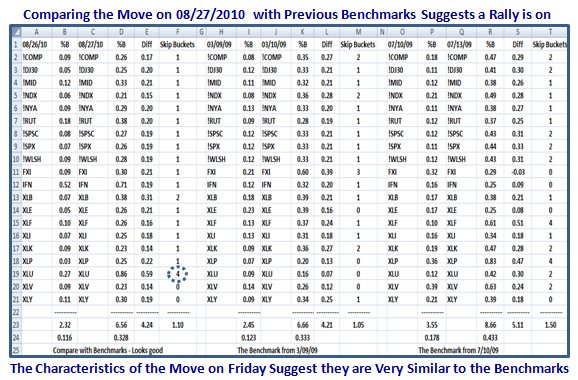
As you will quickly see from past history, the rally was golden provided it confirmed the previous day’s momentum, by most Indexes/ETFs moving from the Pink to the Yellow Zone on the day after the Eureka fired.  We currently have 14 stocks poised to move from the ideal spot of being in the >0.2 <= 0.3 Bucket, while the likes of the India Fund (IFN) and particularly the Utilities ETF (XLU) showing major strength as shown in the next chart:

Note the “4” I have circled which signifies that the XLU skipped four buckets of %B from Thursday to Friday as it went from a %B reading of 0.27 to 0.86, a 0.59 improvement in %B as shown on the chart.  I’ll leave you to compare the various ratios between Friday’s statistics and the two Benchmarks I have used, and you will see that “Jupiter is in line with Mars” if history is anything to go by.  Now, wouldn’t it be a turn up for the books if we see a follow through tomorrow, three days before the usual “Follow Through Day” (FTD) is supposed to show its muscle.  That should stiffen up a few backbones going into the Labor Day holiday.  If not, we can climb back into our shell and understand it was not to be in this crazy on-again-off-again market.

Best Regards, Ian.

Copyright © 2007-2010 Ian Woodward
Disclaimer: Commentaries on this Blog are not to be construed as recommendations to buy or sell the market and/or specific securites. The consumer of the information is responsible for their own investment decisions.