Ian Woodward's Investing Blog

Archive for January, 2011

The Impact of the Egyptian Conflict on the Stock Market

Saturday, January 29th, 2011

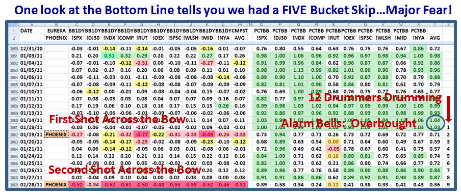
Just when the Stock Market seemed to be struggling one more time to defy gravity and benefit from the Fed’s POMO or QE2 actions, we have had a major shot across the bow with the eruption on the Egyptian scene.  From our perspective it has meant a FIVE BUCKET Drop in one day and since you are now very familiar with my terms, it goes without saying that it is high time for you to take note of what the alternatives are for this coming week:

Here is the impact on the Market Indexes on Friday with the eruption of the Egyptian Crisis…a five bucket skip:

If you look at the extreme right column, you will see that the count is Nine Days on the Twelve Drummers Drumming Concept!  It seems to be a gem for keeping tabs of when the Market gets vulnerable.  Those red numbers at the bottom row are not seen often and not to be taken lightly…We are fortunate to have a weekend in between to digest what has transpired and to see the further reaction in the markets abroad before Monday rolls around. 

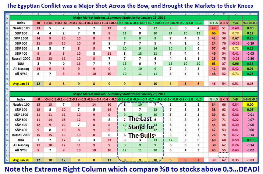
We are down to “Custer’s Last Stand” as I have penned before many moons ago and the next few slides show you where the clues are as things evolve next week.  Just look at the deterioration this past week:

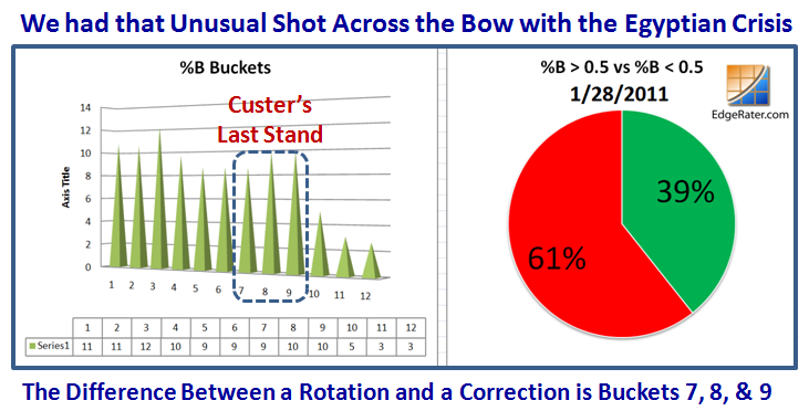
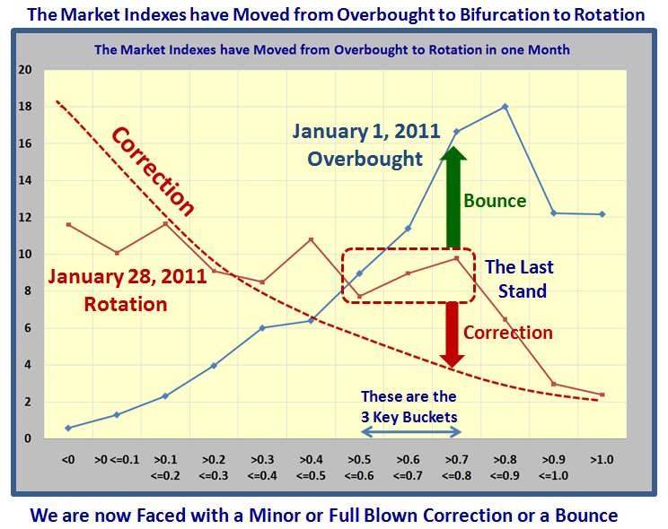
…And here is a snapshot of the movement from Overbought to Bifurcation to Rotation in the past month.  I show what to look for if we have a full blown correction, and again why Buckets 7, 8, and 9 is the last stand for the Bulls:

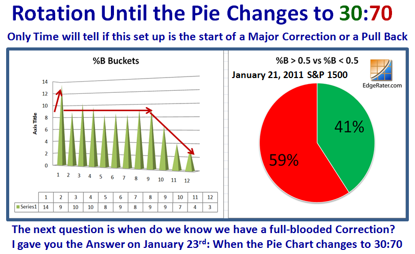
Here is a chart I gave you on the January 23rd Blog Note.  It gives you the answer to a full blooded Correction:

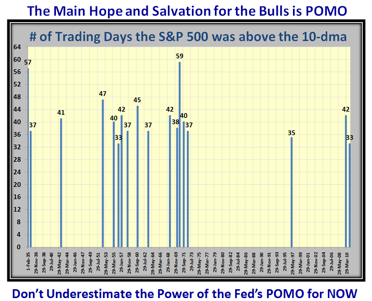
The only hope and salvation for the Bulls is the Feds POMO action and we shall see if this has run its course or if there is more fire in the belly to stem the tide and continue the euphoria to the upside:

The immediate future ala Monday looks very bleak, but hopefully we will ride this crisis through.  Be careful of both Bull and Bear Traps.

Best Regards, Ian.

Stock Market Ebb & Flow in a Nutshell

Thursday, January 27th, 2011

This past week the Stock Market has been acting a trifle jittery, but as I said in my last blog note that despite the obvious bifurcation and rotation in the market, the Institutions were not about to let it drop when we had the State of the Union Address this week, and true to form they have propped it up one more time.

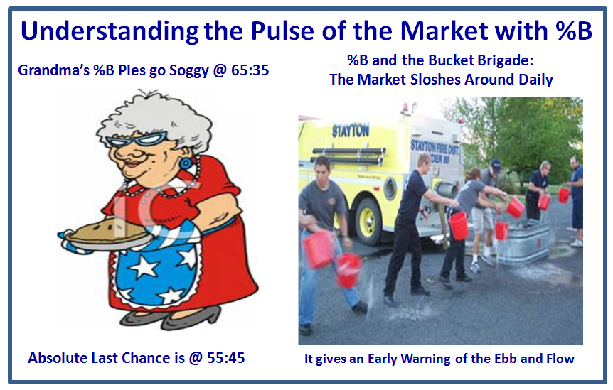
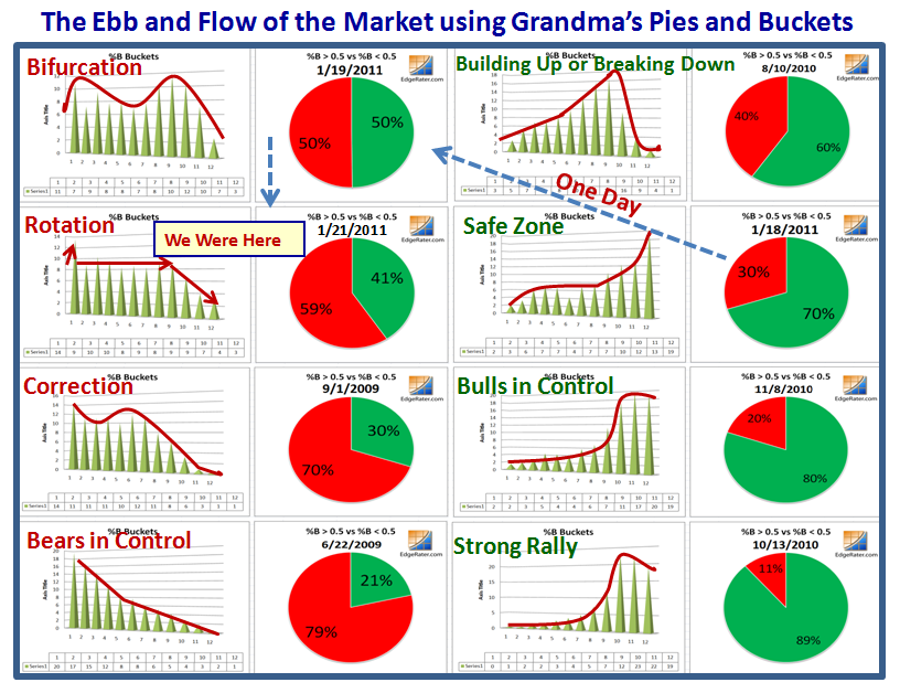
This note offers you the Ebb and Flow of the Market in a Nutshell using Grandma’s Pies and Bucket Skipping. 

Two points of explanation on understanding the Pulse of the Market with %B of the Bollinger Bands:

1.  Grandma’s Pies are a quick way to know who is winning…Bulls or Bears.  I use it with the S&P 1500 to give a large sample of stocks to know the % of stocks above and below a %B of 0.5, the Middle Band of the 20-dma.  As you see from my notes on the chart below, the areas of the most jitteriness are a ratio of 65:35 with a last call of 55:45.  You can of course use any Index you wish.

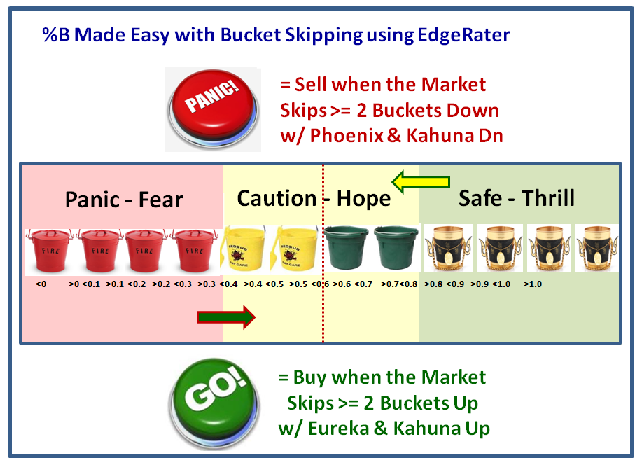
2.  Likewise, I have coined the term Bucket Skipping and those who follow my strategies know it means a 1-Day Change in %B which is in excess of 0.10, representing a single bucket skip.  Since my Kahuna signal requires either a 0.24 or a 0.40 1-day change either up or down, this would be tantamount to a 2-bucket or a 4-bucket skip, respectively;  in other words a significant change in momentum in an Index, a Stock or an ETF.

These concepts are shown in the next two slides:

Using the Edgerater.com Software which my good friend Chris White has provided, we have an easy way to watch the Ebb-Tide of the Market with Grandma’s Pies and Buckets as shown below:

It doesn’t take two minutes to see which way the wind is blowing by the green and red portions of the pie charts and the sloshing of the market from left to right by the contents in the “buckets”.  More importantly, one can see that it can take just a day for the Market to swing from the Safe Zone of 0.70 and above, to Bifurcation as shown by what transpired from 1/18/2011 to 1/19/2011 by the blue arrow. 

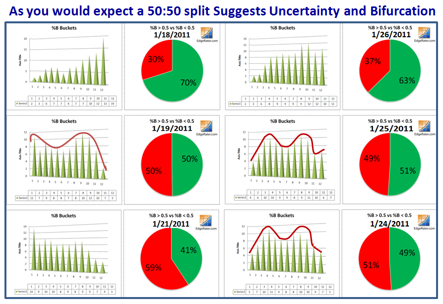
You might wonder how the Market has performed this past week and so here is that picture.  I left out 1/20/2011 as it didn’t add anything to the information and I wanted to show six snapshots on the page:

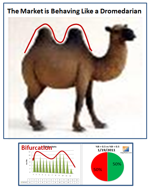
Remember that if you wish to see a larger picture, just click on the chart and enjoy.  So, net-net we have a humped back effect, and our good friend the Dromedarian is a good way to remember Bifurcation!

So there you have it, the EBB-Tide of the Market to understand the High, Low and Middle Road Scenarios in a Nutshell.  You can use any Market Index or your own Portfolio of Stocks and/or ETFs to follow the sunshine and avoid the rain with sufficient warning to do so.

It’s time you folks make your reservations for the Seminar as the Hotel Arrangement at the Marriott Courtyard that give you a break in price holds until March 7th, 2011.  In any event you need to get early bookings for your plane fares, and we need to have ample warning of who is intending to participate at the seminar from March 26 to 28, 2011. 

Best Regards, Ian.

Stock Market Under Pressure: But How Much?

Sunday, January 23rd, 2011

The tide has turned for the worse in the last three days and our friendly Financial Newspaper says “Market Under Pressure”…but the question is “How Much?”  Hopefully this blog note will give you a perspective on the answer to that question:

So let’s start with “From Whence we Came” going back to the Eureka Signal on 12/01/2010 when we had an Eureka and several Big Kahunas to the upside which started the Santa Claus Rally.  By the 18th of January all the Market Indexes were overbought as shown at the bottom right hand side of the next chart.  The very next day we had a Phoenix with some big Kahunas to the downside and that is the first shot across the bow: 

Usually WITHIN twelve days from this Overbought date, we should be into a Correction, and we will see if that golden rule still holds true…we don’t have long to wait.

There are two items that can delay the inevitable tumble for some form of a Correction, since I will show you that we have already achieved “Bifurcation” and the Rotation is already here…but more on that later.  The two Items are:

1.  The State of the Union Address is on Tuesday as my good friend Sherman reminded me at our Saturday User Group Meet Up, and it is most unlikely that the Big Boys will want to drive the market down unless there is some earth shattering news that triggers a big correction.

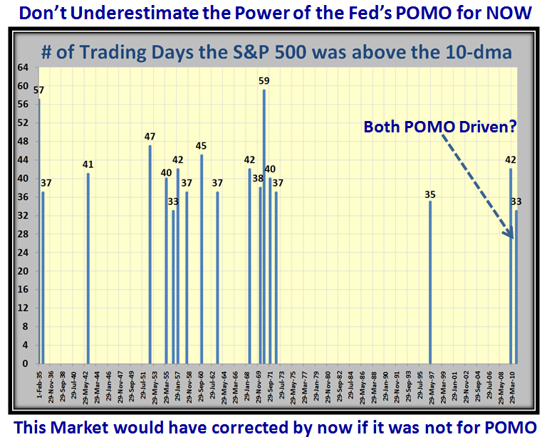
2.  These are different times we are in; similar but different in that we have seen long rallies but different in that this market is being propped up by our good friend Helicopter Ben who is dropping big leaflets by way of the FED’s POMO otherwise why would we have not one, but two long rallies of the S&P 500 above the 10-dma as shown below:
 

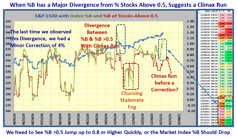
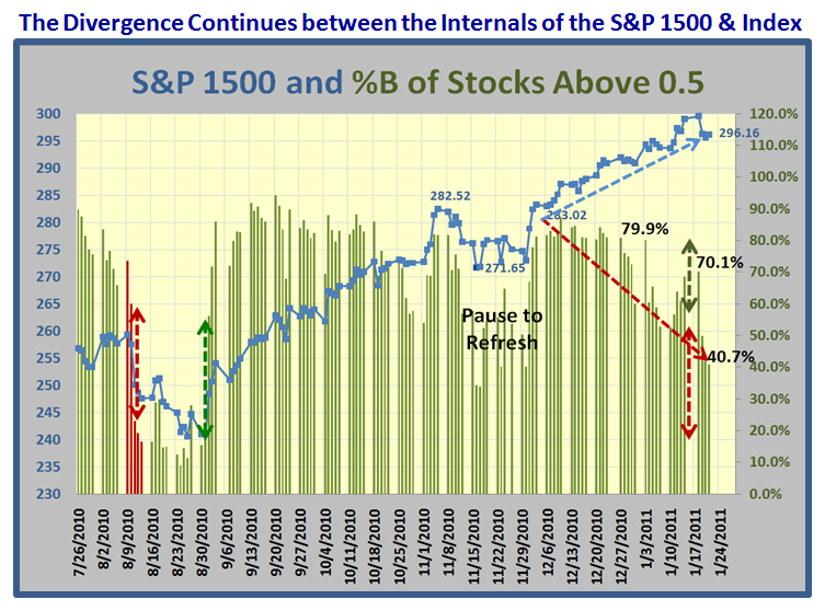
The next two charts are familiar to regular readers so they need no explanation, but will give you the latest picture of the Divergence that continues between the Internals of the Market and the Index Price:
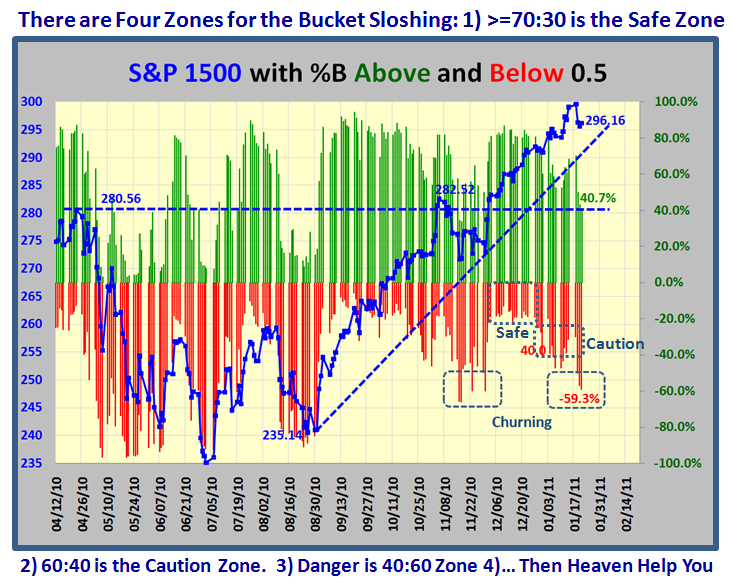
So let’s turn our attention to the stages of deterioration from a Market Top to see how near we are to a Correction.  Based on the recent results I have kept you appraised of we should go from Disparity to Bifurcation to Rotation and ultimately to Correction or a Major Snapback from a Pull Back.

Disparity is a new term and I suggest it is the first clue that things are going heywire when one sees that the %B of the Index is still hanging tough and staying up, while the S&P 1500 Stocks above 0.5 begin to drop off as I showed in the last chart I posted in the previous blog, and repeat it here:
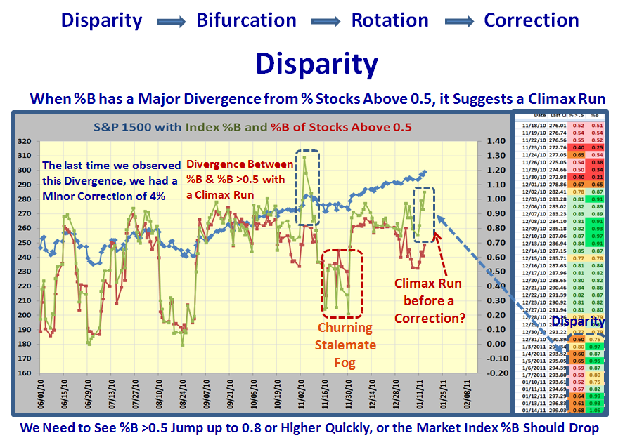
Let’s first look at the Disparity Factor for the past two years.  I consider any difference of >0.20 is a signal.  We can immediately see that this factor was about 0.24 and signaled just before the Flash Crash which then resulted in a 17% correction:
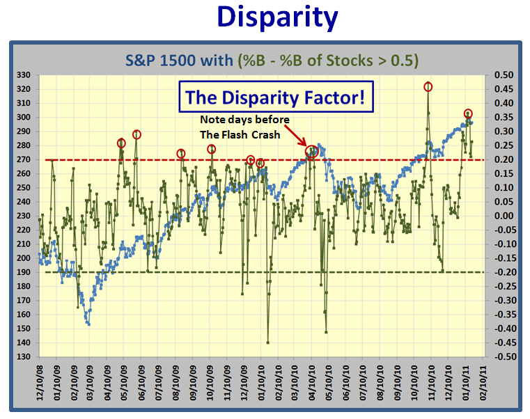
 

So let’s zoom in on Recent Disparity in the last three months where we see the difference, or Disparity as I call it, between %B and the % of stocks above 0.5 was as huge as 0.48 and we had a mild correction of 4%.  This time it reached a peak of 0.37 and the correction has just started:
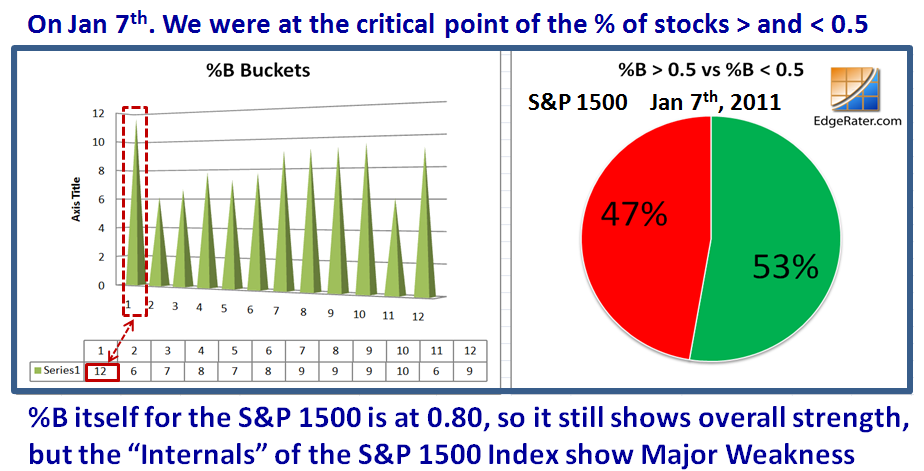
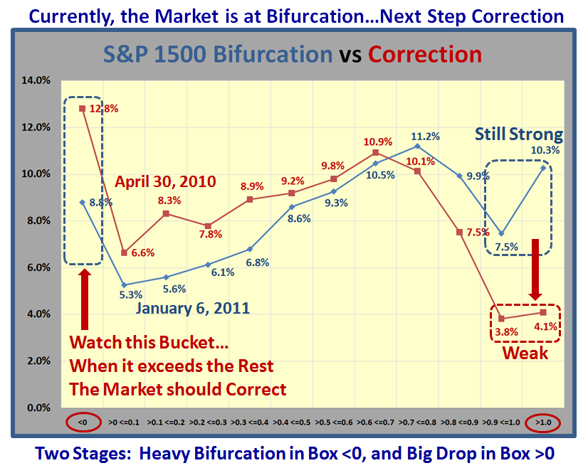
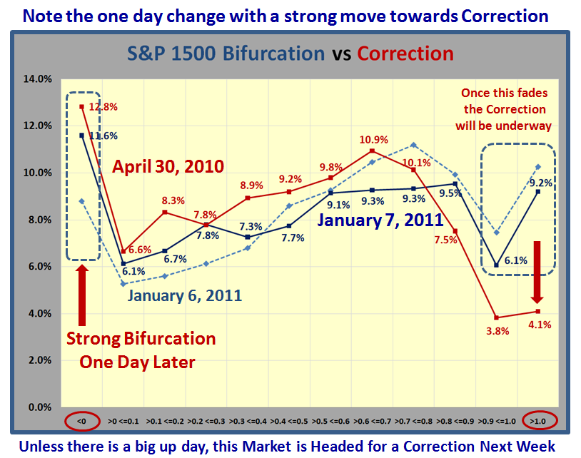
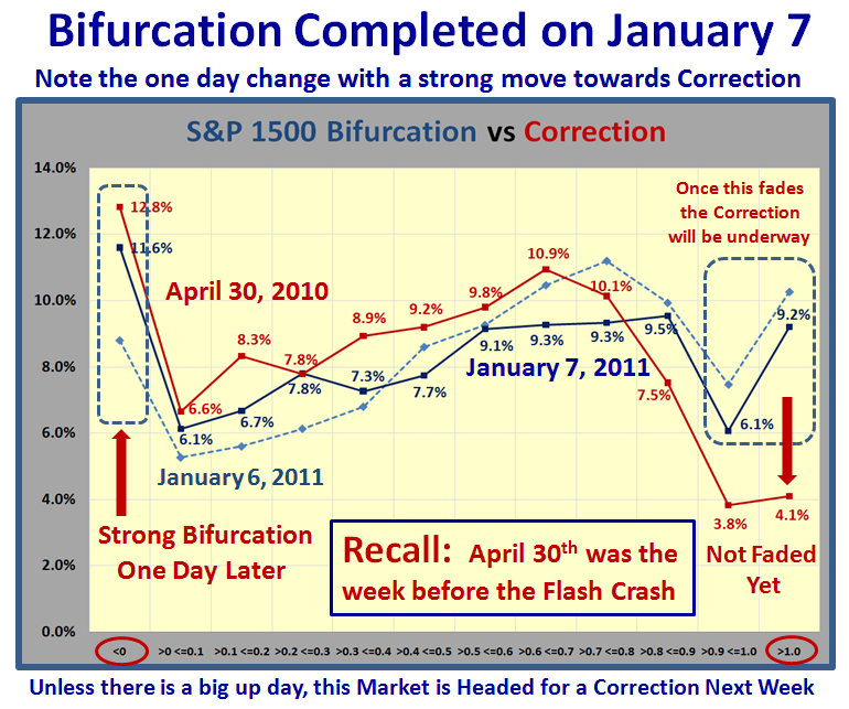
So having spied Disparity, another clue in our arsenal is “Bifurcation” which my good friend Mike Scott dubbed and I have also featured this in earlier blog notes.  Narturally, as we get good at this stuff, the more significant buckets to watch are at the two extremes, <0 and >1, and here we see a whole bunch of stocks being trashed back on January 7th.  In fact the % of stocks in this bucket is the tallest at 12%:

As it turned out Bifurcation first occurred on Janaury 7th.  Note that when compared to what occurred on April 30th a week before the Flash Crash, not only did we have Bifurcation but also the % of stocks in the top bucket >1.0 was also at a low of a mere 4.1% which suggested that the Correction was already underway, whereas now we still had a healthy 9.2%:
 

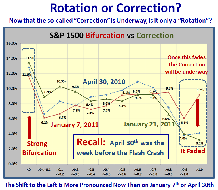
Now let’s look at the picture as of Friday, January 31, we certainly have Rotation underway as the percentage in Bucket >1.0 has faded to 3.2%, but we have to wait to see if it is a full blooded Correction:
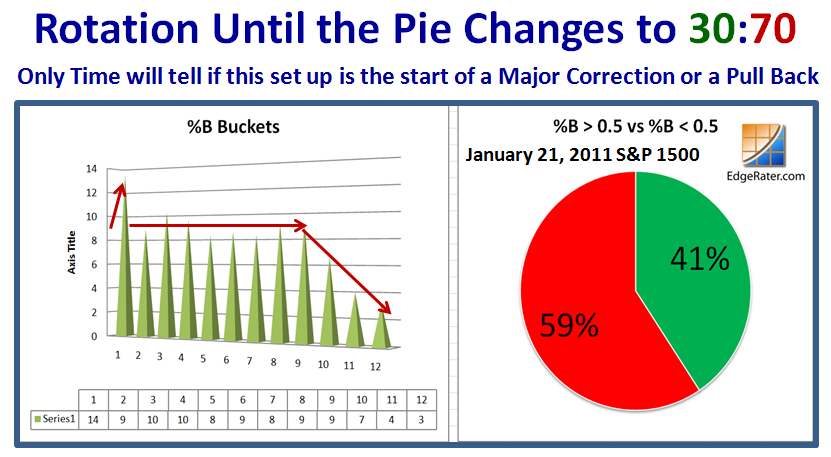
The next question is when do we know we have a full-blooded Correction?  When the Pie Chart changes to 30:70:
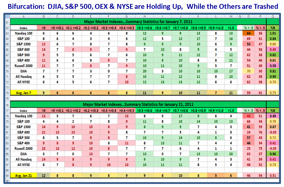
Don’t hold your breath as this next chart shows you the Bifurcation which has occurred in the the Ten Market Indexes I track.  It is no news to you that the likes of the Nasdaq, the NDX, the Mid Caps and especially the Small Caps have all been taken to the woodshed and trashed.  However, surpringly the DOW is the strongest Index with the S&P 500, OEX, and NYSE still holding up.  Just look at the “Rose shading” on the left hand side of the bottom chart…Distribution is heavy:
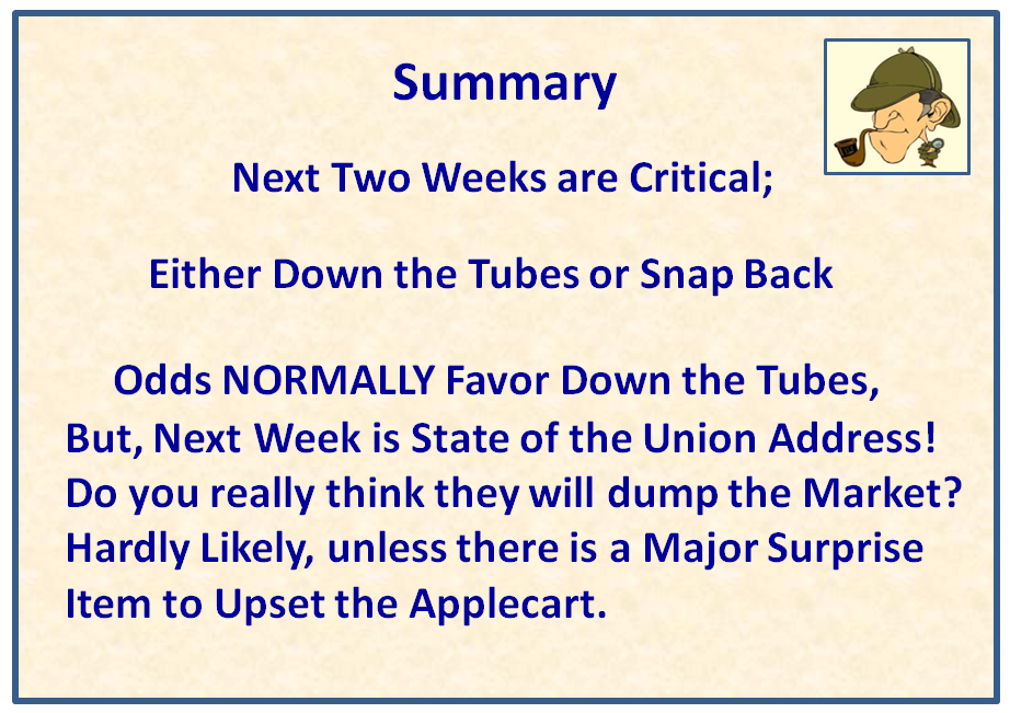
In Summary:  I would have said that next week is critical, but with the State of the Union Address on Tuesday, do you really think they will dump the Market unless something major upsets the Applecart?
This coming Thursday, Ron and I are holding an on-line Webinar on three Impulse Indicators – the Eureka, the Phoenix and the Kahuna.  We are already full and I urge those who are attending to digest this and previous blog notes as they substantially augment what we will cover in an hour and a quarter. 

Best Regards, Ian.

Stock Market: Uncertainty & Fork in the Road is Back

Monday, January 17th, 2011

We have all had three days to ponder on where next and it would seem that although the Market Factors such as the ABCDE’s are quite robust, the breaking news today is that Steve Jobs is taking a leave of abscence and that could cause a perturbation in the Market.  We wish him the very best as he faces new problems with pancreatic cancer.

Steve Job’s medical problems are not new to the Stock Market, but with AAPL being ~21% weighted in the Nasdaq, the market is vulnerable to easy pickings for the market makers to use the opportunity to cause a shake out of the longs and then establish long positions for themselves.  Likewise, there is the “Apple Food Chain” where several stocks move on the strength or weakness of AAPL, so it will be interesting to see how this plays out, especially as AAPL’s Earnings Report and Guidance is due after the close tomorrow.

After the shot across the bow on January 7, 2011 when the % of S&P 1500 Stocks with ~12% in %B <0 being the highest bucket, the Market Indexes %B themselves have all recovered nicely to the point where except for the DJIA which is at a healthy 0.96, the rest are all over 1.0!    All of this suggests to me that the Fork in the Road is back and both the High Road and Low Road could be in play this week, so we need to be on guard, given all of the above:

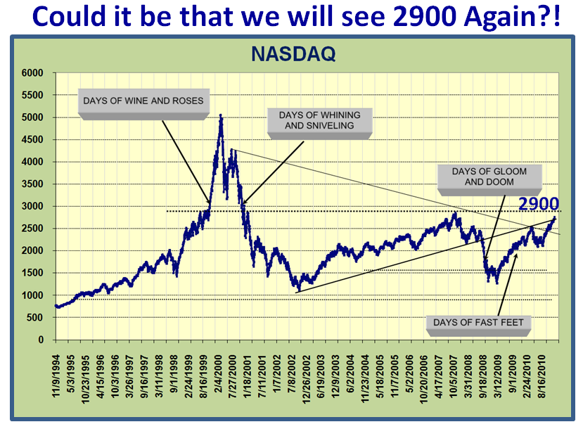
The optimistic longer term view is that we are only a mere 145 points away from that major check point of 2900, and although I am not suggesting that we hit it any time soon, the overall prospects seemed good that we could chip away at half that climb and at least break through 2800 in the near term.    My good friend Mike Scott produced this chart moons ago and I have faithfully kept it up to date and added to his musings, so enjoy:

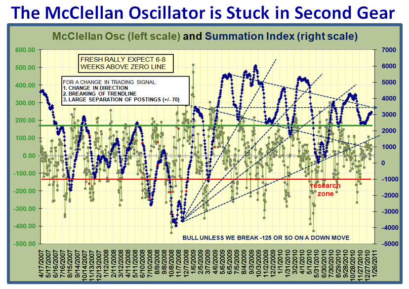
So let’s review the bidding on the usual internal factors that give us a pulse for the Market health, from the McClellan Oscillator, knowing your ABCDE’s, and the % of Nasdaq stocks above the 200-dma:


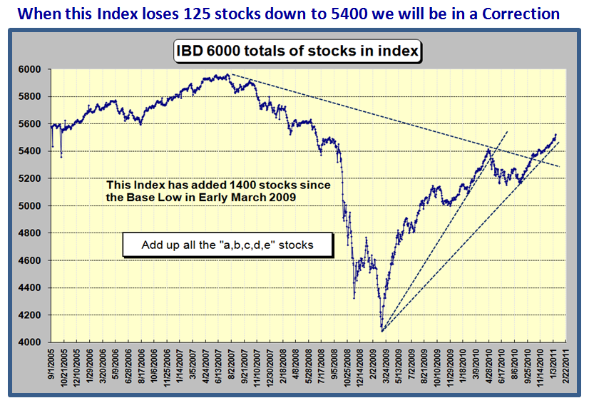
Here’s a picture I haven’t shared with you recently, but it shows how the Market has added over 300 stocks in the last six months and is climbing at a good clip.  We can use it to our advantage when the number of stocks in the IBD Index falls below 5400 as that would signal a correction is in progress:

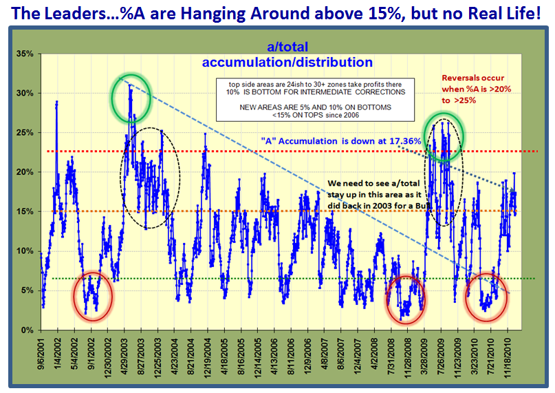
The Leaders with %A Accumulation is at a reasonable 17.36%, but we would prefer to see this above 20 to 23%.  Beggars can’t be choosers and we have to be thankful for small mercies since it is at least above 15%:

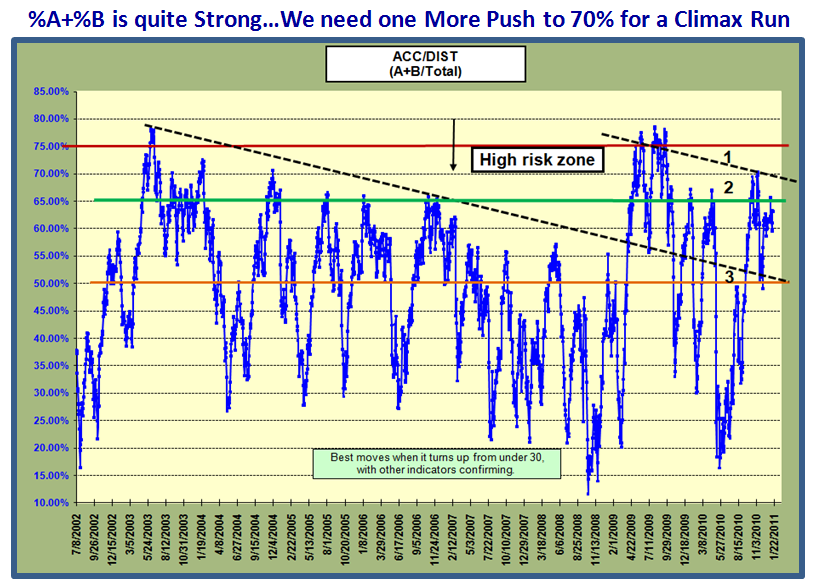
However, the %A + %B Accumulation look a lot stronger at a healthy 63%.  We could do with a push to ~70% if we are to see a Climax Run, but we do have a cushion at this stage until it gets below 50%:

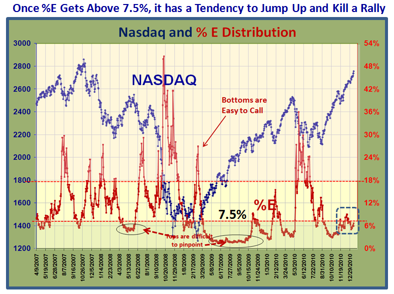
Now for %E, the stocks that are being heavily distributed.  The % is close to 7%, but we have seen this rise as the market has risen, whereas it is normally quiet until the market gets long in the tooth.  Once above 7% it has a tendency to jump so you need to watch for that as that is a sure sign that the Market will correct:

The % of Nasdaq Stocks above the 200-dma is a very respectable 80%, so the overal breadth of the market is good:

We hit a critical point in this rally on January 7th, but recovered.  We are not out of the woods, but at least better off now:

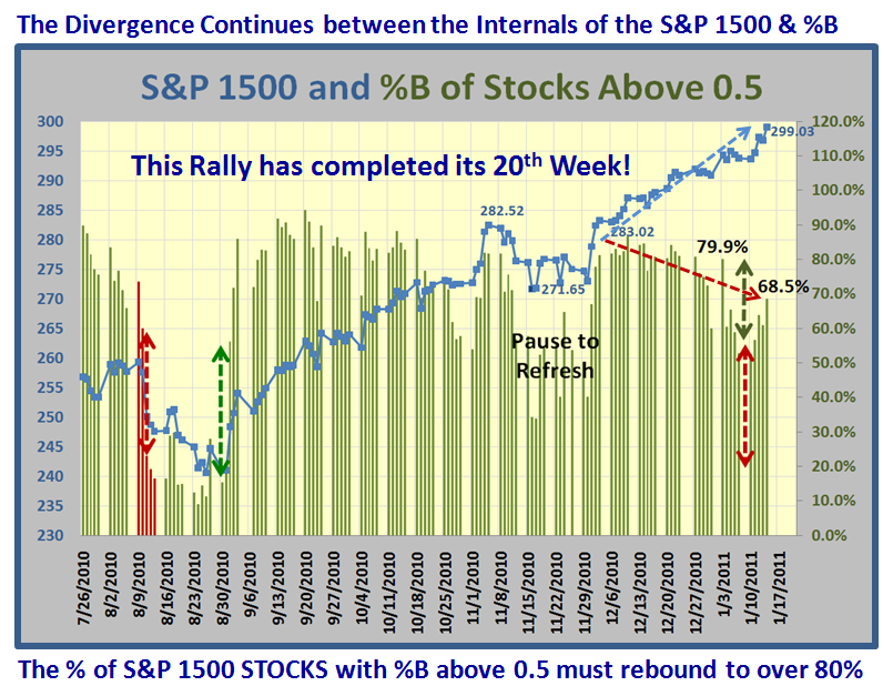
You are familiar with this chart, so it needs no explanation…but it still shows weakness in the %B internals of the S&P 1500:

One scenario for this divergence suggests we are again headed into a climax run.  It may be cut short as a result of the late breaking news regarding Steve Jobs, but we shall see how this plays out the rest of this week.  It’s earnings report due time so be very careful at this time of the year.

Best Regards, Ian.

Stock Market: Primose Path to Fugacious Blossoms

Saturday, January 8th, 2011

My good friend David Galardi prompted me with a theme for this weekend when the market is teetering on fumes, and there are cross-currents appearing that suggest the Large Players may be leading us “Down the Primrose path to Fugacious Blossoms!”  I had to look up the meaning of “fugacious” which turns out to be fleeting, so I offer you this reminder:

So David is right as after a strong recovery on the first trading day of the New Year, similar to last year I might remind you, we are now on the brink of once again sitting at the hairy edge of Stalemate where we wait and see if we bounce out of this hole or give up the ghost and head down for a correction.  Next week should settle the fight between Bulls and Bears:

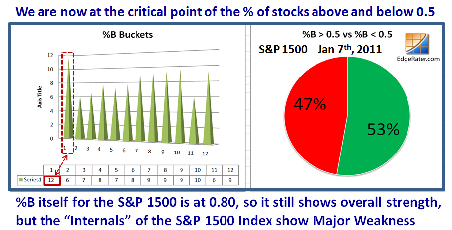
The question you might ask is “What new evidence do we have that things are looking a trifle bleak?”  Another good friend of mine, Mike Scott, recently talked to spying “Bifurcation” where on the one hand %B for the S&P 1500 is still a healthy 0.80, while the internals of the stocks themselves within the S&P 1500 are essentially at 50:50.  More importantly, the bifurcation shows that although the upper end of those stocks above %B >1.0 is still holding up reasonably well with 9% in that bucket, we now see that the highest % in any bucket is in the one <0 with nearly 12%…i.e., being well and truly trashed:


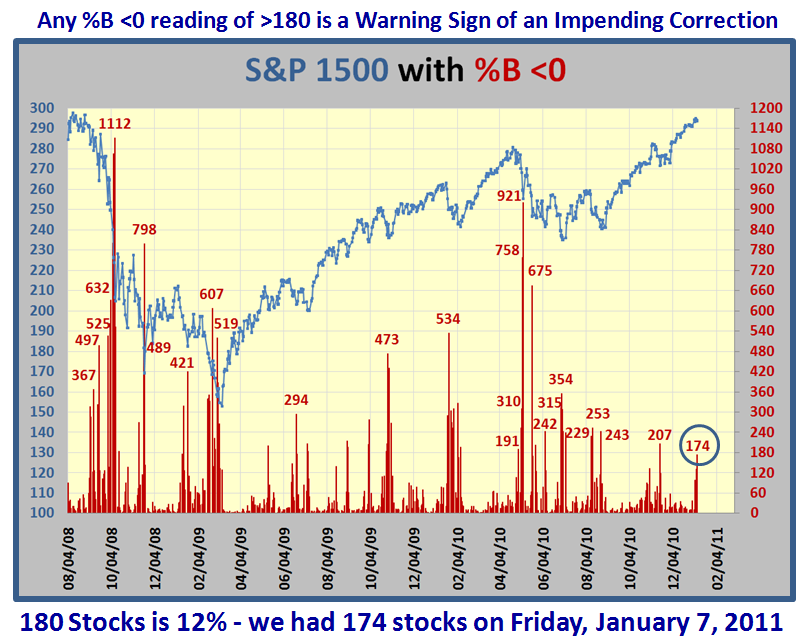
I am sure you have forgotten that one of the Golden Rules I established moons ago is that any %B <0 reading of >180 stocks is an early warning sign of an impending correction.  We had 174 stocks on Friday, January 7, 2011, so we are knocking on the door, and that is close enough for me to give you that picture to prove my point.  It does not mean “die”, but it invariably means correct.

But now I offer two further charts as evidence that Bifurcation is well on its way, and that is invariably the first stage of two to bifurcation and a correction.  I trotted back in time to when the Market Top occured back in April 2010, and here is a comparison of Bifurcation underway on Thursday January 7th, but yet not quite ripe enough  as compared to both Bifurcation and Correction on April 30th.  Note how Bucket >1 is still holding up, while on April 30th, 2010 the last two buckets are very weak as shown in the chart below:

The above was the picture on Thursday, January 7th…now look at how the picture changed for the worse on the very next day, Friday, January 8th.  With the bucket <0 showing the highest percentage of 11.6%, it mimics what we saw on April 30, 2010, so bifurcation is “complete”.  Now we wait to see if the last hold out for the bulls of 9.2% in Bucket >1 gives way to weakening down to below 5%.  I suggest that will be the final blow.  At least we now know what to look for in the critical aspect of the tide turning from Overbought through Stalemate to Oversold.   

There are always surprises in the Stock Market, so don’t count your chickens before they are hatched, but for sure things are ripening towards a correction as early as next week.  We do not have long to wait.  We are now in our 20th week of this Rally.

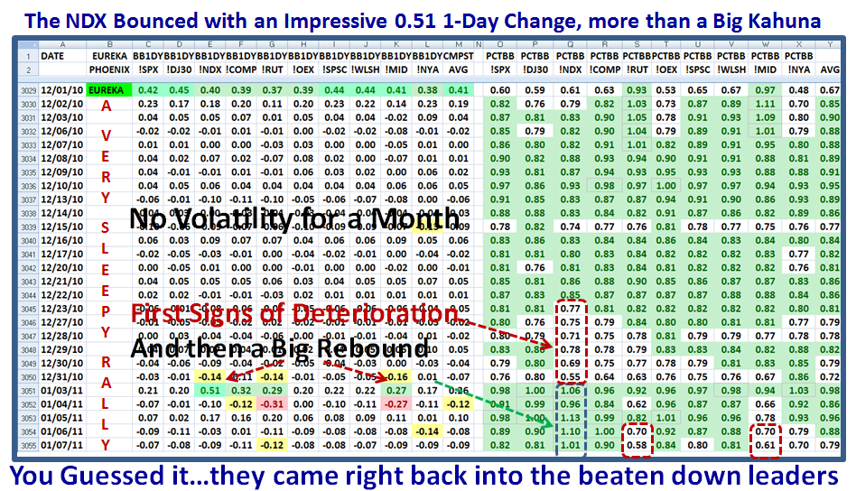
At the top of this note I warned of several cross-currents, and one way to confirm this view is how rapidly the shift in the market occurs when the leaders in the NDX (Nasdaq 100) were being trashed behind the woodshed two weeks ago to come roaring back these past five days as shown below.  Likewise the Small Caps Index of the Russell 2000 (!RUT) is currently the weakest with a %B of 0.58 along with the Mid-cap at 0.61. 

This may well be due to the natural changes Portfolio Managers make at the end of the old year and the start of the new, but then the January Effect hardly lasts more than a couple of weeks, so we might have a surprise reprieve though not for long, especially if the Bucketology continues to show sloshing to the left! 

Best Regards, Ian.

Copyright © 2007-2010 Ian Woodward
Disclaimer: Commentaries on this Blog are not to be construed as recommendations to buy or sell the market and/or specific securites. The consumer of the information is responsible for their own investment decisions.