Ian Woodward's Investing Blog

Stock Market: A Review of Past and Present Flash Crashes

November 2nd, 2015

I’m back!  I took a long rest from posting any Blog Notes after the passing of my dear Wife of 60 Years, and I thank you for your condolences and encouraging notes.

I felt this first note on my return should bring you up to date on the events relating to the scenario for a Flash Crash going back to 2010 and coming forward to the most recent one in 2015:

Flash Crash

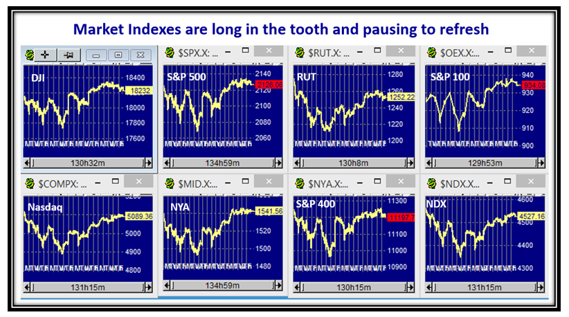
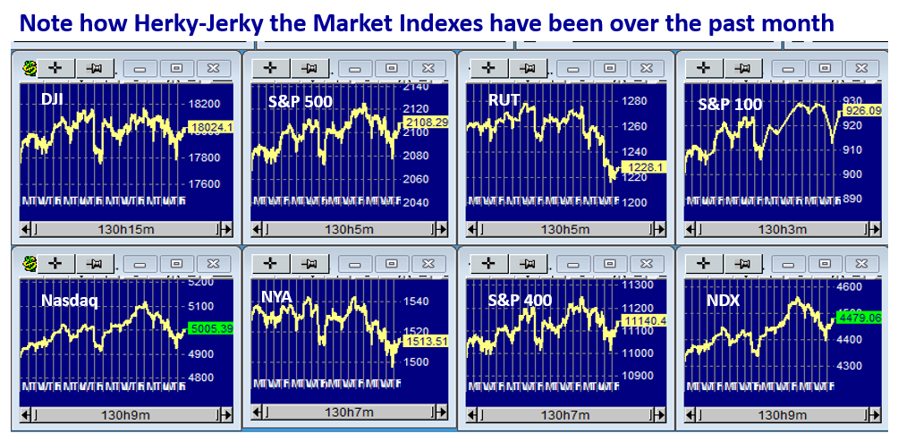
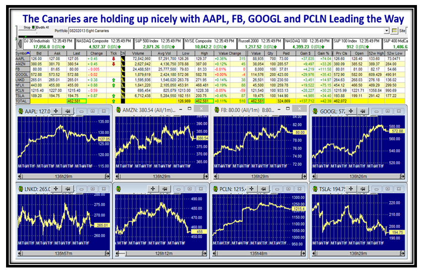
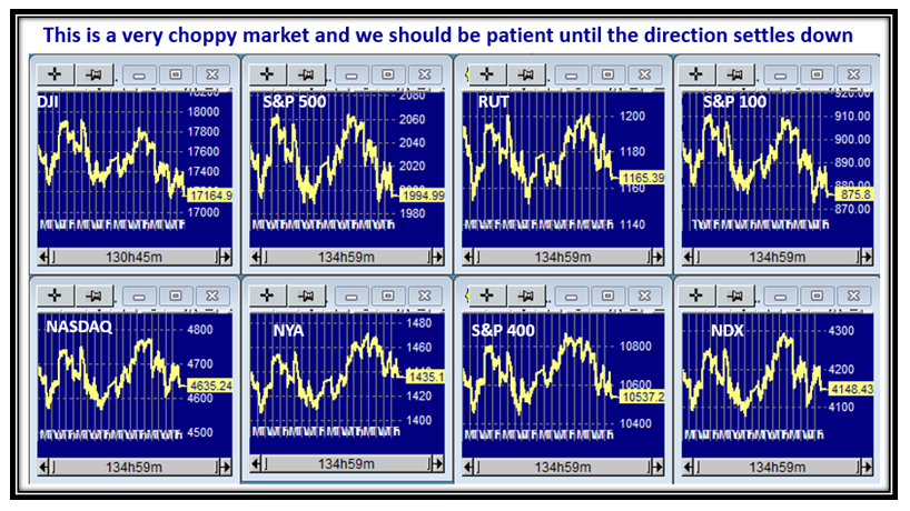
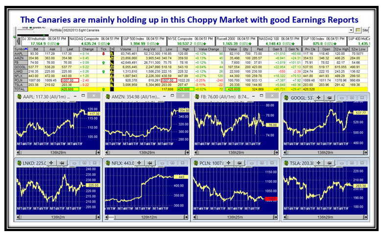
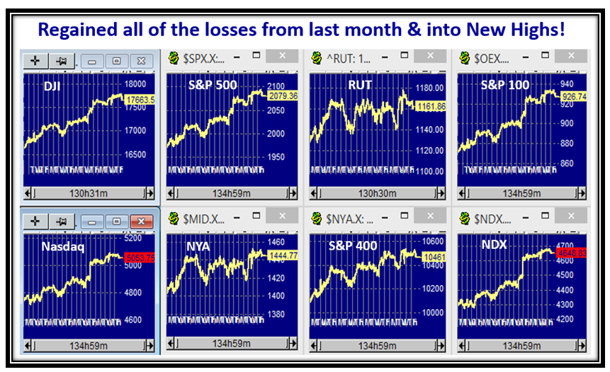
Before I discuss the Flash Crash scenario, let’s look at the Market Indexes which have all risen from the lows of 20 days ago to the new highs shown on this Rally.

Slide2

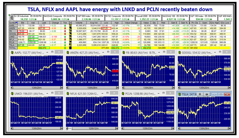
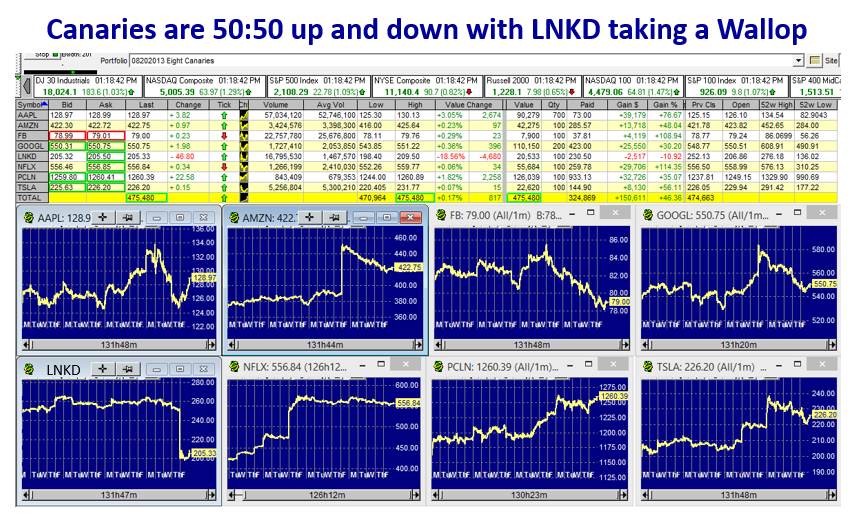
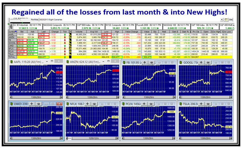
Likewise, although the Canaries had a pullback on Friday, they have also shown strength except for TSLA.

Slide3

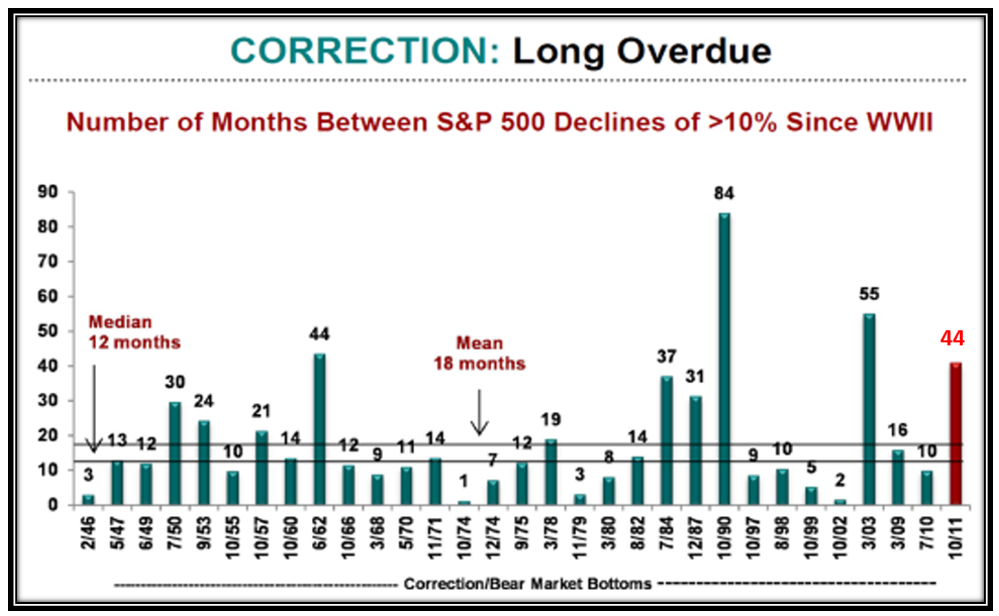
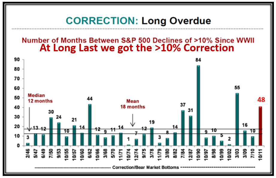
Back last August we had gone 47 Months in a row without a 10% Correction and then on August 24 & 25 we had the Flash Crash of 2015 which we will discuss below.

Slide4

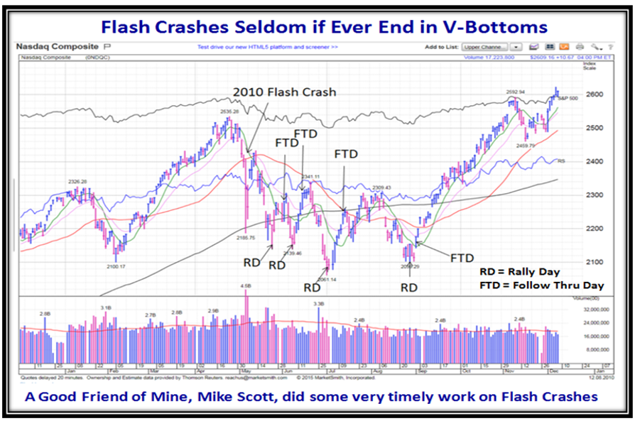
My good friend Mike Scott reminded us of the similarity of the current drop in the market to that of the original Flash Crash in 2010, showing Rally and Follow Through Days, and indicated that it took of the order of 4 Months before we were into a new Rally.  This set the Benchmark for what to look for as we progressed through the current events in 2015.

Slide5

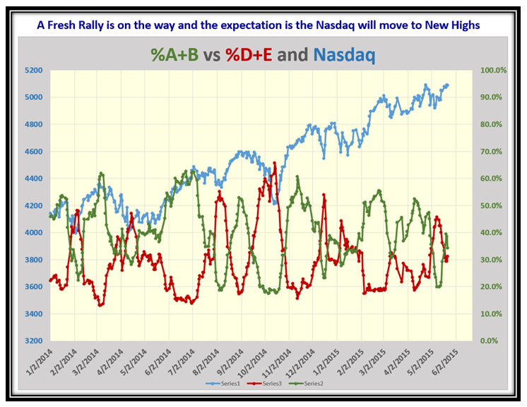
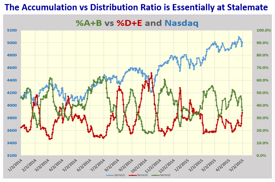
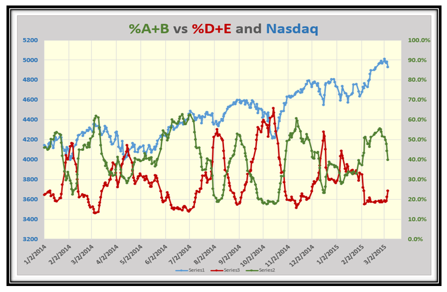
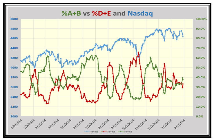
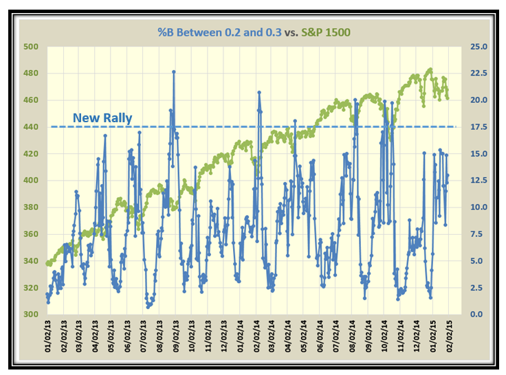
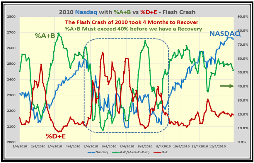
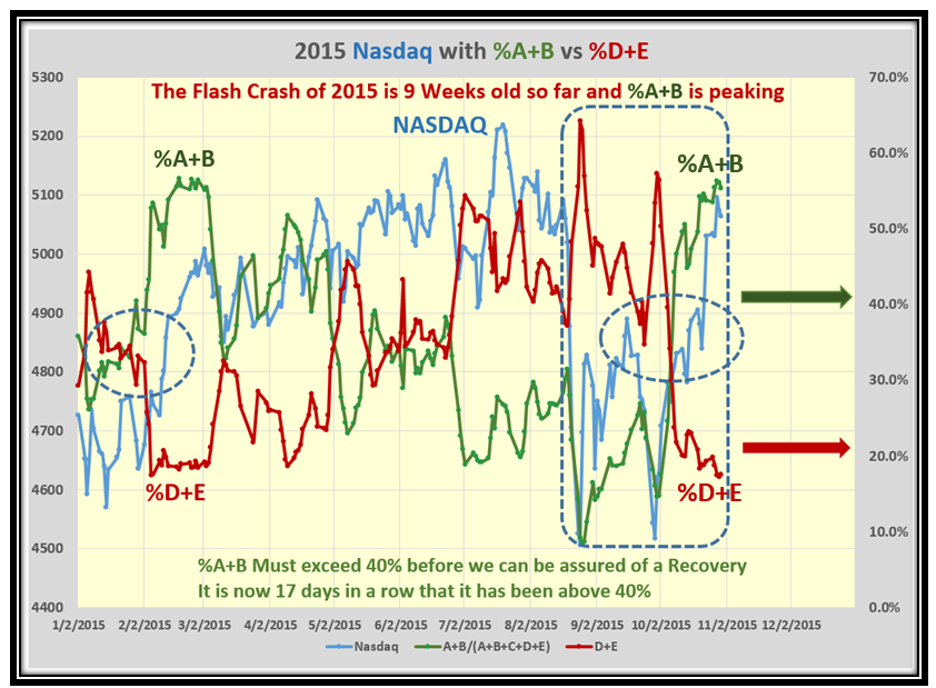
This led me to watch the % of Advancing Stocks (%A+B) to those that were Declining (%D+E) as this also gives us clues that confirm the strength or weakness of the Rallies as they occur.  One clue was that %A+B must remain above 40% for the NASDAQ to show signs of recovery, while %D+E must stay below 20%.  The earliest point in time would be when the two cross which is at 33%, so we again achieved some worthwhile stakes in the ground for rallies:

Slide6

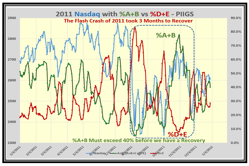
To take this idea a step further I was quick to look at the Debt Crisis for the PIIGS (Portugal, Italy, Ireland, Greece and Spain) in 2011 and again we see a similar pattern with a minimum of three months before the Market recovered:

Slide7

…And now advancing quickly to 2015 we are 9 weeks into recovery so far and should expect a pullback as %A+B is over 55% and is showing signs of being extended.  Please note that the Rally is now 17 days from the completion of a double bottom, so some form of retrenchment is on the cards before we move up again for the usual Thanksgiving and Christmas Rallies.

Slide9

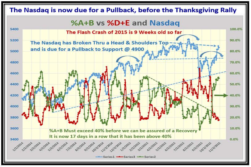
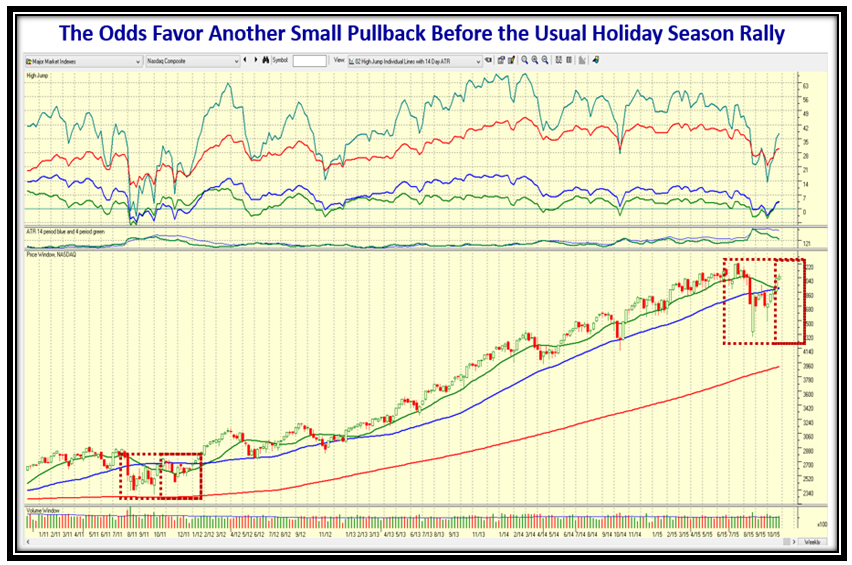
This next chart shows that the NASDAQ has broken thru the Head and Shoulders Top, so we shall see if it has the energy to continue to new highs or will likely retrench before moving up again:

Slide10

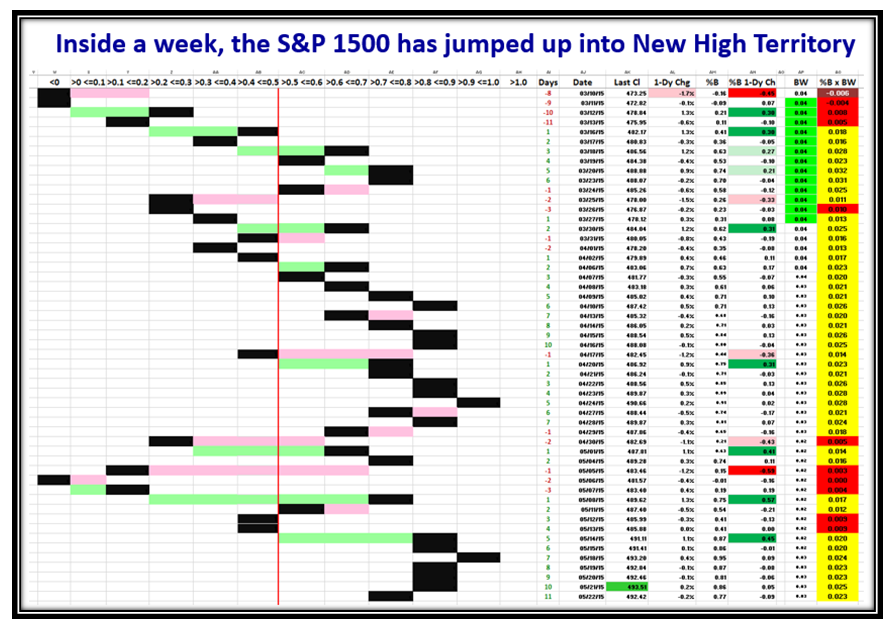
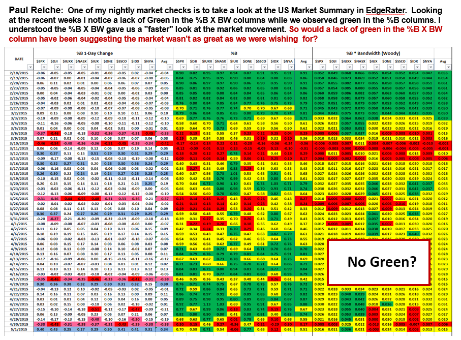
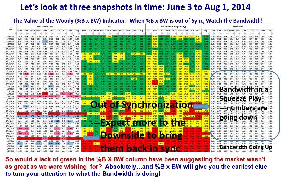
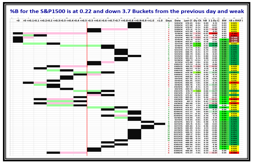
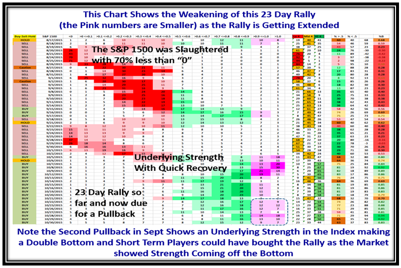
This next chart of the various numbers in %B Slices confirm what we see in the %A+B vs. %D+E in that the Original Flash Crash on August 24 & 25 shows that 70% of the S&P 1500 was below the Lower Bollinger Band (<0), so the Market took a bad fall!  After recovering within 12 days, the second leg down was not as violent so that the next recovery after the W bottom was very fast and the Market was Overbought within a week!  At this stage we are 23 Days into the rally so are due for a pullback as the overbought slices are not showing the same strength as shown by the dotted frame.

Slide11

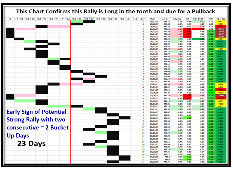
This chart again confirms that the rally with two buckets up on two consecutive days, but now we have 23 days up for the rally so it is getting long in the tooth.  However, as I write this piece on Monday morning the Market is up strong yet again so there are no signs of a pullback yet.

Slide12

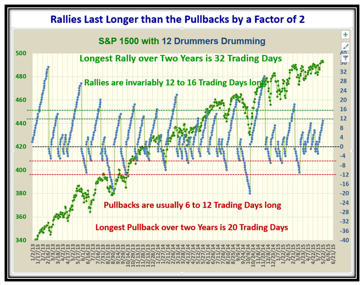
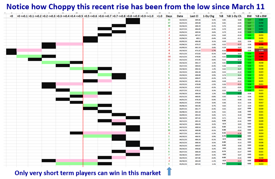
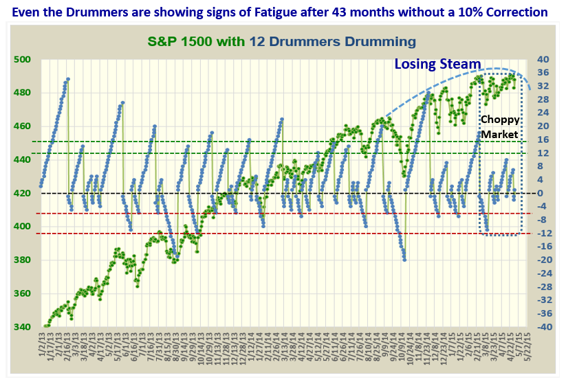
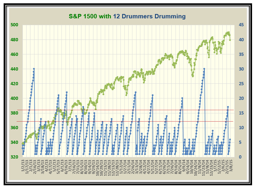
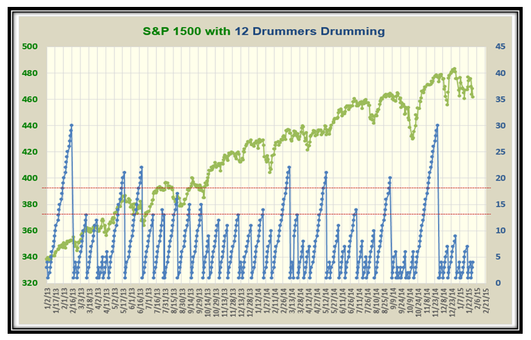
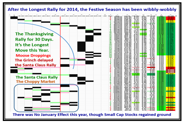
This chart of the Drummers Drumming shows that it is the longest consecutive run we have had this year where the period before the Flash Crash was so choppy and showing a topping action, warning of the possibility of a big pullback.

Slide14

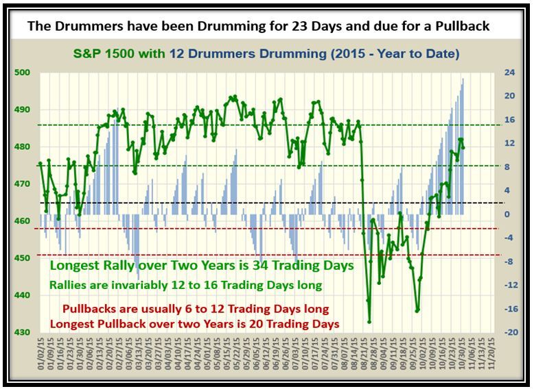
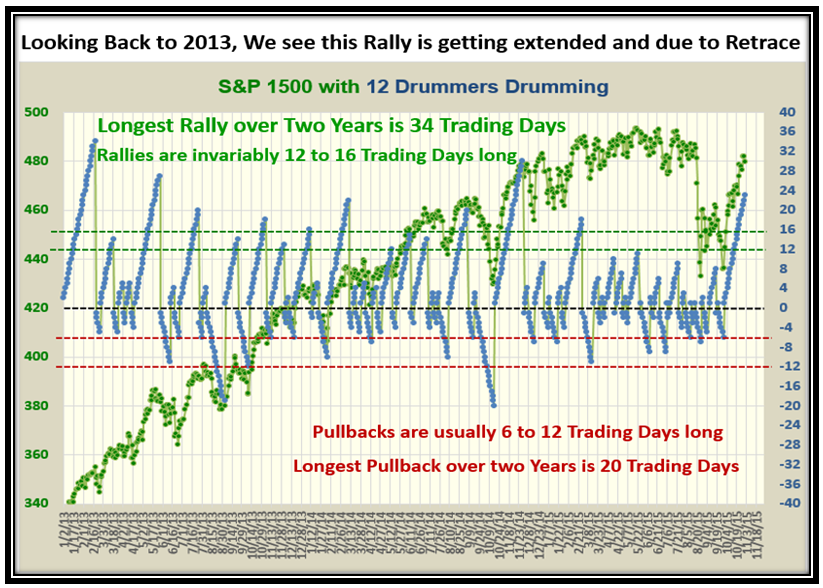
This shows more of the same but gives perspective of the longest rallies over three years and shows we can still head up for another 10 days or so without a breakdown:

Slide15

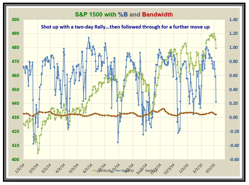
At the time of the Flash Crash, I took the formation at the bottom of this next chart and placed it on the top to show what we should expect as the weeks rolled by.

Slide16

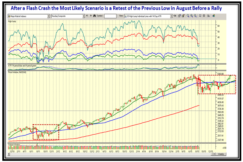
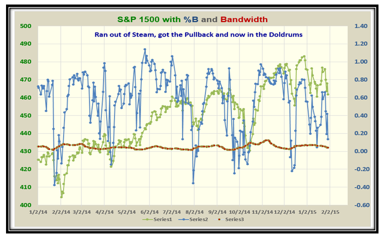
…And this picture shows an up to date picture of what has transpired since then and that we could still see a pullback before we trot off up again into the sunset!  This then begs the question of what are the two possible scenarios for the Market from here.

  1.  The Market Indexes plow through their old highs into new high territory due to the push for the Holiday season before we see a pullback, especially as August was a poor month or
  2. We see the pullback before Thanksgiving and then we see a bounce up with a strong rally into the new year.  After all it is bonus due time and the big boys want to earn their strong bonuses going into the New Year.

Slide17

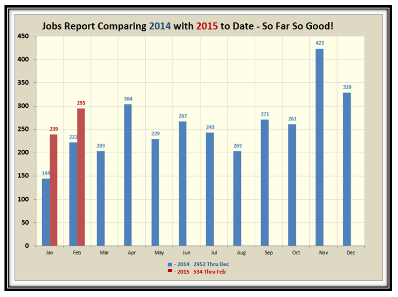
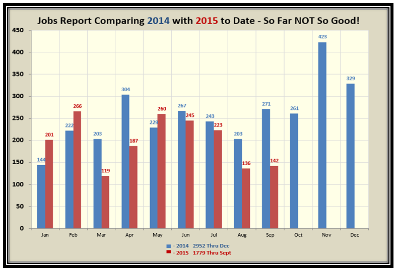
…And finally, here is the Jobs Report which is poor compared to last year.  I’m sure this is why the Fed pulled back from raising interest rates in October.

Slide18

This is my Thanksgiving gift to you and I hope it helps you see both sides of the Market of Fear and Greed!

Best Regards,

Ian.

Stock Market: Happy Memorial Day!

May 24th, 2015

My good friend Bob Meagher helped me put this Blog Note together with wishes to you all for a Happy Memorial Day!Memorial Picture

The Major Market Indexes which are long in the tooth hit new highs this week  and are now pausing to refresh:

Memorial Indexes

The Canaries have found support and are pausing to refresh:

Memorial Canaries

The S&P 1500 is pausing to refresh after jumping up into New High Territory this past week:

Memorial Pat

The Twelve Drummers need to breakout this week or we pullback before hopefully going up again:

Memorial Drummers

With luck, a fresh rally is on the way and we should expect the Accumulation vs. Distribution Ratio to drive the NASDAQ higher:

Memorial AD

%B x BW is still out of sync with %B, but with one more powerful move to the upside we should see things improving:

Memorial Woody

Although I am sure I am “Carrying Coals to Newcastle” as my English friends would say, I have to remind us that this Rally is very long in the tooth and a correction is overdue.

Memorial overdue

We have had a 44 Month run with a 90% gain so no wonder we are all biting our fingernails and wondering when the big dipper is coming:

Memorial big dipper

…And finally, here are the Near Term High and Low Targets…let’s keep our fingers crossed that we hit 5200!

Memorial Targetst

With best regards,

Ian.

Stock Market: Bollinger’s “Bandwidth” Rules the Roost Right Now

May 3rd, 2015

My good friend Paul Reiche made an astute observation when comparing %B versus %B x BW and wondered why the colors are not in “Sync” as shown in chart 7 below.  The value of the Woody Indicator (%B x BW) is to give a faster look at the market movement as he rightly says and at such times it pays to turn your attention to what the Bandwidth is doing!  I will cover this scenario in charts 7 to 10 below.

2015-05-03 Blog Fodder

Let’s first look at the Market Indexes to show the lay of the land and as you would expect it has been a choppy market to say the least for the past month:

2015-05-03 Blog Fodder2

The Canaries haven’t faired much better though NFLX and PCLN have been the stars with LNKD just taking a wallop:

2015-05-03 Blog Fodder3

Note that the Internals of the Market as viewed by the Accum. vs. Dist. Ratio also show that we are at Stalemate:

2015-05-03 Blog Fodder4

The choppiness we have had to put up with is quickly evident in this next favorite chart of ours:

2015-05-03 Blog Fodder5

…And here is the Drummers Chart which also shows the signs of a Choppy Market:

2015-05-03 Blog Fodder6

Now for Paul Reiche’s astute observation below:

2015-05-03 Blog Fodder7

So let’s go back in time and then bring us forward to date to see what happened in a similar situation:

2015-05-03 Blog Fodder8

…And here is the follow on chart which shows how everything got back in sync!

2015-05-03 Blog Fodder9

Lastly, we are back up to date and so we keep a beady eye on the behavior of the Bandwidth to ultimately bring us back into sync:

2015-05-03 Blog Fodder10

Let’s see what transpires over the next week or so.  Hopefully things will right themselves in the fullness of time!

Best Regards,

Ian.

The Stock Market Indexes are back to a “Rounded Top”

March 8th, 2015

This Market is very similar to that we had back at the Start of the Year in early January…a Rounded Top:

Rounded Picture

…And here is the picture to prove it:

Rounded Indexes

The Canaries are pausing to Refresh, but are holding up nicely with AAPL, FB, GOOGL and PCLN leading the way:

Rounded Canaries

The Drummers Drumming Chart shows that we are 6 Days into a down move, and we should expect the Markets to continue down:

RoundedDrummers

…And this chart shows that the odds are still to the downside for %B to come down through the Bandwidth before going up again:

Rounded Bandwidth

The Market took a Major Hit on Friday with the S&P 1500 down 3.7 buckets and should still head down early next week:

Rounded Pat

If you didn’t feel the bias for the Markets is downwards, then hopefully this chart will convince you:

Rounded abcde

Now for the Jobs Report for February which is still showing improvement at around the 300,000 mark:

Rounded Jobs 1

Rounded Jobs 2

Keep your powder dry and have a good week.

Best Regards,

Ian.

Stock Market: “Deflated” Choppy Market!

February 1st, 2015

Thank you for your patience while I suffered a crashed Computer Hard Drive this past week, but hopefully I am back up and running. Today is Superbowl Sunday, and I am sure we all understand this “deflated” Choppy Market we are in.  I feel you all will understand the frustration of seeing the Market Indexes rise and fall over more than 100 points intra-day to say nothing about the daily swings we have endured the past month as I show in many of the charts in this Blog Note.

Fortunately the Canaries have provided excellent Earnings Reports, including AAPL, AMZN and NFLX, so I am hoping for a small new rally with the Canaries leading the charge:

Choppy Picture

Just look at what we have had to put up with this last month, and Investors and Traders must be very nimble:

Choppy Indexes

However, with the recent Earnings Reports on some of the Canaries being excellent, the Leaders are holding up:

Choppy Canaries

It goes without saying that the %Accumulation vs. Distribution Ratio is at Stalemate at ~1, i.e, 33% for each:

Choppy abcdes

Even the Drummers Drumming Chart shows how choppy this market has been with change in direction every few days:

Choppy drummers

%B for the S&P 1500 is below 0.20 and therefore in the doldrums and close to breaking down below the Bandwidth:

Choppy 1500

The signal to re-engage the Market is when the %B for Bucket 0.2 to 0.3 exceeds 17% and we are flailing around:

Choppy B

This next favorite chart tells it all in a nut-shell…until this yin-yang stops we will stay in oscillation:

Choppy Pat

This last chart should convince you to stay out or be very nimble if you take trades when this market is so choppy.

Best Regards,

Ian

Copyright © 2007-2010 Ian Woodward
Disclaimer: Commentaries on this Blog are not to be construed as recommendations to buy or sell the market and/or specific securites. The consumer of the information is responsible for their own investment decisions.