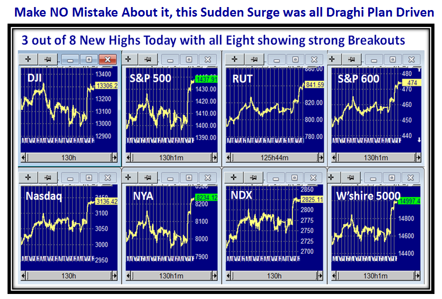
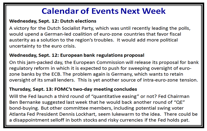
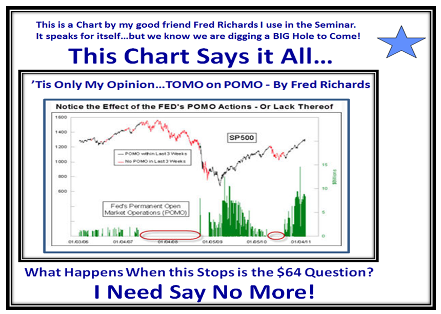
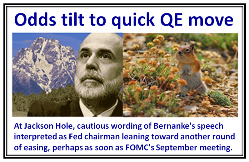
As we enjoy a long Labor Day Weekend with the Markets closed tomorrow, the buzz on Friday evening out of Jackson Hole was that the “Odds Tilt to a Quick QE Move” according to a headline in MarketWatch:

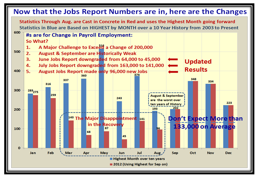
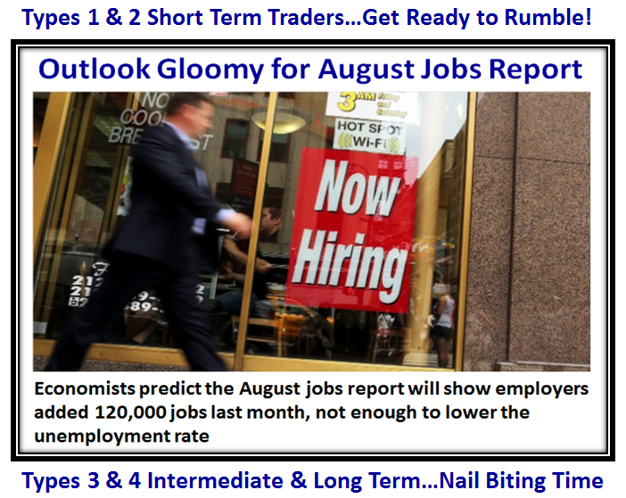
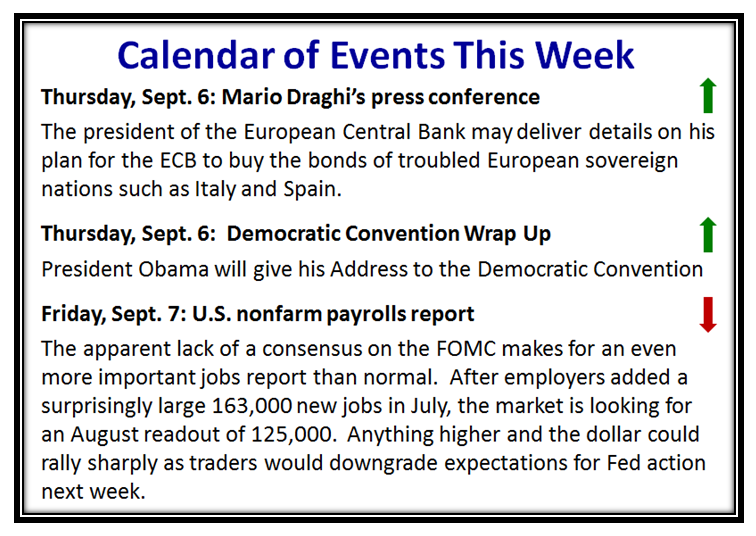
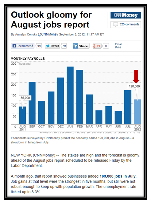
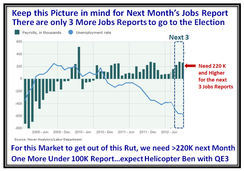
With the Tom-toms beating, I felt it would be of value to you to take a deeper look at the Jobs Report due this next Friday on the 7th of September and so I resurrect the chart I used a month ago. Recall we had just come through the August report which delivered 163,000 new jobs, and having now studied the numbers in a lot more depth, this turned out to be a very commendable report, and the market promptly recovered coupled with the Braghi Comments a few days earlier. My off the cuff suggestion was in order for this momentum to continue the Market would be looking for a further boost in the September Report to the tune of around 220,000 Increase in jobs.

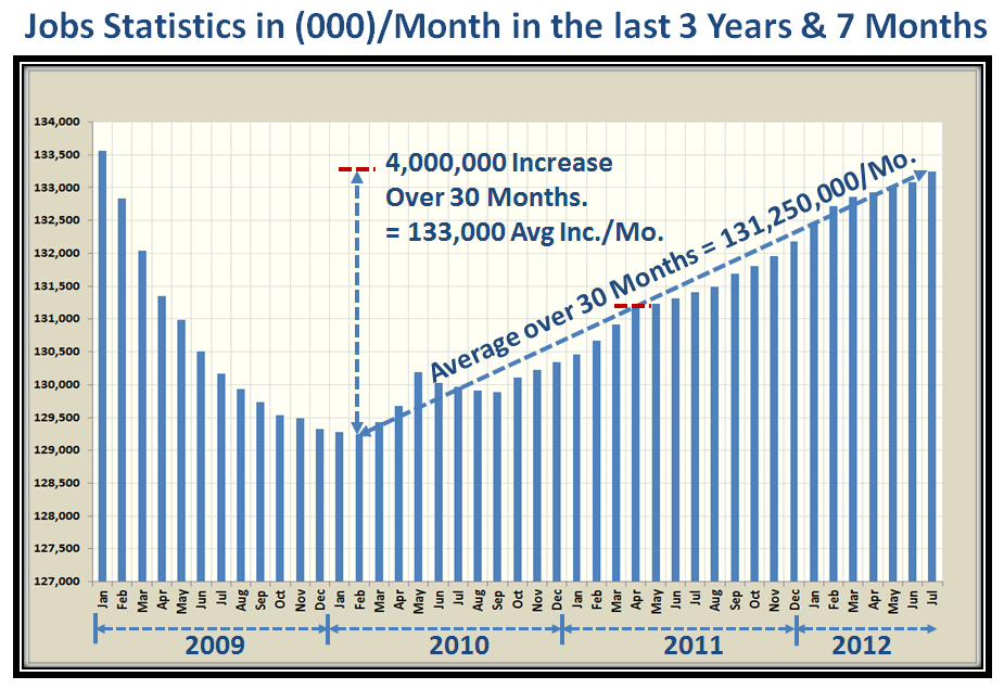
You know me well enough by now that I invariably will divide complex problems into three with the High, Middle and Low Road Scenarios which was my objective with all the hub-bub about QE-3 being almost a certainty. It may well be a boost for the Market in the Short Term, but we all know by now that if and when this economy finally turn around this indiscriminate printing of Money will eventually catch up with us, as Inflation eventually kicks in with raising Interest rates to keep things in check. I was fortunate to come across the Untied States Bureau of Labor Statistics for the past 10+ years. From that I plucked the month by month Jobs numbers in the next chart, so that you can see the basis for my analysis, and that the Average Increase per Month is ~133,000 new jobs, based on the last 30 months:

So it would seem this tallies with the 4.5 Million New Jobs that the Administration quotes as a statistic of its overall performance based on a low 30 months ago when the Increase/Month bottomed…looking forward for an additional five months.
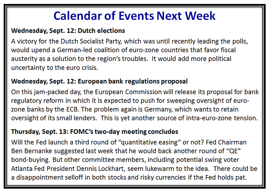
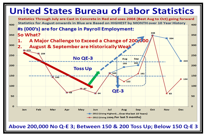
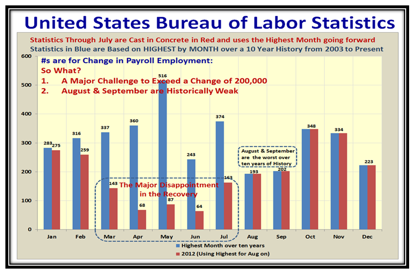
Now let’s look forward for at least the next couple of months as they will certainly be an influencing factor with regard to any new Quantitative Easing that may be essential to boost the Economy and Jobs. In the following two charts I show the pertinent data for this year, with the Statistics through July already behind us. For August through Year-end I show the highest number increase for each month based on the past ten years of statistics, and those for 2004 when the recovery from the Technology Bubble was well on its way by way of two stakes in the ground. Note the very disappointing statistics for the four months prior to July, as we trotted down to just a 64,000 increase in June. As I state on the Chart, and it is important to repeat myself in the assessment, my conclusions were startling looking ahead:
1. It will be A Major Challenge to Exceed a Change of 200,000 New Jobs/month
2. August & September are Historically Weak, with the HIGHEST New Jobs being 193,000 and 202,000 based on the last ten years history.

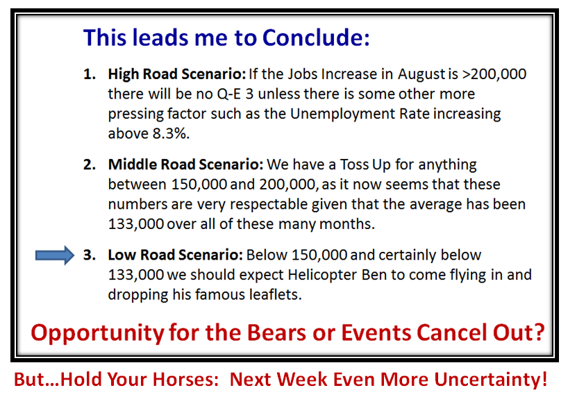
This leads me to conclude:
1. High Road Scenario: If the Jobs Increase in August is >200,000 there will be no Q-E 3 unless there is some other more pressing factor such as the Unemployment Rate increasing above 8.3%.
2. Middle Road Scenario: We have a Toss Up for anything between 150,000 and 200,000, as it now seems that these numbers are very respectable given that the average has been 133,000 over all of these many months.
3. Low Road Scenario: Below 150,000 and certainly below 133,000 we should expect Helicopter Ben to come flying in and dropping his famous leaflets.
This next chart shows the HIGHEST Score over the past ten years of history, so it includes the 2004 to 2007 time-frame when we came out of the prior crisis of the Technology Bubble. It dramatically shows the problems we faced in the March through June timeframe where the numbers are nothing less than putrid. It also opens my eyes to the fact that “Operation Twist” did nothing to turn the Economy around. It suggests that the value of these major interventions are now dwindling with time, but then “who am I to know” when all I am trying to do is keep you on the right side of the Market and primarily decide which way the wind is blowing between Fear and Greed.

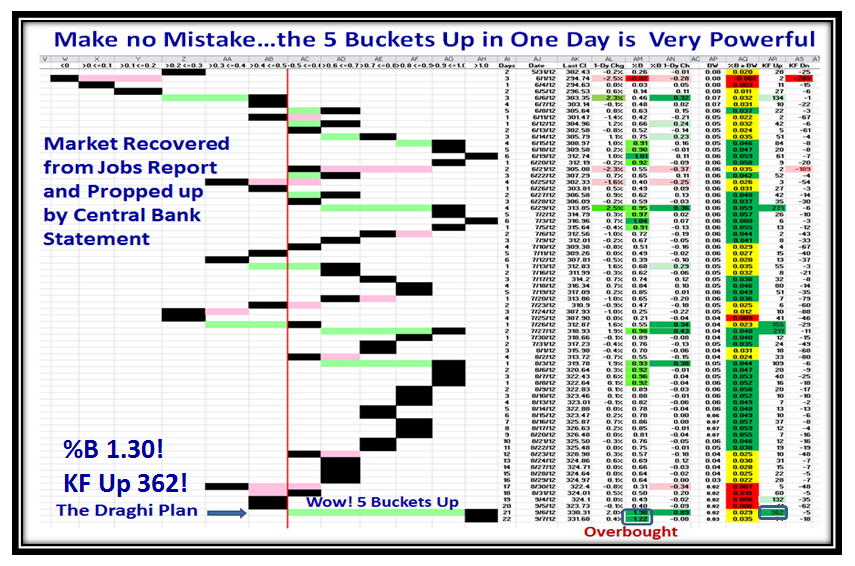
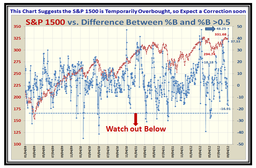
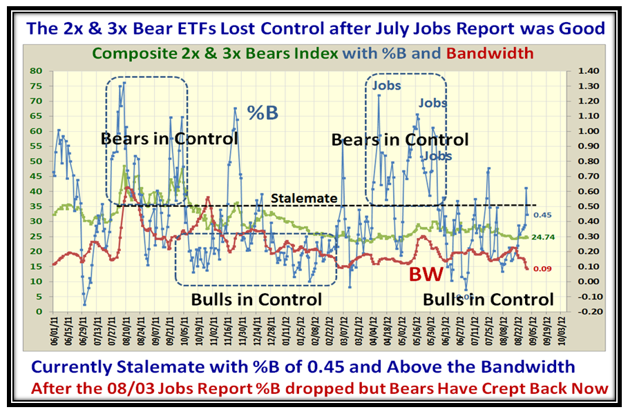
I hope the above clarifies my position going into this week’s Jobs Report, and we do not have long to wait. Now let’s turn our attention to the Market Statistics of Fear and Greed. Net-net we are at Stalemate as you see from the next chart which is totally familiar to you by now:
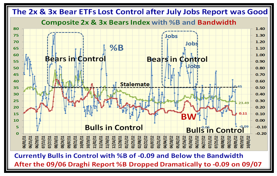
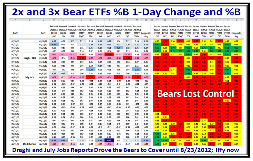
If you do not believe that this Market is News Driven, this next chart which is the twin to the above helps:
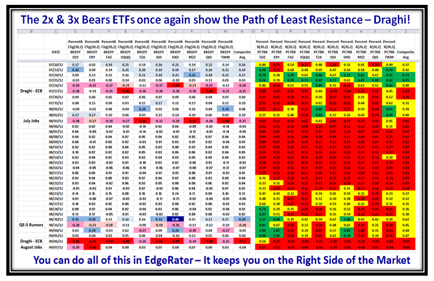
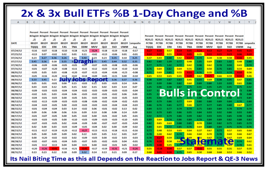
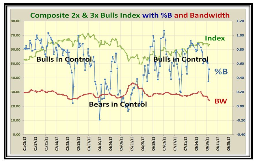
It doesn’t take two minutes to see that Draghi and the July Jobs Report turned the Market around and sent the Bears scurrying for shelter. Now the market is “Iffy” one more time until we get fresh news this week. Let’s take a minute to look at the converse which is the 2x and 3x Bull ETFs:
…And here is the twin chart:
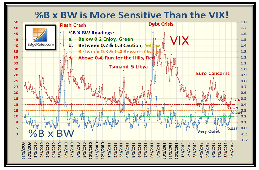
And where does the VIX sit in all of this, you might ask? Poking its head up once again and poised if there is Fear lurking:
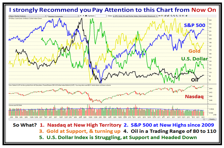
I have not discussed what to watch in the arena of Commodities, but now is the time to sit up and take notice. One way is to understand where Gold, Silver, Oil and the US Dollar Index sit in relation to each other and the S&P 500 and Nasdaq Indexes. We can do this easily in HGSI, where Ron has provided such a chart, and I have summarized the “So What” of the current situation below.
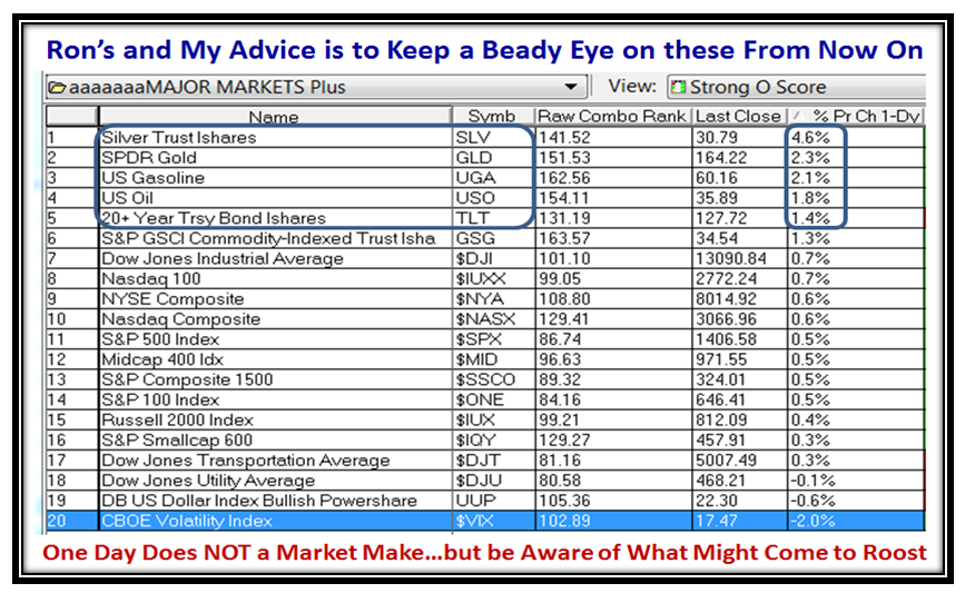
As a follow up, Ron provides a quick check view by using his Major Market Plus Index as shown below:
I thought my readers worldwide would like to get a feel for those interested in my work, so here is a chart of the hits I have had from different countries these last seven days:
We are just eight weeks away from the October 27 to 29 Seminar where you will learn from Ron and myself how to make money and to keep the money you make. Over the years we have a plethora of people who give their views and ideas in impromptu presentations so that our objective is to learn from each other in Workshop style.
Best Regards,
Ian
 Ian Woodward's Investing Blog
