Stock Market: Is Uncle Ben Rolling Up His Sleeves?
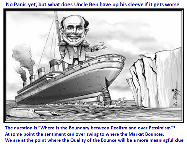
Now that QE-2 is virtually over, the summer doldrums are upon us, and complacency still abounds, it won’t be long before we see a real knee jerk to the down side to wake us up. Time is running out for Uncle Ben and one wonders what rabbit he has for the next phase of the Market cycle. The Gloom and Doom Camp say that we are but ten years into the 17 year “locust” cycle, so expect another big leg down before we have a flourishing Market again. With the Debt the biggest cause for concern, we wonder what Uncle Ben has up his sleeve to avoid the disaster of a double dip recession?
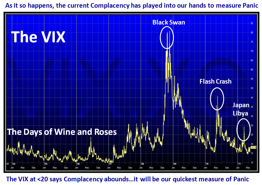
Let me first address the “go to weapon” for measuring Panic…it is our old friend the VIX. I gave you this chart a few blogs ago or maybe it was in the newsletter, so let’s look at it now. We couldn’t be at a better point in time.
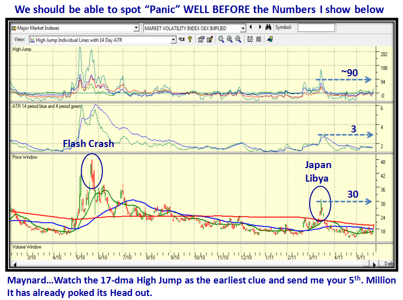
The VIX is around 18, but shot up to above its 200-dma at ~20 intra-day yesterday with that big down day. However, my good friend Maynard has chided me that I have kept this secret weapon to myself when I introduced you to the High Jump in conjunction with ATR (Average True Range). My life and your life should revolve around “threes”, red, yellow, green; High, Low and Middle road, etc. So the other day I dusted off the VIX in conjunction with the High Jump and the ATR…why these two items? Because they magnify the measurement of “Panic” when it happens and enhances the chances of us spotting it earlier! The early bird catches the worm:
I couldn’t resist that leg pull with my dear friend Maynard…they don’t come any better. So, that makes up for all my tardiness on this gem! It will save our skins.
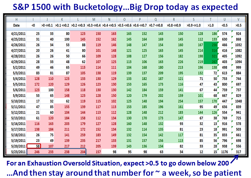
Now let’s turn our attention to a follow up to yesterday’s blog, and show you the results and findings to give further clues as to oversold and Bounce Plays:
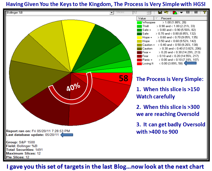
As you would expect, major damage was done yesterday to the internals of the market as shown above, but we are still not at exhaustion to the downside. Please realize that Memorial Day is this coming weekend and things tend to get quiet around such three day weekends as this is when the big wigs trot off to the Hamptons. I gave you the chart in yesterday’s blog note, and added the percentage of 40% for the bottom four slices to give you a quick comparison with the damage done yesterday which is shown on the following two charts:
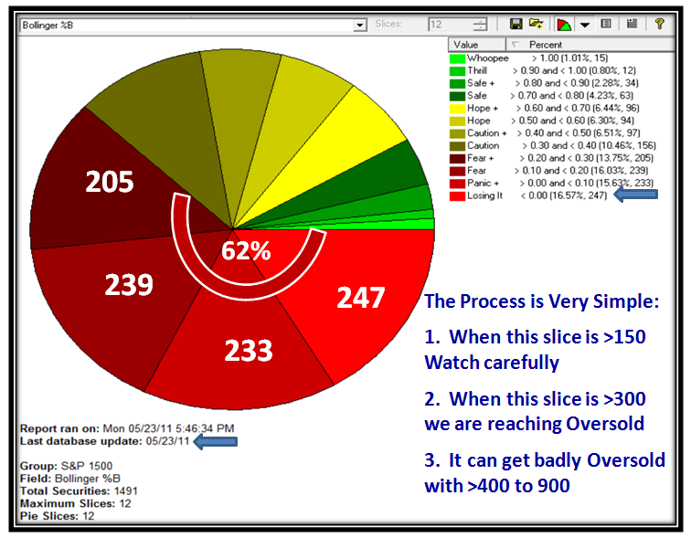
…And here is yesterday’s results. Lots of damage done, but always the hope that we now are leaning to an oversold market and can then expect a Bounce:
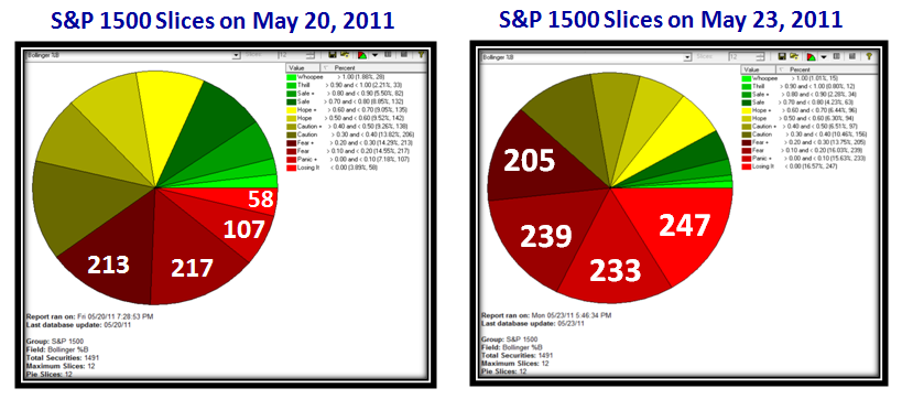
…And here for your convenience are the two pies together, showing the actual numbers for the bottom four buckets of the S&P 1500:
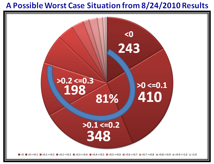
So what you might ask? Well, here is a recent comparison of a Low Day back on 8/24/2010, where you will recall we had already had a ~17% correction and were retesting the lows prior to the start of the Fresh Market Rally on September 1, 2010:
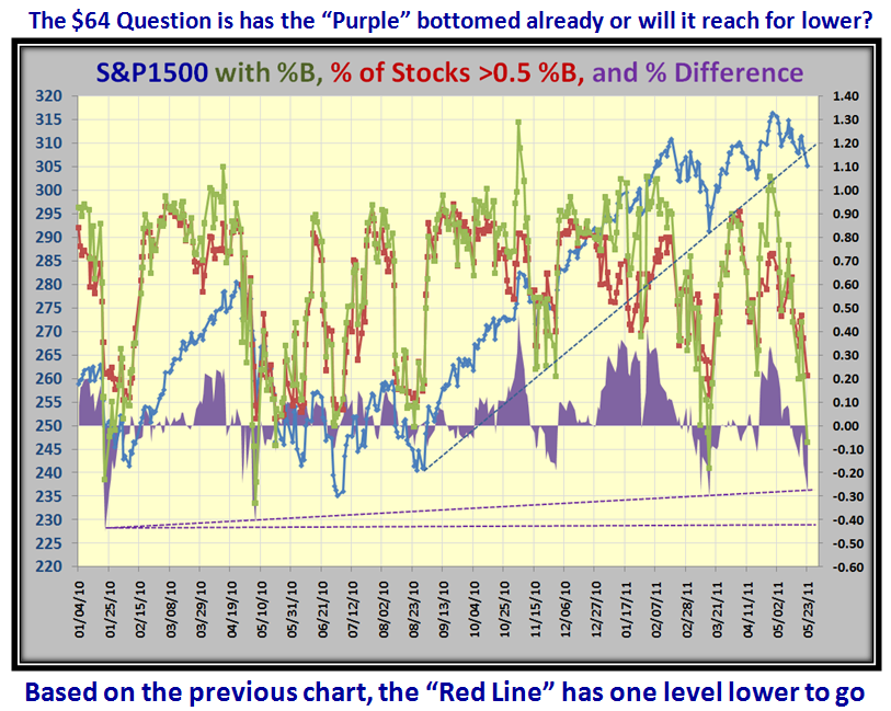
We could have a ways to go if Gloom and Doom sets in. I produced this particular chart using EdgeRater, with a tip of my hat to my good friend Chris White. Last but by no means least, here is an extended view of the “Purple” chart, which gives us a good feel for where we are and where we could go to bottom. Good Stuff:
So there you have it. I hope you folks feel you get something out of all of this stuff…I am not looking for atta boys, but it would be rewarding to get some feedback or have a comment to make from others than the usual faithfuls who always show their appreciation. As you can imagine it takes a good deal of Ron and my time with all the fodder we provide for you to keep you on the right side of the market. Have a Happy! Ian.
 Ian Woodward's Investing Blog