Ian Woodward's Investing Blog

Archive for December, 2013

Stock Market: Nasdaq hit “Higher Target” and Still Rising
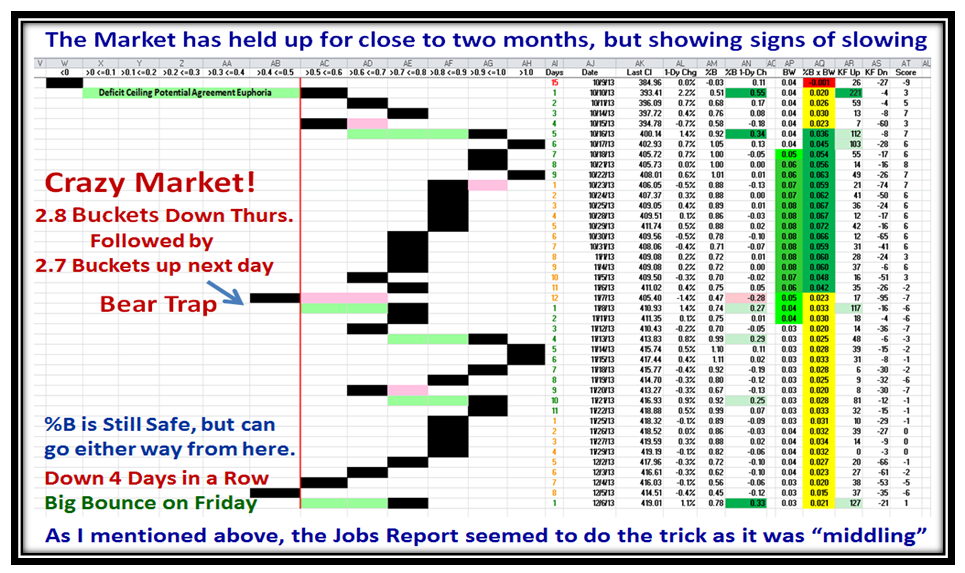
Thursday, December 26th, 2013

I am delighted to mention that the High Jump Tool has proven itself invaluable yet again, while the Market continues upwards and onwards:

Ho-Ho-Ho Picture

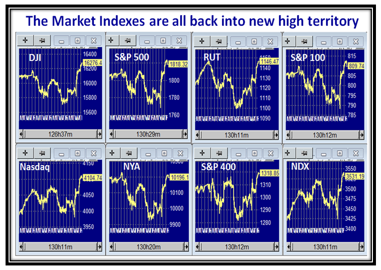
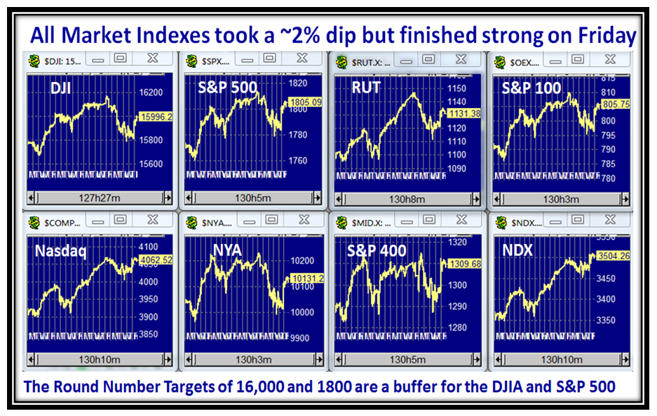
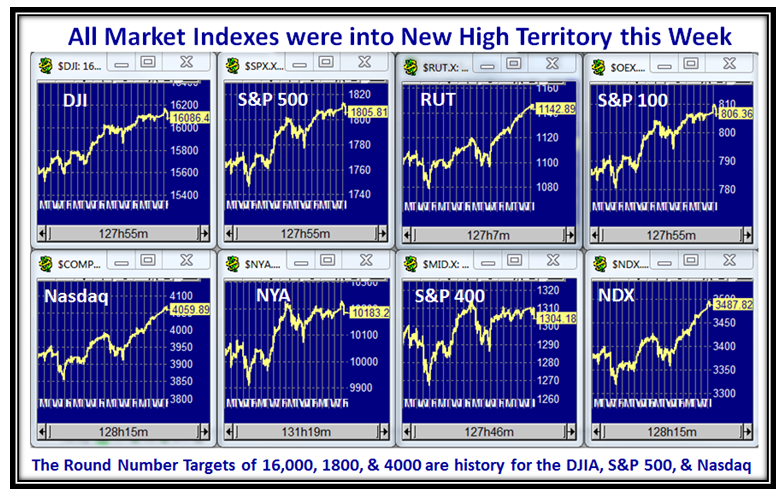
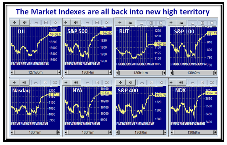
The Market Indexes are all into New High Territory:

Ho-Ho-Ho Indexes

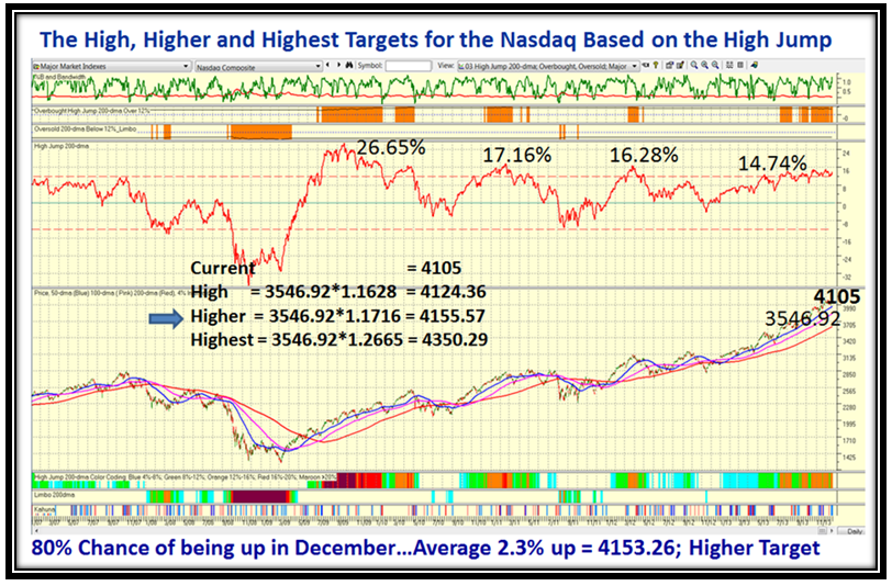
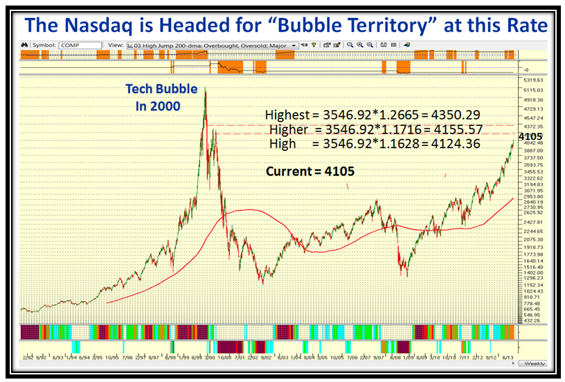
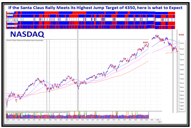
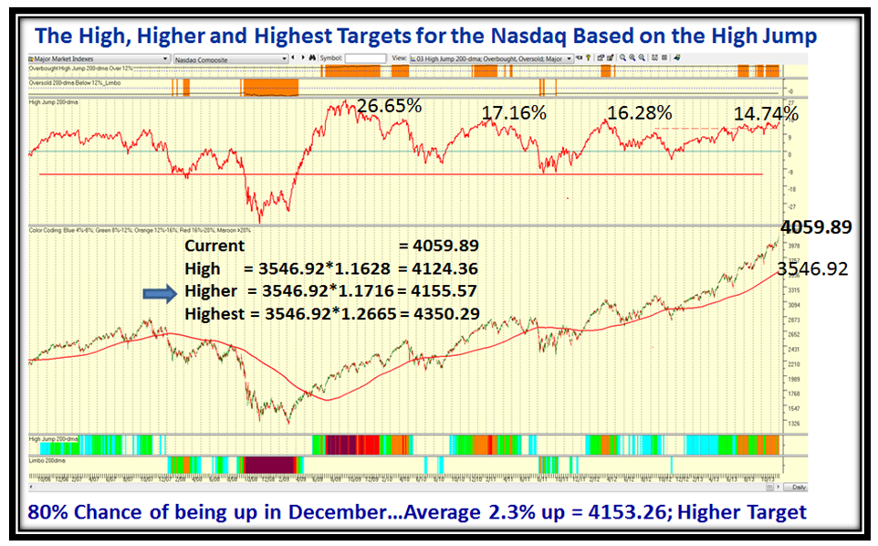
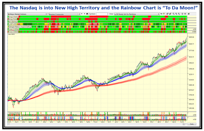
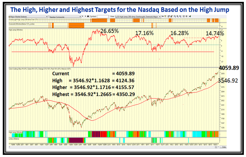
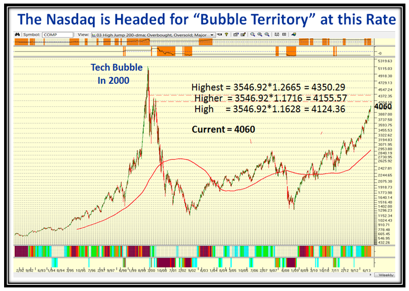
You will recall from earlier Blog Notes how we keep a tally of the High Jump Targets  and the NASDAQ  met the “Higher Target” of 4155 on Christmas Eve.

Ho-Ho-Ho Nasdaq1

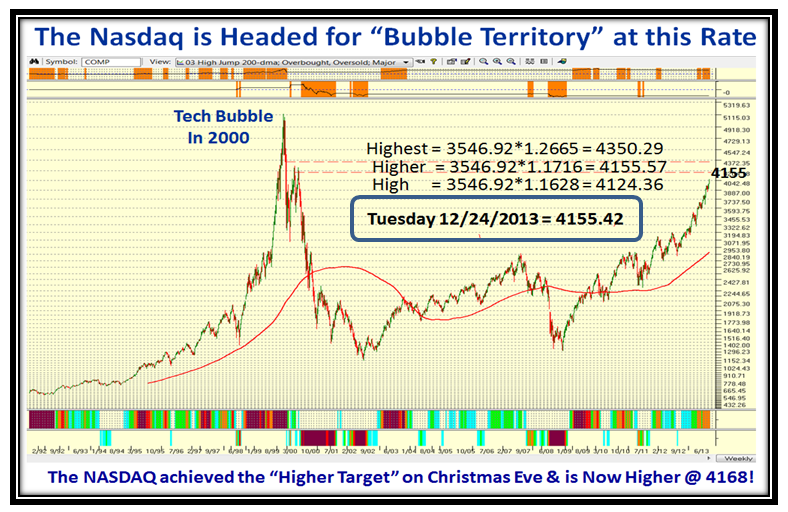
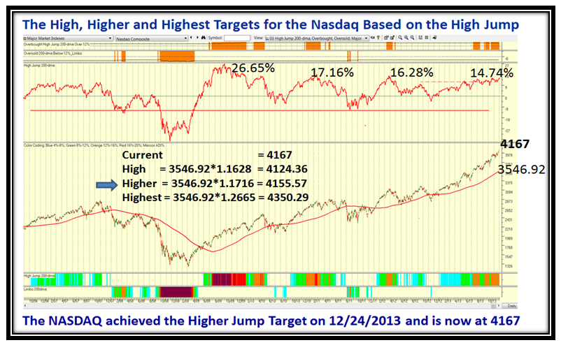
The Nasdaq is currently at 4167 and now on its way to the Highest Target of 4350 to complete the next rung of the ladder based on it reaching 16.28% up from where the measurements were taken from the 200-dma when it was at 3546.92:

Ho-Ho-Ho Nasdaq2

At this stage with the Indexes all reaching for overdrive, it is natural that the VIX is reaching for a recent all-time new low.  It reached an interim low during the course of today of 11.75 as shown on the following chart and bounced back to finish the day at 12.33.  More importantly, the Bulls have a huge cushion before the VIX can signal major danger.

Ho-Ho-Ho VIX

Take it a day at a time, but the odds are very good to play towards the upside for now until there is a serious shot across the bow, which we well know from all the signs I have taught you.

Best Regards,

Ian.

Stock Market: Wall Street Says Thanks

Sunday, December 22nd, 2013

Uncle Helicopter Ben and his crew came up with their perfect Tapering Scenario as far as the Big Guns at Wall Street were concerned and in turn said Thank You on his way out next year.  This seems to have solidified the Santa Claus Rally as witnessed by the several charts I have put together as my Christmas Present to you.

Ben Picture

Here is the proof that the Market Indexes are all trotting back into New High Territory:

Ben Indexes

Even the sluggish Canaries are perking up, and have posted good gains in two months of over 40% for FB, NFLX & AMZN:

Ben Canaries

The Acc vs. Dist Ratio A+B  to D+E has shown strength these last three days and is above Stalemate with a 1.7:1 Ratio:

Ben abcde

It seemed that the Santa Claus Rally was doomed on 12/11/2013, but it has bounced back with vigor as shown below:

Ben Kahunas

…And here is what saved the day: 6 Buckets up on the 1-Day %B for the S&P 1500, of which there are only 3 in 7 Years:

Ben buckets

The Bears were caught in a “Bear Trap”, when it seemed that we were in for a rotten Santa Claus Rally.  Hope springs eternal and in this sensitive Market to any news good and bad don’t get too excited but play it a day at a time for now:

Ben Pat

Here is a reminder of the High Jump Targets I gave you before with the “Current Price” only changed to 4105:

Ben Targets

We are still climbing, but have not reached the High Target yet which is only 19 points away, so watch out for progress:

Ben Targets 2

…And finally, if we reach the Highest Target of 4350 by early January we should then be looking for a bigger correction than usual of at least a Major Correction of 12 to 16%, but that is all conjecture.  If we do have a big dip then we should see a “Bingo” or two (grey bars) and that may be a sign that we have bottomed and found support, but if not we will trot on down for something much worse.

Ben correction

I wish you all a Merry Christmas and a very Happy New Year.

Ian.

Stock Market: Newsletter Overview

Sunday, December 15th, 2013

Overview:

We wish you all A Merry Christmas and a Bright New Year, our faithful supporters.  I hope the Late Breaking News I have for you doesn’t turn out to be a Bad Omen for the usual Santa Claus Rally, but we had 5.9 Buckets Down in one day on %B for the S&P 1500 on 12/11/2013.  “So What” you ask? This has happened six times in the last seven years and has NOT occurred in December until now.  Also on the previous six occasions it has taken 12 days or more to recover for five of the six, and six days for the one from 2/25/13…let’s hope it repeats that one!

Santa Picture

The Newsletter will cover the High, Middle, and Low Road Scenarios, and show you the pulse of the Market Indexes.  I will also give you more insight into the Concept of using the 1-Day Chg. in %B for the S&P 1500.  This month Ron will cover Day to Day Group Rotation within the Smart Groups.

The Round Table discussion is on Tuesday, 17th Dec. at 4.30pm EST, where we will as usual expand on the ideas in the Newsletter.  Don’t miss this golden opportunity.

Best Regards,

Ian.

Stock Market: The Hindenburg Omen Strikes Again!

Sunday, December 8th, 2013

This past week has provided a good deal of information and insight regarding the overall direction of the Market.  It trotted down for most of the past week, and it appeared the Grinch was making an early appearance.  However all of that was brushed aside with the strong up-day on Friday which was triggered by the Jobs Report.  Everyone is measuring and interpreting every bit of information as to when the bough will break, but as yet nothing is broken and we trundle on.  To add to the excitement, the Hindenburg Omen has poked its head out again!

I will address three important themes in this blog note:

1.  The perspective on the Jobs Report

2.  The Market Indexes, Hindenburg Omen, and Market Internals

3.  A follow up perspective on the behavior of the S&P 500 based on the past 25 years performance

Grinch Picture

Here is an update on the Jobs Report Statistics, where I relate the latest numbers to the previous benchmarks I have used for 2005 and 2012 in past blog notes.  Net-net, the So What is this latest November report was not anything to get excited about in terms of the long term improvement in the economy.  However, mediocrity at this stage is interpreted as good as it will not cause the FED to take action in increasing Interest Rates, but not that bad for them to throw more Q-E money into the pot.  Go figure, but that’s what helped stave the Grinch from doing more damage at least for this week.  You judge for yourself…but our nest eggs accept any gifts!

Grinch Jobs

Grinch Jobs2

Grinch Jobs3

The Market Indexes charts show the 2% to 3% drop followed by a strong rebound on Friday:

Grinch Indexes

Beware of the Hindenburg Omen which has poked its ugly head up again:

Grinch omen

The Acc:Dist Ratio has gone to pot and is at stalemate at the moment, another warning sign:

Grinch abcde

Friday came to the rescue with a 3.3 Buckets up day to keep the Rally alive:

Grinch Pat

Here is a Repeat chart to remind you of where the High, Higher and Highest Targets are for the High Jump:

Grinch High Jump

…And here is the longer term picture:

Grinch High Jump2

Here is an updated picture of the one I left you with to ponder over the S&P 500 Historical Prices and I have been able to milk blood out of a stone to show that for the past 25 years we have been in Rally mode for 5 years at a time.  This latest rally is the 2nd largest of the four I show below:

Grinch 500

…And this chart with the help of my good friend Bob Meagher ties it all together for where we stand:

Grinch Nasdaq Wrap up

Enjoy, and Best Regards,

Ian.

Stock Market: Blowing Bubbles in Sight

Sunday, December 1st, 2013

Now that Thanksgiving has come and gone with nary a sign of the Market giving up its upward climb yet, the Indexes have blown through the rounded numbers of 16,000, 4000 and 1800 for the DJIA, NASDAQ and the S&P 500.  So now we look forward to Santa Claus in his red car to drive this Rally to even further heights, hopefully before it gives up the ghost.

Bubbles Picture

The Market Indexes drove into New High Territory yet again this past week as shown below:

Bubbles Indexes

The NASDAQ is showing fresh Momentum and the Rainbow Charts are rising to the Moon…notice that %A/D is strong showing “dark Green”, with three Blue Kahunas in the last ten days!

Bubbles Nasdaq

The obvious question at this stage is “How Much Further can the Nasdaq go?”  Let’s turn to the High Jump, which has served us well when the Market gets Overbought, as it is now.  The answer based on recent History is on the next chart:

Bubbles  High Jump

Here is where the Greed and Fear really sets in as seen by this next chart which shows the famous Tech Bubble from 1999 to late 2000, with the High Jump potential Targets on the chart.  It doesn’t take much to see that we are fast moving to nose bleed territory!

Bubbles  Nose Bleed

Now let’s take a look at the innards of the Market and see how the Canaries are holding up since they have recently found support, and had a strong bounce back on 11/27/2013, the day before Thanksgiving:

Bubbles  Canaries

…And here is the Index for the Canaries, which shows a small recovery so far, but not enough to dance the Highland Fling!

Bubbles  Canaries 2

Here is the improvement since the two day ying-yang we had two weeks ago, which shows we are in safe territory with a cushion:

Bubbles  Pat

…And its twin picture which shows that the discrepancy between %B of the S&P 1500 and the % Stocks >0.5 has righted itself:

Bubble Pat 2

Here is a bonus picture for you to ponder over…The Historical Prices Year-by-Year of the Total Return for the S&P 500, which shows that the last five years from 2009 to 2013 have been very strong.

Bubble S&P500

Best Regards,

Ian.


Copyright © 2007-2010 Ian Woodward
Disclaimer: Commentaries on this Blog are not to be construed as recommendations to buy or sell the market and/or specific securites. The consumer of the information is responsible for their own investment decisions.