Ian Woodward's Investing Blog

Archive for the ‘Market Analysis’ Category

The Stock Market Fork in the Road

Saturday, July 10th, 2010

                                  fork

My good friend Mike Scott sent me this picture some time back which I felt was appropriate to use on this occasion.  The Bears are saying “What Fork in the Road?  After this little rally from an oversold market, we will be headed down once more.”  And the Bulls are hoping that with supposedly stellar earnings to come starting this week, the worst is behind us and we are in the recovery phase, albeit a trifle tepid by way of a rally without good volume so far.

roadmap

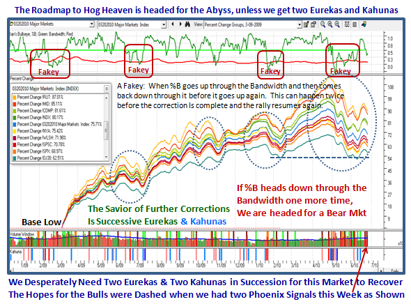
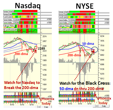
Since you are now all familiar with the Roadmap chart which shows the rise and fall of Key Market Indexes, I need only point out the most recent changes since you last saw this picture.

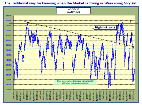
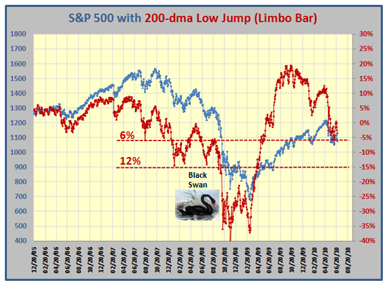
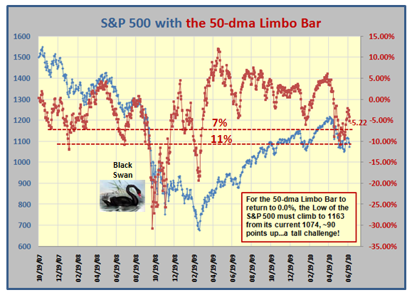
1.  When a Market suffers a Major Correction where the High to Low % change is 16% to 20%, we are just short of a Bear Market and it takes a lot to extract oneself from the mire.  That is precisely where we are.

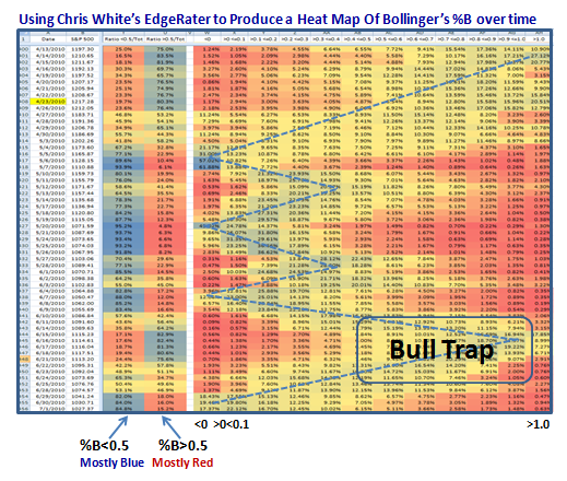
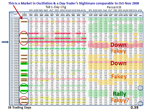
2.  We have learned that two Eurekas in a row coupled with a Kahuna is not good enough to avoid a Bull Trap, which we saw over a week ago.  The same thing goes for Follow Through Days (FTDs) which got equally bounced around two days after they were declared. 

3.  Minor Corrections of the previous three we had in 2009 and the recent one in Feb 2010 can sustain a potential one or two day drumming from the Bears through Phoenix signals, but when they have either an Intermediate or a Major Correction under their belt, watch out for a Fakey!

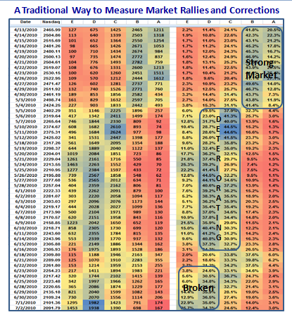
4.  That is precisely what happened.  We had three Phoenix Impulse Signals in quick succession on 6/22, 6/24 and 6/29 to take us down to a -17.4% Correction, High to Low on the S&P 500, with Black Crosses appearing two-a-penny on most of the Indexes.  So the Bears were whooping it up.

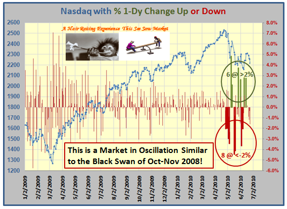
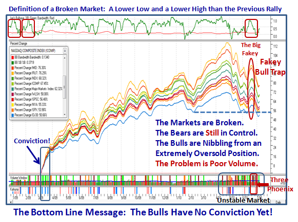
6.  Not even a % B reading of well over 0.8 could protect the Market from tumbling into coming down to break the Bandwidth (red line, top window) yet again, the likes of which we have not seen since Black Swan days back in early 2009, when this market was trying to recover from an extremely oversold situation (look back to the left hand top of the chart).

7.  The Bulls are now nibbling from an extremely oversold position with the Eureka signal on 7/7, and we have had a tepid rally these last four days.  I say tepid since all the pundits will tell you “There is no beef in the volume”.

8.  I don’t have to tell you that we have an extremely Volatile Market as recorded by the yo-yo signals as shown at the bottom right hand side of the chart.

9.  The Bottom line message is that until we see the type of conviction we saw in March 2009 where we had a powerful move up on all cylinders: price, volume and momentum, the Bears will continue to enjoy the power they have missed for all of 15 months. 

Very short term Type 1 and maybe Type 2 Players can make hay in this market and  like Rumpelstiltskin spin straw into gold, but Types 3 & 4 need to be patient and wait for Goldilocks to give the all clear. 

Best Regards, Ian.

Taking the Market Temperature with %B & Heat Maps!

Monday, July 5th, 2010

The other day I was discussing with Ron Brown and Chris White how I had found a way to expand our repertoire of uses for the Bollinger Bands %B, and here are the fruits of those efforts.  Having shown him what I was doing, Chris not only came up with a Back History database of what I was looking for using his EdgeRater Software, but also suggested using Heat Maps as a quick way to view big globs of data to show the results…so here it is with a tribute to Chris for his good work and friendship.  There is no way I could have so easily developed these pictures without Chris’ EdgeRater Software at www.EdgeRater.com.

                                     edge

I have shown you many times on this blog, in the newsletter, and at the seminars how we traditionally evaluate the strength or weakness of the market using Accumulation/Distribution for both Industry Groups and Stocks.  I usually refer  to this as learning your ABCDE’s, and here is one of the Charts I use:

a and b

Using Chris’ idea, we can look at similar data with a Heat Map in Excel and it would look like this for the last 10 weeks as the Market peaked and then gradually deteriorated to the point where it is now broken.  The colors are enough to give you the concept since a picture is worth a thousand words…or in this case numbers.

         a to e

By now, I am sure you are saying “But Ian, the previous chart gives me a better picture of when the market is rising or falling.”  And, you would be right, but stick with me as I unfold the concept I came up with to get a better feel for the changes in the Market as well as its volatility, which unfolds a lot faster before your beady eyes:

%B Heat map

Since this is a new view, it needs some explanation to understand the technique I have used for %B:

1. Besides the Date and S&P 500 Close Price Columns, the next two are the most illuminating. 

2.  They are the % values for stocks above and below %B of 0.5, i.e., the Middle Bollinger Band. 

3.  You don’t have to study the numbers…the colors say it all, blue in the LHS depicts a weak market, and in the right hand column a strong market.  The Market peaked on 4/23/2010 as shown in yellow and as we see, the market was strong being blue.  It didn’t take but five days for the blue color to shift to the <0.5 column showing that the Market had weakened within that timeframe, and stayed that way essentially all the way until 6/9/2010.

4.  We then see a small patch of blue on the >0.5 Column for five days where the bulls thought they were off to the races one more time only to find that the promise of Follow Through Days, Eurekas and Kahunas all died on them. Their hopes were dashed with a quick return to big blue numbers in the <0.5 column where we have been the last four days.  It turned out to be a Bull Trap as shown on the diagram.  This Market is Broken.

5.  The Message is clear:  The shift is very quick when the Market has very high volatility, the likes of which we have not seen since Black Swan Days in Oct-Nov 2008.  This quick shift is invaluable in giving an early warning of which way the wind is blowing, and more importantly with what degree of strength.  %B is the quickest way to see Market Rotation.

6.  The rest of the chart shows how I broke the “buckets” down into smaller intervals of 0.1 at a time, i.e., those stocks less than 0, followed by those between 0 and 0.1, etc. etc., with >1.0 the last column.

That should whet your appetite for my Newsletter which is due out in a week and will show you the Rest of the Story, including what to look for, if it has not already happened by then.  I will dove-tail the Heat Map concept with Filters in HGSI and you will enjoy Manna from Heaven!

The Market is so oversold that we should expect a Bounce Play next week…how long and how strong is in the lap of the gods.

Best Regards, Ian.

The AAPL Food Chain Index

Monday, June 28th, 2010

Many thanks to many of you who wrote expressing your positive feedback on the last Blog, where you liked the Limbo Bar and more especially the piece on the AAPL Food Chain Index.  For those of you who have the HGSI Software, here is an idea of how to keep an eye on which way the wind is blowing.  Just watch how the %B changes on a daily basis.  You don’t have to go through all I have done below, but just five minutes of your time will give you the answer: 

aapl food chain

The Bottom Line Messages: It was essentially a Standoff today: 

1.  %B is up from 0.69 on Friday to 0.74 today which is good

2.  Three stocks were up, four stocks were down, & the Index was down slightly

3.  OVTI was the biggest up and SNDK the biggest down

4.  Volume was generally down as was the Market, except for OVTI and CRUS

If you get different results, don’t blame me because you forgot to Index from 03-09-2009.  Go to the Designer to set the date and then build it for this one Index.

Enjoy!  Best Regards, Ian.

A Bear Market Looms Unless we get a Miracle

Saturday, June 26th, 2010

I sat and watched Ghana defeat the USA in the World Cup this afternoon and I guess it adds to my gloom as I try to make sense of what has transpired this past week on the Stock Market.  After surviving a 14.4% correction on the S&P 500 with two Eurekas and Kahunas, it seemed that we were at least headed for a decent rally before we hit resistance at the Heads and Shoulders Top area I warned you about.  It was not to be…we are now sitting with a couple of quick Phoenix Impulse Signals this past week to show that the Bears are once again firmly in control.

The net conclusion is that this market is in Oscillation with Intra-Day, Intra-Week and Inter-Week Volatility the likes of which we haven’t seen since the Black Swan Days of October and November 2008.  It may be a trifle early to be trotting out an old favorite picture at this juncture, but let’s blame it on my mood with the loss in the World Cup. 

                           billy

I have made good friends through this medium with a man named Billy who lives in Belgium and whose work is second to none, which he shares willingly and helps me understand the very short term trading that is the vogue these days…of necessity.  He has a good sense of where the Large Players are at and the way the wind blows, not withstanding the High Frequency Traders (HTFs) we have to tolerate who can push the market as they please when volume is low.  Just look at the see-saw action with big up and down days this past seven weeks and you will see that this Market is not for the faint of heart.

nasdaq

Those of you who follow my blog regularly have now become accustomed to seeing the value of this next chart as time goes by.  The Red, Orange and Green Bars at the right hand side of the Chart says it all to describe the extreme volatility and echos what we have seen in the frequency of big 1-Day swings in the chart above.  By the way, please understand that these positive and negative Impulse Signals of the ARMS Index (TRIN) coupled with the Kahuna Signals shown in the bottom window are “rare beasts” as they occur at the “Fat Tails” end of the Normal Distribution as John Bollinger calls them.  That is the true value of the chart, i.e., Volatility not seen before in the eleven years of history.

roadmap

Some people like to see numbers instead of words.  I will warn you please do not write to me and say you can’t see the NUMBERS…that is not my purpose for even sharing this research with you.  My purpose is to show you that we are able to take John Bollinger’s %B and my %B 1-Day Change (Kahuna) to a higher level, by displaying the so-called “Interior Decoration” of  the 10 Market Indexes and its Composite Average for these two factors.  My good friends Bill Roberts and Tom Ellis produced this chart for me and I thank them.  

As you can see the colors speak for themselves where obviously Green means good and covers a %B range for above 0.8, i.e., close to the Upper Bollinger Band, 0.2 to 0.8 is in white where numbers below 0.6 to 0.2 is the area where the stock is potentially vulnerable and is the zone I call “Fakey”.  It ties in with the description on the previous chart, and can turn a potentially good rally on its heels and is an area of caution.  Anything between 0.2 and “0” (zero) is colored Yellow and therefore extreme caution, and below “0” is Red as that means the Index is below the Lower Bollinger Band.

Bear spreadsheet

For those whose eyes are rolling in the back of their heads and are only interested in the bottom line, the message is that we have not seen action like this since the MAJOR DISASTER back in Oct-Nov 2008, and the only exception is that so far we have been spared with only a 14.4% correction on the S&P 500.  My point is that with this amount of volatility we have an extremely unstable market and can potentially head down into a Bear Market if there is no Major Bounce and strong rally next week.   Note that the Composite %B for the ten Indexes is at 0.39, and one more Phoenix to the downside will be enough to throw this Market back into the red on the chart.

To add salt to the wounds, just look at the next chart which shows the Industry Group “A” Accumulation and the “E” Distribution and we can see they are both in limbo…a standoff.  “E” Distribution was recently as High as >60 Groups or about 40% of the Groups, but it has retreated after the attempted Rally two weeks ago.

acc

You know me better than to leave you hanging without giving you some feel as to what to look for next week.  Time and time again simple tools have given us the clues.  We have seen the value of the High Jump which accurately gave us the reasonable expectation for when this market would top, which I featured on this blog several moons ago. 

Now my good friend Mike Smith sent me this picture to remind me that it is time to get out the “Low Jump” or Limbo Bar as I like to call it.  It proved valuable during the Black Swan days, so here first is the picture of Chubby Checker doing the Limbo just to remind you of fun times past:

                        limbo

We are close to the -6% line DOWN from the 200-dma to the S&P 500 Index so watch out that it doesn’t go any lower:

200

…And here is the picture for the 50-dma.  The message is simple, we CANNOT see more than 6 to 7% down, before the floodgates start to open:

50

Over the past month or so I have focused you on just one stock…AAPL.  Now, I give you the AAPL food chain to enjoy.  As you can see these stocks in this next chart have prospered due to their close ties in providing components to Apple’s product line.  The important thing from this chart is that the Composite Index %B is at 0.69…far higher than the 0.39 I showed you earlier for the Composite of the Market Indexes.  These stocks should be watched carefully next week to see if they hold or give up the ghost.  They are the last vestige of hope for the Bulls, but are vulnerable as they are fat with  profits:

aapl

Best Regards, Ian.

Beware the Black Cross Cometh!

Tuesday, June 22nd, 2010

The message given today’s debaucle is simple:  Beware the Black Cross Cometh!

            black

With a Phoenix today, the rally is in big jeapordy, unless it is nothing more than game playing by the Big Boys.  Understand I suggested in my last blog that you watch out for Step #3 …the dreaded Head and Shoulders Top! 

The Bulls must step up to the plate tomorrow, otherwise watch out below.  If the 50-dma comes down heavily through the 200-dma on the NYSE, we have a Black Cross, or some call it the Death Cross.  Take your pick.  The other Indexes are not quite there yet, but it could set the mood.

Best Regards, Ian.

Copyright © 2007-2010 Ian Woodward
Disclaimer: Commentaries on this Blog are not to be construed as recommendations to buy or sell the market and/or specific securites. The consumer of the information is responsible for their own investment decisions.