Ian Woodward's Investing Blog

Archive for July, 2007

Dead Cat Bounce or an Irish Jig

Monday, July 30th, 2007

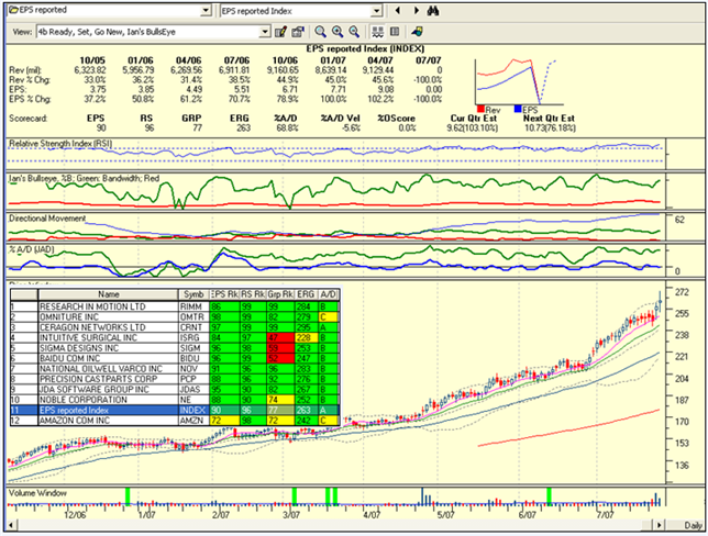
Last night I gave you eleven stocks which had recent stellar earnings reports and were bucking the trend of a down market.  I called it the “Last Chance for the Last Dance.”  The $64 question is whether the strong performance today of the stocks in the Index is the expected Dead Cat Bounce or an Irish Jig with this Index leading the way to new highs. 

One day does not a market make, but I note that the Index is up 2.53% already, based on buying 100 shares of each stock for a total outlay of $117,102, up $2905 already.  Of course the outlay can be scaled to just $10,000 for a gain of ~$291.  Ten of the eleven stocks are up so this clearly shows this group is made up of leaders, with only Amazon (AMZN) taking a breather after its stellar earnings announcement. Now, let’s come back down to earth and reality.  The purpose of this Case Study is to show you that there are all kinds of opportunity in the market if your timing is right and you are nimble with Strong High Growth Stocks (HGS).   

Here is the lesson learned: 

  1. When a market is badly oversold, the pendulum invariably swings the other way 
  2. When Earnings Reports are out, look for those that have reported stellar earnings   
  3. If you are a very short term trader, select a basket and be at the ready for the next day 
  4. Wait for how the market reacts the next day and then decide whether to take the basket or selected stocks from that basket depending on their behavior and the Market. 
  5. If the Market goes up, you will invariably be on a winning trade.  Now you are in the driver’s seat and can play for short or longer term gains. 
  6. Recall I said the purpose of this select list was to determine when the Party might be over 
  7. So the tactics must be to look only for short term gains and play close to the exits 
  8. At some point these OVERBOUGHT glamorous stocks will be too fat with profits that they become a target for a correction. 
  9. The best way to measure that point is to use the High Jump Indicator…another proprietary HGSI Indicator.  It is the sum of the 17-dma, 50-dma and 200-dma from the Stock Price. 
  10. So play close to the exits and you will do an Irish Jig with the money you make 

We will know if this was a Dead Cat Bounce for the Last Dance or if the Market has had a minor perturbation like the week of Feb 27, 2007 in the fullness of time.  Nobody knows how the cards will play out, but if “You know when to hold them and when to fold them” you will be a winner.

Last Dance Portfolio

The Last Chance for The Last Dance!

Sunday, July 29th, 2007

As I showed you in the note of July 26 Musings two notes ago and below, the group of stocks I was following to determine the top in the market is now broken.   There is one last chance for a last dance that my good friend Robert Minkowsky has suggested which is to take those stocks that have bucked the trend and are still heading northwards against the grain.  Watching a small list of these stocks which have already reported their earnings will give us a clue as to whether the recent drop in the market was like February 27th for a week or so or whether this time we are headed down for a decent clean out.   Below is the list of eleven stocks to follow and the Index of these to show you that the Index is above the 9-dma (pink line).  If this Index breaks down, the party’s over!  Enjoy

LastChance90

Trailing Stops in Volatile Markets

Sunday, July 29th, 2007

Question:  I read that book “Trading for a Living” that someone recommended and it was good. He recommends a 2% stop, but someone on the board said to use a 6-7% stop… with 2% I keep getting stopped out same day, and with 6% it goes up a bit, but crashes back and I end up losing a bit. What kind of strategy can I use to overcome this problem? 

Answer:  You are not alone…the setting of stops in a Volatile Market as this is, leaves one frustrated more often than not.    It has been a while since I read Elder’s Book, but you need to look at page 260 again.  He was referring to risking no more than 2% of your ACCOUNT equity.  If you have a $100,000 account, then the most you should risk is $2000 on a trade.  If it is $20,000 then you can only risk $400 on the trade.   Let’s suppose you have 10 stocks of $10,000 each for a $100,000 account.  Now let’s suppose you have 500 shares of a $20 stock you can afford to set your stop at $16, lose $4/share and therefore $2000 total.  This is still only 2% of your total account of $100,000.  However, if you hit a bad patch and lose three or four of your trades in a row, and lose $8,000, then stop trading for the rest of the month.   

Now I am not suggesting for one minute you should lose 25% of your hard earned money on a trade.  You certainly should not sit around and let a 6%-8% loss turn into a 25% one before you act. I’m sure Elder never meant that as a standard rule for all trades.  The crafty Market Makers will invariably employ the spidery leg syndrome and swoop down and grab stocks with stop losses that are at around 6% down from the current price and then as quickly as you can say “Jack Rabbit”, they will trot back up again and cause those spidery legs you see (tails) on the end of daily stock prices.  That invariably happens at the start of the day.  The first tip is to try and stay away from such volatile stocks.   

The next point is that any stock that has lost 3% or more in a day is likely to go down further the next day, before it trots back up. Of course you need to watch the volume traded on that day.  if it is light then it may be that the stock is correcting in concert with a poor day in the market.  If on the other hand, it is a high volume day, then for sure you need to think about taking a stock off that is down >3% at the end of the day, and certainly if it is down 6%. 

There is generally two rules people use: 

1.  Support and Resistance Lines:  I’m sure you have watched Ron Brown’s movies on the HGSI Website, and how he always draws horizontal lines showing support and resistance.  Measure the distance from your expected entry point and either set your stop loss at just below that support or pass on the trade if it is too big a percentage to that support level.  In other words, you need to look for tight stocks and be very careful of loose stock patterns. 

2.  The second way is to use Average True Range (ATR):  You can do this on HGSI.  Most look to no more than 2ATR as the limit of their stop loss tolerance.  This then makes allowances for the volatility of the stock and therefore sets different levels for tight or loose stocks.  A tight stock by our definition is one that flies like the geese, straight along the 17-dma from lower left to upper right or an LLUR as we call it for short.  Try to find such beasts.  They are the best long term winners.   

Of course, if you have made 10% or more say in a matter of a few days to a week, and especially these days, then you should make sure to raise your stop loss to ensure that you don’t let a reasonable gain turn into a losing trade.  Again, you may play snakes and ladders with your money (see a note below for what I mean), but that is a caution that we are currently in a highly volatile market.   In the days of wine and roses, I used to say that each base was worth 25% and if you hit a home run you make 100% or a “hundy” as I call it.  Those days are gone for now…the market won’t let you make more than 10%/base for a home run of 40 to 50% maximum unless you are on a huge winner.  I switched thoughts to a Baseball analogy, but I’m sure you get the point.   

One last thought, if you made a little money on a good stock and it ends up taking some back to virtually a very minor gain, wait for the pullback to finish and then take it again.  Most of us fail to take another ride and on the second chance, it will invariably trot off into the sunset, leaving you behind waving feverishly to let you on.  Then like an unruly dog chasing fast cars you buy it far too extended and get whacked. 

Best Regards, Ian.

Using the Kahuna, Eureka and Tsunami to Identify Market Tops

Sunday, July 29th, 2007

Identifying Tops and Bottoms in Market Indexes are always difficult.  However the High Growth Stock Investing (HGSI) software has a unique set of indicators of unusual events in the ebb and flow of the market that give early warning to sit up and take notice. There are three such indicators which all use the proprietary Visual Filter Back Test (VFB) function which enables showing when a specific set of conditions is met.  The appropriate color coding can be used to highlight positive and negative conditions with green and magenta/red, respectively. 

The three indicators featured below are the Eureka, Kahuna and Tsunami as discussed briefly below.  I have used the latest pictures for the Nasdaq to show how these proprietary Indicators were flashing red these past few weeks and should be followed as the days and weeks progress: 

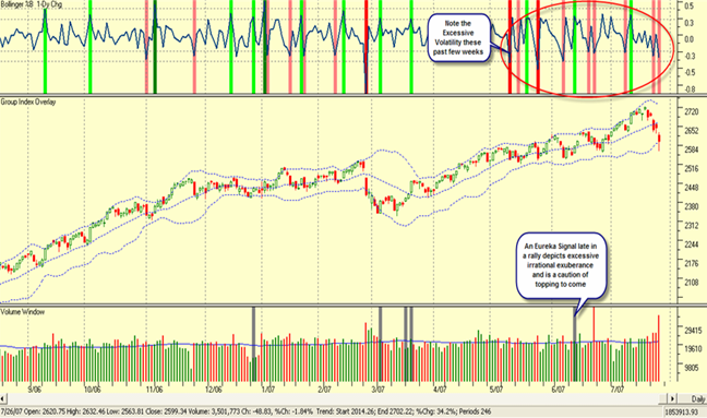
The Kahuna: The first unique indicator provides “one-day” snapshots of major up or down days in the market, i.e. Volatility, as depicted by the long green and red candles in the Price window.  Those conditions are captured by the Kahuna Indicator which has four conditions depending on the extent of the 1-Day change in both Price and Volume.  We use light green and dark green to indicate Little or Big Kahunas on up day and magenta and dark red to indicate the reverse, respectively.  The value to the user is several fold in visually depicting the Volatility in addition to Price and Volume in the market.  Clusters of these green and red bars give clues to market topping or the beginning of a new move, as shown in the chart below:

KahunaChart

Note the light green, dark green, magenta and dark red in the window above the Price Window showing the various types of “Kahuna days” over the past year.  When the bars are closer together that depicts heavy volatility and a sense that the Nasdaq Composite Index is running out of steam and may be due for a correction.  This is apparent from Jan. to late Feb. and again in mid-May to July in 2007. 

The Eureka: The second type of unique Indicator works hand-in-glove with the Kahuna and is called the Eureka.  It is shown in dark grey in the Volume Window on the same chart above.  The Eureka uses a totally different set of conditions based on the ARMS Index than the Kahuna, and is aimed to depict unusually strong accumulation, primarily at the start or continuation of a bull run.  When green Kahunas and grey Eurekas appear closely in the same week it usually signifies the start of a new rally.  However, when a Eureka signal appears towards the end of a Rally as it did in mid-June, it invariably signals caution of a potential correction to come.   Please note that these Indicators can be placed in any window at the whim and fancy of the user.

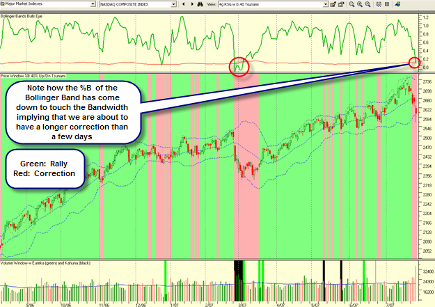
The Tsunami: The chart below shows the VFB indicator being overlaid on the Price sub-window to show a particular market index condition identified and named as “Tsunami” by Ian Woodward. Tsunami conditions were met where you see the chart color coded green and magenta, representing a bull run or a correction, respectively. Once an Index like the Nasdaq has shown signs of choppiness, the Tsunami will first show alternate green and pink zones and then a long downdraft of pink denoting a broken Index. 

   Tsunami

The Tsunami conditions that give the above visual effect are essentially triggered by the Index or stock falling below or rising above the middle Bollinger Band (BB) as shown in the above chart.  Note that when the Nasdaq Composite Index is rising, it sits between the middle and upper BB and is shown in green.  When the Index falls between the middle and lower BB it is shown in red.  The panoramic “pictograph” immediately conveys the feeling of a rally or a correction in the Nasdaq Index and information to the user to either buy, or hold or sell depending on their investing style.

High Growth Stock – Musings

Thursday, July 26th, 2007

Prior to the Market opening this week I said in my Musings note of the 22nd July (see notes below) that we were probably due for a down week.  Sad to say it happened. 

For your convenience I show the table below of then and now (shown in red)

The Market Indexes finished the week on a sour note, particularly in the last hour when they sold off heavily.  Both Google and Caterpillar reported disappointing earnings. This suggests that the Markets may have more on the downside at the start of the week. 


Six important things to watch going into this week (23July):                                     

                                                                                                                            26July

  1.  The Down Jones Transportation Index – Must hold at 5225 and bounce up        5069.43

  2. The Philadelphia Semiconductor Index – Must hold at 535                                 511.94
  3. The Nasdaq 100 Index – Must stay above 1995                                               1970.97
  4. The Volatility Index – Must come back down below 15.00                                    21.65
  5. The 10 Year Bond Yield Index– Must stay below 49.50                                       47.92
  6. Watch GOOG, RIMM, AAPL and FSLR – Must hold with minor loss.
  7. As we can see only one item is not broken…the Ten Year Bond Yield (TNX), which will be good for equities but bad for the bonds.  The triple A’s are running into trouble.


    The $64 question now is what’s next.  The answer is simple…the numbers shown above must quickly turn back above the “Lines in the Sand” or we are headed down for a decent correction and a further clean out.


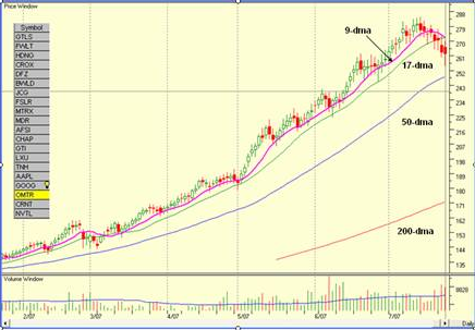
    The Twenty Stocks I recently follow shows the Index has turned down drastically, so all-in-all we have a bleak outlook:

    ian-blog.png 

Copyright © 2007-2010 Ian Woodward
Disclaimer: Commentaries on this Blog are not to be construed as recommendations to buy or sell the market and/or specific securites. The consumer of the information is responsible for their own investment decisions.