 Ian Woodward's Investing Blog
Volatility, the VIX, S&P 500 and High Jump

Since most of the country is blanketed in snow at this time of the Year, the Picture above is the HGSI Team’s Seasons Greetings to all of you our loyal supporters and to the blog friends we have made around the world. Consider this blog as my Christmas Present to all of you.
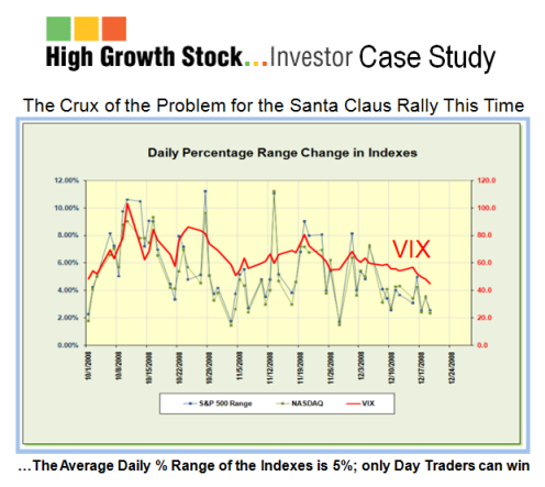
In an earlier blog just two weeks ago, I showed the Daily % range change in the Indexes together with the VIX since October 1. I noted that “the Crux of the Problem for this Santa Claus Rally is the fear exhibited by this chart which shows the average at 5% (between friends) together with a VIX >50!” At the time I did not know how these few weeks going into the traditional Year-end and the January Effect Rally would pan out, but I felt I should revisit this concern and shed more light on the subject.
The intent of this Case Study is to see:
1. The Volatility as expressed by the VIX and the % Daily Range of the S&P 500
2. The extent of the extreme Volatility the Market has endured these past four months
3. If there are any signs of an abatement to this high Volatility
4. The Positive & Negative swings and Nasdaq, Bingo & Eureka for the past four months
5. The comparison of the past four months to what preceded it the previous 12 months
6. If the High Jump Indicator could shed any light of the Volatility in 2002-03 and now
So let’s take them one at a time as follows:
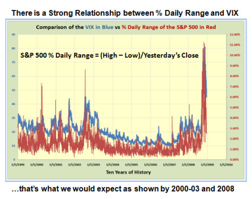
As we can see from the chart above there is a strong correlation between the % Daily Range of the S&P 500 and the VIX. % Daily Range is defined as the (High – Low)/ Previous Day’s Close, expressed as a percentage. Note the spikes that occurred back in 2000 to 2003 just as we have now, though the % Range and the VIX Readings were much less than now. However, also note the extreme volatility is also accompanied by big spikes in the % Daily Range readings, which was shown in the previous chart, confirming the strong relationship. There is nothing novel in this since my friend at VIX and More has very eloquently described long before now. I recommend you visit his site.
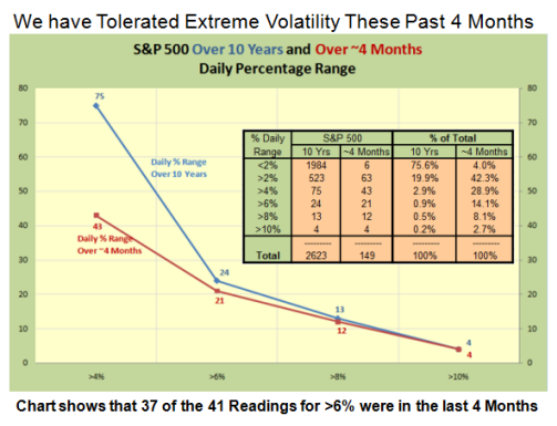
This chart is an eye-opener as it shows in a flash the extent of the extreme readings in % Daily Range these past four months compared to that over a 10 year period. Over a long period of time the normal expectation is a % Daily Range of <2% which occurs three-quarters of the time. 95% of the readings are under 4%. 37 of the 41 readings above 6% this past four months is a staggering 90% compared to 10 years. The conclusion is that the Market Fear Indicator has been in Oscillation!
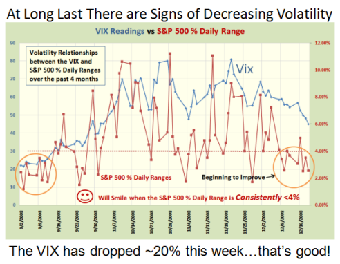
The chart above shows the extreme readings of over 11% with very few below the 4% mark. However, note that in the past ten days with the tight “handles” produced in the S&P 500, and for that matter in all the other indexes, the volatility in the VIX has dropped substantially along with a drop in % Daily Range to below 4% for the most part.
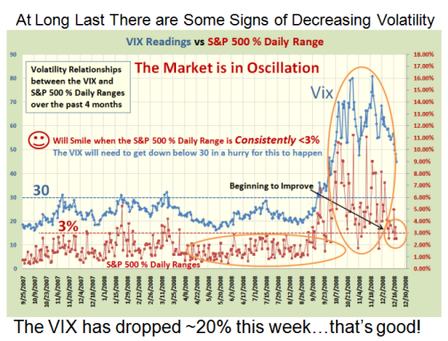
This chart shows a longer term view of where there was some degree of normalcy despite the fact that we had chalked up several readings in the VIX of ~30. The Bears are a trifle concerned at the recent drop off in the VIX, but are hoping that it will find support at the 200 day Moving Average and bounce higher. The Bulls will only smile when the S&P 500 % Daily Range is consistently <3%, and the VIX gets down below 30 for this to happen.
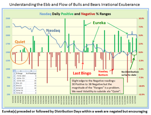
This chart shows the Ebb and Flow of the Positive and Negative swings by the Bulls and Bears, and the Irrational Exuberance expressed by the Eureka signals we have come to respect as a sign that there is at least some interest by long term value investors to grab some tasty morsels in the hopes that we have reached a bottom for now. The updated late breaking news is that we had yet another Eureka this past week (not shown on the chart), but the Market Indexes are all stuck in a trading range.
Now comes the tricky part…which way does this tepid Santa Claus Rally go…up, down or sideways? I felt it might be fun to bring out my trusty High Jump Indicator and show its value in another form. The chart below shows a comparison of the High Jump for the 2002-03 timeframe and now in 2008.
Some have noted that this tight trading range is very unusual for all Indexes showing identical patterns that it suggests a coiled spring and a dramatic move one way or another. Others suggest that it is not surprising that the market is meandering in a trading range.
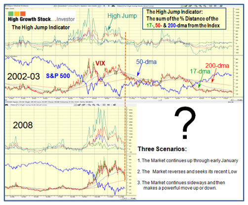
There are two ways to line up these charts, either have the Peaks of the High Jump in line or the cross over of the 17 and the 50 Day Moving Averages. I chose to use the latter as shown by the dotted Orange Line as that shows the current momentum which is down for the VIX. Tomorrow will be critical to see if all the Market Indexes can push through their stiff resistance which I have previously explained before is at 915 for the S&P 500. Although the Index is now 24% up from the Base Low of 714 which is a point at which many rallies get turned back, my feel suggests “Up” for now, but who am I to say. I base my bias on the fact that the Internals of the Market such as the % of Industry Groups above 50-dma is now at 80, the Number of “A” and “B” Accumulation Groups is 22 and 111, respectively, and Bongo Daily and Weekly Stocks are at 3165 and 1794, respectively. These are numbers we have not seen since June of this year.
Seasons Greetings and all Good Cheer to you and yours. Spare a thought for the HGSI Team. We like to hear from you. Ian.
P.S. If you have never tried HGS Investor sign up for our free 60 day trial. www.highgrowthstock
