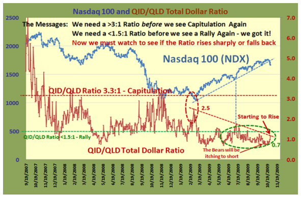
Question: thanks…so the QID is short the NASDAQ x 2 and the QLD is long the NASDAQ x 2. The ratio of 3.3 to 1 needed to signal capitulation means that 3.3 times higher volume (or is it dollar value) in the QID (the short one) is the telltale sign things are turning to custard big-time? Have I got that basically correct?
And conversely, if the QLD (long NASDAQ x 2) is showing only 1.5 to 1 higher ratio vs. the QID then it is time to buy again…
And not having heaps of time, a glance every day at the volume of these two ETF’s will give a glimpse of the underlying behaviour of larger market participants to indicate possible market direction? Kiwi Keith
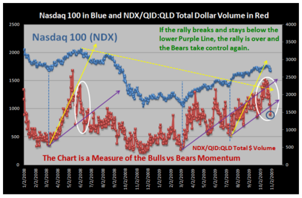
Answer: Kiwi Keith: Now you’re cooking, you have it close enough for government work. But let me make sure you know exactly what is involved. Let’s take a specific case like today to show you what you are looking at in the “Green and Yellow” chart on the previous blog, and why Maynard and I feel it captures the relationships between the two regarding which way the wind is blowing in the MARKET!
If you trot over to Yahoo Finance and type in the QID and QLD you will get the following numbers:
Date Open High Low Close Volume Cl x Vol Ratio
QID 11/2/2009 24.13 24.54 23.46 23.97 40,304,907 966,108,621 1.182
QLD 11/2/2009 47.81 49.12 46.97 48.08 16,996,844 817,208,260
The second last Column is the Close Price x Volume for each.
QID/QLD Total $ Volume Ratio = 966,108,621/817,208,26 = 1.182
NOTE! If your numbers are slightly different sitting in sunny New Zealand, don’t worry about it…it’s close enough for gov’t work.
What concerns me is that although you have it pegged right that 3.3 times means “custard big-time”, that happened back in November 2008, and it is important to undestand WHAT it takes to get to that ratio. It is a totally different state of affairs than now and the numbers back on 11/12/2008 just 10 days short of a year ago looked like this:
Date Open High Low Close Volume Cl x Vol Ratio
QID 11/12/2008 76.87 81.80 76.11 81.40 49,680,200 4,043,968,280 3.388
QLD 11/12/2008 28.14 28.45 26.22 26.39 45,231,000 1,193,646,090
Big Difference…and let’s hope we don’t see that again during any correction we might have going forward. My point is that you will know full well when the Market is falling apart long before we see a number like that.
“And not having heaps of time, a glance every day at the volume of these two ETF’s will give a glimpse of the underlying behaviour of larger market participants to indicate possible market direction?”
Now you are on the ball and almost correct. If you cast your beady eyes on the price of the QID and QLD, you will see the price difference is 2:1 in favor of the QLD at this time. Since you don’t have heaps of time, all you have to do to see which way the wind is blowing is divide the QID VOLUME by 2 on the day and if it is running higher than the QLD volume, you know that the ratio is >1 and if lower, then the Market favors the Bulls with the ratio <1. Otherwise, do the math as shown above.
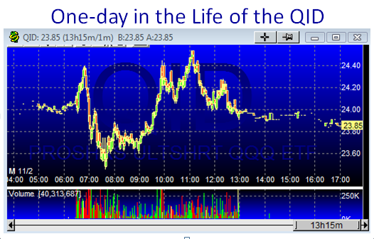
But Kiwi…life is not that simple, especially for Type 3 people like you. Since you do not have time to watch the market all day long, the INTRA day swings are humongous right now. There is a 4% swing from Low to High and the QID essentially finished flat…16c between the open and close is no biggie.
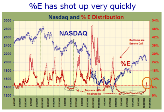
I sense you have lopped onto the “twofer one” of the QID and QLD, and gambling types are playing “threefers” which is the whole attraction of these ETF’s. A Type 3 playing with Type 1 toys gets slaughtered unless they are nimble. These are primarily short-term instruments unless you call the Bottom and the Top precisely:
I hope that clears up your questions and that you are understanding the value of the above chart to keep you on the right side of which way the wind is blowing in the Market. So much to learn, so little time.
Best Regards, Ian.
 Ian Woodward's Investing Blog