Ian Woodward's Investing Blog

Archive for June, 2010

The AAPL Food Chain Index

Monday, June 28th, 2010

Many thanks to many of you who wrote expressing your positive feedback on the last Blog, where you liked the Limbo Bar and more especially the piece on the AAPL Food Chain Index.  For those of you who have the HGSI Software, here is an idea of how to keep an eye on which way the wind is blowing.  Just watch how the %B changes on a daily basis.  You don’t have to go through all I have done below, but just five minutes of your time will give you the answer: 

aapl food chain

The Bottom Line Messages: It was essentially a Standoff today: 

1.  %B is up from 0.69 on Friday to 0.74 today which is good

2.  Three stocks were up, four stocks were down, & the Index was down slightly

3.  OVTI was the biggest up and SNDK the biggest down

4.  Volume was generally down as was the Market, except for OVTI and CRUS

If you get different results, don’t blame me because you forgot to Index from 03-09-2009.  Go to the Designer to set the date and then build it for this one Index.

Enjoy!  Best Regards, Ian.

A Bear Market Looms Unless we get a Miracle

Saturday, June 26th, 2010

I sat and watched Ghana defeat the USA in the World Cup this afternoon and I guess it adds to my gloom as I try to make sense of what has transpired this past week on the Stock Market.  After surviving a 14.4% correction on the S&P 500 with two Eurekas and Kahunas, it seemed that we were at least headed for a decent rally before we hit resistance at the Heads and Shoulders Top area I warned you about.  It was not to be…we are now sitting with a couple of quick Phoenix Impulse Signals this past week to show that the Bears are once again firmly in control.

The net conclusion is that this market is in Oscillation with Intra-Day, Intra-Week and Inter-Week Volatility the likes of which we haven’t seen since the Black Swan Days of October and November 2008.  It may be a trifle early to be trotting out an old favorite picture at this juncture, but let’s blame it on my mood with the loss in the World Cup. 

                           billy

I have made good friends through this medium with a man named Billy who lives in Belgium and whose work is second to none, which he shares willingly and helps me understand the very short term trading that is the vogue these days…of necessity.  He has a good sense of where the Large Players are at and the way the wind blows, not withstanding the High Frequency Traders (HTFs) we have to tolerate who can push the market as they please when volume is low.  Just look at the see-saw action with big up and down days this past seven weeks and you will see that this Market is not for the faint of heart.

nasdaq

Those of you who follow my blog regularly have now become accustomed to seeing the value of this next chart as time goes by.  The Red, Orange and Green Bars at the right hand side of the Chart says it all to describe the extreme volatility and echos what we have seen in the frequency of big 1-Day swings in the chart above.  By the way, please understand that these positive and negative Impulse Signals of the ARMS Index (TRIN) coupled with the Kahuna Signals shown in the bottom window are “rare beasts” as they occur at the “Fat Tails” end of the Normal Distribution as John Bollinger calls them.  That is the true value of the chart, i.e., Volatility not seen before in the eleven years of history.

roadmap

Some people like to see numbers instead of words.  I will warn you please do not write to me and say you can’t see the NUMBERS…that is not my purpose for even sharing this research with you.  My purpose is to show you that we are able to take John Bollinger’s %B and my %B 1-Day Change (Kahuna) to a higher level, by displaying the so-called “Interior Decoration” of  the 10 Market Indexes and its Composite Average for these two factors.  My good friends Bill Roberts and Tom Ellis produced this chart for me and I thank them.  

As you can see the colors speak for themselves where obviously Green means good and covers a %B range for above 0.8, i.e., close to the Upper Bollinger Band, 0.2 to 0.8 is in white where numbers below 0.6 to 0.2 is the area where the stock is potentially vulnerable and is the zone I call “Fakey”.  It ties in with the description on the previous chart, and can turn a potentially good rally on its heels and is an area of caution.  Anything between 0.2 and “0” (zero) is colored Yellow and therefore extreme caution, and below “0” is Red as that means the Index is below the Lower Bollinger Band.

Bear spreadsheet

For those whose eyes are rolling in the back of their heads and are only interested in the bottom line, the message is that we have not seen action like this since the MAJOR DISASTER back in Oct-Nov 2008, and the only exception is that so far we have been spared with only a 14.4% correction on the S&P 500.  My point is that with this amount of volatility we have an extremely unstable market and can potentially head down into a Bear Market if there is no Major Bounce and strong rally next week.   Note that the Composite %B for the ten Indexes is at 0.39, and one more Phoenix to the downside will be enough to throw this Market back into the red on the chart.

To add salt to the wounds, just look at the next chart which shows the Industry Group “A” Accumulation and the “E” Distribution and we can see they are both in limbo…a standoff.  “E” Distribution was recently as High as >60 Groups or about 40% of the Groups, but it has retreated after the attempted Rally two weeks ago.

acc

You know me better than to leave you hanging without giving you some feel as to what to look for next week.  Time and time again simple tools have given us the clues.  We have seen the value of the High Jump which accurately gave us the reasonable expectation for when this market would top, which I featured on this blog several moons ago. 

Now my good friend Mike Smith sent me this picture to remind me that it is time to get out the “Low Jump” or Limbo Bar as I like to call it.  It proved valuable during the Black Swan days, so here first is the picture of Chubby Checker doing the Limbo just to remind you of fun times past:

                        limbo

We are close to the -6% line DOWN from the 200-dma to the S&P 500 Index so watch out that it doesn’t go any lower:

200

…And here is the picture for the 50-dma.  The message is simple, we CANNOT see more than 6 to 7% down, before the floodgates start to open:

50

Over the past month or so I have focused you on just one stock…AAPL.  Now, I give you the AAPL food chain to enjoy.  As you can see these stocks in this next chart have prospered due to their close ties in providing components to Apple’s product line.  The important thing from this chart is that the Composite Index %B is at 0.69…far higher than the 0.39 I showed you earlier for the Composite of the Market Indexes.  These stocks should be watched carefully next week to see if they hold or give up the ghost.  They are the last vestige of hope for the Bulls, but are vulnerable as they are fat with  profits:

aapl

Best Regards, Ian.

Beware the Black Cross Cometh!

Tuesday, June 22nd, 2010

The message given today’s debaucle is simple:  Beware the Black Cross Cometh!

            black

With a Phoenix today, the rally is in big jeapordy, unless it is nothing more than game playing by the Big Boys.  Understand I suggested in my last blog that you watch out for Step #3 …the dreaded Head and Shoulders Top! 

The Bulls must step up to the plate tomorrow, otherwise watch out below.  If the 50-dma comes down heavily through the 200-dma on the NYSE, we have a Black Cross, or some call it the Death Cross.  Take your pick.  The other Indexes are not quite there yet, but it could set the mood.

Best Regards, Ian.

Stock Market Blues: Where’s the Beef?

Friday, June 18th, 2010

Mailbag:  My friend David Elliott wrote:

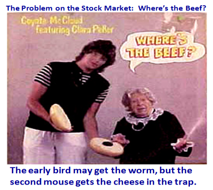
Ian:  Many moons ago you wrote “Where is the Beef”.  As I remember it was a market that climbed higher on low volume, but eventually failed.  Is our current market similar?

Hope you have a good day.  Why not play golf; the market seems to like it when you do.  David

              beef picture

Well David, you have a good memory and your wish is my command as I watch the U.S. Open at Pebble Beach, along with the Soccer and of course the Lakers, yesterday.  If the Market can do as well after a hard fought series we should gradually see this Market rise out of the ashes.  But you are right…the Volume has been a trifle putrid, but we must have patience as we have only achieved Step 1 of the Recovery.

major

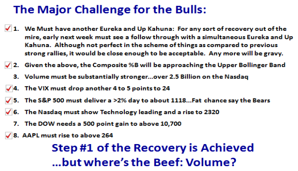
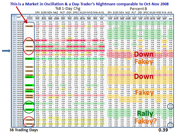
I hear Hsin saying:  “All Ian’s bullish signals have been fulfilled, so should we be bullish now?”  Short term traders have long since closed out their shorts by and large after that rotten FTD call by our friendly newspaper.  We waited patiently for the two Eurekas and simultaneous Kahunas and the Composite %B >0.50, so yes the requirements for a Rally were met.  However, that does not guarantee a successful Rally, just a start to getting off the bottom.  So Day Traders turned to the long side once they got the second FTD, the earlier the better since the Early Bird catches the worm.

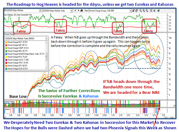
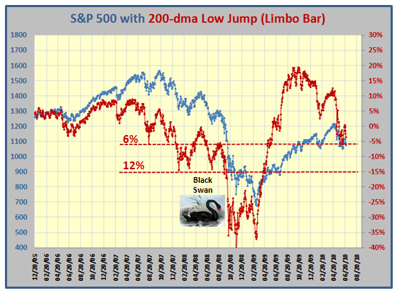
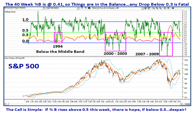
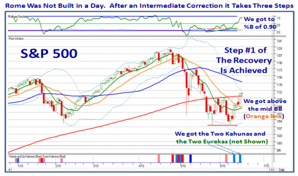
Rome was not built in a Day, and after an Intermediate Correction which has been this deep, i.e., 14.4% from High to Low on the S&P 500, and in this case, we need three steps in all to get out of the woods to a fresh solid rally.  Here is the picture of what was achieved this week:

rome

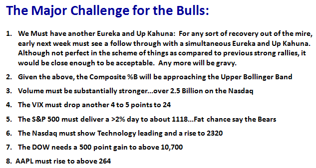
That’s not bad for a week’s work, but now comes the next step which is harder.   My good friend Dave Baratto reminded me at the March Seminar…”Ian, with all the new good stuff, we are inclined to forget the golden rules of yester-year you have taught us regarding Classic Recoveries”. 

I gave you that Winky-winky in my May 30th Blog, so please go back and see the Chart Pattern.  However, here it is for your convenience, and I have stuck the need on the Right Hand Side of the chart, so that the challenge is perfectly clear:

1.  We must rise at least half-way up the right side of the cup
2.  We must form a handle…Cups without handles will burn you
3.  The 50-day Moving Average must be flat to slightly pointing up
4.  A breakout above the Declining Tops Line (DTL) from the high to the top of the handle, aka…the 405 Freeway.
5.  The 9-dma >17-dma >50-dma with the moving average crossovers
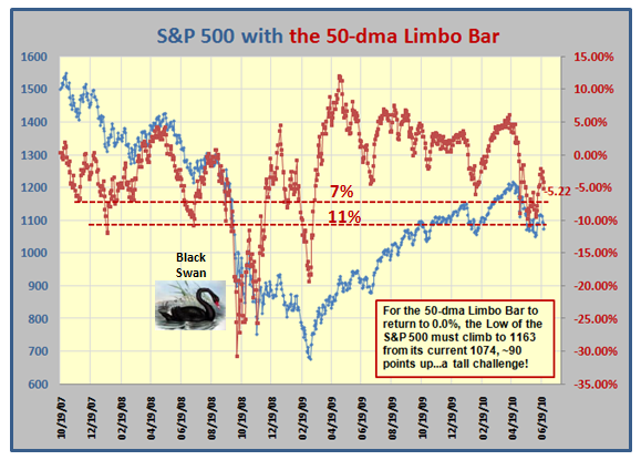
So here is Step #2:

step2

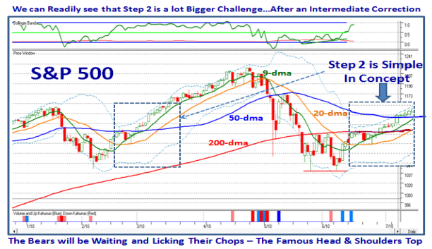
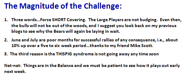
Obviously the longer you wait, the higher the Indexes rise and sooner or later there will be a correction.  So far the Bulls have dodged a bullet as the market has risen at least five days in a row.  One might have expected a correction today being Options Expiration Day, which is certainly a surprise, though nothing should surprise us these days.  The correction can come in two forms, a minor tight move sideways to form the most important requirement in Step #2 which is a “Handle” or the rally fizzles and goes down as a bust.  Don’t forget this:  Handles must of necessity have light volume as a signal that bulls and bears are in agreement on the value of the Index or stock.  Then the breakout must have high volume…mark my words, or it fizzles.

And now we come to Step #3.  This comes with always understanding three Scenarios and recognizing what your Competition is thinking and is up to.  I did it all my career…”Know thy Competition”.  If you are Bullish then at least understand the Bearish Scenario and vice versa.  If the Market has just come out of an Intermediate Correction or worse, you must recognize that the Bears are just waiting to trounce the Bulls, especially if they were trapped themselves on the wrong side of the market.  It goes without saying, but I will say it, that is how the favorite patterns of Double Tops and Head and Shoulders Tops come about especially when they coincide with the 50-dma in the case of the right shoulder!  The higher the Indexes rise towards the 50-dma or 200-dma (whichever applies in this case), the more the skeptics of the move rub their hands, and those who are feint of heart never get in until it is too late.  It’s all a case of Approach, Style and Stomach which is different for each one of us…so here is Step #3:

step3

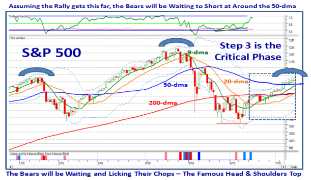
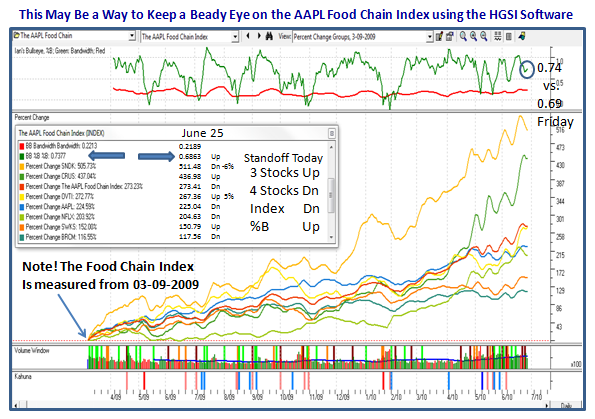
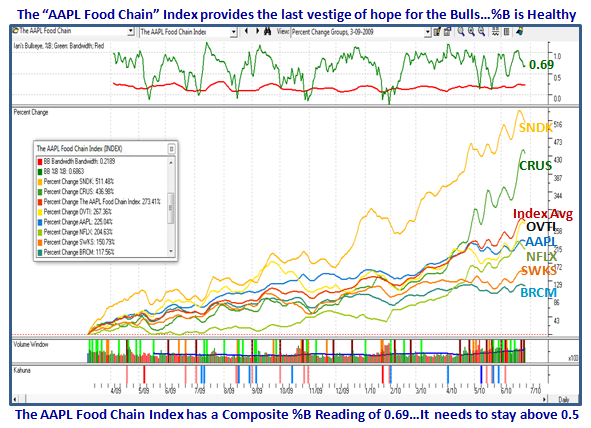
I didn’t say it was easy, but at least you know what to look for.  Remember this, there is absolutely no harm in establishing Targets which come from the discipline and experience of Stakes in the Ground, Measuring Rods and Rules of Thumb.  That suggests you have done your homework.  Never fall in love with a Scenario, but you will immediately recognize which one the Market is telling you it is on.  The Major Challenges I set have been met, but then that sets the stage for a worthwhile rally, especially as the canary, aka AAPL has more than a dose of oxygen and looks a trifle “Perky” since it is now at a new all-time high.  Don’t stop there…when you see the likes of SNDK and OVTI also trotting off into the sunset, you realize that the food chain is also benefitting. 

We started this with “Where’s the Beef?”…and it remains that way as the conundrum for now;  the higher the market goes without volume the more vulnerable, but it’s the second mouse that gets the cheese in the trap!  Whether that is the Bulls or the Bears remains to be seen.  So far, the Bulls are thankful for small mercies, and the early birds are enjoying the worms.  

 Best Regards, Ian.

Stock Market Targets – The KISS Approach

Sunday, June 13th, 2010

In reviewing the Blog Note I wrote yesterday, I realized that the Multi-Taskers might like to see the KISS Approach, so here it is in one slide with the key Messages at the bottom of the picture. 

    Kiss Picture

Others who want to learn how to get to the bottom line or as I call it “So What?”, will always ask “Why?”  So for those who want to dig further to see the rationale the next two slides should do the trick:

kiss daily

kiss weekly

…And then there are those who prefer the words instead of the music and look for the “What, the “When” and the “How?”  That is what I gave you yesterday, but to keep it simple for you because “I don’t have time, Ian” here it is in the next two slides:

Major

magnitude

But before we get too excited about all of the above, I warned you last week that the Volume was pitiful, especially with the likes of the Nasdaq and Russell 2000.  My good friend and partner, Ron Brown, summarized his Weekly Report as follows “The most striking thing about the market rallies on Thursday and Friday was the lack of volume.”  Make a point of catching his valuable weekend movies at:

www.highgrowthstock.com/WeeklyReports

So there you have it just as you get it on all my blog notes, the Newsletters and the Seminars…”The What, the Why, the When, the How and the So What”.  There is no substitute for seeing how your stock portfolio is doing, and then having the appropriate key candidate lists for both the long and the short side.  In the most recent work we have done that is exemplified by the JIRM list, which needs to at least be outperforming the Market Indexes (which it is), and then the fresh list of new candidates which should be providing respectable bases and attractive set-ups.

Please understand that I primarily focus on the Market and Tops Down analysis on this blog, but you ALSO KNOW that I do my homework with what others would call a Bottoms Up approach.  Call it what you wish, the HGSI Software provides the flexibility to fit your Approach, Style, and Stomach…I’ll spare you the acronym!

Lastly, don’t suffer from Analysis Paralysis…get to the “So What” Synthesis quickly.

Best Regards, Ian.

Copyright © 2007-2010 Ian Woodward
Disclaimer: Commentaries on this Blog are not to be construed as recommendations to buy or sell the market and/or specific securites. The consumer of the information is responsible for their own investment decisions.