 Ian Woodward's Investing Blog
Taking the Market Temperature with %B & Heat Maps!
Monday, July 5th, 2010The other day I was discussing with Ron Brown and Chris White how I had found a way to expand our repertoire of uses for the Bollinger Bands %B, and here are the fruits of those efforts. Having shown him what I was doing, Chris not only came up with a Back History database of what I was looking for using his EdgeRater Software, but also suggested using Heat Maps as a quick way to view big globs of data to show the results…so here it is with a tribute to Chris for his good work and friendship. There is no way I could have so easily developed these pictures without Chris’ EdgeRater Software at www.EdgeRater.com.

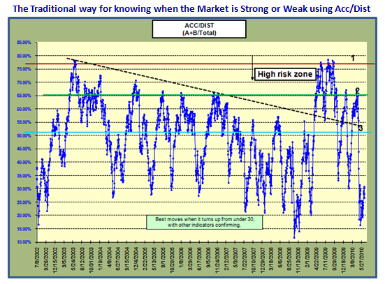
I have shown you many times on this blog, in the newsletter, and at the seminars how we traditionally evaluate the strength or weakness of the market using Accumulation/Distribution for both Industry Groups and Stocks. I usually refer to this as learning your ABCDE’s, and here is one of the Charts I use:
Using Chris’ idea, we can look at similar data with a Heat Map in Excel and it would look like this for the last 10 weeks as the Market peaked and then gradually deteriorated to the point where it is now broken. The colors are enough to give you the concept since a picture is worth a thousand words…or in this case numbers.
By now, I am sure you are saying “But Ian, the previous chart gives me a better picture of when the market is rising or falling.” And, you would be right, but stick with me as I unfold the concept I came up with to get a better feel for the changes in the Market as well as its volatility, which unfolds a lot faster before your beady eyes:
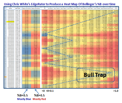
Since this is a new view, it needs some explanation to understand the technique I have used for %B:
1. Besides the Date and S&P 500 Close Price Columns, the next two are the most illuminating.
2. They are the % values for stocks above and below %B of 0.5, i.e., the Middle Bollinger Band.
3. You don’t have to study the numbers…the colors say it all, blue in the LHS depicts a weak market, and in the right hand column a strong market. The Market peaked on 4/23/2010 as shown in yellow and as we see, the market was strong being blue. It didn’t take but five days for the blue color to shift to the <0.5 column showing that the Market had weakened within that timeframe, and stayed that way essentially all the way until 6/9/2010.
4. We then see a small patch of blue on the >0.5 Column for five days where the bulls thought they were off to the races one more time only to find that the promise of Follow Through Days, Eurekas and Kahunas all died on them. Their hopes were dashed with a quick return to big blue numbers in the <0.5 column where we have been the last four days. It turned out to be a Bull Trap as shown on the diagram. This Market is Broken.
5. The Message is clear: The shift is very quick when the Market has very high volatility, the likes of which we have not seen since Black Swan Days in Oct-Nov 2008. This quick shift is invaluable in giving an early warning of which way the wind is blowing, and more importantly with what degree of strength. %B is the quickest way to see Market Rotation.
6. The rest of the chart shows how I broke the “buckets” down into smaller intervals of 0.1 at a time, i.e., those stocks less than 0, followed by those between 0 and 0.1, etc. etc., with >1.0 the last column.
That should whet your appetite for my Newsletter which is due out in a week and will show you the Rest of the Story, including what to look for, if it has not already happened by then. I will dove-tail the Heat Map concept with Filters in HGSI and you will enjoy Manna from Heaven!
The Market is so oversold that we should expect a Bounce Play next week…how long and how strong is in the lap of the gods.
Best Regards, Ian.
