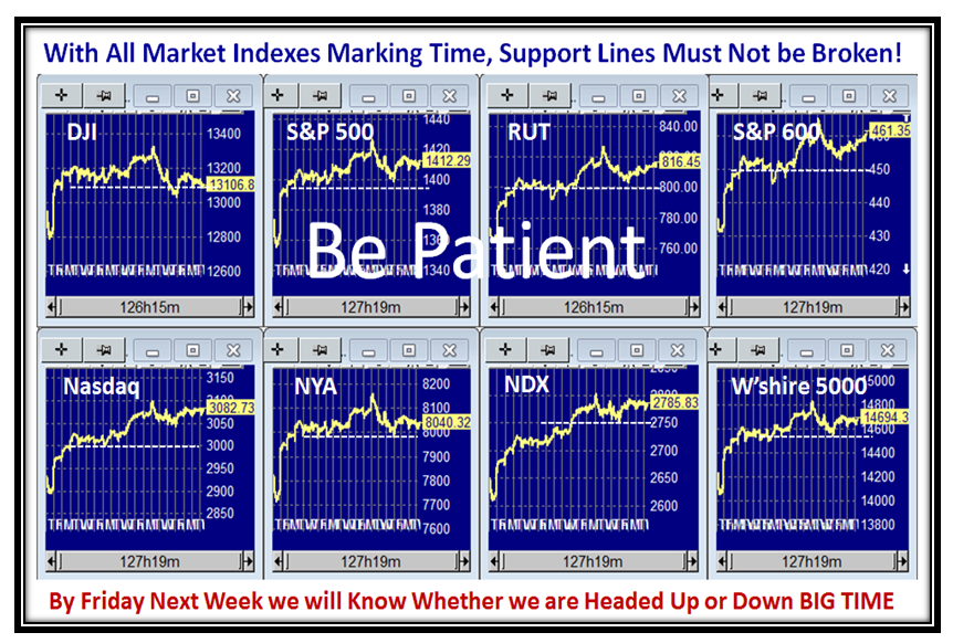
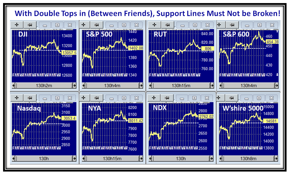
We were spoiled with two solid weeks of the London Olympics, while the stock market has been slowly but surely inching up to the point that Double Tops are now in sight:

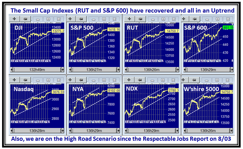
We now have all eight market Indexes in a tight channel, with even the Small Caps showing a burst of speed:

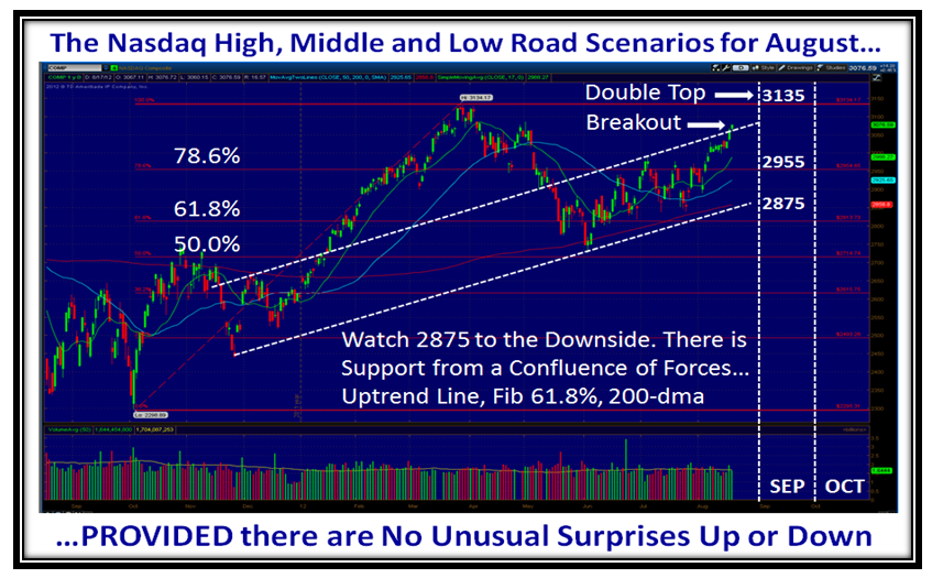
…And here are the High, Middle and Low Road Scenarios for the Nasdaq. There is strong support at 2875 so if there is any untoward problem and the markets trundle down, that area should provide the stability, and if not run for the hills:

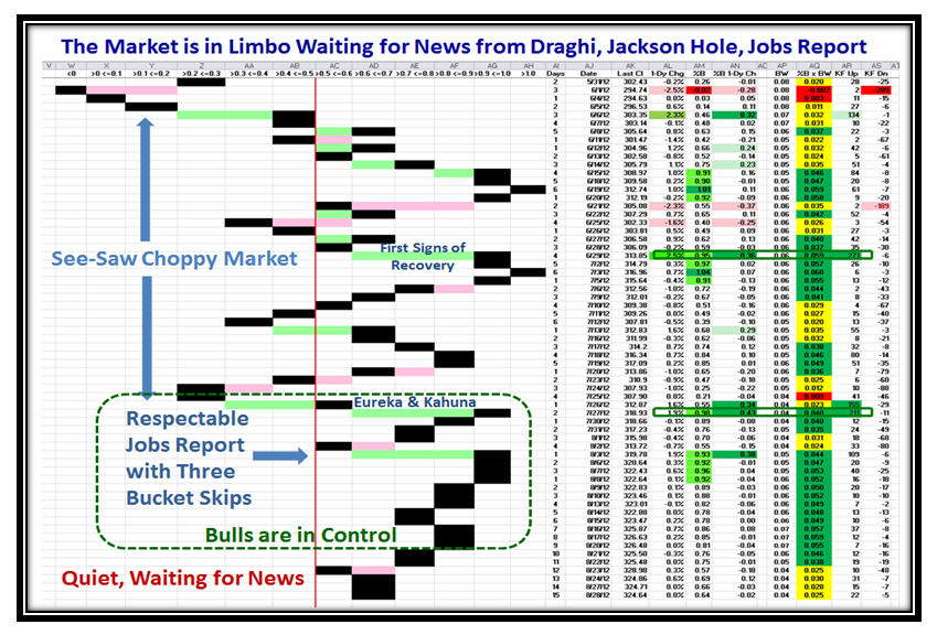
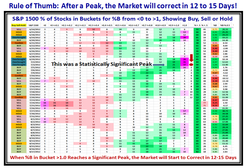
I haven’t used this chart for sometime, but there is a tremendous amount of information relating to Fear and Greed and I will always be indebted to my good friend Pat Turner for her thinking in depicting the ebb and flow of the Market, and in this case the S&P 1500. Given that we have 12 years of history for this particular view, the colors of light, medium and dark green or rose represent 1, 2, and 3 standard deviations from the average. In addition she painted the two extreme buckets with Pink to emphasize when the markets are either oversold or overbought. I have been able to milk this view further by noting the statistics for the peaks and troughs. I am sure some of you remember that once a Peak is reached and expecially one as significant as 37% in Bucket >1.0 on 07/12/2012, it pays to start a count of “Twelve drummers drumming” and invariably within 12 to 15 Days the market will have drifted into a correction. You can take that Rule of Thumb to the Bank!

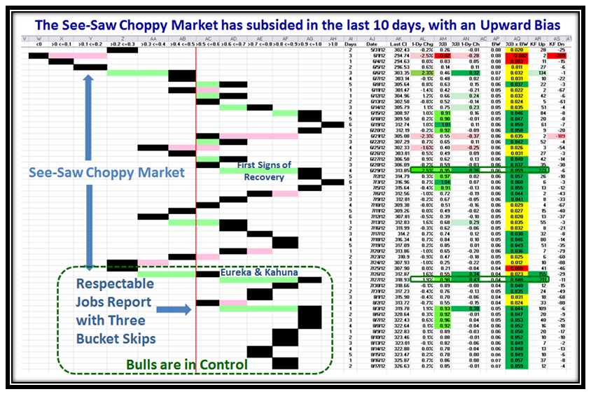
Here is another one of Pat Turner’s Priceless Charts, which opened up a whole new vista for my work on which I continue to build. As a result, I have recently been recognized for my work by the Market Technicians Association (MTA) in their August Newsletter. I am indebted to Chris Wilson, who is a member of this group and a strong supporter of HGSI, and who won an auction and gave me the opportunity to have a luncheon with John Bollinger all of 5 Years ago. My sincere thanks to Michael Carr for spending countless hours developing the story of my contribution to you. Through Chris’ generosity I have built a friendship with John who pays me the tribute of revitalizing his work with several new BB Indicators. What goes around, comes around.

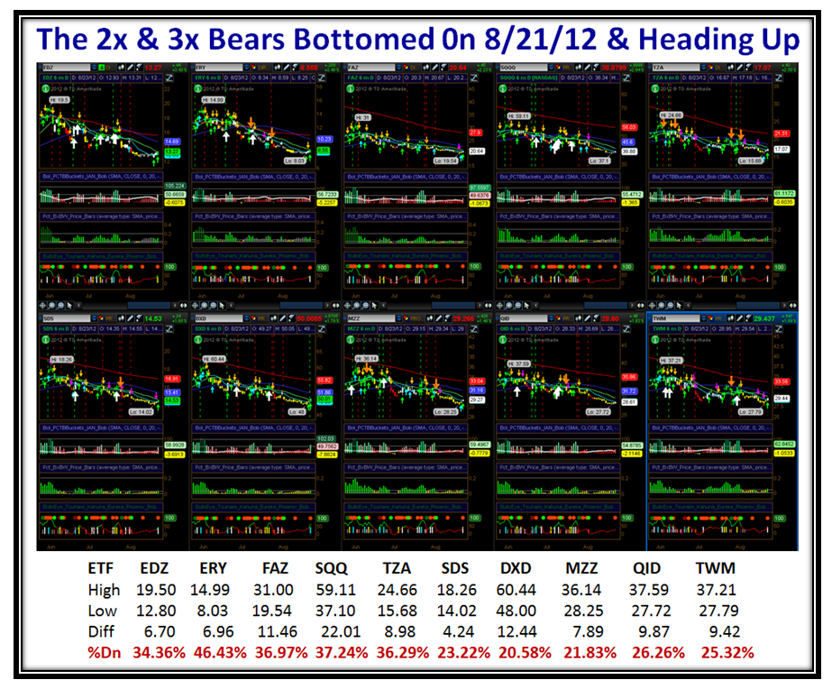
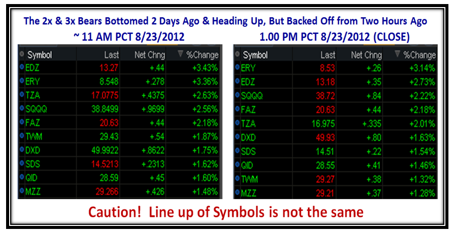
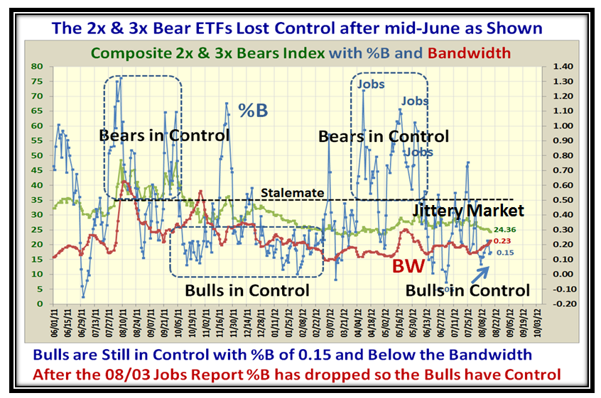
At times like these when there is a noticeable shift in the Market from Bearish to Bullish, I find that one of the clues is to examine the Bollinger Bands %B and Bandwidth using a composite Index of 2x and 3x Bear ETFs. It stands to reason those who use these instruments are quick on the trigger to either pounce in with both feet or run for the hills when they smell trouble as is apparent in the following chart. That should give us a clue as to which way the wind is blowing:

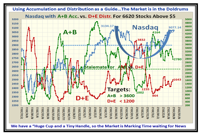
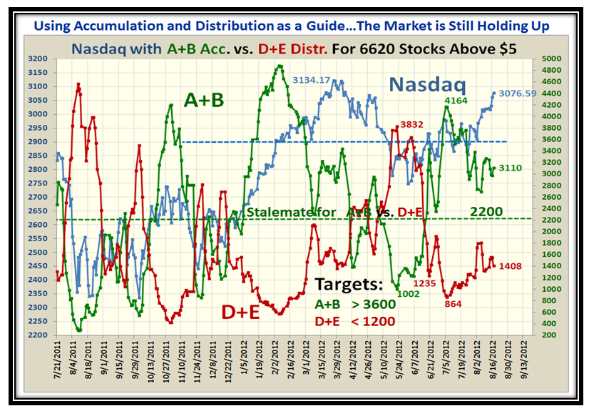
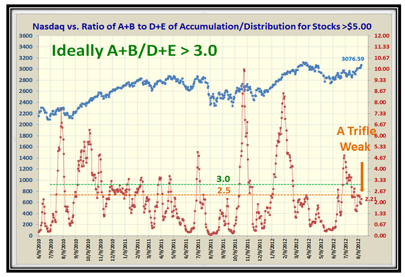
Now let’s turn our attention to the Accumulation and Distribution of the over 6620 stocks in the Database with a price over $5. As I will show in the next three charts that Ratio of those stocks under Accumulation to Distribution is not as strong as we would like. I have set another Rule of Thumb for you in that the ratio should be 3:1 or better. Judge for yourself:


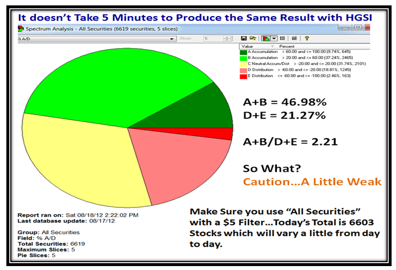
…And here is how you can get the same result using the Pie Chart Tool in HGSI:

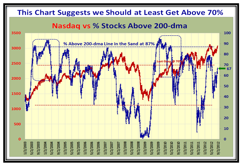
Here are some more Internals of the Market with the % of Stocks for the Nasdaq above the 200-dma:

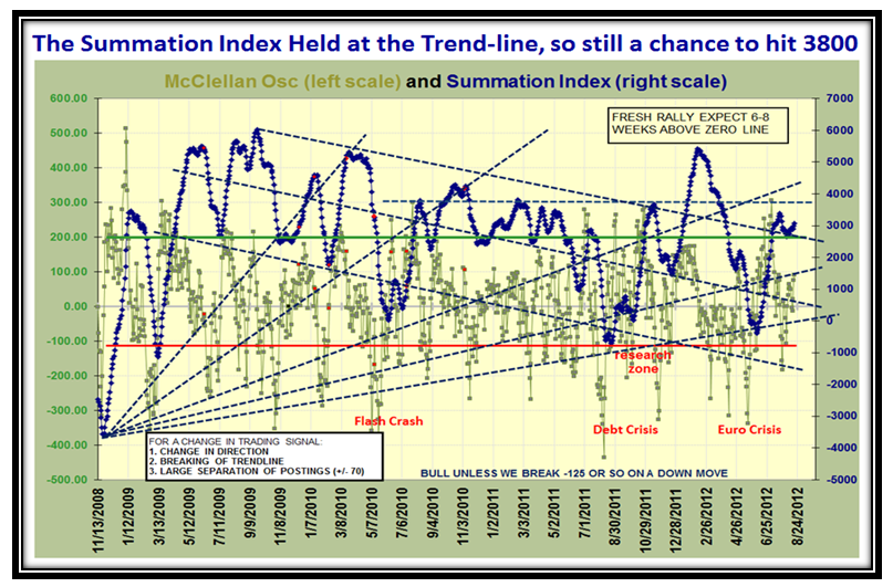
…And here is a chart of the McClellan Osc. and Summation Index which shows we have a reprieve:

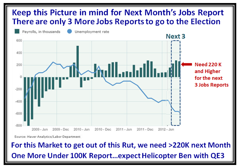
Finally, make sure to have a copy of this chart by your side in two plus weeks time, as we will be staring at the Jobs Report and you know how that goes when it is good or bad. I have done my usual trick of taking a snippet from the past to show what would seem to be reasonable for the next three months:

Thanks to all of you who give me feedback and encouragement in putting these Blog Notes out…it does wonders to keep me going as I am sure you can see the work that goes into one of these. Thanks also to the worldwide audience which is growing all over the world…let’s hear from you in the comments section at the bottom of this note.
Best Regards,
Ian
 Ian Woodward's Investing Blog
