Ian Woodward's Investing Blog

Archive for May, 2013

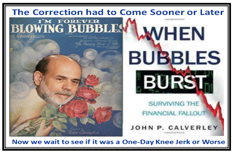
Stock Market: When Bubbles Burst?
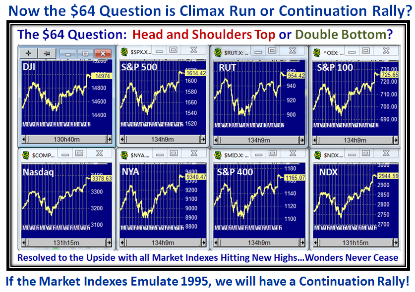
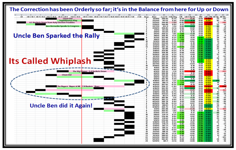
Monday, May 27th, 2013

It’s no news to you that we had a Climax Run blow off on 05/22/2013 when most Indexes hit new highs and then the next day we had a knee jerk down.  However as you will see, the Correction so far has been orderly and has found temporary support.  This week will be critical to determine whether we continue downwards to arrive at the first downwards target of -4% from their highs, or we find new support and press upwards to either a double top or push on through to the next target higher:

Burst Picture

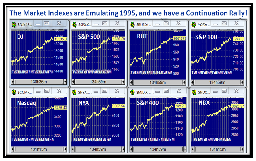
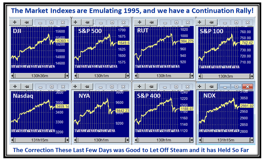
Here is the usual picture of the eight Market Indexes which show at a glance the action in unison of them:

Burst Indexes

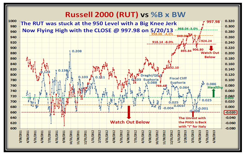
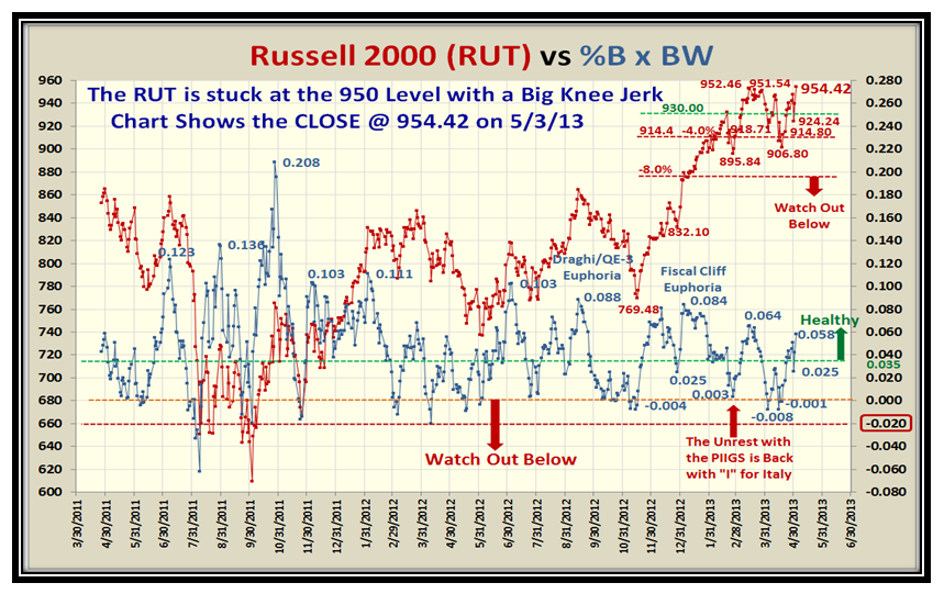
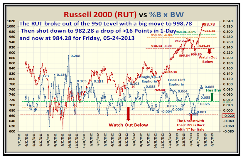
…And here is the Russell 2000 which shows the drop of over 16 points in one day for the Knee Jerk:

Burst RUT

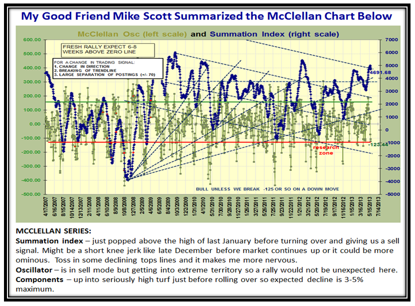
My good friend Mike Scott keeps a beady eye on the McClellan Oscillator and Summation Index and sent me his usual update which he has done for over 20 years.  Here is his summary thoughts on where we stand today:

Burst Mc

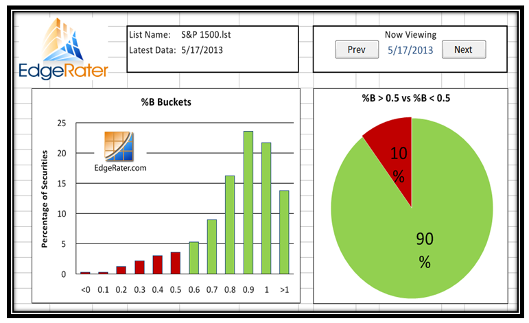
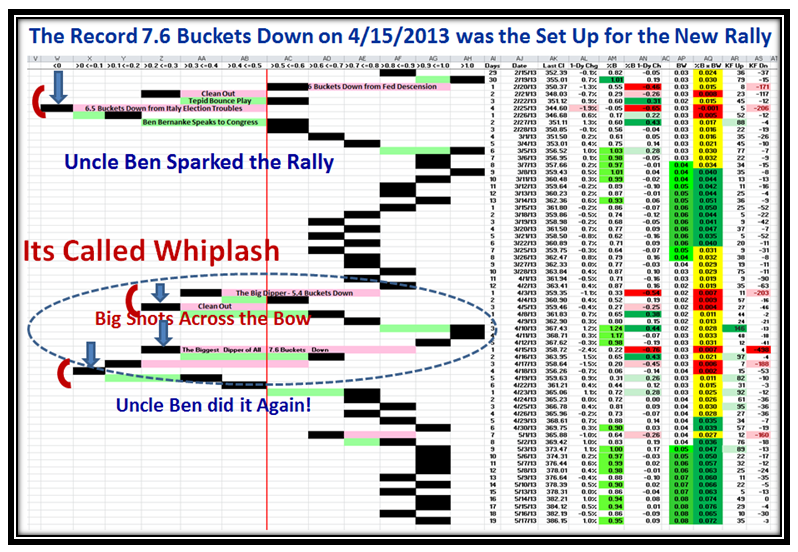
Here is the supporting evidence that the Correction has been only four days and orderly so far:

Burst Pat

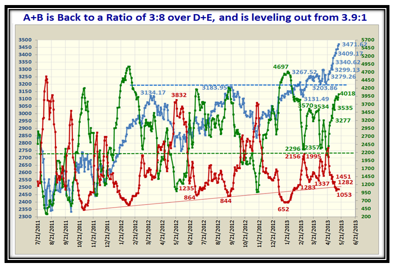
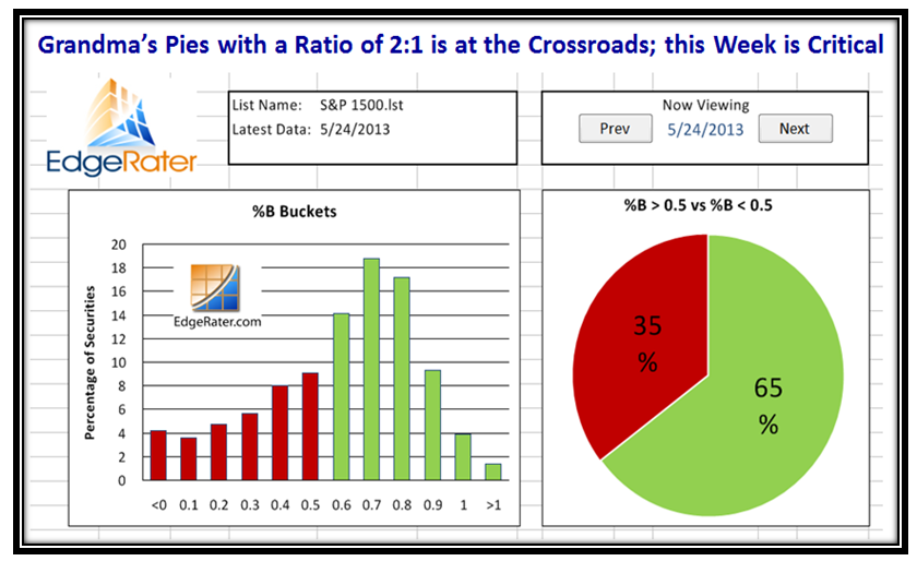
Grandma’s Pies show we are at the Crossroads:

Burst Pies

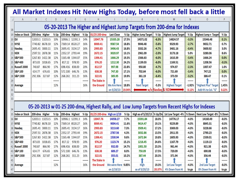
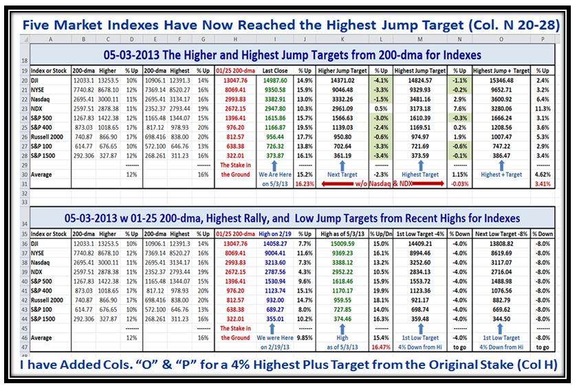
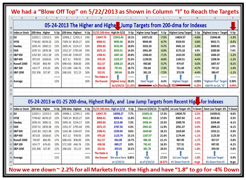
Now that we have reached a top with regard to meeting the Highest Jump Plus Targets (except for the Nasdaq and NDX which we know have lagged all along due to the hammering AAPL took earlier and its heavy influence on these Indexes), I show the Highs reached on 5/22/2013 and the extent of the decline so far which is approximately -2% on average:

Burst Spreadsheet

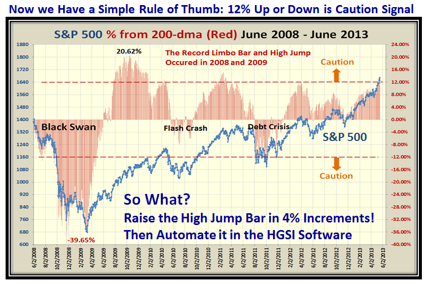
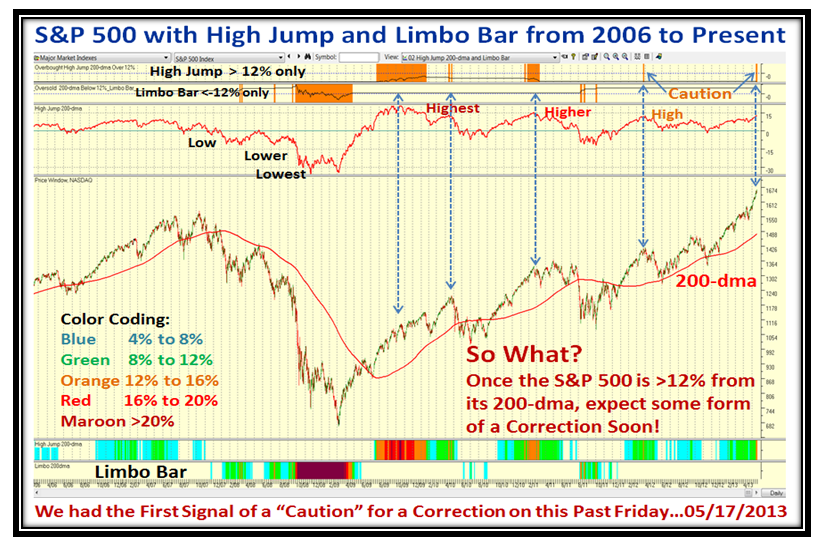
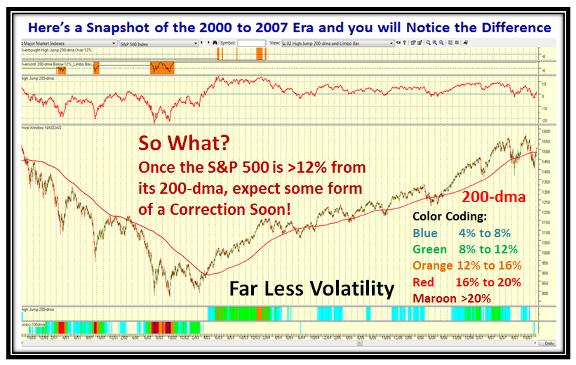
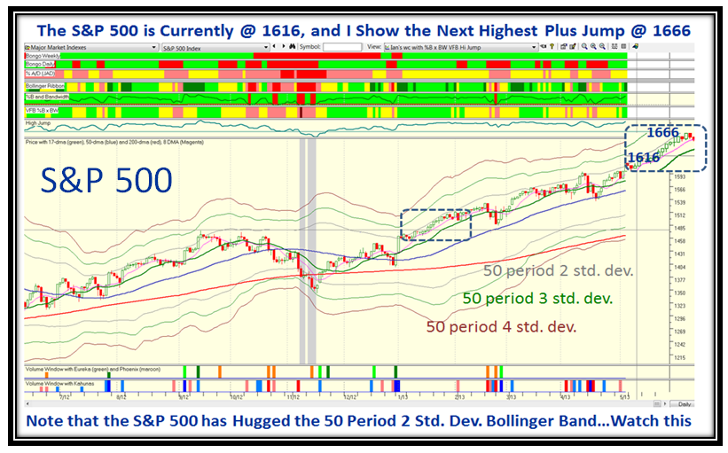
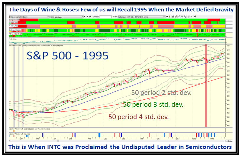
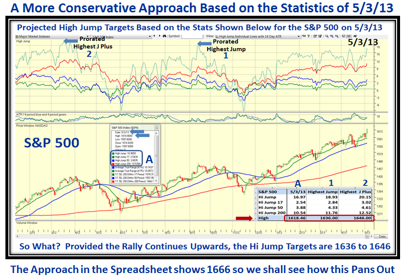
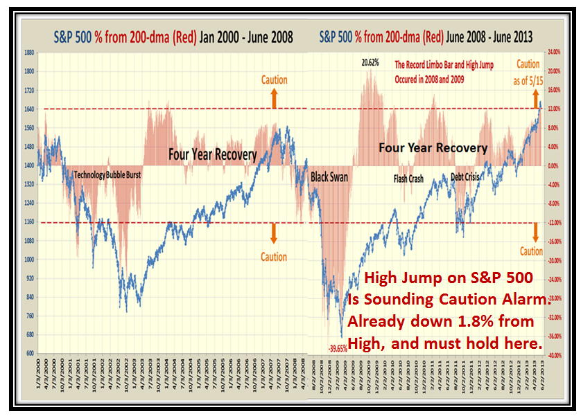
Now here are a series of charts which hopefully you will find are “Good Stuff”.  It picks up on the theme of the High Jump which clinches that plus or minus 12% from the 200-dma is the Caution Signal for the S&P 500…Enjoy:

Burst S&P 500

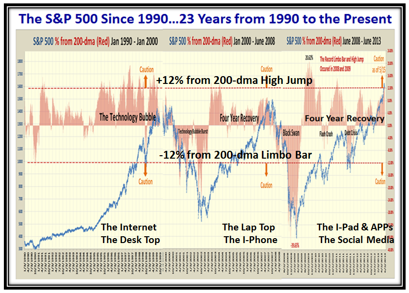
…And here is a closer in view which shows the last 13 years.  Please note the Caution on the chart:

Burst S&P 500 #2

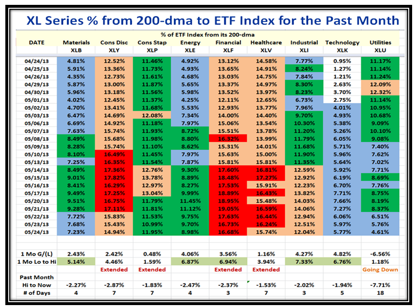
I felt we should turn our attention to the XL Series of ETFs and show you a snapshot of their performance over the last month.  I have indicated what I feel are the ETFs that are extended and also those that may still be playable provided the market turns upwards yet one more time:

Burst ETFs

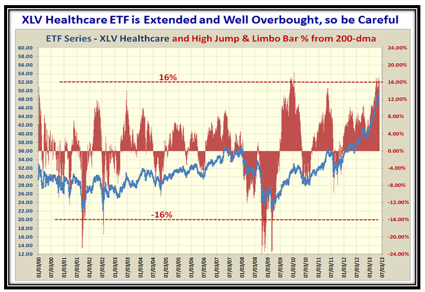
Here is the History for the Healthcare ETF XLV, which shows this one is extended and well overbought:

Burst Healthcare

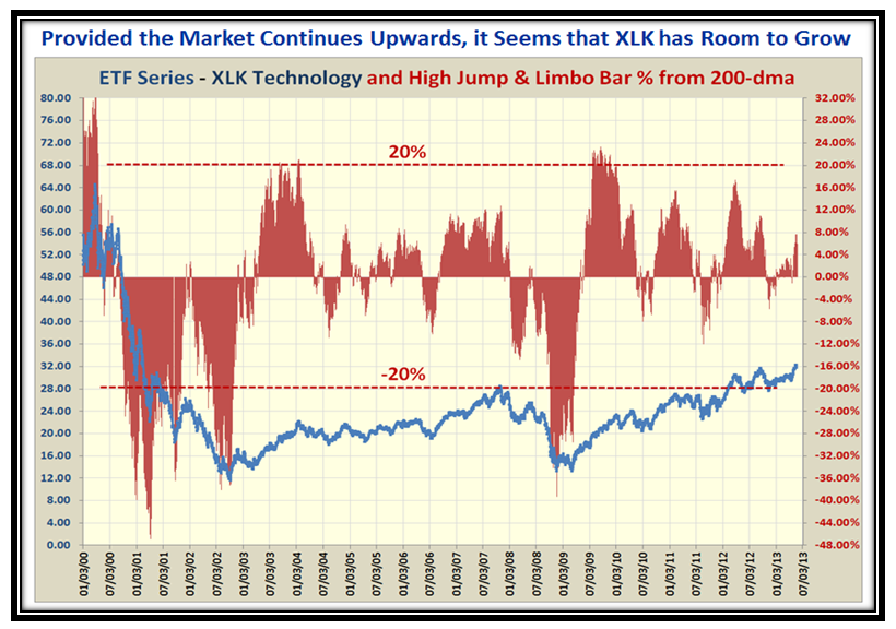
…And here is a chart for the Technology ETF XLK, which may offer an opportunity if the market has more to the upside:

Burst Technology

I trust you all had a good Memorial Day and remembered our troops in your thoughts and prayers.

Best Regards,

Ian

Stock Market: Q-E 3 Bubbles in the Air!

Monday, May 20th, 2013

It has been a couple of weeks since I posted a blog note and I thank you for being patient, as I am sure you have constantly been reminded that this Continuation Rally is coming to an end.  I also remind you that as long as his nibs, Uncle Ben, keeps printing money ala Q-E 3 and doesn’t throw a monkey wrench in the pot by announcing that interest rates are about to be raised, we will continue to be confounded.   I hope you find the wait has been worthwhile as I feel I have some “good stuff” to show you in this blog note.  Give me feedback, please.

Bubbles Picture

The Market Indexes are emulating 1995 when they also defied the saying “Go away in May and come back in October” , but we shall see how much longer this steady climb can continue as I see the first signs of being truly overbought and I will show you why I say that:

Bubbles Indexes

The RUT has just today broken through the 1000 Barrier so the beat goes on:

Bubbles RUT

The VIX remains quiet despite bulletin board chatter that tries to turn the tea leaves for any sign of a change in Volatility:

Bubbles VIX

…And as we would expect the Accumulation vs. Distribution Ratio continues to improve though slowly:

Bubbles acc

Likewise, Grandma’s Pies continue to rise to being overbought with a 90:10% ratio:

Bubbles Pie

After the Whiplash where we suffered the 7.6 Buckets down in one day on April 15th, the %B is back to highs:

Bubbles Pat

Now we are reaching for New Highs and you will be glad to see that I feel that I have broken the code for when to be really cautious based on the fresh work I have done since my last blog note, which has kept me busy to hopefully keep you on the right side of the Market.

Bubbles ss

As we can quickly see we are now reaching new highs on most Indexes and that led me to a brainwave to show the relationship between the S&P 500 and the % of the Index from the 200-dma through the period from 2008 to 2013.  Note how one can readily see that both on the High Jump and on the Limbo Bar (the downside) that the key point for CAUTION is when the % from the 200-dma is + or – 12%, respectively.  Note that the scale on the right for the % from the 200-dma is in increments of 4% and that gives us the clue for the next three charts!

Bubbles Chart

As we well know, 2009 was the year we came out of the Black Swan swoon with a brand new Rally, so it is not surprising that we stayed above 12% for several months, but since then note how few times we broke above 12% for 2011, 2012 and just this past Friday in 2013.  So I say now is the time for Caution…but we need to build on this idea in the HGSI Software so that we can immediately see when we measure the degree of extension with a color coding requiring 4% increments as shown.  The whole intent is to make life easier and know when to really be uptight for potential corrections.  Hopefully the Blue arrows on this next chart should stiffen up your backbone that some form of correction is imminent whenever the % from the 200-dma gets above 12%.  Of course, it doesn’t tell us how much the correction will be, but at least the warning is consistent.

Bubbles Chart2

Note the color coding goes in steps of 4% and we are able to show both the High Jump and the Limbo Bar on the same chart so that we have a good feel for where the market is sitting over time.  I’m sure by now you are saying “Show me what the 2000 to 2007 period looked like before I am convinced”, so here it is.  The surprising conclusion is that the days of Wine and Roses back then was far less Volatile…you judge for yourself:

Bubbles Chart3

With this chart in the HGSI Software which will soon be incorporated we not only can look back in time with the S&P 500, but with any of the other Market Indexes and in a wink know when to be really cautious and when to play with impunity!

Enjoy, with best regards,

Ian.

Stock Market: Wonders Never Cease!

Saturday, May 4th, 2013

I need hardly say that any of us expected we would be hitting new highs with a resounding move upwards for the Bulls to continue this long Rally essentially since mid-November.

Wonders Picture

…And here is the picture of the Market Indexes which show the explosive breakout the last couple of days:

Wonders Indexes

As we well know the Small Cap Stocks have recently been sluggish but the RUT is recovering and above its old high:

Wonders RUT

The Accumulation to Distribution ratio has now improved to 3:1, but we have a ways to go to show a 4:1 ratio:

Wonders acc

The %B for the S&P 1500 is now back in safe territory sitting up in the 0.8 to 0.90 Bucket, so again we have a cushion:

Wonders Pat

…And the twin picture of the %B Net Score continues its upwards journey:

Wonders Pat2

Now for the High Jump Spreadsheet which has served us well during this extremely difficult period of staying on the right side of the Market.  I have not seen such knee-jerky action in several years…this is a very tricky market, especially for the Bears.  You will note that we are now to the point where five Indexes have surpassed their Highest Jump Targets that I set back on 1/25/2003.  So that we can continue this process to show the High Road Target, anticipating that the Rally continues upwards, I have added a further couple of columns for what I have called “Highest Jump Plus” Targets which adds 4% to the 200-dma Stake in the Ground numbers shown in red as a reasonable next jump target.  Please also understand that I have shown a different method lower down and you can take your pick, as these two approaches give us a range of 1636-1646, to 1666 for the S&P 500.  When this plays out and we finally have a correction, we can then determine the best approach to use in the future.

Wonders spreadsheet

For this second approach, I had a brainwave to use  a 50-period Bollinger Band with 2, 3, and 4 Standard Deviations, and as you can see I feel I struck oil.  The S&P 500 Index hugs the 50-period 2 Std. Dev. line and the entire envelope is tracking up in similar fashion to the 17-day MA.  In this next slide I took the past snippet and attached it to now to show the expectation over the next couple of weeks if the Rally continues upwards.

Wonders S&P 1

Going back into history, it suddenly struck me that the last time anything like what we have seen continue with the Rally far past May was in the Days of Wine and Roses back in 1995 when INTC was declared the World Leader in Semiconductors:

Wonders S&P 2

So what’s my point…it has happened before and Wonders Never Cease so don’t be surprised if it happens again.  In this new example of addressing Targets, I have taken the latest numbers as of 5/03/2013 (Friday) and applied them for the Higher and Highest jump records during 2012, so that I am using recent ratios and prorating them based on current performance:

Wonders S&P 3

I hope all of this is of value to you…so far it has proven worthwhile, and hopefully has kept you on the right side of the market.

Best Regards,

Ian

Copyright © 2007-2010 Ian Woodward
Disclaimer: Commentaries on this Blog are not to be construed as recommendations to buy or sell the market and/or specific securites. The consumer of the information is responsible for their own investment decisions.