Ian Woodward's Investing Blog

Author Archive

Stock Market: Uncertainty & Fork in the Road is Back

Monday, January 17th, 2011

We have all had three days to ponder on where next and it would seem that although the Market Factors such as the ABCDE’s are quite robust, the breaking news today is that Steve Jobs is taking a leave of abscence and that could cause a perturbation in the Market.  We wish him the very best as he faces new problems with pancreatic cancer.

Steve Job’s medical problems are not new to the Stock Market, but with AAPL being ~21% weighted in the Nasdaq, the market is vulnerable to easy pickings for the market makers to use the opportunity to cause a shake out of the longs and then establish long positions for themselves.  Likewise, there is the “Apple Food Chain” where several stocks move on the strength or weakness of AAPL, so it will be interesting to see how this plays out, especially as AAPL’s Earnings Report and Guidance is due after the close tomorrow.

After the shot across the bow on January 7, 2011 when the % of S&P 1500 Stocks with ~12% in %B <0 being the highest bucket, the Market Indexes %B themselves have all recovered nicely to the point where except for the DJIA which is at a healthy 0.96, the rest are all over 1.0!    All of this suggests to me that the Fork in the Road is back and both the High Road and Low Road could be in play this week, so we need to be on guard, given all of the above:

The optimistic longer term view is that we are only a mere 145 points away from that major check point of 2900, and although I am not suggesting that we hit it any time soon, the overall prospects seemed good that we could chip away at half that climb and at least break through 2800 in the near term.    My good friend Mike Scott produced this chart moons ago and I have faithfully kept it up to date and added to his musings, so enjoy:

So let’s review the bidding on the usual internal factors that give us a pulse for the Market health, from the McClellan Oscillator, knowing your ABCDE’s, and the % of Nasdaq stocks above the 200-dma:


Here’s a picture I haven’t shared with you recently, but it shows how the Market has added over 300 stocks in the last six months and is climbing at a good clip.  We can use it to our advantage when the number of stocks in the IBD Index falls below 5400 as that would signal a correction is in progress:

The Leaders with %A Accumulation is at a reasonable 17.36%, but we would prefer to see this above 20 to 23%.  Beggars can’t be choosers and we have to be thankful for small mercies since it is at least above 15%:

However, the %A + %B Accumulation look a lot stronger at a healthy 63%.  We could do with a push to ~70% if we are to see a Climax Run, but we do have a cushion at this stage until it gets below 50%:

Now for %E, the stocks that are being heavily distributed.  The % is close to 7%, but we have seen this rise as the market has risen, whereas it is normally quiet until the market gets long in the tooth.  Once above 7% it has a tendency to jump so you need to watch for that as that is a sure sign that the Market will correct:

The % of Nasdaq Stocks above the 200-dma is a very respectable 80%, so the overal breadth of the market is good:

We hit a critical point in this rally on January 7th, but recovered.  We are not out of the woods, but at least better off now:

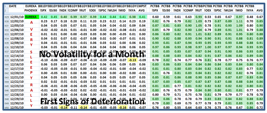
You are familiar with this chart, so it needs no explanation…but it still shows weakness in the %B internals of the S&P 1500:

One scenario for this divergence suggests we are again headed into a climax run.  It may be cut short as a result of the late breaking news regarding Steve Jobs, but we shall see how this plays out the rest of this week.  It’s earnings report due time so be very careful at this time of the year.

Best Regards, Ian.

Stock Market: Primose Path to Fugacious Blossoms

Saturday, January 8th, 2011

My good friend David Galardi prompted me with a theme for this weekend when the market is teetering on fumes, and there are cross-currents appearing that suggest the Large Players may be leading us “Down the Primrose path to Fugacious Blossoms!”  I had to look up the meaning of “fugacious” which turns out to be fleeting, so I offer you this reminder:

So David is right as after a strong recovery on the first trading day of the New Year, similar to last year I might remind you, we are now on the brink of once again sitting at the hairy edge of Stalemate where we wait and see if we bounce out of this hole or give up the ghost and head down for a correction.  Next week should settle the fight between Bulls and Bears:

The question you might ask is “What new evidence do we have that things are looking a trifle bleak?”  Another good friend of mine, Mike Scott, recently talked to spying “Bifurcation” where on the one hand %B for the S&P 1500 is still a healthy 0.80, while the internals of the stocks themselves within the S&P 1500 are essentially at 50:50.  More importantly, the bifurcation shows that although the upper end of those stocks above %B >1.0 is still holding up reasonably well with 9% in that bucket, we now see that the highest % in any bucket is in the one <0 with nearly 12%…i.e., being well and truly trashed:


I am sure you have forgotten that one of the Golden Rules I established moons ago is that any %B <0 reading of >180 stocks is an early warning sign of an impending correction.  We had 174 stocks on Friday, January 7, 2011, so we are knocking on the door, and that is close enough for me to give you that picture to prove my point.  It does not mean “die”, but it invariably means correct.

But now I offer two further charts as evidence that Bifurcation is well on its way, and that is invariably the first stage of two to bifurcation and a correction.  I trotted back in time to when the Market Top occured back in April 2010, and here is a comparison of Bifurcation underway on Thursday January 7th, but yet not quite ripe enough  as compared to both Bifurcation and Correction on April 30th.  Note how Bucket >1 is still holding up, while on April 30th, 2010 the last two buckets are very weak as shown in the chart below:

The above was the picture on Thursday, January 7th…now look at how the picture changed for the worse on the very next day, Friday, January 8th.  With the bucket <0 showing the highest percentage of 11.6%, it mimics what we saw on April 30, 2010, so bifurcation is “complete”.  Now we wait to see if the last hold out for the bulls of 9.2% in Bucket >1 gives way to weakening down to below 5%.  I suggest that will be the final blow.  At least we now know what to look for in the critical aspect of the tide turning from Overbought through Stalemate to Oversold.   

There are always surprises in the Stock Market, so don’t count your chickens before they are hatched, but for sure things are ripening towards a correction as early as next week.  We do not have long to wait.  We are now in our 20th week of this Rally.

At the top of this note I warned of several cross-currents, and one way to confirm this view is how rapidly the shift in the market occurs when the leaders in the NDX (Nasdaq 100) were being trashed behind the woodshed two weeks ago to come roaring back these past five days as shown below.  Likewise the Small Caps Index of the Russell 2000 (!RUT) is currently the weakest with a %B of 0.58 along with the Mid-cap at 0.61. 

This may well be due to the natural changes Portfolio Managers make at the end of the old year and the start of the new, but then the January Effect hardly lasts more than a couple of weeks, so we might have a surprise reprieve though not for long, especially if the Bucketology continues to show sloshing to the left! 

Best Regards, Ian.

Stock Market: Highland Fling for the New Year!

Monday, January 3rd, 2011

Well, I warned you that we might have a turn up for the books with a Highland Fling, but that was only to make sure we don’t count our chickens before they hatched with all the negative signs I addressed in my last Blog note.  It looks as if the Annual January Effect is on so we should at least see several days of driving the small cap stocks, though today the big push was in the beaten down NDX.

The Grinch has departed for now and the Bounce is big as we see from the Chart below:

So, with the experience of the last couple of days, we learn that the Bucket >0.6 <= 0.7 is indeed the “Swing Bucket”…the market either drops big time or it rebounds to regain the rally status.  One day does not a rally make, but at least it is a promising start:

…And here is the chart that shows the major shift in one day demonstrating there is a good degree of momentum.  Although there was no Eureka today, we had plenty of Kahunas in the Market Indexes and that always suggests strong momentum:

Finally, you can see the major bounce back in the Market Indexes showing their one day change on the left and the %B for each on the right.  Note that the numbers are again all green on the bottom line and that spells “Good”!

If you want to see the numbers more clearly, click on the chart and you will see a bigger picture.

Best Regards, Ian.

Stock Market: Calm Before The Storm

Saturday, January 1st, 2011

A Happy New Year from the HGSI Team to all our supporters and new friends with peace, prosperity and continued friendships for the coming year.  The Stock Market has had a long run and it is no wonder that it is running on fumes.  It is vulnerable now that the year is finished, but given the putrid volume these past several weeks, we may yet see a final Highland Fling before we see a much awaited correction for the Bears:


Now that Santa Claus has come and gone, the Grinch is lurking in the bushes and waiting to pounce.  This has been the period of the Calm Before the Storm and unless the Market gets a boost with strong winds at its back, all signals suggest we are headed down:


Forewarned is Forearmed I say and I will expand on the picture above as we review the bidding for the alternative scenarios:


The deterioration is very evident in the past week, and I have warned you earlier that once we get to >=16 in the “Swing Bucket” of >0.6 <=0.7, you better watch out below:

Don’t forget to click on the Chart to see a bigger view!  We are currently at “Stalemate” with an Early Warning Sign that the Normal Distribution is shifting towards the center:

…And here is a comparison with the Peak of the Market Indexes from  three weeks ago:

“Where Next”, you might well ask?  Who knows, but the odds favor a trot down.  As you well know the Market Volatility has been relatively calm and so we are due for a “2% Day” either way.  What that will spell is either a Phoenix with its 2 Bucket Skip to the downside and its corresponding Kahuna Down, or an Eureka with a 2 Bucket Skip to the upside and its accompanying Kahuna Up.  If it does neither, we wallow around in the Middle Road Scenario until there is some earth shattering news to make it get out of Stalemate. 

Now let me zoom out to when we had an Eureka just one month ago, and show you the favorite map of how the Market Indexes have performed since then.  Note that we have not had either an Eureka or a Phoenix for the past month, indicating that there has been relatively little volatility, but of course the seasonal volume has been dismal.  However, New Year’s Eve showed the first signs of deterioration on a day-to-day basis with three Indexes showing at least a Half Kahuna drop to the downside.  More importantly note that the NDX, which after all contained the favorite leadership, is the weakest of them all with a %B for the NDX of a paltry 0.55.  Grandma’s Pies are getting a trifle soggy.

Last but not least we have the chart we have now tracked for the past 18 weeks with Santa’s red car now being replaced by a lurking Grinch.  We can certainly tolerate a 3% dip, and maybe even a 7% drop, but any more than that and the Bears will have a field day and be in total control until the Bulls get an appetite to buy into this market with gusto.

So there you have it.  Have a wonderful year, and we hope to see many of you at the March 26 to 28 Seminar.  Drop me a line and tell me you are coming. 

Best Regards, Ian. 


Stock Market Bucketology for Clues of Market Tops

Tuesday, December 28th, 2010

Give my HGSI supporters an inch and they take a mile!  Joe came up with a great new term for all this %B good stuff I have thrown at you and “Bucketology” sure fits the bill.  The hour is late so here in two slides is my New Year’s gift to you. 

In my last blog I covered all the bases for you and showed you how the Market was deteriorating.  We must recognize that this week is a very quiet week with little volume since most people are still enjoying their holidays despite the turmoil on both the East and West Coast with snowstorms and heavy rains, respectively.  We all are saddened for those who have suffered so much these last few days. 

I have followed up with what I had suggested should be an early warning sign and to watch carefully for the #17 or greater in Bucket #8,  >0.6 <=0.7, and here is the first signs of chinks in the armor.  Not full blown yet, but if this downward deterioration continues one more day, it will be interesting to see what happens next:

Don’t forget to click on the chart to see a bigger view if the numbers are too small for your beady eyes, but I have highlighted the three 17’s/18’s that “fired” today as shown.  As you all know this is a new concept evolving as it is happening, so take it for what it is worth with a pinch of salt, and we shall soon see if the Market bounces from here as it must do to maintain the rally, or it fizzles in the next few days or early next year.

Best Regards, Ian.

Copyright © 2007-2010 Ian Woodward
Disclaimer: Commentaries on this Blog are not to be construed as recommendations to buy or sell the market and/or specific securites. The consumer of the information is responsible for their own investment decisions.