Ian Woodward's Investing Blog

Archive for the ‘HGS Principles’ Category

Stock Market: Where Next?

Thursday, August 23rd, 2012

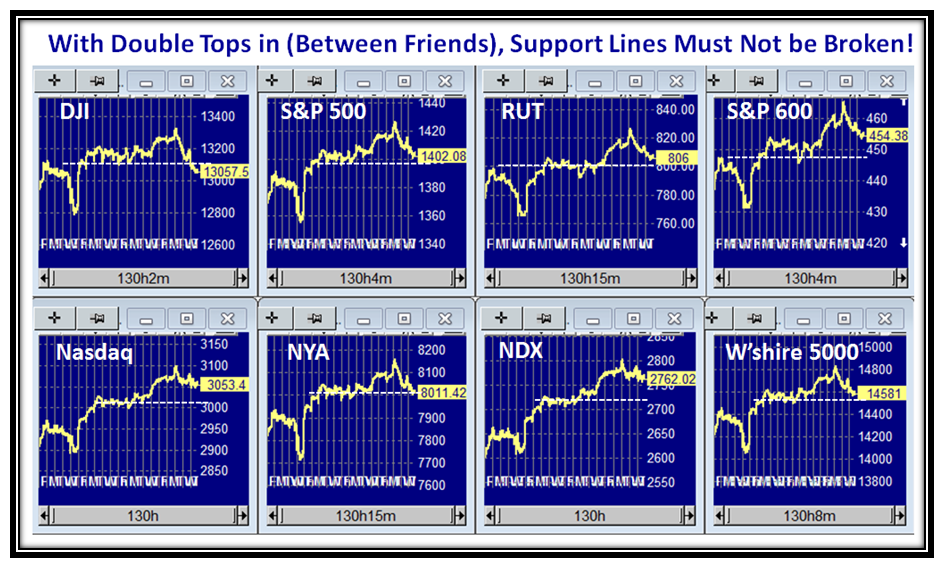
It’s Thursday afternoon, the Markets are closed and there was a mild shot across the bow, so I see my followers in Australia, Canada, Belgium and Egypt to name a few along with the US Contingent who signed in today are looking for more fodder.

So here we have the latest pulse of the Market hot off the press:

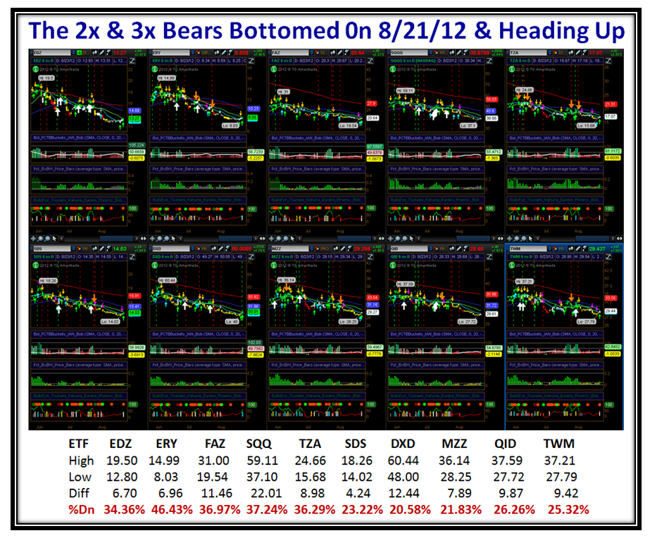
If you use Think or Swim (TOS), make yourself a Template for the ten 3x and 2x Bears I use to keep me a step ahead of the game and the whole world will be your oyster.  Note that on a three month chart you will see the recent Highs back in June and they all bottomed on 8/21/2012 and have started to head up.  It’s too early to call, but at least be aware that the sell off in the Market Indexes these last couple of days and especially today have given some hope to the Bears that we have put in a Double Top.  For those of you who are NIMBLE Type 1 or 2 Traders and can sit and watch your computer all day you know how to play the game, but for those who are Type 3 & 4 Longer Term Traders and Investors this tells us when the wind is at your back or in your face.  Just look at the Whallop the Bears theoretically had in these past three months playing this game.  However, when the numbers get so high, the Bears are just itching to nibble and that is precisely what they have started to do in the hope that they have caught the bottom.  Not for the feint of heart, but these give you a feel for the way the windsock is blowing to understand fear and greed and stay on the right side of the Market:

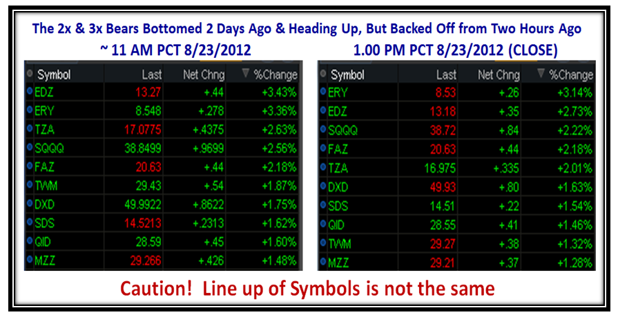
Now let’s look at the action of these ten in Real Time today with two snapshots in time, one at 11.00am PCT and the next at the close.  All these ten bears were positive and had a respectable day.  The Tables are in Rank order, so the two charts are not aligned…anyway you get the idea:

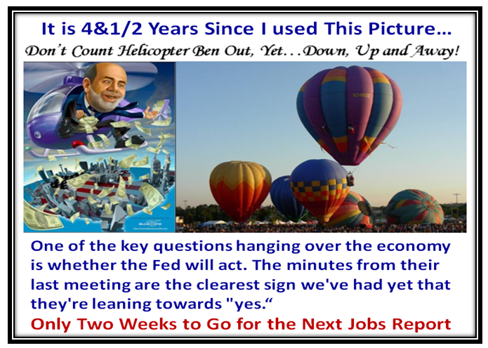
So now we are closing in on “Crunch Time”, with the Jobs Report only two weeks away.  The buzz in this neck of the woods is that Helicopter Ben is ready to drop leaflets again if need be, but I am sure the FED will wait to see if the report is good or dismal:

I hope you enjoyed this update hot off the press.

Best Regards,

Ian

Stock Market: Heading for Double Tops?

Saturday, August 18th, 2012

We were spoiled with two solid weeks of the London Olympics, while the stock market has been slowly but surely inching up to the point that Double Tops are now in sight:

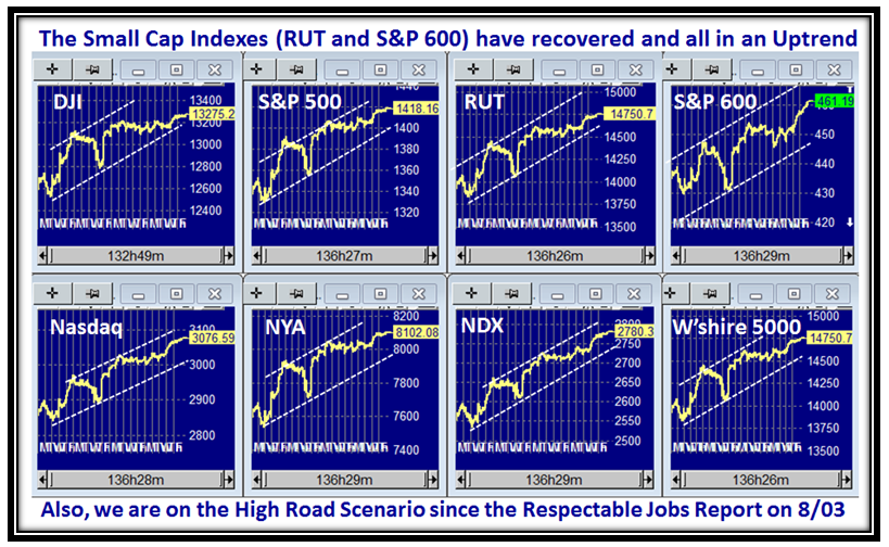
We now have all eight market Indexes in a tight channel, with even the Small Caps showing a burst of speed:

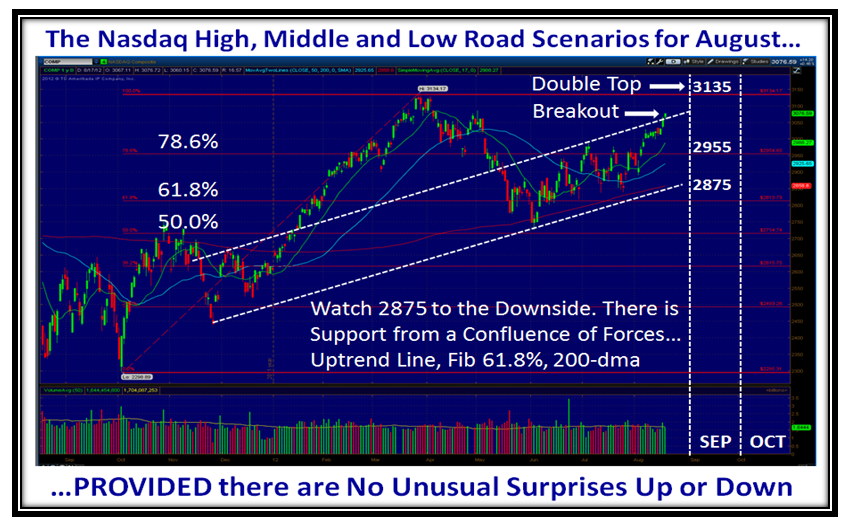
…And here are the High, Middle and Low Road Scenarios for the Nasdaq.  There is strong support at 2875 so if there is any untoward problem and the markets trundle down, that area should provide the stability, and if not run for the hills:

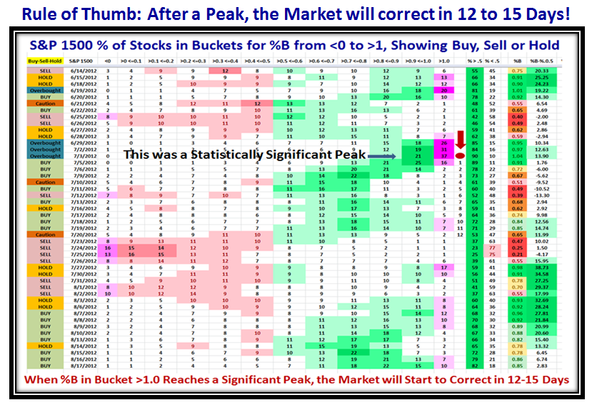
I haven’t used this chart for sometime, but there is a tremendous amount of information relating to Fear and Greed and I will always be indebted to my good friend Pat Turner for her thinking in depicting the ebb and flow of the Market, and in this case the S&P 1500.  Given that we have 12 years of history for this particular view, the colors of light, medium and dark green or rose represent 1, 2, and 3 standard deviations from the average.  In addition she painted the two extreme buckets with Pink to emphasize when the markets are either oversold or overbought.  I have been able to milk this view further by noting the statistics for the peaks and troughs. I am sure some of you remember that once a Peak is reached and expecially one as significant as 37% in Bucket >1.0 on 07/12/2012, it pays to start a count of “Twelve drummers drumming” and invariably within 12 to 15 Days the market will have drifted into a correction.  You can take that Rule of Thumb to the Bank!

Here is another one of Pat Turner’s Priceless Charts, which opened up a whole new vista for my work on which I continue to build.  As a result, I have recently been recognized for my work by the Market Technicians Association (MTA) in their August Newsletter.  I am indebted to Chris Wilson, who is a member of this group and a strong supporter of HGSI, and who won an auction and gave me the opportunity to have a luncheon with John Bollinger all of 5 Years ago. My sincere thanks to Michael Carr for spending countless hours developing the story of my contribution to you.  Through Chris’ generosity I have built a friendship with John who pays me the tribute of revitalizing his work with several new BB Indicators.  What goes around, comes around.

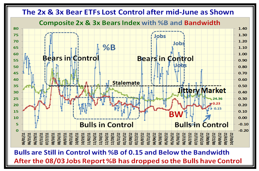
At times like these when there is a noticeable shift in the Market from Bearish to Bullish, I find that one of the clues is to examine the Bollinger Bands %B and Bandwidth using a composite Index of 2x and 3x Bear ETFs.  It stands to reason those who use these instruments are quick on the trigger to either pounce in with both feet or run for the hills when they smell trouble as is apparent in the following chart.  That should give us a clue as to which way the wind is blowing:

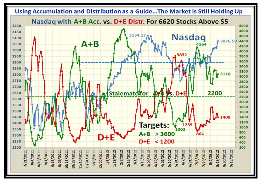
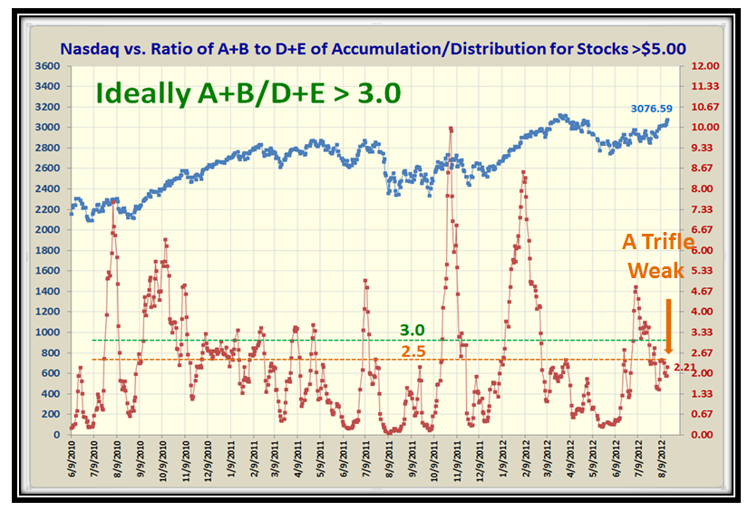
Now let’s turn our attention to the Accumulation and Distribution of the over 6620 stocks in the Database with a price over $5.  As I will show in the next three charts that Ratio of those stocks under Accumulation to Distribution is not as strong as we would like.  I have set another Rule of Thumb for you in that the ratio should be 3:1 or better.  Judge for yourself:

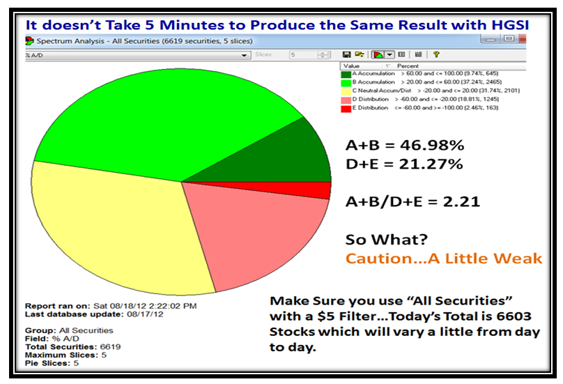
…And here is how you can get the same result using the Pie Chart Tool in HGSI:

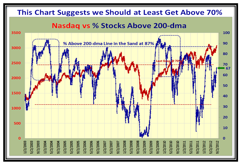
Here are some more Internals of the Market with the % of Stocks for the Nasdaq above the 200-dma:

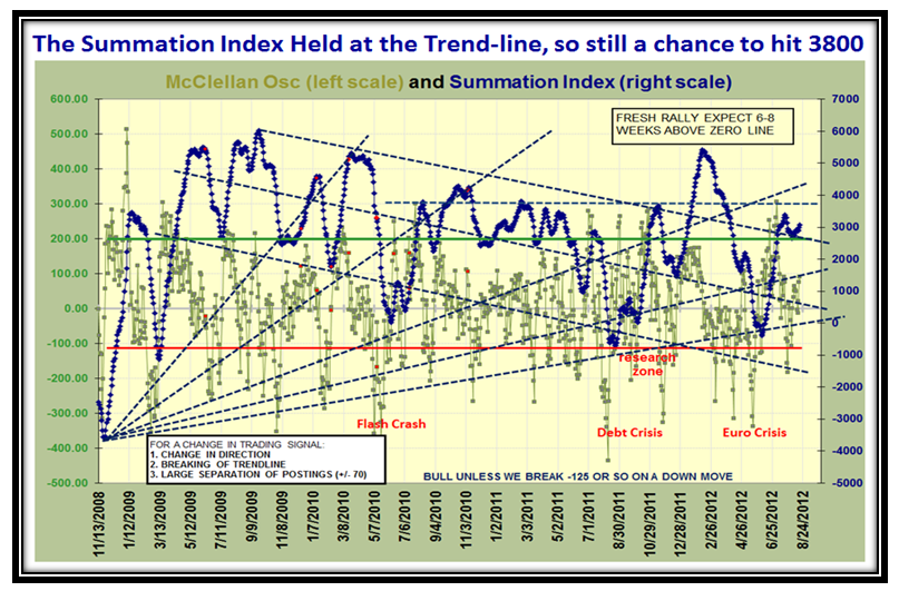
…And here is a chart of the McClellan  Osc. and Summation Index which shows we have a reprieve:

Finally, make sure to have a copy of this chart by your side in two plus weeks time, as we will be staring at the Jobs Report and you know how that goes when it is good or bad.  I have done my usual trick of taking a snippet from the past to show what would seem to be reasonable for the next three months:

Thanks to all of you who give me feedback and encouragement in putting these Blog Notes out…it does wonders to keep me going as I am sure you can see the work that goes into one of these.  Thanks also to the worldwide audience which is growing all over the world…let’s hear from you in the comments section at the bottom of this note.
Best Regards,

Ian

August Newsletter Overview

Tuesday, August 14th, 2012

I’m busy writing the Newsletter for August which will be out tomorrow, and I thought you would like a preview of the Overview:

Overview:

 This Month’s Picture suggests that the Bulls are enjoying a little breeze to the upside despite the Market Indexes see-sawing every five days or so, on the Middle Road Scenario.  The respectable Jobs Report which met expectations kept the Markets up, though the RUT and S&P 600 Small Cap Stocks are lagging with Death Crosses looming. The ordinary investor has toddled off into the sunset to enjoy Graduations, Weddings and Vacations as overall volume has been dismal.  Hence the Low Volume has played right into the hands of the HFTs and they are having fun at our expense.

Besides discussing the High and Low Road Scenarios, my theme for this month is to respond to a set of stocks selected by a supporter to show points of view as to stock selection and timing entry.  Ron has focused on how we can combine multiple indicators to screen for stocks, ETFs or indexes.  These indicators include the Bongo Daily and Weekly, the DI+/DI- and ADX directional movement indicators, and the Force Indexes. The Round Table discussion is on Thursday, 16thAugust at 4.30pm EST, where we will as usual expand on the ideas in the newsletter.

We look forward to seeing our faithful supporters at the Seminar on October 27 to 29 at the Palos Verdes Library and as always we will have fresh material to cover as we again raise the bar.  The Block Rate at the Courtyard Marriott has been raised $10 by them to $89/night, plus the usual Tax which in essence takes us to around $100/night.  Details are in the Newsletter.

Best Regards,

Ian.

Pump & Dump, Slop & Crop, See-Saw…Whatever!

Monday, July 30th, 2012

Can you believe the two-day turn up for the books on Thursday and Friday of last week to raise the hopes of the Bulls that there is enough momentum to lift this Stock Market out of the doldrums. Make no mistake about it this was a strong rebound as I will demonstrate in the ensuing charts. However, we are still suffering from a chop-chop market:

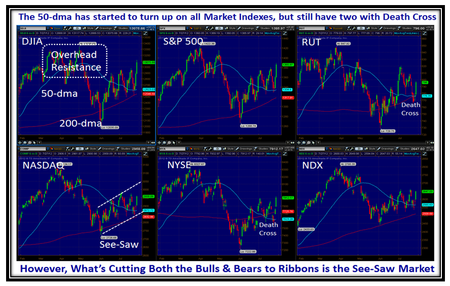
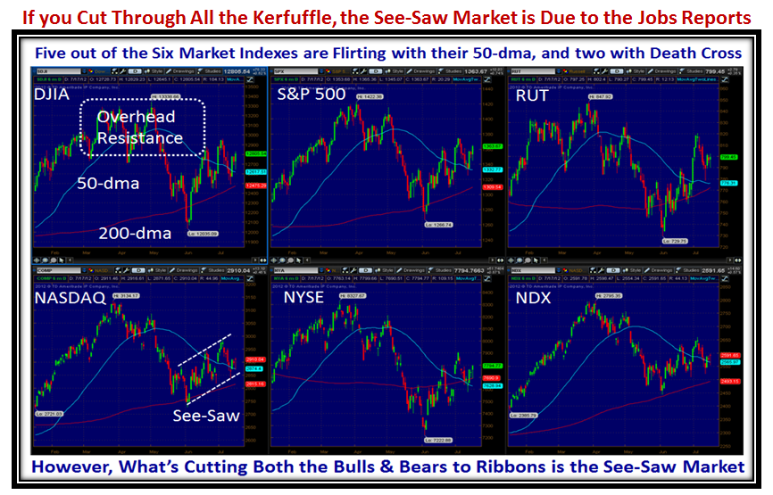
Prior to the last two days we were in danger of heading down to break the 50-dma on all the Market Indexes, and although we have two Indexes with Death Crosses where the 50-dma comes down through the 200-dma, we now have a whiff of all Markets with their 50-dma turned slightly up:

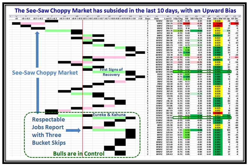
This See-Saw Market now has a pattern to it which is five days up and down (between friends) for the past five weeks with little progress to the upside:

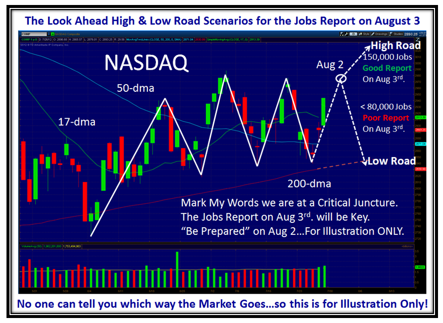
However, with two explosive moves upwards on Thursday and more especially on Friday where we had a Strong Eureka, the Bulls can now hope that they can once again get the Nasdaq above 3000 and close the gap as shown by August 2nd.  Don’t tell me you have forgotten the significance of August 2nd?…Be Prepared for the Jobs Report on August 3rd.  At least the European Central Bank president, Mario Draghi, turned the market upwards with his assurances to preserve the Euro.

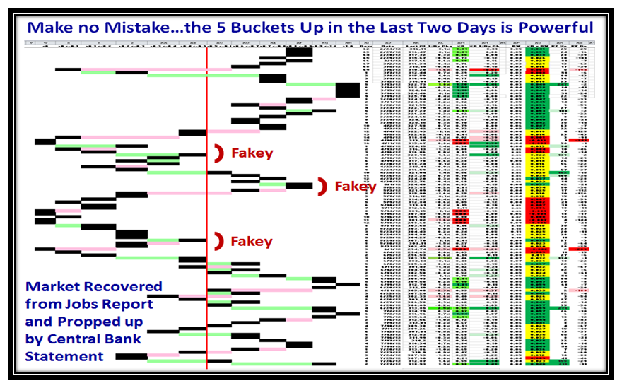
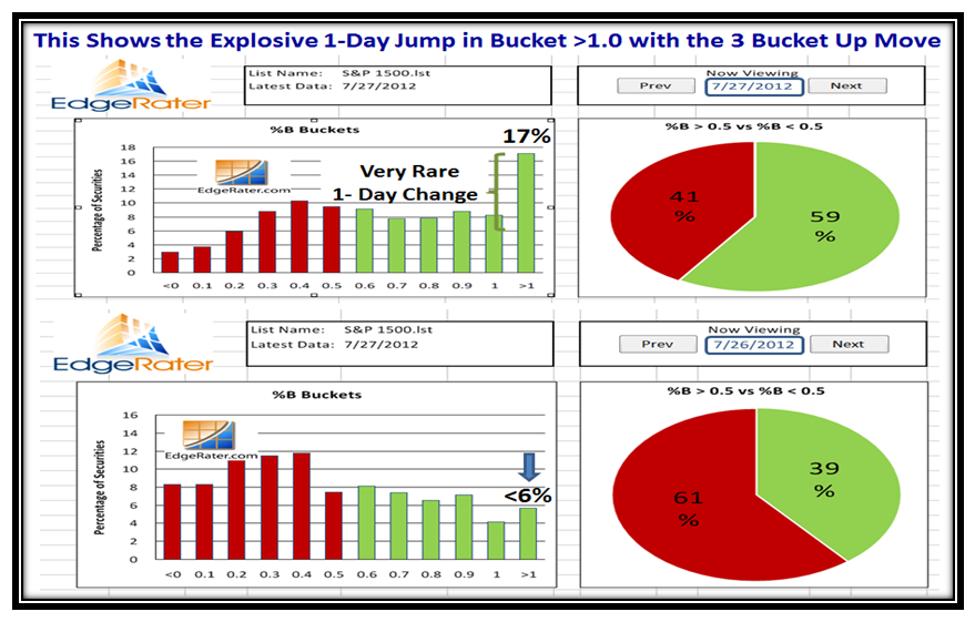
This two day upward thrust of 2 Buckets and then 3 Buckets up has put a whole new compexion on the momentum of the market.  We must now wait and see if it was yet another flash in the pan of supposedly good news or whether we fall back once again into the doldrums:

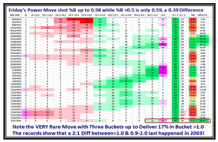
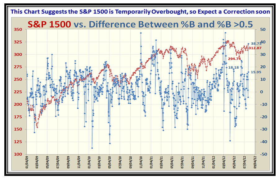
Reviewing past history shows that the move on Friday to jump from 6% on Thursday in Bucket >1.0 to 17% was no mean feat and was similar in momentum to back in March of 2003!  We must also note that the %B for the S&P 1500 is now at 0.98, whereas the % of Stocks above 0.5 is only 0.59, a difference of 0.39.  This suggests that we are truly overbought in the Leaders, and we either amble around here for the rest of the pack to catch up or we slide down into the doldrums once again.  I have my dear friend Pat Turner to thank for the concepts displayed above and below:

Note also the 1-day change in the Pie Chart and especially the one day jump from ~6% to 17% in Bucket >1.0, which is not to be sneezed at:

Now here is a New Chart to get your arms around.  It shows the DIFFERENCE between %B for the S&P 1500 Market Index and the % of S&P 1500 Stocks >0.5.  You will note that it jumped from 15.95% to 38.73% in one day.  Note that we are now in nosebleed territory and it is most likely there will be a correction and then hope that the Index itself will go higher.

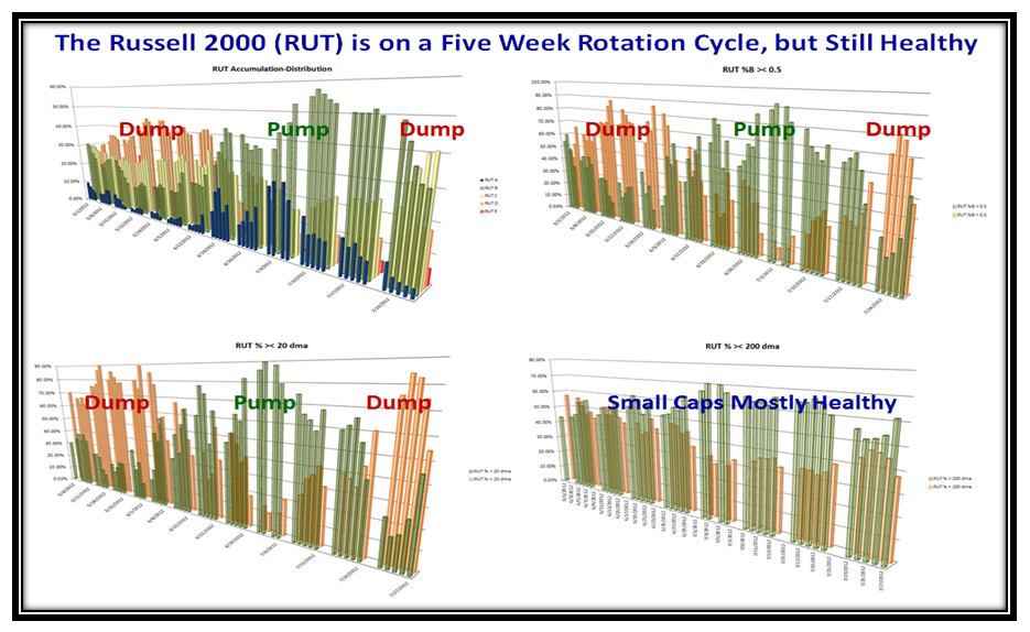
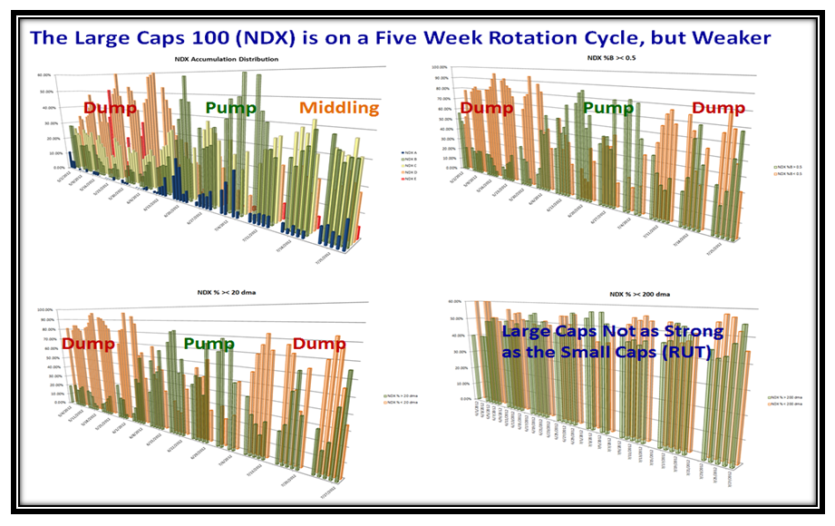
Three Cheers for my good friend Dr. Robert Minkowsky who has turned up trumps once again to give us a more rounded feel for what is transpiring in the Internals of the Market Indexes and specifically the Small Cap Russell 2000 (RUT) within itself and then compared to the Large Cap Nasdaq 100 (NDX).  The pictures are for Acc/Dist, %B ><0.5, %>< 20-dma and %>< 200-dma.  Note the Dump, Pump, Dump cycle we have been in since last May:

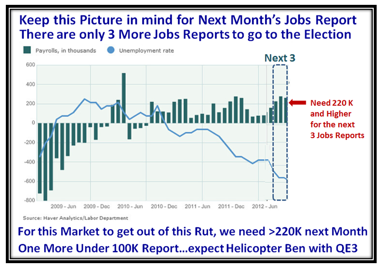
My good friend Maynard is holding his Monthly Group Meeting this coming Wednesday and I hope they will chew the fat on all of the above and especially my sense of the projected High and Low Road Scenarios to come.  This anticipates two conditions I gave you in my last blog note on the Jobs Report due this Friday, which I hope you have pinned to your desktop:

In a nutshell, the Jobs Report had better be good at >150,000 or so and not <80,000 for the gurus to get excited to the upside!

I hope you are all enjoying the London Olympics.

Best Regards,

Ian.

Helicopter Ben: Risk Going Over a Massive Financial Cliff

Tuesday, July 17th, 2012

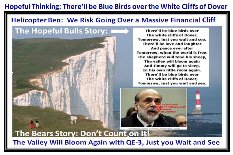
The six-month meeting between the Fed Chairman and Congress ended in Finger Pointing both ways while Helicopter Ben indicated concern that we risk going over a massive financial cliff.  If it is that massive then there is no prettier cliff than the White Cliffs of Dover, so I couldn’t resist thinking back to my youth and singing the song which I am sure you all know:

So What you ask?  Given what we have put up with these past few months and especially this last few weeks, I offer you a suggestion which it seems that most of you have already done and that is stay away from this “Cut you to Ribbons” Market.

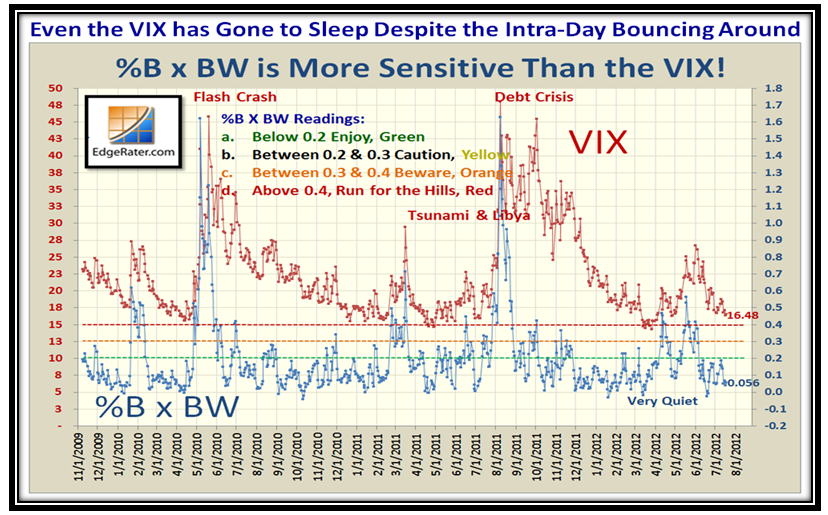
…And yet, in all this turmoil, the only signs of volatility is intra-day as the VIX is very quiet…so that confirms that the High Frequency Traders (HFTs) are making hay while the sun shines:

You are well familiar with this picture and the only good thing is that the Market is going up through all the see-saw we have put up with:

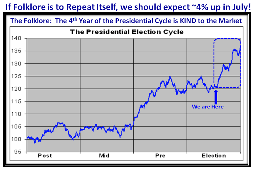
The only ray of Hope that this market will climb a wall of fear is the folklore of the 4th year of the Presidential Cycle:

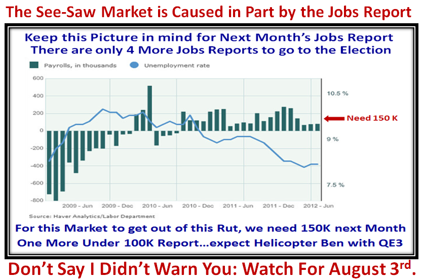
Keep an eye out for August 3rd…the Next Jobs Report must be golden or we hit the skids one more time:

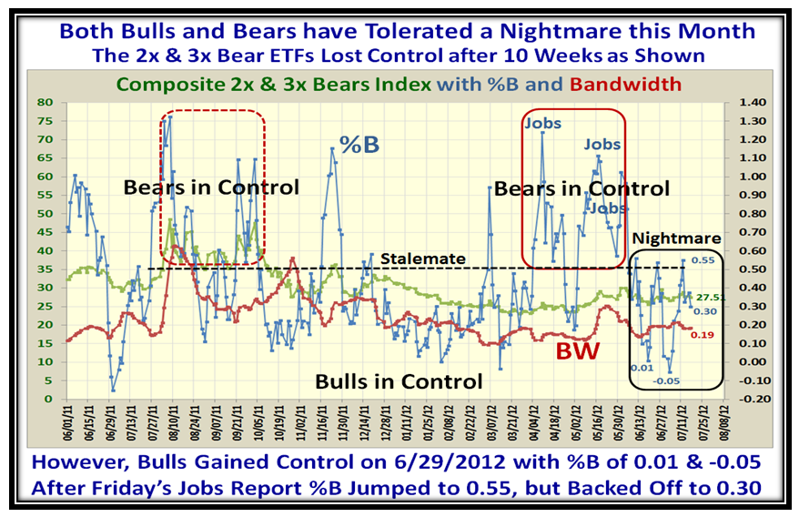
I mentioned on the recent Blog Notes that the best early clue for knowing for sure which way the wind is blowing is to track the %B for 2x & 3x Bear ETFs, and this has proved to be a valuable tool.  We can see that the Bears have been losing ground for the last month.  The other value is to understand very near term volatility and whether we have a calm and stable market or one in oscillation.  The over exaggerated moves in %B give us that clue!  We want to see %B below the Bandwidth (red line) and relatively quiet as seen in the middle of the chart and not a yin-yang up and down as on the right hand side, which is a nightmare.
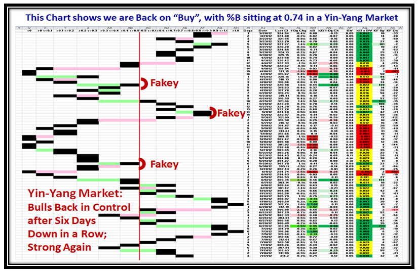
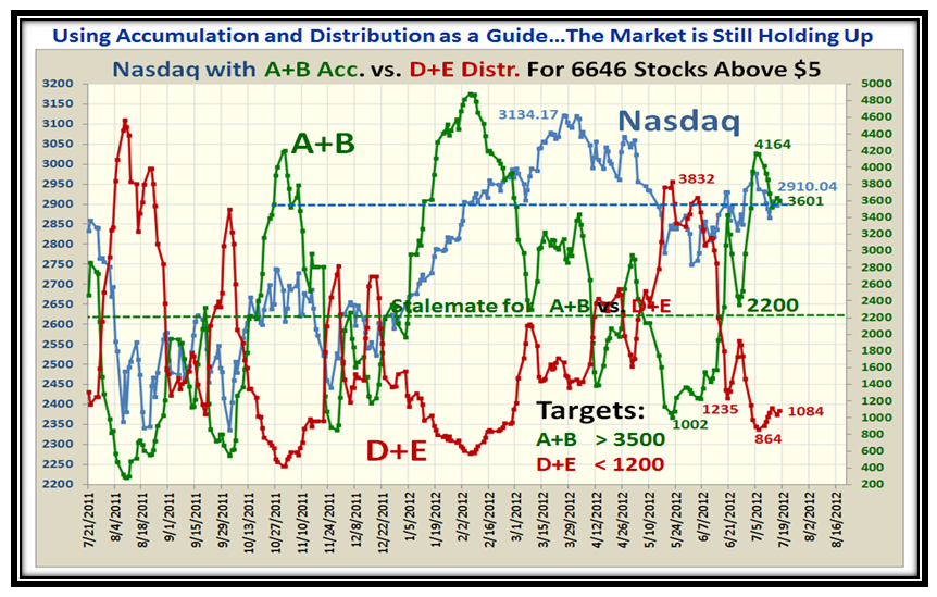
So What is the Near Term Bias based on %B with the S&P 1500 and then with Accumulation/Distribution?  Both are very positive, but play it close to your vest:

Well there you have it…Keep your powder dry and pick your spots, but be nimble.

Best Regards,

Ian.

Copyright © 2007-2010 Ian Woodward
Disclaimer: Commentaries on this Blog are not to be construed as recommendations to buy or sell the market and/or specific securites. The consumer of the information is responsible for their own investment decisions.