A Recap of the High and Low Road Scenarios
Saturday, January 21st, 2012My faithful followers on this blog have been patiently waiting for me to put up a fresh blog note, and now that the Newsletter followers have had first insight into Ron’s and my thinking, it is now time to bring us all up to date. I felt I should use the same picture as Newsletter Readers will immediately relate to the High and Low Road Scenarios.
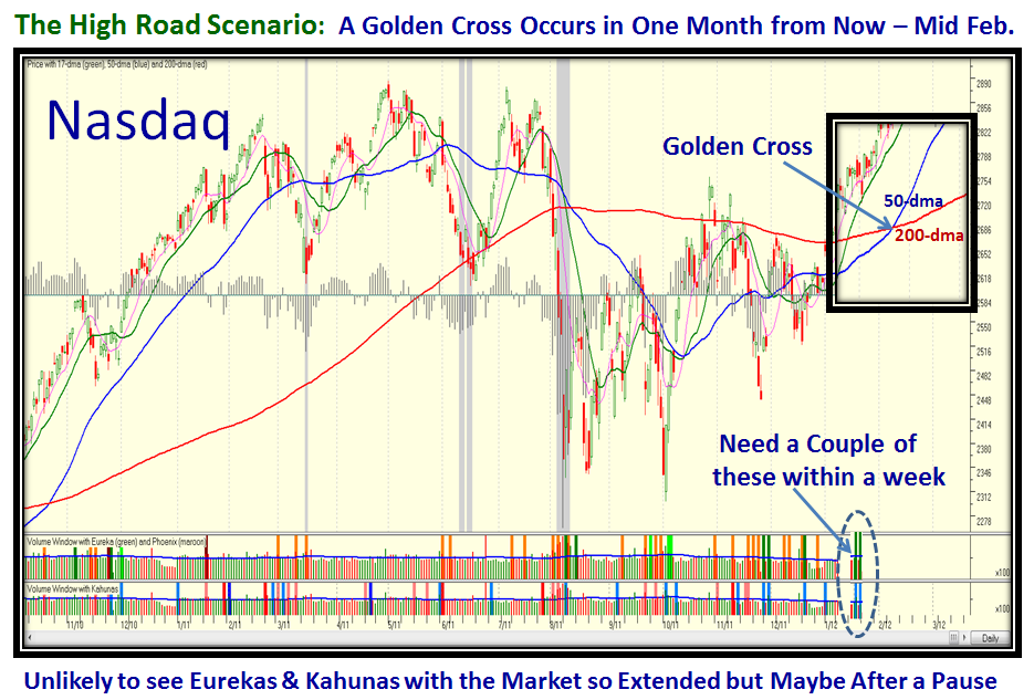
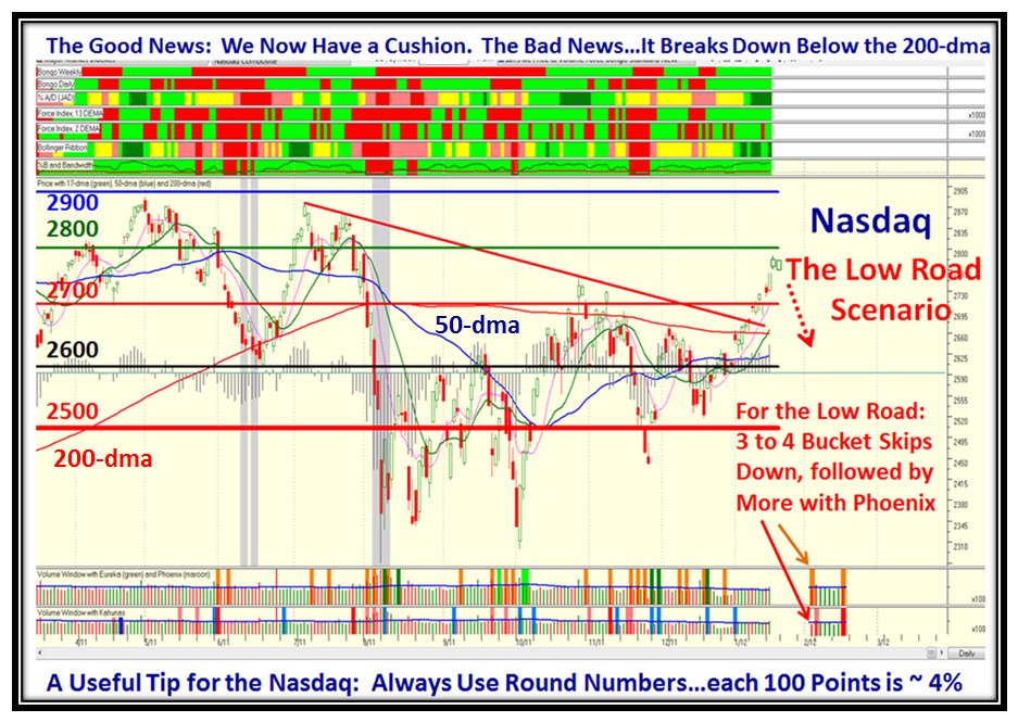
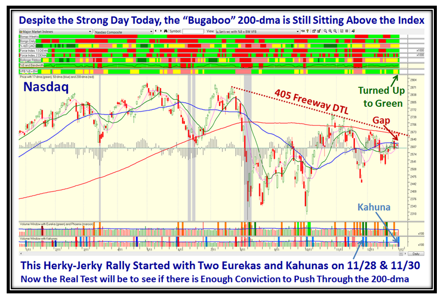
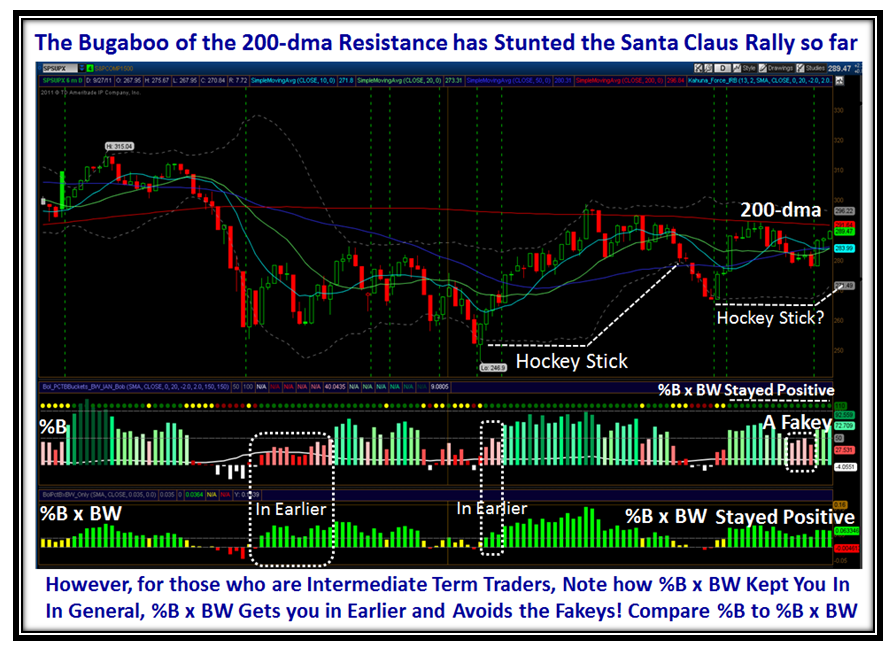
I hypothesized that we either head on up for a Golden Cross of the Nasdaq (50-dma coming up through the 200-dma) a month from now or we trot down again for the Low Road to test support at the 200-dma or lower, the 50-dma. My good friend Manu reminds me that we already have a Golden Cross with the DJIA, but all the other Market Indexes have still to achieve that significant event.
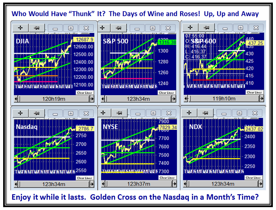
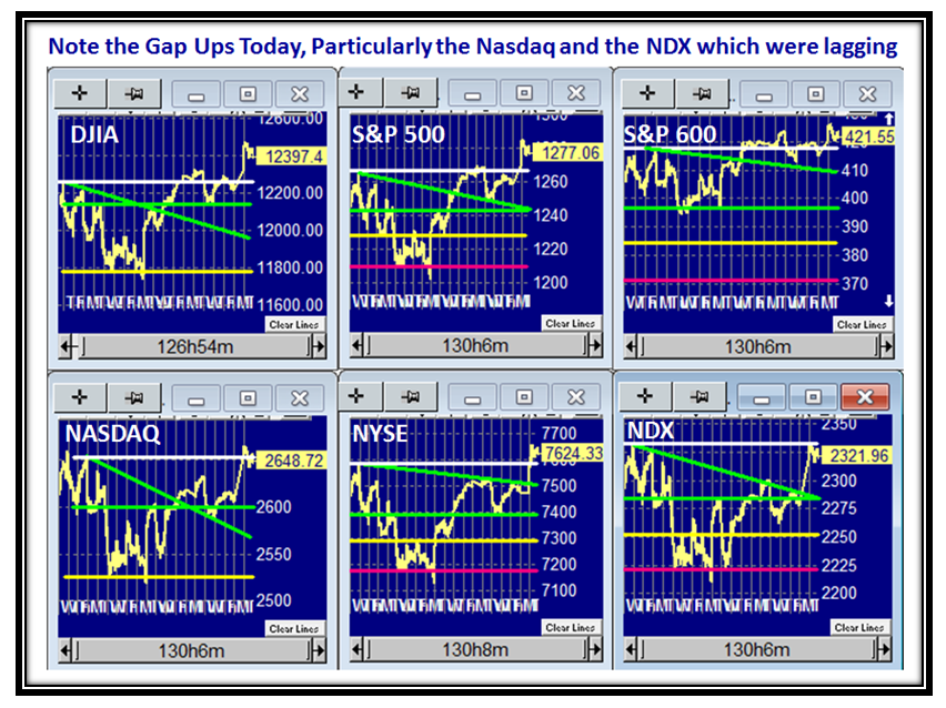
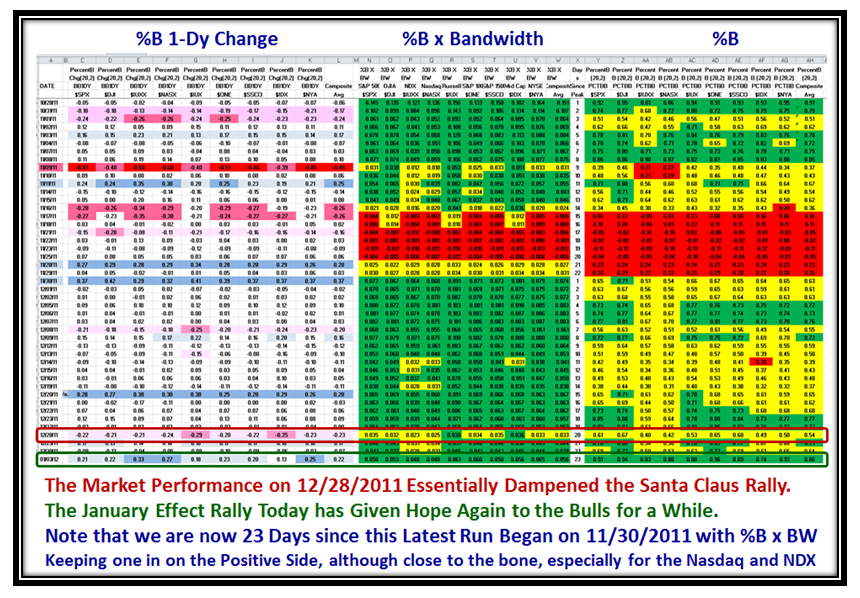
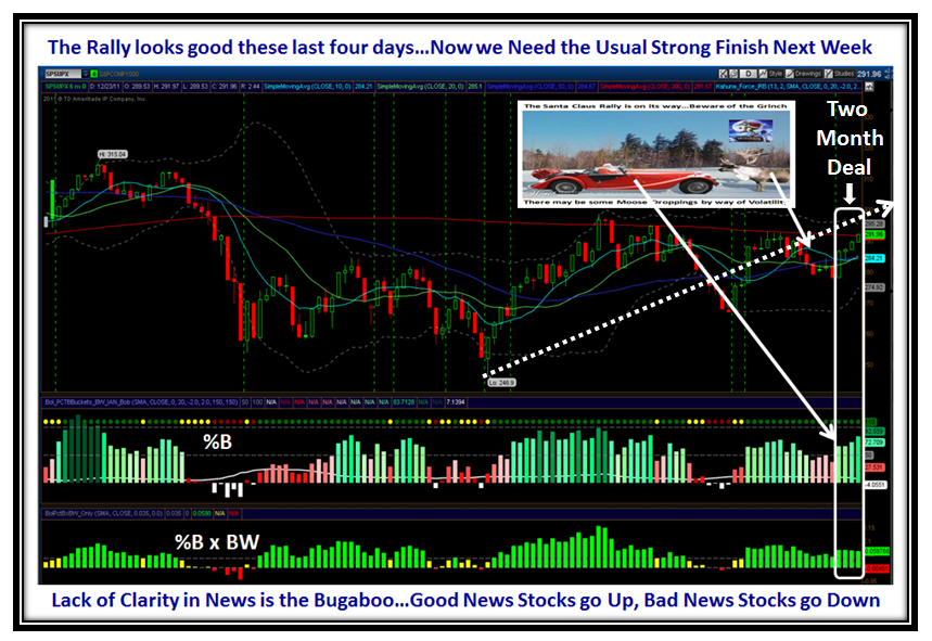
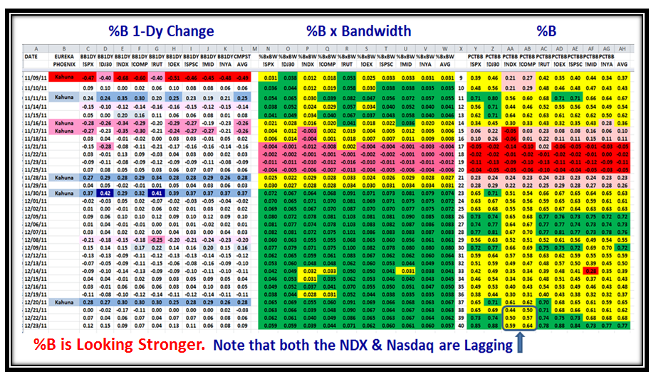
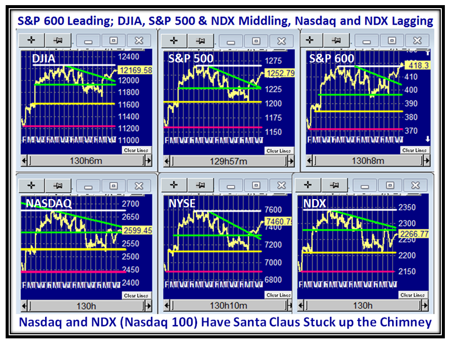
But first let’s look at the significant TIGHT moves all the Market Indexes have made not only this past week but in the last 20 days, which the picture below presents. It all started with a bang coming out of the shute on the very first day of the New Year Rally on 01/03/2012.
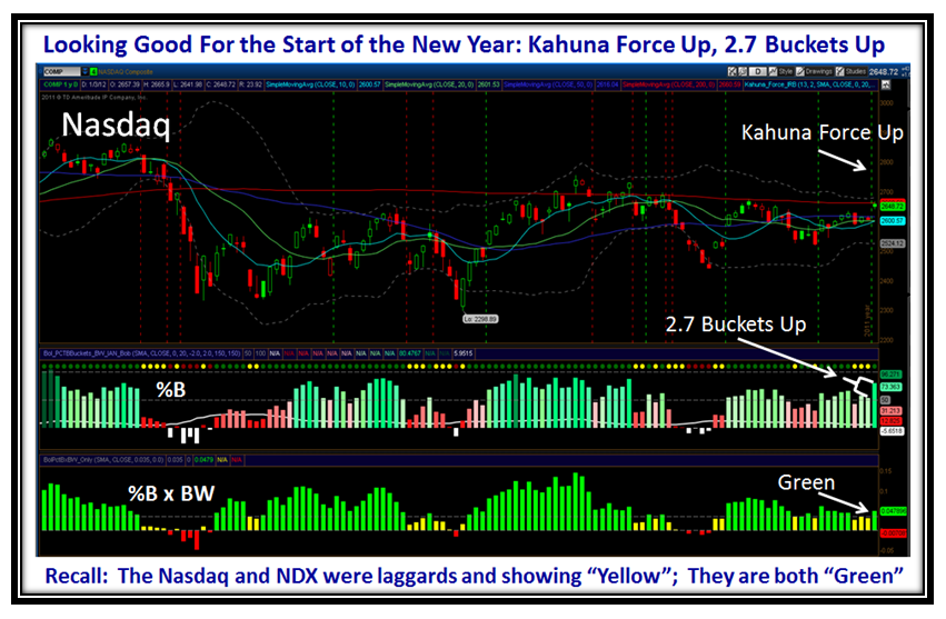
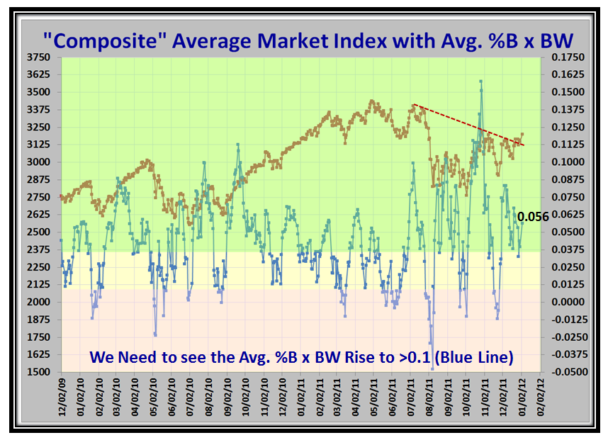
The High Road Scenario: I have overlaid a month’s worth of looking forward to depict how the Golden Cross comes to fruition in about a month from now, provided the move essentially continues as we have seen for the past month. I say that we will need to see some more Kahunas, but given that %B is already in the 90’s that is unlikely, but if we have a small pull back then we could see that extra adrenalin to push %B above the Upper Bollinger Band, i.e., >1.0.
The Low Road Scenario: This Rally runs out of steam and we head down for some form of correction. Fortunately, at this stage we are sufficiently above the 200-dma, which up to now was the strong resistance, that we have a decent cushion to give the Bulls an opportunity to find support at that line. All of this pre-supposes that we don’t get a Major Negative Surprise on the Global Economy front that has plagued this market the last eight months with a 17% correction in such a short timeframe of a matter of a week when most of the damage was done.
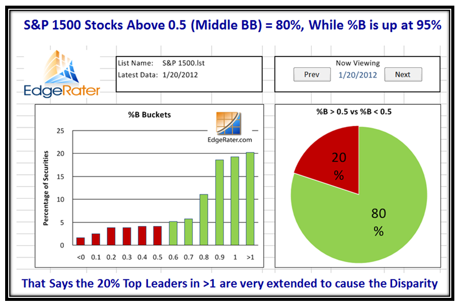
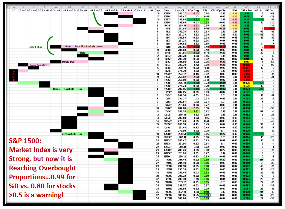
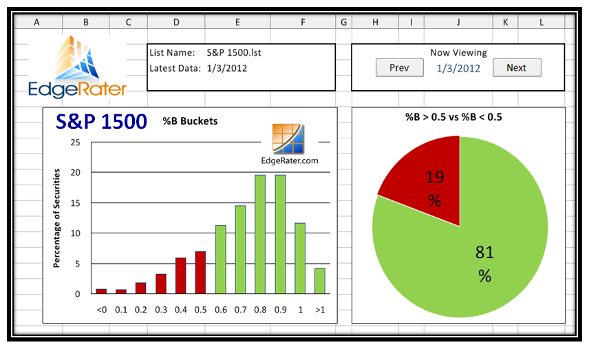
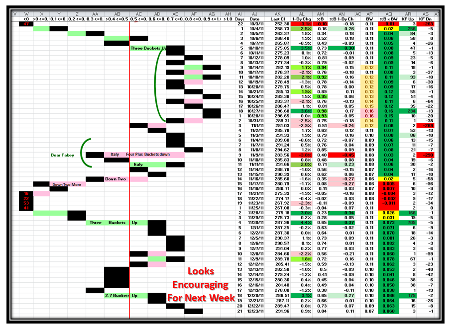
Having laid out the two scenarios simply in two charts, the next several charts show you the underlying pieces of the jigsaw and what to look for when a Rally gets a trifle “Peaky”. Let’s start with two old favorites, the S&P 1500 Pie chart showing %B Buckets and then the %B for where the S&P 1500 %B for the Index sits and the disparity between them.
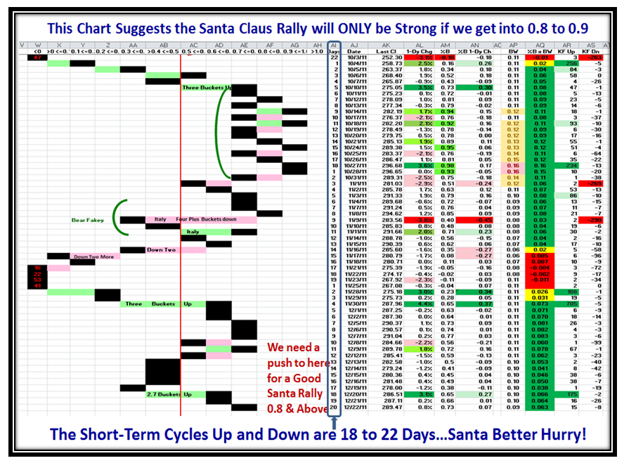
Note in this next chart where it seemed the Rally had run out of steam with the eight consecutive days stuck between 0.8 and 0.9, it got a second wind and %B for the S&P 1500 is now sitting up a notch higher with a Bucket skip to now reach 0.99 and 0.95 in the last two days.
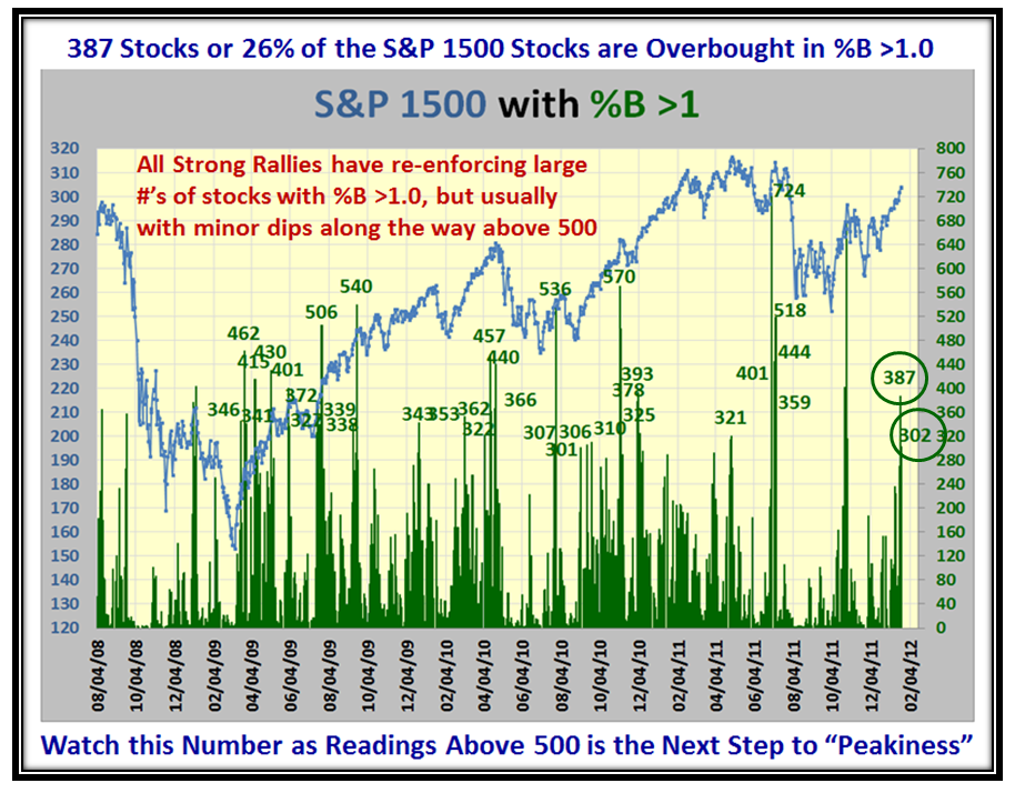
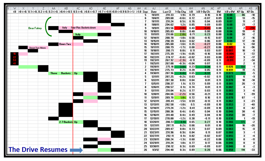
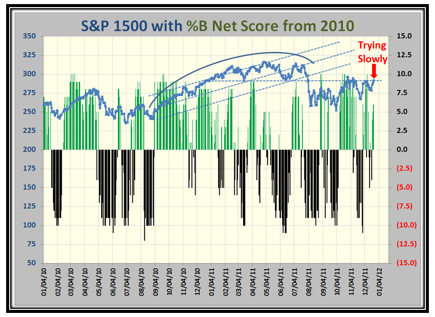
We haven’t looked at this next chart in quite a while mainly because there has not been this kind of momentum for it to give us clues as to the potential strength of the move. As you see on the right hand side with the two ringed numbers we are having healthy hits of over 300 stocks in Bucket >1.0…the overbought leaders! That’s healthy, but as you can see on the one hand we need to see this number rise to >500, it also signifies on the other hand that once reached there is invariably a pause to refresh before moving up again or it is the signal of a Climax Run with a decent correction to follow:
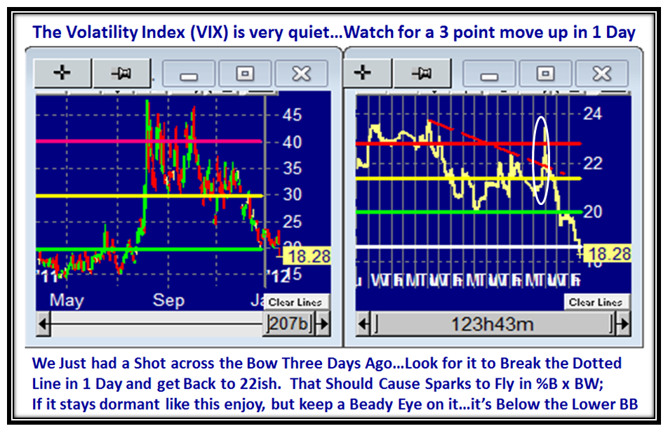
As you would expect, the VIX has gone mighty quiet in the last three days, whereas there was a one day attempt that gave a spike up of about 2.5 points as shown by the white ring, which then immediately fizzled to the lowly 18.28 level which hasn’t been seen since last July. As we well know this VIX Indicator is the “Go To” one especially as it just hit the lower BB, and so a rebound of some sort is near. Readers of the Newsletter now know that I have come up with an even better gem in %B x BW which together will give us the early warning signs that the ballgame is changing. Suffice it to say that any 1-Day change in the VIX which catapults it 3+ points will be a day to sit up and truly heed the shot across the bow.
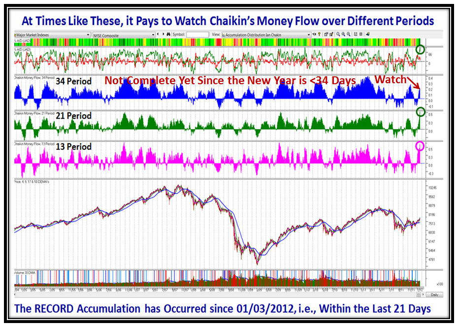
Then again, another favorite Go To Chart is what is Chaikin’s Money Flow doing in three different timeframes. You can view this in HGSI, but understand that 34 period portion has yet to prove of value as it has been just 20 days in this fresh portion of the Rally. Note the major rush of Money Flow for the 13-Period and 21-Period which are at Record Levels.
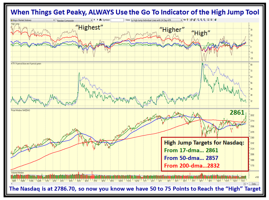
…And now, last but not least, my favorite at tricky times like these, use the jolly old High Jump Tool only found in the HGSI software. I have taught you several times of how to use it and if you don’t know, come to our next seminar on March 24 to 26. I have done the homework for you and have given you that PROVIDED the Rally continues higher we have 50 to 75 points more to go based on past history before this Rally is really long in the tooth:
In summary, I have given you four different items to watch and those who have EdgeRater now have a fifth with %B x BW for the VIX as introduced by my good friend Chris White just a few days ago which I discussed in the Newsletter. Just let the Market tell you which Road it is on, but these approaches to seeing which way the wind is blowing will help you protect your hard earned Nest Egg well ahead of the big shoe dropping if that is to be our fate. Give us feedback.
Best Regards, Ian.
 Ian Woodward's Investing Blog
