 Ian Woodward's Investing Blog
Wishful Thinking or the Next Leg of the Bear Market?
Sure it is too early to say whether we are Up, Up and Away on a second leg of this rally. With most Indexes having vanguished the barrier of the 200-dma, and we should note with a Breakaway Gap, the Bears have been drummed into seclusion and the Bulls are already counting their chickens before they are hatched.
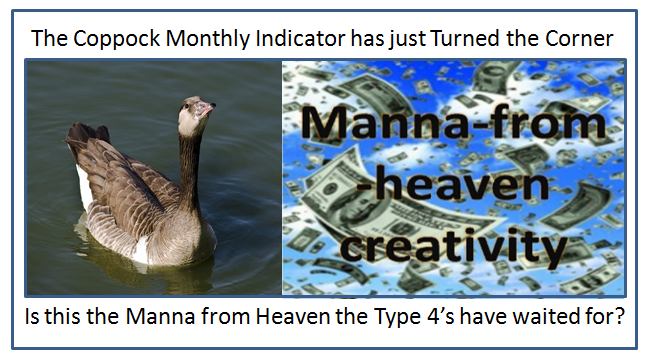
The bulletin boards (bb) are abuzz with talk that the Coppock Monthly Indicator has turned the corner, and this is sweet music for the Type 4 Buy and Hold Investors who have waited patiently in the wings while they have missed all of a 41.5% move from the Base Low. Is this the Manna from Heaven they have been waiting for?
The HGSI Team has a strong contingent of supporters from the State of Texas and we are indebted to Maynard Burstein for his contributions in educating so many people down in that neck of the woods in San Antonio. It is only fitting that I tip my hat to them as their favorite son, Edwin Coppock, who invented this little Indicator which is not known by most. Except for “Quants” who have flooded the airwaves with a “Heads Up” today as more fuel for the fire of a new leg up, most would wonder what this is all about.
Since the Coppock is probably not as well known, let me first give you some background on its origin and then relate to the context in which I suggest it might be of value.
• The Coppock Curve was first published in Barron’s in 1962
• Edwin Coppock was an economist from Texas
• Coppock was asked by the Episcopal Church to find long tern opportunities
• He saw Bear Markets as “bereavements” requiring mourning before recovery
• He based the Coppock Signal on the time people need to recover, 11 to 14 Mos.
• The Monthly Coppock is a laggard indicator, but is generally reliable
• The more negative the Coppock Indicator, the longer and stronger the bull
market that follows it when it finally turns up.
• It is far more reliable at signalling Bottoms in the Market than Tops
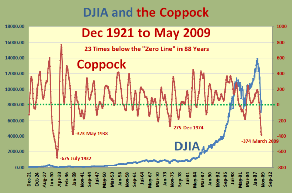
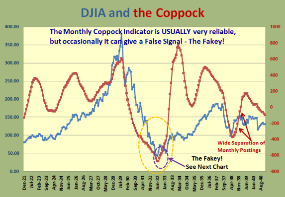
• It is currently at the second lowest reading in 88 Years of History per below:
So why do we have all this excitement all of a sudden? Another good friend, Dave Steckler, gave us an excerpt from another bb which summarizes the value of this Indicator by a contributor to that bb:
“I found that going back to 1928, there were 23 times when the Curve went below zero and hit at least a one-year low, then ticked up (this month’s reading was higher than last month’s). One year later, the S&P was positive 17 times (74% win rate) with an average return of +13.7%. I think the suggested time frame is three years, so using that I got 20 winners (87% wins) with an average of +29.0%. The average drawdown during those three-year trades was only -9.9% compared to an average max gain of +45.2%.”
Now let’s look at what the fuss is all about. The following chart shows the reason:
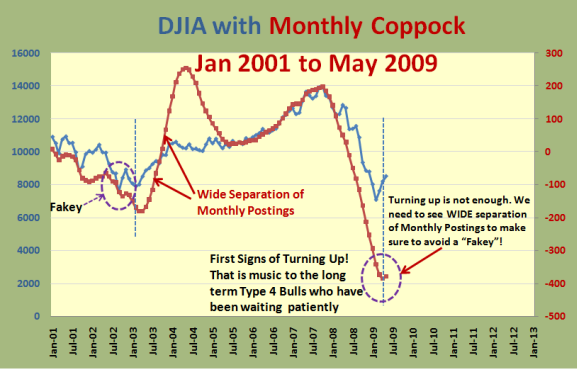
Note that it shows the first signs of the Monthly Coppock Indicator turning up. However, a word of caution is that turning up is not enough, and one can be faked out in long term Buy and Hold Type 4’s entering too soon. If my beady eyes have spied the problem I suggest we need to see WIDE Separation of monthly postings to make sure to avoid a “Fakey”. Note that in 2001 and 2002 the Coppock Signal turned up only to cause a “Fakey”, and not until 2003 did we get the wide separation of postings.
However, assurance is at the price of lost Market gain as we are already up 41% from the Base Low and if one needs complete assurance then it would seem it would take a few more months for that to happen. That scenario would suggest it would pay to wait for the famous Golden Cross which I have covered several times in this blog of the 50-dma crossing up through the 200-dma. To each his/her own.
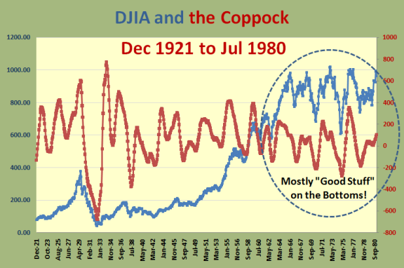
Now let’s look at the snapshot of Dec 1921 to July 1980 which shows that the signals
are far more reliable at the Bottoms than the tops as seen by the 1964 to 80 timeframe:
And now let’s zero in on the best case of all when we look at what happened in 1932-33
as shown in the next two charts:
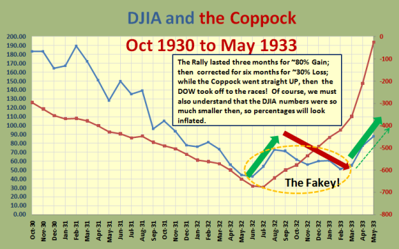
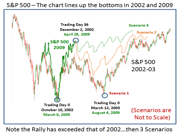
I’m sure you get my point about the “Fakey” by now. Before I wrap this up, it is only fitting that I remind you of three possible scenarios a month ago in the May 3rd blog. I have favored Scenario #2, but until we see differently, we might just be on Scenario #3!
Best Regards, Ian.
