As I explained on the HGSI Yahoo bb, I was unable to upload this Blog Note yesterday due to Technical difficulties, but hope the message will still be useful as it seems my fears came to pass this morning as I write this note. I trust the many users of the HGSI software appreciate the support you continue to get from the HGSI Team. Many thanks to George and Matt for fixing the problem late into the night.
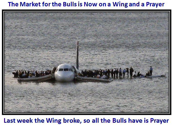
Last week I gave you a hint that the tide was turning, and the clue would be the extent of the Bounce Play from an oversold market. So my message this week to the Bulls is “The Wing is Broken, Start Praying”:

Let me hasten to add that nobody can tell you how much of a correction we will have, but Friday’s action was enough to suggest that the early bias has started the turn to the downside. Let me also say that the Market is NOT Broken at this stage, and that we have a cushion regarding Lines in the Sand for the downside targets at this point in time. I also believe at times like these, forewarned is forearmed.
In the following charts I will give you the fruits of several months of work to identify Overbought and Oversold Markets at Critical TURNING Points with many of the charts that you are totally familiar with, so there should be no surprises. I will start by picking up where I left off on my last blog in particular, then review a few other charts of AAPL and ABCDE Pie Charts which I stress from time to time, and finally leave you with just one chart you can use with the HGSI Software that will give you the day to day pulse of the Market relative to the Targets which I will unfold for you to watch.
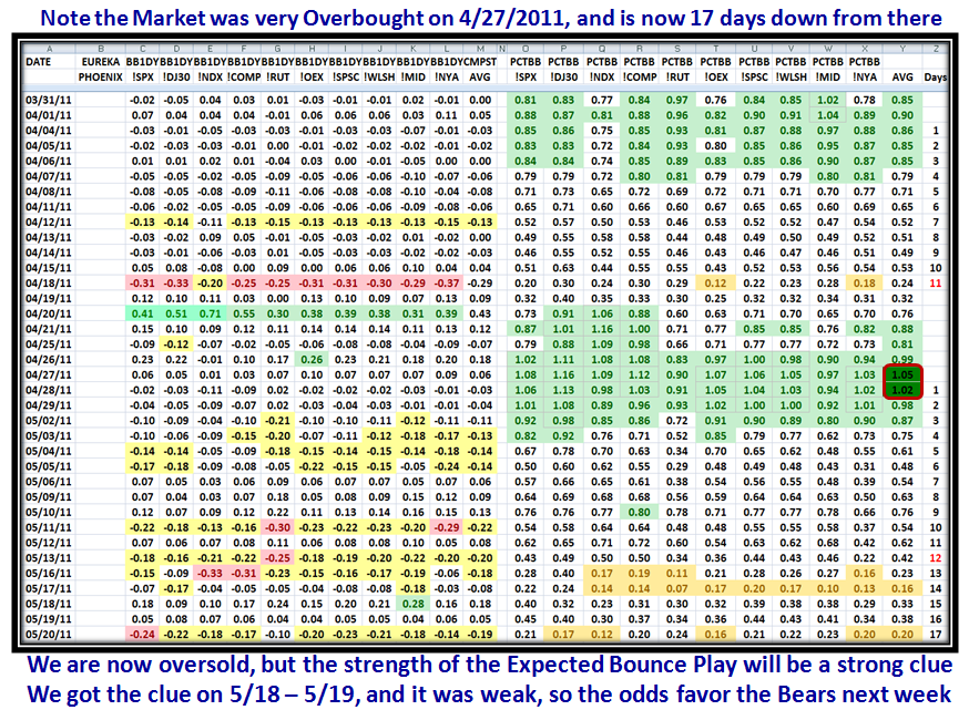
To maintain continuity with last week’s blog, I start with three further slides to the one above to update the picture since then and to explain the so-called “Purple” Chart. I start with the now very familiar chart of the 10 Market Indexes with the % 1-Day Change in %B for each and their average on the left hand side; also, the actual day by day %B Bollinger Band reading for the same Market Indexes with the Average, and then Days Since that Average attained a recent high at the extreme right hand side of the chart.
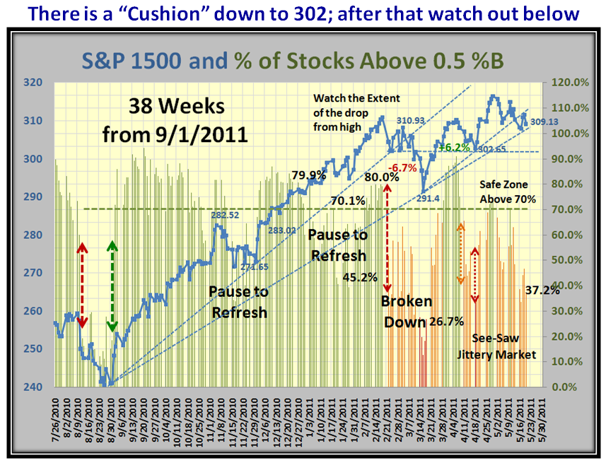
Although the numbers are there to see, the colors are focused on to show when the Market Indexes either Peak or Trough. Notice in the following chart that the Indexes peaked with the Averages shown in Dark Green over two days of 1.05 and 1.02. The significance of this Overbought status is that such results have occurred on approximately 40 occasions over the course of the past 12 years, so about three times a year. As one would expect some form of correction ensues, sometimes minor of less than -8% down, sometimes Intermediate of between -8% and -12%, and occasionally drop to a Major and/or a Bear Market of over -20% down. The biggest drop we have had these past two years is the -17% in the so-called Flash Crash of May 2010, which lasted through August of that year. Since then the new bull rally started on September 1, 2010 and has eked out ups and downs over the past 38 weeks since then with the last three months being very jittery, as shown in two charts down from here:

You will recall that I stressed last week that with the Market Indexes correcting as expected from the high of 4/27/2011 (I might remind you virtually one year to the date it peaked last year), we should expect a dip to a low in the Indexes to follow. This occurred on 5/17/2011 at an average low reading of just 0.16, when it was expected we should expect a bounce play. The clue to the strength, or lack of, that bounce came within two days and the Market Indexes then swooned on this Friday, as shown. Note that it was Options Expiration day, and the only comforts that the Bulls can take are the lack of volume and the complacency still existent by the low VIX readings under 18!
The next chart shows how jittery the market has been these past 13 weeks. However there is a natural cushion down to 302 for the S&P 1500, while the -8% Line in the Sand is at 291, so those two yardsticks should be kept in mind as the weeks progress:

I left you with a conundrum last week with the so-called “Purple Chart”, which I assured you takes out the mystery of the relationship between the Bollinger Band %B of the Indexes and the % of stocks over 0.5%B, which is the key to the “Bucketing Process”. Here is the original chart with a few annotations added such as “Major Tug-o-War” and “1” and “2” on top of the Arrows as shown:

You will note that if recent history was to repeat itself, we should expect a Bounce at either “1” or “2”. Since the S&P 1500 %B reading was at 0.20, I indicated that we should see a Bounce Play at Point 1 the following day, or we would fair far worse and could get badly oversold to Point 2. The Market chose to Bounce at “1”, which then gave us the perfect opportunity to watch the QUALITY of the ensuing Bounce Play. Needless-to-say, it fizzled as shown on the next chart, where I also uncover the way to interpret the “Purple”, which is the difference between Bollinger Band %B in Green, and % of Stocks >0.5 %B in Red! Note that I have drawn in the difference between the two green and red lines on the upper portion of the chart in Purple:

After months of wrestling with the two differences between %B and % of Stocks above 0.5%B, I feel this is a breakthrough in interpretation, and leads to a very simple way for you to follow the pulse of the market regarding the possible behavior of Large (institutions) and Small (herd) Players! That will come later in this Blog when I give you just one pie chart to follow to understand the pulse of the market.
For posterity sake, let me expand on what is on the chart with regard to the essence of my findings:
1. When %B of the Index is ABOVE that of the % of Stocks >0.5 %B, play to your heart’s content. The Large Players are Bullish and driving the market up with heavy accumulation of Leading Sectors, Industry Groups, Stocks and ETFs. The emphasis is on “Leading”. The broader market of all 1500 S&P stocks is lagging, as depicted by the Difference between the two “green” and “red” line readings, i.e., the purple portions of the chart which I have designated as “Play”. We know from past experience that when either or both readings are above 0.70 (70%), the market is in the Safe Zone and one plays with impunity.
2. Let me now take the reverse situation…when %B of the Index (green line) is BELOW that of the % of Stocks >0.5%B (red line), Large Players are fleeing the market, while the herd is still lethargic and/or complacent, i.e., watch out for pullbacks, corrections, bifurcation, rotation…you name it. This is best illustrated by the Negative Purple area from 3/1/2011 to 3/16/2011, where all Market Indexes were severely trashed. This phenomenon has also shown up this past six days from 5/13/2011 to now.
3. In between these two general boundaries of Overbought and Oversold is a “Place your bets and take your chances” zone depending on the strength of the Bounce Plays, where a typical area is coming out of a correction to a potential new rally. This is best described by the 3/17/2011 to 4/06/2011 timeframe, where both the green and red lines are moving essentially in unison. The start of such a move is seldom before %B has come up through the Bandwidth and usually from around 0.20. Likewise, potential Bounce Plays occur at 0.20 upwards. I need hardly mention that at the start of a Fresh Market Rally, ala 9/1/2010, the odds of success are far greater than they are now 38 weeks later.
If this market deteriorates further next week, then the likelihood is that we will at best Bounce at 302 on the S&P 1500, or if that is broken then at 291 which would be the last line of support at -8% down as mentioned above, before the floodgates open.
Let’s turn to the Canary in the Coalmine…i.e., AAPL. You will recall this chart I showed a few blogs back:

…And here is where we are today:

If AAPL breaks 331 to the downside, watch out below as the market should then be in serious jeopardy. It goes without saying that this market will cut you to ribbons when you see the see-saw of the Groups:

Now let me give you the tools to watch the market at Overbought and Oversold stages so that you can just rely on one chart for you to use in the HGSI Software Spectrum Analyzer which will give you the pulse of the market in five minutes flat on a daily basis:

Here are the Keys to the Kingdom for Oversold and then Overbought for the past three years. We start with the number of stocks recorded for the S&P 1500 with %B <0, i.e., below the Lower Bollinger Band:

…And here is that same picture for stocks >1.0, i.e, above the Upper Bollinger Band:

The Meeting at the Palos Verdes Library on Saturday got the people all excited that this is their Oyster. Our special thanks to Ron Brown for giving us his Weekly Report, which was much appreciated. The reading of 58 in the Bucket <0 is shown, and I give you the Targets to watch for in order to gauge the extent of any correction lower from this point. Use the Warehouse with Market Index Components, and then select the S&P 1500. Then turn on the Spectrum Analysis Tool and load Bollinger %B as shown:

Be careful until the dust settles. If the market recovers from here, keep this in mind for the next time.
Best Regards, Ian.
 Ian Woodward's Investing Blog


