 Ian Woodward's Investing Blog
Stock Market: Wolves Howling with More Hindenburg Omens
The Wolves are howling in a Blue Moon giving warning of two more Hindenburg Omens this past week with the last one surprisingly on Friday!

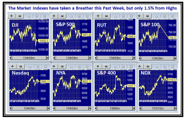
The Market Indexes took a well deserved breather this past week with many of them having chalked up new Highs, and at this early stage they are only down about 1.5% from their recent highs. We have been here before, but the tom toms are beating with the revival of these recent Hindenburg Omen Sightings.
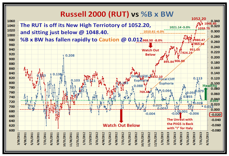
The Small Cap Russell 2000 (RUT) which has mostly led the way lost a lot of ground in its %B x BW reading, so this also suggests Caution and suggests more down movement to come unless the Bulls can renew their enthusiasm to step in:
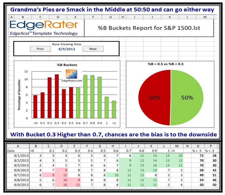
Grandma’s Pies are at Stalemate and next week will determine which way the market will move, up or down:
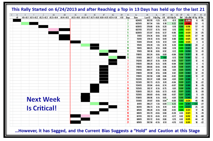
The Rally is long in the tooth and sitting at the 50:50 dividing line, which once again confirms that next week is critical:
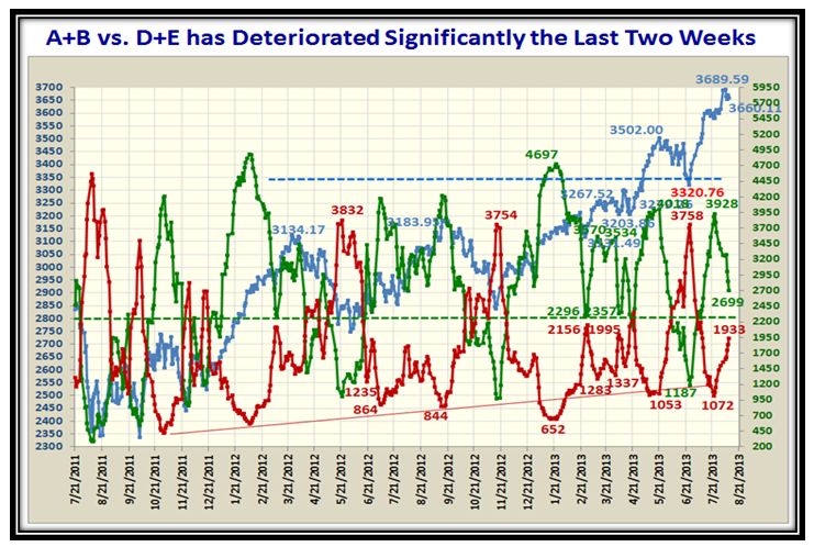
…More of the same: Accumulation vs. Distribution shows major sagging:
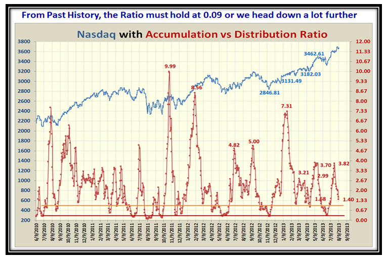
Here is a New Picture of the %A – %E stocks, which suggests we are close to a turn up or we suffer a lot more downwards:
Now we come to the news of all this Hindenburg Omen mumbo jumbo (good stuff). I can hardly believe that six years have passed since my Blog Note of this phenomenon was mentioned by Wikipedia. Time passes when you are having fun. 80% of the time, these signals result in minor to medium corrections with minor far outweighing medium. However, the Omen is that for other 20%, there has never been a Bear Market Correction without a series of Hindenburg Omen signals, which is its real claim to fame. Here is where we stand as a follow-up to my last Blog Note on the subject and I am really indebted to Chris White for providing us this indicator in template form to stay on top of such events.
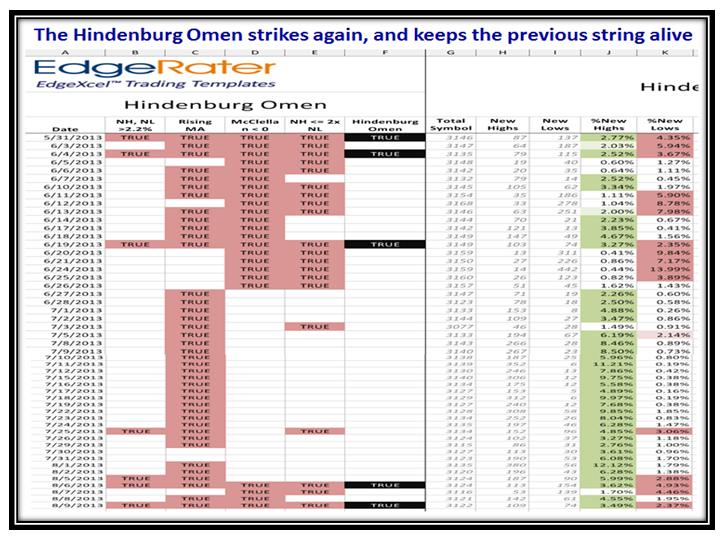
For those of you who are new to this stuff, please understand that the powers that be changed the criteria for these sightings when the NYSE made drastic changes to the content of stocks for their NYSE composite to just using only common stocks which caused a switch to using ALL NYSE stocks instead which roughly doubled the number. The HGSI software which pioneered providing this feature back in the early 2000’s at my behest has not switched to this new set at this time, so keeping track of this valuable function is not possible at this time.
This raises another question as there are essentially three camps:
1. Those who only want to know it has occurred without the details, or alternatively could care less discarding it as a bunch of hokey pokey.
2. Those who want to understand the details by way of numbers (use EdgeRater Pro software)
3. Those who would prefer to see the results depicted as a graph (HGSI software)
Since I have encouraged both these products to incorporate this valuable Indicator, I have taken the time to satisfy both types by “painting in the dates” (for now) from EdgeRater Pro onto the HGSI chart as shown below:
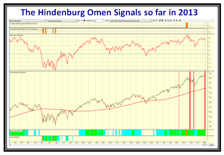
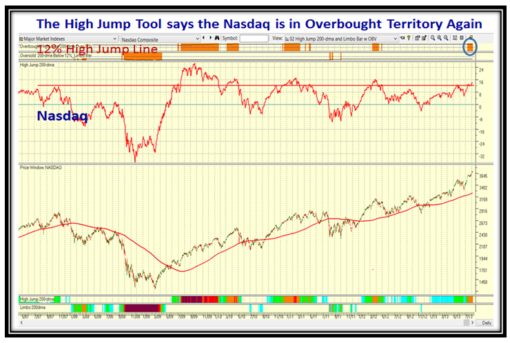
There is a Method in my madness to show the chart using one of the other features I consider of tremendous value to Top Down Investing and that is the High Jump Tool. I used the SPY (S&P 500 surrogate) in the above chart, but show the Nasdaq view below. Please note that this view is also showing caution by the blue ring, where the Nasdaq is now >12% above its 200-dma.
Forewarned is forearmed and you now have both sides of the coin to know what to do to preserve and/or grow your nest-egg which is my objective to help you.
Best Regards,
Ian
