 Ian Woodward's Investing Blog
Stock Market: A Review of the Past Three Weeks
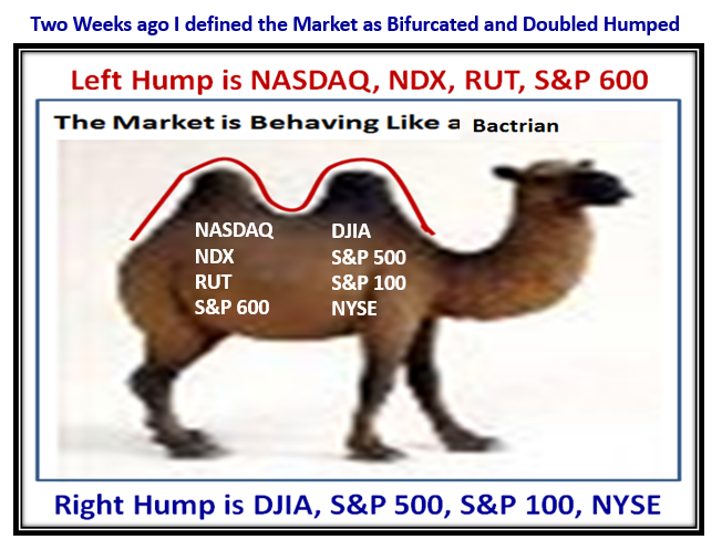
With Memorial Weekend upon us, I felt I should step back and recap what has transpired these last three weeks as we have moved from a Bactrian two humped Camel to a Dromedarian to the Bears winning to the Bulls and Canaries showing a new Spark of Life. I will use many of the charts you are familiar with together with some new fodder to help us determine what to do going forward. So let’s use four different Pictures interspersed with fodder to show us what we have endured these past few weeks:
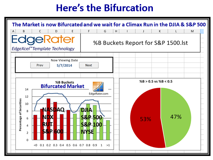
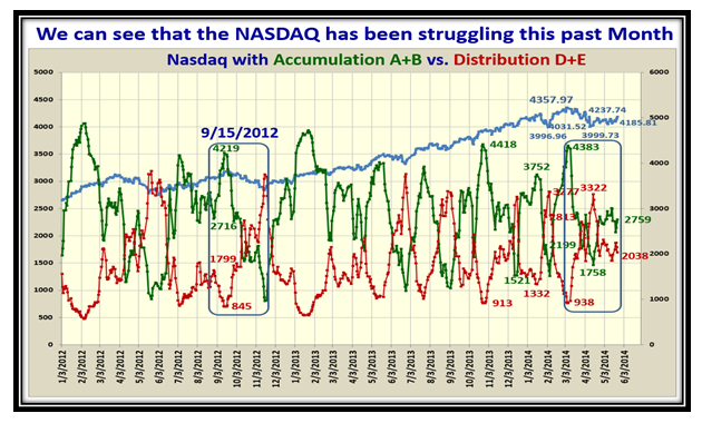
…And this chart showed the Bifurcation and the Market in Stalemate at the time, with the Nasdaq and NDX the laggards!
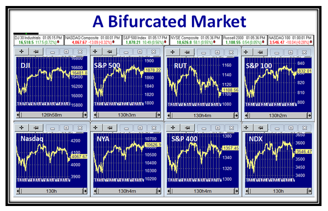
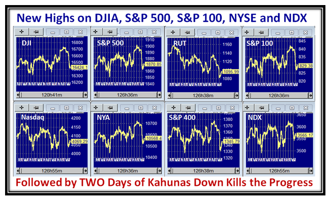
Here was the picture of the eight Market Indexes we follow which show the S&P 500 and DJIA leading:
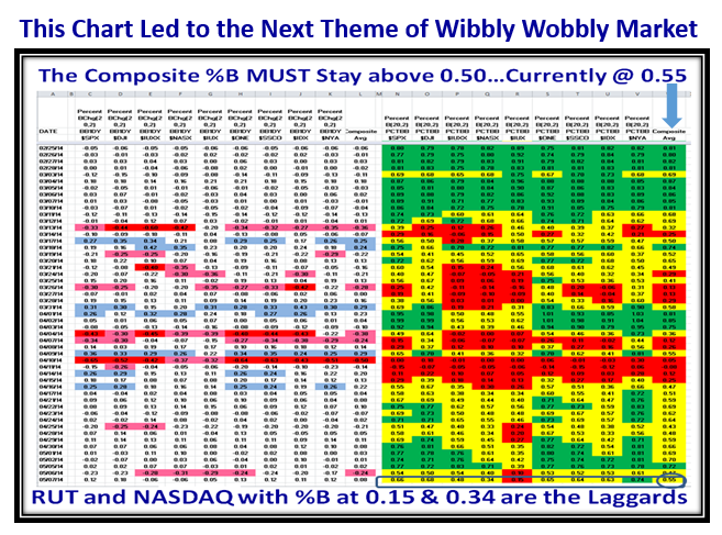
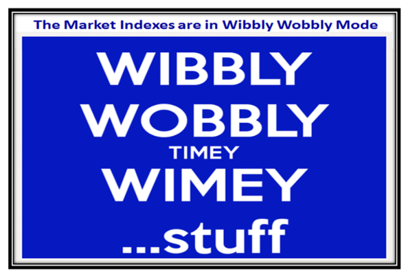
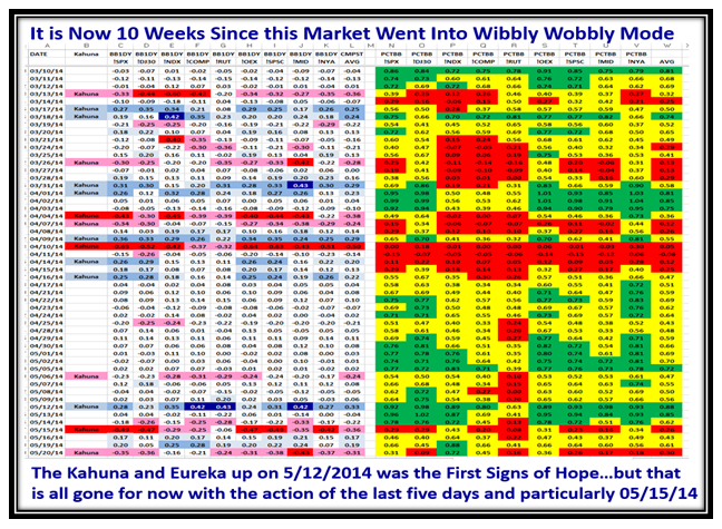
…And to round this week out, my favorite chart shows the Turmoil of a Wibbly Wobbly Market we endured:
The Theme Chart was obvious for the next week, where it signals that Type 3 & 4 Longer Term Players should hunker down:
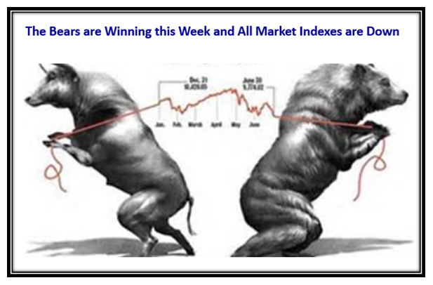
…And true to form, the two humped Camel turned to one, with all Market Indexes headed down with a 2:1 ratio to the downside:
The Market Indexes Chart shows the dramatic drop back to support at the lower level, and concern that the Bears would win:
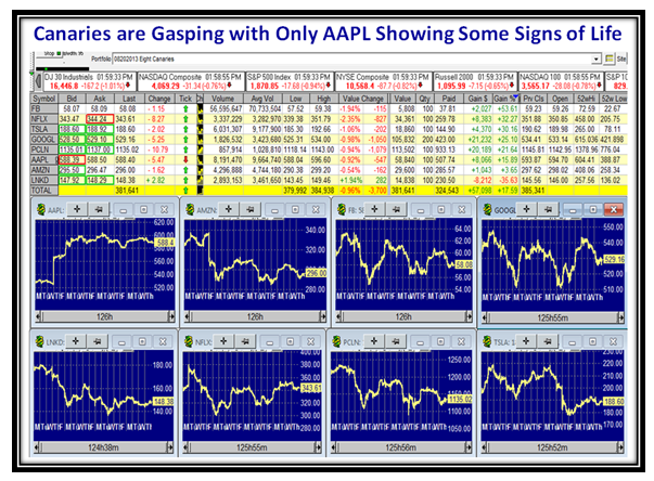
The Canaries were all Gasping except for AAPL and confirming that the Big Cap NDX stocks were in trouble:
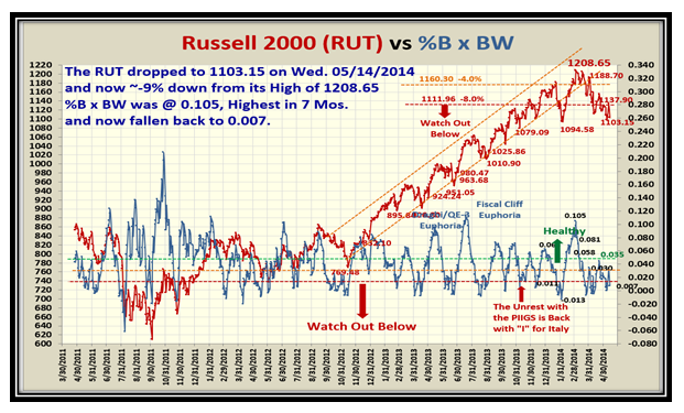
By this stage the Russell 2000 (RUT) Small Cap stocks were behaving the poorest as shown by the chart below:
The underlying Accumulation vs Distribution chart was also showing that the Market was essentially in Stalemate:
It didn’t take much to indicate that the Bears were winning the tug-o-war that week with all Market Indexes down:
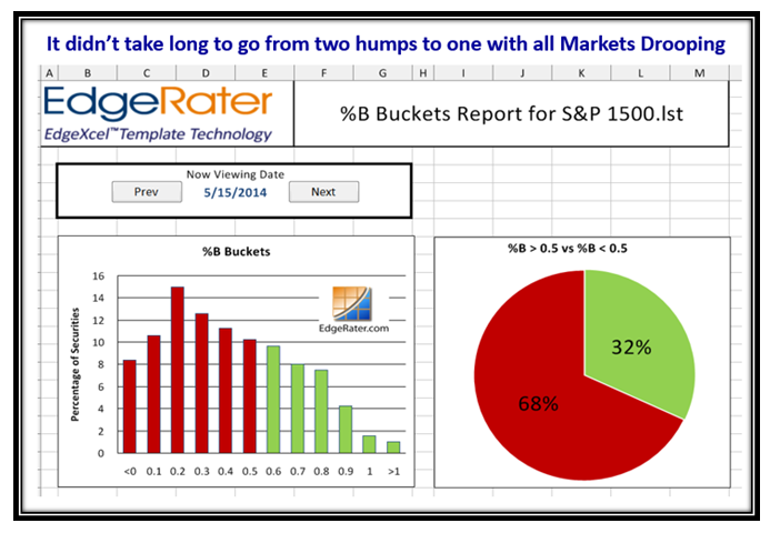
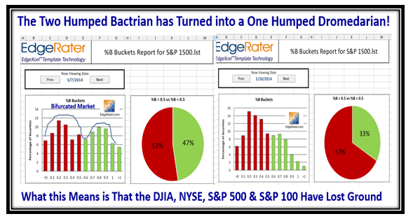
The Buckets chart showed that the Two Humps bifurcation had changed to one with all Markets dragged downwards:
You don’t have to read the numbers to see that the Market Indexes were in Turmoil, and it seemed inevitable we were going down:
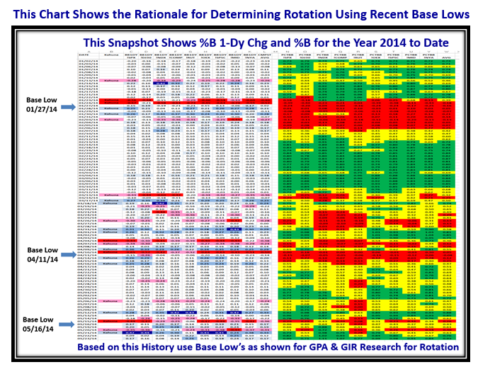
I know that some of you do a lot of work with two key features we have in the HGSI Software using the Group Performance Analysis (GPA) and the Group Inclusion Report (GIR), and here is a winky-winky to use the recent base lows to spot rotation as shown:
Would you believe it, the Big Guns decided that we were oversold, and the Market Indexes have all risen where the Bulls are back:
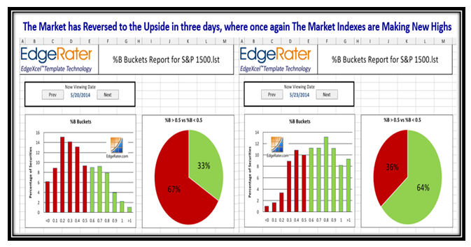
Inside a matter of three days Grandma’s Pies have reversed themselves from 2:1 against to 2:1 for the Bulls:
Here’s another brainwave with a new chart…use the Composite Market Indexes Price and %B to get a feel for the overall Market:
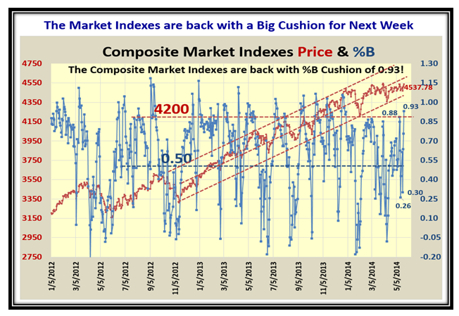
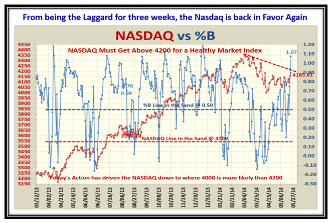
Note how the Composite Index Price has been flat and tight for the best part of two months, and is finally hinting at a breakout. Unlike the NASDAQ which took a beating but at long last is poking its head upwards with %B above the Upper Bollinger Band:
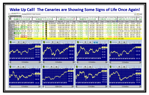
Would you believe it but the jolly old Canaries are perking up once again and confirming that the NDX is the leading Index:
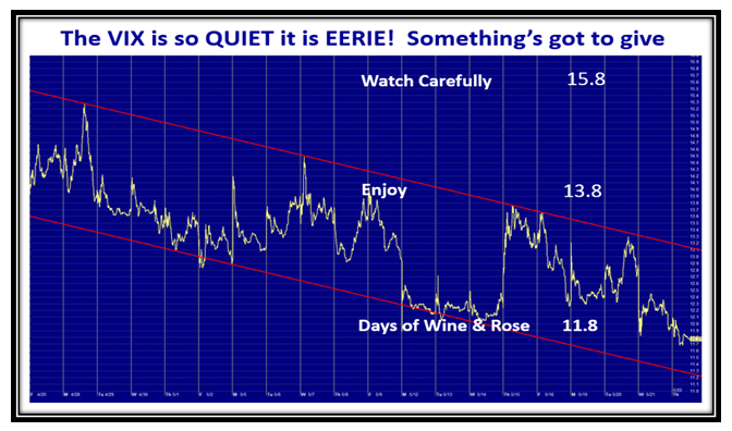
Finally, let’s not forget to look at the VIX and it signals you have at least a two to four day cushion to the upside this coming week:
I hope you have enjoyed this long blog which gives you a flavor for how I put my blog notes together to keep you and me on the right side of the market. Have a good Memorial Day Weekend!
Best Regards,
Ian.
