Ian Woodward's Investing Blog

Archive for the ‘Market Analysis’ Category

An Early Stock Market Gift From Santa
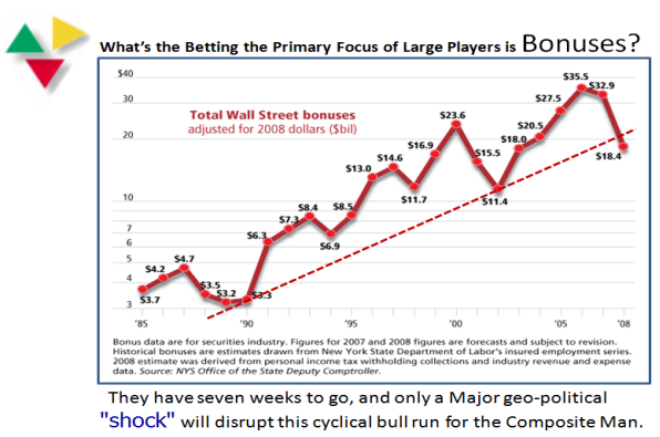
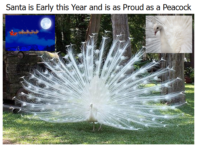
Monday, November 16th, 2009

Last week I told you that the Santa Claus Rally would come early this year, and true to form he is as proud as a Peacock as he drops in with some goodies for all of us:

santa

Having recovered from getting the Newsletter posted yesterday, I offer two brand new Leaders Indexes as a Santa Gift to you and trust they will serve you well in the weeks to come.  One is an updated RonIandex from the work we did at the seminar which now replaces the tired and worn out 06152009 Gorilla Mkt Leaders which has served its purpose very well.  The other is a brand new idea which builds on the work that Ron has developed to make use of the Force Index and Total Dollar Volume Combo Rank we provided in the Newsletter of yesterday.

Twenty years ago when I first introduced the concept of the Ian Index, with a name change 15 years back to Iandex, and then ten years ago to the RonIandex when Ron and I teamed up, we have successfully provided you with a set of about 20 to 25 leaders at critical points in time.  These Indexes have paid their dues time and time again in two ways:

1.  The primary purpose was to provide an early warning of when the Stock Market Indexes might correct. 

2.  Since no one can identify exactly when the market will top, many of the stocks on the list provide a winky-winky to do your homework for additional profitable gains until they do break down and correct.  Look for pullbacks in these Gorillas and hop on for the ride.

The underlying principle of the RonIandex is based on the axiom “The higher they rise, the faster they fall”.  It is an Aggressive Growth Stock Index aimed at identifying tops, as well as a snapback after a correction.  At minimum it can be classed as a Minor Correction of <8% on the S&P 500 and about 10% on the Nasdaq.   Most often when a rally has been as long as nine months, the correction can be at least an Intermediate Correction of between 12 to 16% for the Nasdaq.

The intent of the RonIandex is to select those stocks that are the leaders in leading HGS Groups once the Nasdaq breaks out into new high territory and at this time is >18% above the 200 Day MA.  It did that on 9/23 when the Nasdaq peaked at nearly 27% above its 200-dma High Jump.  It then slipped back under heavy profit taking and just as quickly snapped back up. 

That shows that buying on dips is once again in vogue, so now is the time to identify those leading, and usually very extended, stocks that will give us an early warning sign, hopefully before the Market curls over and corrects once again. 

The logic is that since these stocks are fat with profits and are in leading groups with High ERG and strong Rel Str Rank, they will get hit hardest when the market corrects.   The primary purpose of the RonIandex is to show that it is breaking key support points such as the 9 Day MA, 17 Day MA and ultimately the 50 Day MA, if the correction is MORE THAN MINOR.  So the secondary purpose is to identify the best of the best 20 to 25 stocks in 15 or more leading groups that will provide a steady climb based on their behavior the past few months.  However, to all NEWBIES my strongest warning is don’t play with dynamite until you know how to handle it  – you can get eaten alive if you go in blindly and buy these stocks and the market turns sour on you.

With all of that as background, here is the chart which compares the 06152009 Gorilla Mkt Index with the two new indexes and the Nasdaq to give you some idea of the relative strength of these Indexes when measured from the Base Low in March 2009.  The stocks that make up the Indexes are shown below the chart for your convenience:
chart

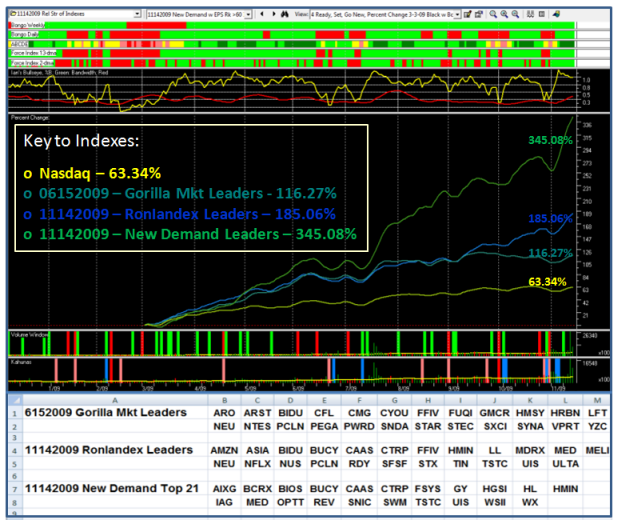
If you stare at the chart, here are some pointers for you:

1.  Note how the 06152009 Gorilla Mkt Leaders Index is nearly twice the strength of the Nasdaq.  Being of stalwart make-up, it matched the fresh RonIandex of 11142009, until it tailed off in strength in mid September, and is now essentially flat, indicating it has served its purpose. However, it still has life in it as it surged 1.57% today and is up over 33% since 6/15/09, when I first introduced it to you.

2.  The 11142009 RonIandex is made up of a few old warriors and several new leaders which are showing their muscle, now that the EARNINGS REPORTS are behind them.  There is nothing worse than selecting stocks for such Indexes that haven’t announced their earnings.  The whole purpose is to time the selection of such Indexes after the bulk of the Earnings Season, so that one can quickly identify NEW Leadership.  This Index is up 1.42% at the close today.

3.  Albeit, we are too quick to paint this rally as “Junk off the Bottom”, but I learned many moons ago that the fresh new companies that are coming out of the woodwork which I call Box 7 stocks with >100% earnings the last two quarters is the best kept secret HGS Users have known for Years.  So fresh off the drawing boards, I built on Ron’s portion of the newsletter to give you the “New Demand Leaders” which has a mixture of up and coming new leaders and “tiddlers”, so that there is something in there for everybody to taste.  Naturally, its Index is “To Da Moon” with a reading of 345%, over five times the Nasdaq!  If you don’t work with stocks below $15 just overlook them, but there is a smattering of six tiddlers in this Index.  This Index is up 2.26% at the close.

4.  Just one glance at the steep rise in % Change in mid-July, and again confirmed two weeks ago from early November, should leave no doubt that these stocks are worth reviewing and selecting and discarding as one sees fit according to your fancy.  Note the surge in Volume on those two occasions. Also note the Dark Green ribbon, third from the top, which confirms heavy accumulation of the stocks in this Index now. 

Those of you who attended the seminar need to dust off HGS 1001 and review Pages 179 to 181 to prepare yourself for the next targets for the S&P 500 and Nasdaq…now that 2206 is within the Nasdaq’s sites.  Don’t forget there is still a residual “White Swan” volume vacuum, particularly for the S&P 500.

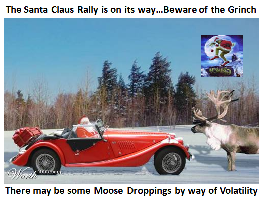
Yes, of course there will be Moose Droppings along the way, but Santa is enjoying the sleigh ride early this year.

Best Regards, Ian.

Seven Weeks Away From the New Year

Sunday, November 8th, 2009

Time flies when you are having fun and who would have thought that we are just seven weeks away from the New Year.  I don’t show themes about Santa Claus Rallies this early, but as you will see there is a method in my madness and I assure you I have not taken leave of my senses.  So with that in mind, I offer you that during this next several weeks there will be much talk about Santa, the Grinch & Moose Droppings along the way:

        santa

I have taught you not to fall in love with one theme for which way the Market will go…it is fatal to do that and I have mentioned enough times that now is the time to have light feet and stay nimble.  That said, for the benefit of those who may be passers-by, here is what I espouse and follow faithfully.

 three

At the Seminar we held two weeks ago, I gave my friends the balanced review of the internals of the market and which way the wind was blowing for each Camp and I would like to share it with all of you.  Please note that only three days ago I came out with a blog note that said the Internals had gone to “Pot” and showed you why.

Here in quick succession are three slides I used (suitably updated where necessary) which lays out the case for Camp Sunshine and Camp Gloom and Doom, and poses the question “When will we know this Powerful Rally is over?”

The Case for the Bulls:

bulls

The Case for the Bears:

bears

When will we know this phase is over?

phase

As I digest the various discussions on the bb’s I frequent, there are excellent reviews of what will give confidence that this is or is not a Bull or a Bear Trap, depending on which side of the fence one is on.  The eye opener for me is what transpired on Friday with the jobs report as I highlighted in red on the above slide.  So I offer you the following slide which may just shed light on what the Composite Man’s goals are in the next seven weeks and why I felt I should give you an early heads-up on the Santa Claus Rally and January Effect phenomenon:

bonus

We shall see how this plays out. 

Best Regards, Ian.

Stock Markets Never Die, They Gently Fade Away

Wednesday, November 4th, 2009

picture

It is barely ten days since we held our Seminar, and who would have thought the Internals of the Market would show such weakness in such a short time.  My good friend Maynard is holding his Group Meeting tomorrow, so I felt they would like some fresh fodder to update them on where the Internals stand.  The charts are self explanatory and the hour is late so I want to get this posted in a hurry with no explanation, but the charts speak for themselves:

chaikin

up

new

e

a

ss

Enjoy.  Best regards, Ian.

The QID:QLD Revisited

Monday, November 2nd, 2009

Question:  thanks…so the QID is short the NASDAQ x 2 and the QLD is long the NASDAQ x 2. The ratio of 3.3 to 1 needed to signal capitulation means that 3.3 times higher volume (or is it dollar value) in the QID (the short one) is the telltale sign things are turning to custard big-time?  Have I got that basically correct?

And conversely, if the QLD (long NASDAQ x 2) is showing only 1.5 to 1 higher ratio vs. the QID then it is time to buy again…

And not having heaps of time, a glance every day at the volume of these two ETF’s will give a glimpse of the underlying behaviour of larger market participants to indicate possible market direction?  Kiwi Keith

Answer: Kiwi Keith:  Now you’re cooking, you have it close enough for government work.  But let me make sure you know exactly what is involved.  Let’s take a specific case like today to show you what you are looking at in the “Green and Yellow” chart on the previous blog, and why Maynard and I feel it captures the relationships between the two regarding which way the wind is blowing in the MARKET! 

If you trot over to Yahoo Finance and type in  the QID and QLD you will get the following numbers:

           Date        Open    High    Low    Close      Volume          Cl x Vol         Ratio
QID 11/2/2009     24.13   24.54  23.46  23.97      40,304,907    966,108,621    1.182
QLD 11/2/2009     47.81   49.12  46.97  48.08      16,996,844     817,208,260

The second last Column is the Close Price x Volume for each. 

QID/QLD Total $ Volume Ratio = 966,108,621/817,208,26 = 1.182

NOTE! If your numbers are slightly different sitting in sunny New Zealand, don’t worry about it…it’s close enough for gov’t work.

What concerns me is that although you have it pegged right that 3.3 times means “custard big-time”, that happened back in November 2008, and it is important to undestand WHAT it takes to get to that ratio.  It is a totally different state of affairs than now and the numbers back on 11/12/2008 just 10 days short of a year ago looked like this:

            Date         Open   High   Low    Close      Volume           Cl x Vol          Ratio
QID  11/12/2008    76.87  81.80  76.11  81.40      49,680,200      4,043,968,280   3.388
QLD  11/12/2008    28.14  28.45  26.22  26.39      45,231,000      1,193,646,090

Big Difference…and let’s hope we don’t see that again during any correction we might have going forward.  My point is that you will know full well when the Market is falling apart long before we see a number like that.

“And not having heaps of time, a glance every day at the volume of these two ETF’s will give a glimpse of the underlying behaviour of larger market participants to indicate possible market direction?”

Now you are on the ball and almost correct.  If you cast your beady eyes on the price of the QID and QLD, you will see the price difference is 2:1 in favor of the QLD at this time.  Since you don’t have heaps of time, all you have to do to see which way the wind is blowing is divide the QID VOLUME by 2 on the day and if it is running higher than the QLD volume, you know that the ratio is >1 and if lower, then the Market favors the Bulls with the ratio <1.  Otherwise, do the math as shown above.

But Kiwi…life is not that simple, especially for Type 3 people like you.  Since you do not have time to watch the market all day long, the INTRA day swings are humongous right now.  There is a 4% swing from Low to High and the QID essentially finished flat…16c between the open and close is no biggie. 

              qid 

I sense you have lopped onto the “twofer one” of the QID and QLD, and gambling types are playing “threefers” which is the whole attraction of these ETF’s.  A Type 3 playing with Type 1 toys gets slaughtered unless they are nimble.  These are primarily short-term instruments unless you call the Bottom and the Top precisely:

          wc

I hope that clears up your questions and that you are understanding the value of the above chart to keep you on the right side of which way the wind is blowing in the Market.  So much to learn, so little time.

Best Regards, Ian.

The Forgotten Key Target!

Sunday, November 1st, 2009

My good friend Maynard reminds me that in my last blog I forgot to mention one key target that has served us well in the past.  Since Cricket has eleven players, here is the 11th Man to keep an eye on in this tug-o-war between Bulls and Bears.

cricket

In this modern day and age with the advent of ETF’s, one measure of the fight between Bulls and Bears is to watch the relationship of the Nasdaq 100 (NDX) and the QID/QLD Total Dollar Ratio.  Here are two charts that I have shown in the past and I am sure it may give us a feel for who is winning by watching these two views this time:

green

1.  Note how quickly the QID/QLD Total Dollar Ratio rose rapidly from 1.0 to 2.5 as the NDX bottomed back in March 2009. 

2.  Then see how the ratio has remained dormant essentially below 1.5 for this entire rally, except again in mid year when all the Market Indexes swooned about 9% from High to Low.  Note the dotted vertical blue line which shows that when the Bulls gained control again the ratio which had risen sharply fell back below 1.5.

3. Now once again, the Bears are rising from the ashes with the lowest ratio reaching 0.7 and ominously touching the down-trend-line from last March.  The Target to watch is two fold; a) break above the line , and b) head rapidly for a reading of 1.5 for the Bears to win or fall back rapidly for the Bulls to gain control again.

I’m sure you are saying “That’s all well and good, but I can’t keep track of these factors; life is too short, Ian.”  You don’t have to, as I am sure what caught Maynard’s beady eyes was that the VOLUME on the QID on Friday rose to nearly 41 million shares, while the QLD by comparison had a paltry 18 million.  The day previous the volume was 23M and 11M, respectively, but what we need to do is just keep an eye on the day to day volume more so than the price change at this stage of the game to see which way the wind is blowing.  We must recognize that these instruments are also used as a hedge for one’s portfolio, but let’s see if this item can help us.  Incidently, the last time the QID volume was above 41 Million shares was on July 23rd when it hit nearly 50 Million shares while the QLD was at 19 Million. The QID lost ground after that and the Bull Rally continued until now.

black

This one is more “loosey-goosey” where we divide the NDX by the QID:QLD Total Dollar Volume.  However it has broken the lower trend line though not convincingly.

Best regards, Ian.

Copyright © 2007-2010 Ian Woodward
Disclaimer: Commentaries on this Blog are not to be construed as recommendations to buy or sell the market and/or specific securites. The consumer of the information is responsible for their own investment decisions.