Ian Woodward's Investing Blog

Stock Market: Will Soon Be Reaching “Bubble” Territory
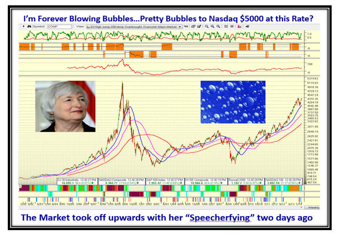
June 21st, 2014

I just couldn’t resist showing you how the Market behaved as Ms. Janet Yellen was pontificating to the Senate despite all the turbulence around us with concerns of the situation in Iraq uppermost on our minds:

Bubble Picture

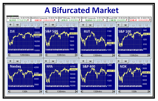
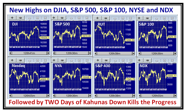
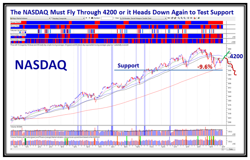
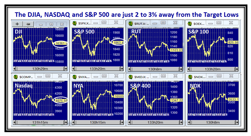
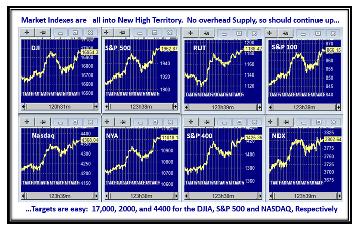
The Market Indexes have all reached double tops, so we either pull back again or burst out upwards next week:

Bubble Indexes

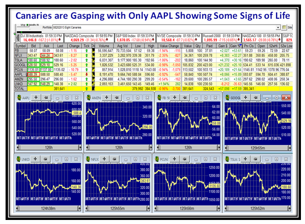
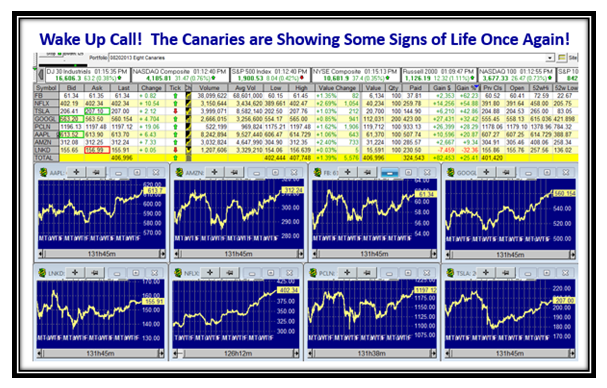
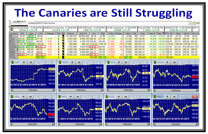
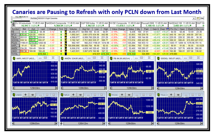
The Canaries have behaved relatively well during this period, but pausing to refresh at the moment with PCLN lagging:

Bubble Canaries

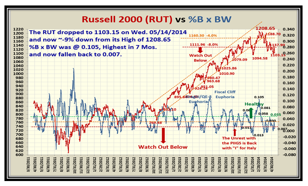
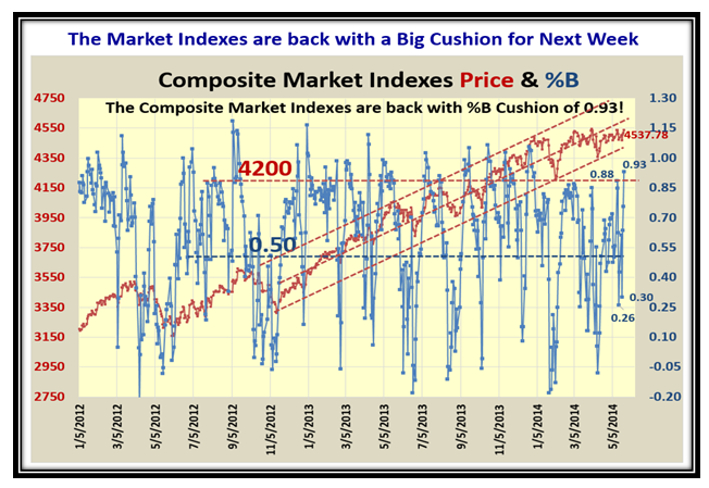
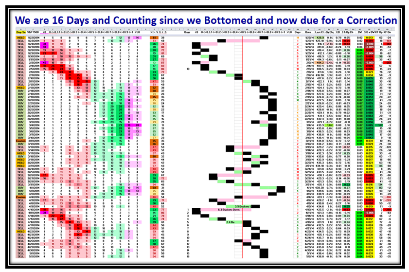
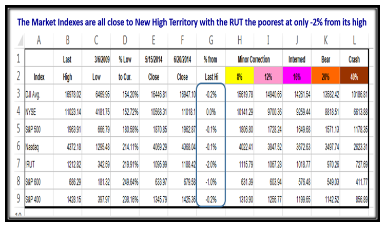
This next chart is worth its weight in gold and summarizes where the Markets stand relative to the New Highs they have just made and when you need to have taken some form of action if they all drop violently towards -8% Corrections:

Bubble Big Foot

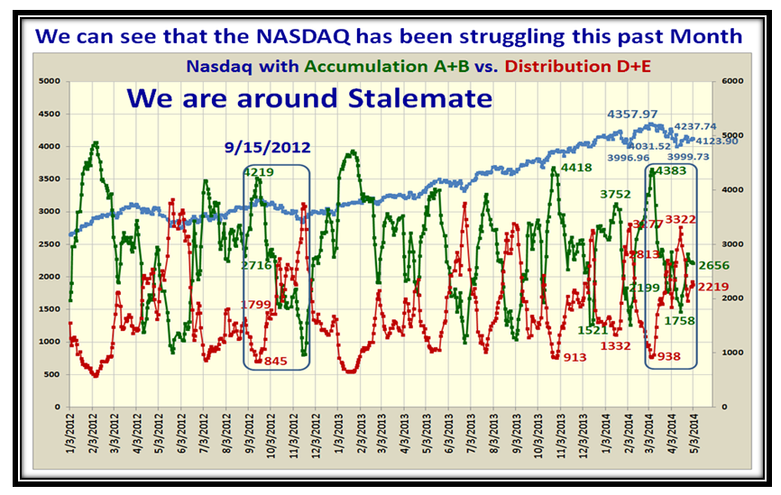
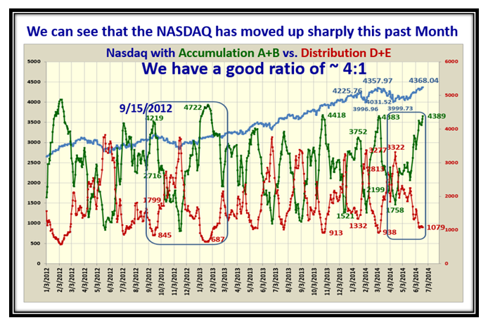
As we would expect the Accumulation: Distribution ratio of A+B:D+E has now reached a comfortable 4:1. so good cushion:

Bubble abcde

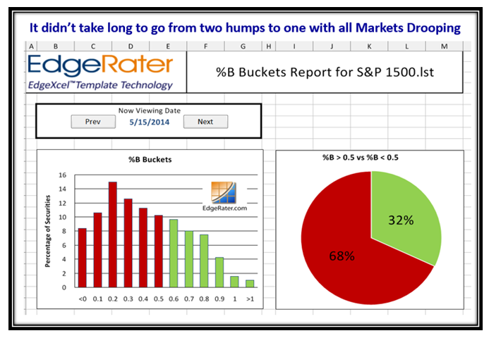
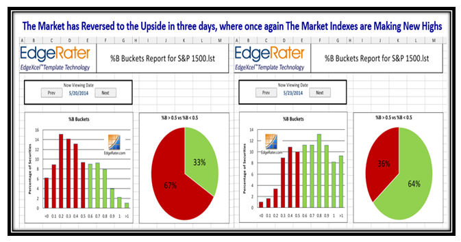
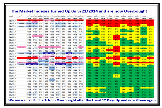
The Markets have settled down again with %B for the Indexes all in Green Territory, with only a minor correction last week:

Bubble Indexes2

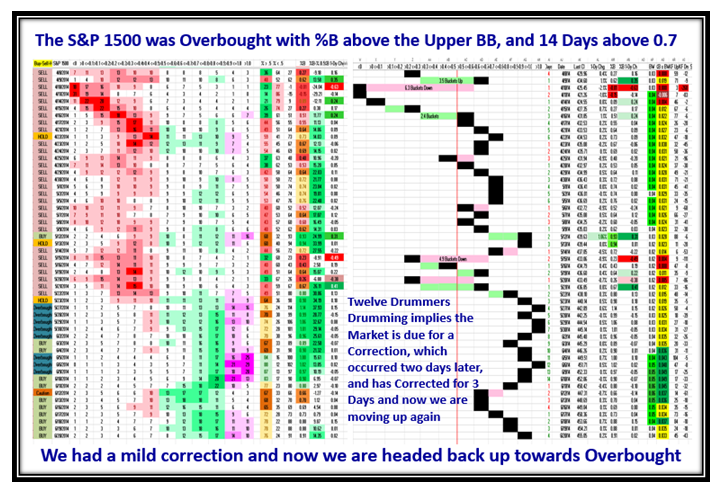
Likewise the picture of the behavior of the S&P 1500 looks equally good as we once again rise towards Overbought territory:

Bubble Pat

Grandma’s Pies Confirm the see-saw action of two months ago and the current strong performance of the last few weeks:

Bubble Pies

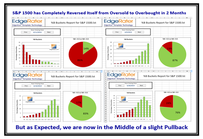
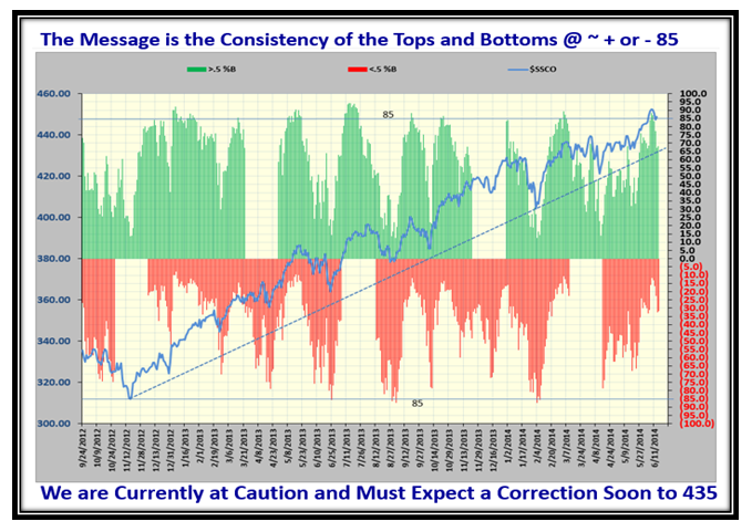
We are a long way from being at the lows of %B with a reading of 0.86, but when the rot sets in, it trots down fast:

Bubble Nasdaq

…And here is a similar picture for the S&P 1500…the value is in the Consistency of the Tops and Bottoms, so we can act:

BubbleS&P1500

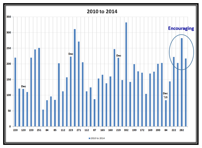
Now for the Jobs Report of a week ago, where at least they are encouraging with the past four months above 200,000/mo:

BubbleJobs 1

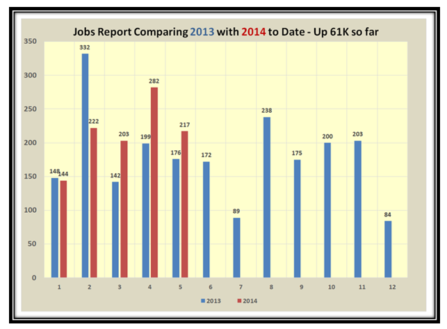
…And here is the comparison to last year.  Since the next two months for last year are low, there is hope!

BubbleJobs 2

I trust all of this was worth waiting for?!  Enjoy.

Ian.

Stock Market: A Review of the Past Three Weeks

May 24th, 2014

With Memorial Weekend upon us, I felt I should step back and recap what has transpired these last three weeks as we have moved from a Bactrian two humped Camel to a Dromedarian to the Bears winning to the Bulls and Canaries showing a new Spark of Life.  I will use many of the charts you are familiar with together with some new fodder to help us determine what to do going forward.  So let’s use four different Pictures interspersed with fodder to show us what we have endured these past few weeks:

Recap Picture

…And this chart showed the Bifurcation and the Market in Stalemate at the time, with the Nasdaq and NDX the laggards!

Recap Bifurcation

Here was the picture of the eight Market Indexes we follow which show the S&P 500 and DJIA leading:

Recap Indexes

…And to round this week out, my favorite chart shows the Turmoil of a Wibbly Wobbly Market we endured:

Recap Pat

The Theme Chart was obvious for the next week, where it signals that Type 3 & 4 Longer Term Players should hunker down:

Recap Wibbly

…And true to form, the two humped Camel turned to one, with all Market Indexes headed down with a 2:1 ratio to the downside:

Recap Pie

The Market Indexes Chart shows the dramatic drop back to support at the lower level, and concern that the Bears would win:

Recap Indexes2

The Canaries were all Gasping except for AAPL and confirming that the Big Cap NDX stocks were in trouble:

Recap Canaries

By this stage the Russell 2000 (RUT) Small Cap stocks were behaving the poorest as shown by the chart below:

Recap RUT

The underlying Accumulation vs Distribution chart was also showing that the Market was essentially in Stalemate:

Recap abcde

It didn’t take much to indicate that the Bears were winning the tug-o-war that week with all Market Indexes down:

Recap Picture3

The Buckets chart showed that the Two Humps bifurcation had changed to one with all Markets dragged downwards:

Recap Pie3

You don’t have to read the numbers to see that the Market Indexes were in Turmoil, and it seemed inevitable we were going down:

Recap Pat3

I know that some of you do a lot of work with two key features we have in the HGSI Software using the Group Performance Analysis (GPA) and the Group Inclusion Report (GIR), and here is a winky-winky to use the recent base lows to spot rotation as shown:

Recap Pat4

Would you believe it, the Big Guns decided that we were oversold, and the Market Indexes have all risen where the Bulls are back:

Recap Picture4

Inside a matter of three days Grandma’s Pies have reversed themselves from 2:1 against to 2:1 for the Bulls:

Recap Pie4

Here’s another brainwave with a new chart…use the Composite Market Indexes Price and %B to get a feel for the overall Market:

Recap Indexes3

Note how the Composite Index Price has been flat and tight for the best part of two months, and is finally hinting at a breakout.  Unlike the NASDAQ which took a beating but at long last is poking its head upwards with %B above the Upper Bollinger Band:

Recap NASDAQ

Would you believe it but the jolly old Canaries are perking up once again and confirming that the NDX is the leading Index:

Recap Canaries2

Finally, let’s not forget to look at the VIX and it signals you have at least a two to four day cushion to the upside this coming week:

Recap VIX

I hope you have enjoyed this long blog which gives you a flavor for how I put my blog notes together to keep you and me on the right side of the market.  Have a good Memorial Day Weekend!

Best Regards,

Ian.

Stock Market: Bifurcated Bactrian!

May 7th, 2014

It has been more than a while since I used Camels to depict the Behavior of the Market (I stand corrected as I used Dromedarian earlier and am correcting it per one of our supporters as a Bactrian has two humps and not a Dromedarian), but that is exactly where we stand after the behavior of the Market Indexes these past few weeks, and I am sure you get the point:

Bractrian Picture

When a Market is essentially at Stalemate, and the chart pattern of Grandma’s Pies is double humped, it pays to see if there is a separation of Growth Stocks and Indexes vs Value.  Here is that picture:

Dromedarian Pie

The Market Indexes show the same problem with the NASDAQ and RUT lagging the rest:

Dromedarian Indexes

This next chart shows the Rationale for watching the Composite %B which is currently at 0.55 to ensure we focus on more that one particular Index like the NASDAQ or the Small Cap RUT:

Dromedarian Pat

This is a New Chart which shows the relationship of the NASDAQ not to its %B, but that of the Composite %B.  We note that at least for today the DJIA, S&P 500, S&P 100 and NYSE pulled the other Laggards up a bit where the NASDAQ %B and RUT are as low as 0.34 and 0.15, respectively.

Dromedarian hump

Now we wait to see which set of Market Indexes either pull the other set up or take the Market down.

Best Regards,

Ian.

Stock Market: Sell in May and Go Away?

May 3rd, 2014

Who knows where the Market goes from here, but for sure we are now in May and as we go Round and Round in Sunny Qatar, your guess is as good as mine.  Kevin and a few of his friends faithfully support my Blog, and even came out to Sunny Palos Verdes for one of our Seminars a few moons ago, so with tongue in cheek I give him a nod as I remind him of the joke on Nasal Catarhh!

May Picture

I say Round and Round we go, but really the Market Indexes are once again in a tizzy as they go up and down:

May Indexes

Many would say “What more do we want?” Most Indexes are close to their highs…that’s true.  But it is the skittishness of the Indexes in the Yo-Yo moves they have endured particularly over the past two months that makes Intermediate Term Investing very difficult, and most must play glued to their screens for the continuous rotation we see:

May NASDAQ

The Canaries as a group are still struggling, but trying to find support just below the 200-dma.

May Canaries

…And here is the Canaries Index which shows it has dropped -33% from its high and struggling for support:

May Canaries2

The Accumulation:Distribution Ratio is essentially struggling at Stalemate, i.e., 50:50, so again little enthusiasm:

May abcde

Finally, I show you the S&P 1500 as it has meandered up and down over the past two months, is 16 days up from its recent low, and doesn’t seem to be able to push much higher.  Unless we see a major push in Grandma’s Pies to the upside, we are now at a day count of 16 days which suggests the bias is down before it trots up:

May Pies

Best Regards,

Ian.

Stock Market: Downside Targets

April 27th, 2014

There comes a time when things get tough to turn to the Keep It Simple Stupid (KISS) approach and this is one of those occasions.   You will recall my earlier yardsticks when the market was headed up that I mentioned things always get difficult around round numbers.  On that occasion the hiccup occurred at 16,000, 4000, and 1800 on the DJIA, NASDAQ and S&P 500, respectively.  Now many moons later since those numbers were finally breached to the upside, we are once again sitting just above them as the support levels before the Market Indexes finally give up the ghost to the downside:

Target Picture

Here is the Current Status:

Target Indexes

…And here using the -4% Benchmarks I always use to gauge the potential Targets is the NASDAQ:

Target Nasdaq

Now you have it… the Rationale being that at these ROUND NUMBERS there is now plenty of Support and with all the shenanagins of the Big Guns they either mean business to hold the line at these levels or World News is too difficult to overcome.  If the Market Indexes stay above these round numbers, then play till the cows come home, if you can put up with the Turmoil.  Lesson learned…When in doubt, Keep it Pithy!

Best Regards,

Ian.

Copyright © 2007-2010 Ian Woodward
Disclaimer: Commentaries on this Blog are not to be construed as recommendations to buy or sell the market and/or specific securites. The consumer of the information is responsible for their own investment decisions.