Early Warning Signs of a Stock Market Top
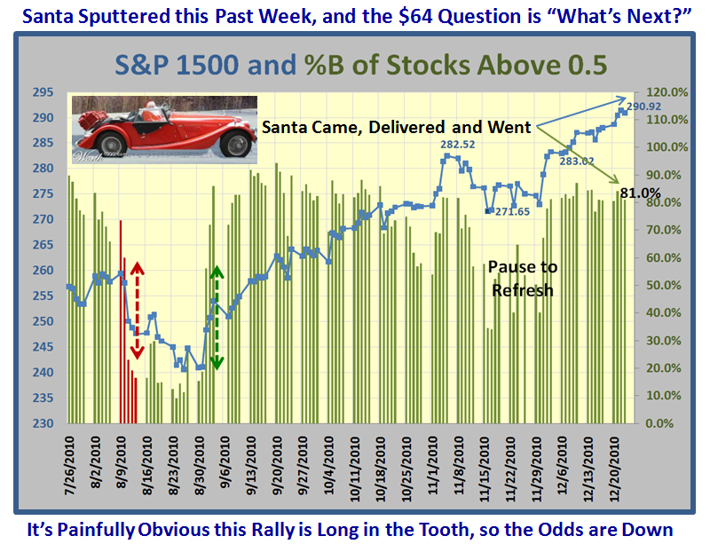
Santa Claus has come and gone and sputtered this last week, but that was to be expected as we have had the best part of a 17 week rally if you accept that the two week “Pause to Refresh” in mid to late November was only a minor correction of about 4%.
The $64 question is “What’s Next?” Never ever have only one outlook or bias. By all means develop the High, Middle and Low Road Scenarios, but in the final equation let the Market tell you which road it is on. Certainly, when the Rally is this long in the tooth, it is prudent to take profits along the way, lighten up and be cautious. But how many times have we all been fooled by the Market Behavior, so although the odds favor a correction soon, don’t bet on it until the evidence is cast-iron.
So let’s turn to “Fly-Specking” Sherlock Holmes style using all we have learned these past several months to see if we can develop the three scenarios for the High, Middle and Low Roads. The objective is to identify some Early Warning Signs using %B criteria, given what we have observed in the recent past.
Allow me a little indulgence in that many of our supporters are realizing the value of watching more carefully what I call the “internals of the market”. We each have our own favorites, but many of you are seeing the value of observing the EBB-Tide effect as the percentage of stocks in the Market Indexes slosh back and forth from oversold to overbought. The extremes are usually not difficult to see when they happen. However, it is that important phase of just a few days grace one can look for without being caught in an avoidable downdraft that can make all the difference to your pocket and your confidence. No one can foresee Flash Crashes, but it is the Fly-Specking that may catch the early wind either up or down when the Market is sitting in Stalemate.
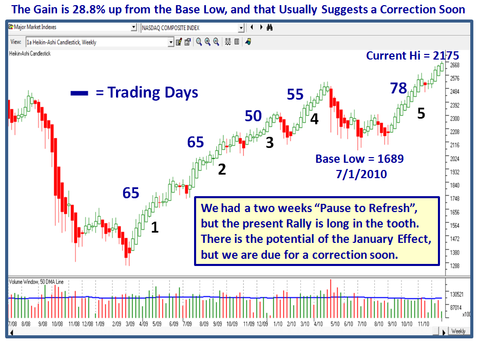
The first place to start is to establish a Stake in the Ground and Measuring Rods. ALWAYS establish the latest Base Low…it used to be back on 3/06/2009 but once we had that over 17% Correction back in May and June, we moved the Base Low to 7/1/2010, as shown on the Chart below. I use Heikin-Ashi Weekly Charts to determine the trend and you can do this in HGSI as shown.
78 Trading days is long in the tooth by any stretch of the imagination, hence the concern by many. Leading stocks are being pummeled, rotation is clearly visible from the NDX to the OEX, Large Caps to Small Caps, etc., etc. We have the recent heads-up of the infamous Hindenburg Omen coupled with the VIX at lows, and %E’s rising with the Market for a little while and then falling back again (strange behavior), to say nothing of Distribution Days two-a-penny as all the usual tell-tale signs that we are on borrowed time. To top it off, oil is up and rotation to Energy stocks is well underway. What all of that adds up to is that the Market is climbing a Wall of Fear, and will ultimately have to move out to an obvious Climax Run or fall apart at the seams very soon.
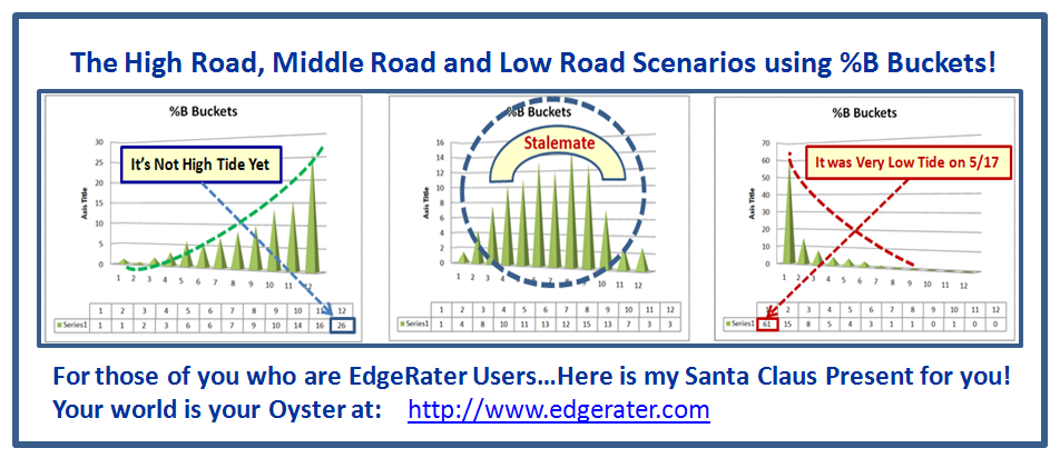
For those who are casual readers, we now have great insight into the sloshing from High Tide through Stalemate to Low Tide with the Pictographs I show below:
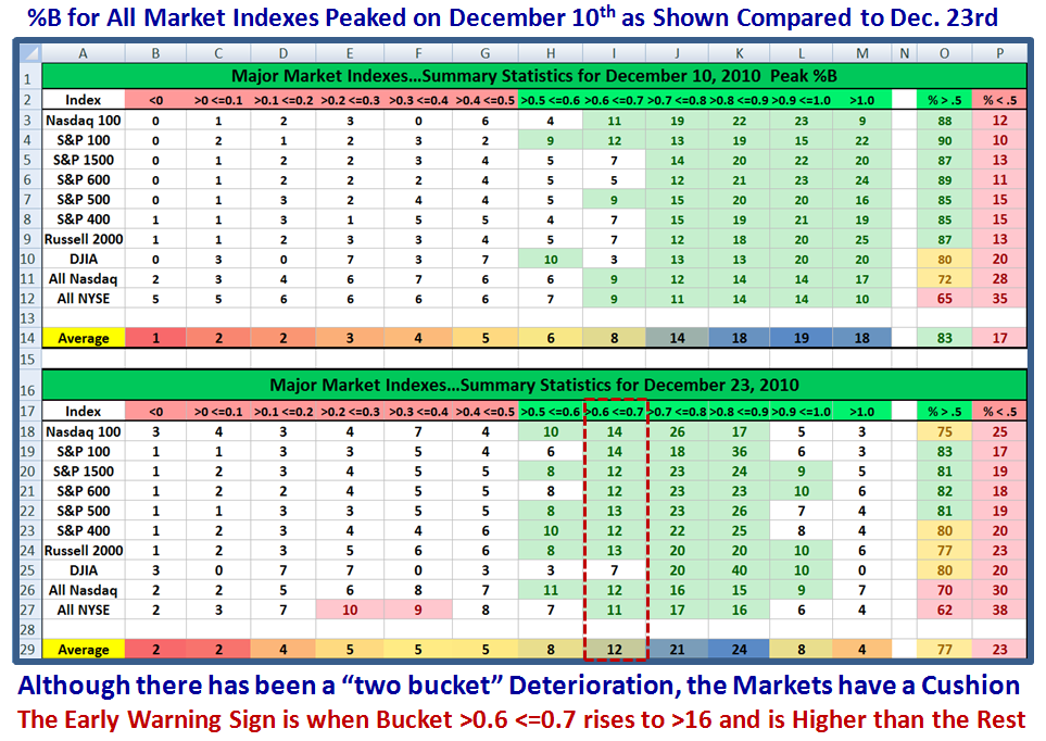
I suggest that although there are no chinks in the armor as yet, there are subtle signs that we are fast turning to “Stalemate”, and let me lay out the logic through the next few slides. Let’s start with the fact that so far in the past three weeks, the MOMENTUM of the market reached a peak on December 10 by showing ten Market Indexes at that snapshot and for comparison as it is at the close of business on Thursday, Dec. 23rd.
Understand that the chart depicts the % of stocks for each Market Index by “bucket” of 0.1 slices making 12 in all, and also the % Above and Below 0.5, the Middle Bollinger Band, and NOT the %B of the Indexes themselves, which are usually higher as I have shown you several times before.
The first point to note is that it is nine days since December 10th, so we have three days of cloth on that score before the market should correct, OR we move to a higher level! We have not long to wait on that score. Look back at the previous notes if you don’t follow that logic. There is a lot to take in, but let me direct you to look at the heat maps on the two “Average” lines which I highlighted in Yellow. Note how the Dark Blue has slipped two Buckets to the left between the two timeframes. Please understand that I maintain right now that the Markets are still positive, but it doesn’t take much imagination that if the next downward step were to come it would move the center of gravity still further to the left with the likelihood that Bucket >0.6 <=0.7 will be prominently higher than the rest.
I told my HGSI supporters I would give them a clue that when that Bucket hits 17 (or higher), which is my oldest grandson’s age, watch out below. I’m sure you are wondering where on earth did that piece of logic come into play, and I offer you the next chart which shows the Heat Maps for four Market Indexes:
I have highlighted with a dotted red line the critical area where the market Indexes all hit “17” or greater before the pause to refresh occured. The numbers are shaded in gray. By the way, if you really want to see the numbers more clearly, just click in the window of the chart and it should open up larger in a separate window. Better yet, use Snagit to capture the picture and you can blow it up to whatever size suits you.
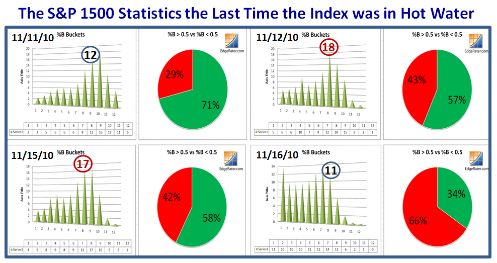
Now let’s zero in on the S&P 1500 and look at the Pie Charts and Spikes for the period 11/11/2010 to 11/16/2010 to show how the shape changed dramatically within four days as Box # 8 (>0.6 <=0.7) moved through two days of peak at 18 and 17, respectively, and then the dramatic shift to the left on 11/16/2010, where the Bears were once in control of the Market for the Two Week Pause to Refresh period.
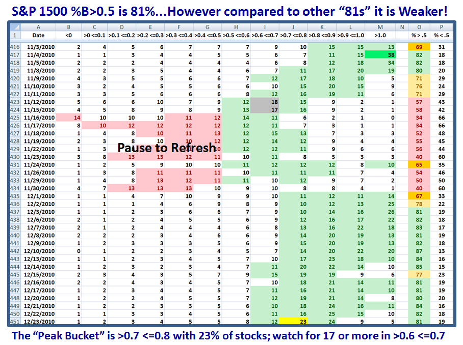
The next chart unfolds the strengths and weaknesses from the peak in 11/4/2010 down through the valley for two weeks and back up again these past three weeks. As my new found friend, Joe, points out, we have hit our head against a wall at the 81:19 level several times recently, and we are right at that mark as we speak. Note that I have highlighted the “23” in the bucket just before the famous one to watch and that number of 23 is higher than any previous one when the Market was at 81:19…suggesting that we are weaker right now. There must be a holding of the fort on Monday to take the Market higher or we look for the now famous 17% in bucket #8.
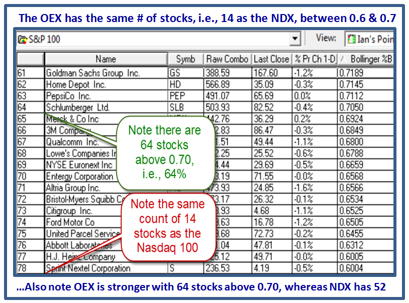
In the next two charts, I show you how easy it is to watch for this phenomenon using HGSI software and it becomes even easier when you use the NDX and the OEX in the Major Market Components Folder, since they both have 100 stocks and the percentages fall into place immediately.
So what then are the High, Middle and Low Road Scenarios:
High Road: An Immediate bounce play this week, with the Nasdaq ultimately reaching 2700 and then 2727 which would give reasonable targets for the High Jump.
Middle Road: The tug-o-war continues with little ground being given up through the first week in January, and most likely a move to the downside depending on world events.
Low Road: The observed weakness continues and we trot down with both the 12 Drummers Drumming and the count of 17 in Box #8 fulfilling our Sherlock Holmes Fly-Specking!
Now we have done our homework and we let the Market tell us where we are headed with one finger on the Eject Button!
Best Regards to you all. Ian.
 Ian Woodward's Investing Blog