Ian Woodward's Investing Blog

Archive for the ‘HGS Principles’ Category

Stock Market: Oversold and Bulls Need a Strong Bounce Play

Sunday, June 19th, 2011

It’s the final day of the U.S. Open so I will limit my commentary as in addition to that, the news is obvious we are so oversold that we are due for a Bounce Play.   The last two attempts have been putrid, so all signals point to more to come on the downside.

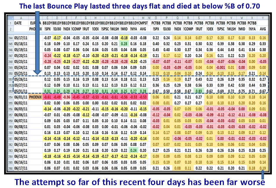
…And here is the disappointing picture for the last two Bounce Plays…there is absolutely no enthusiasm by the Bulls in this Market.  The latest zinger this past week came from the problems in Greece, which impacts the Euro, raises the Dollar and takes the Market  and its Indexes down:

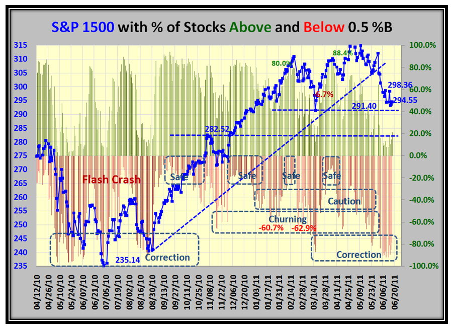
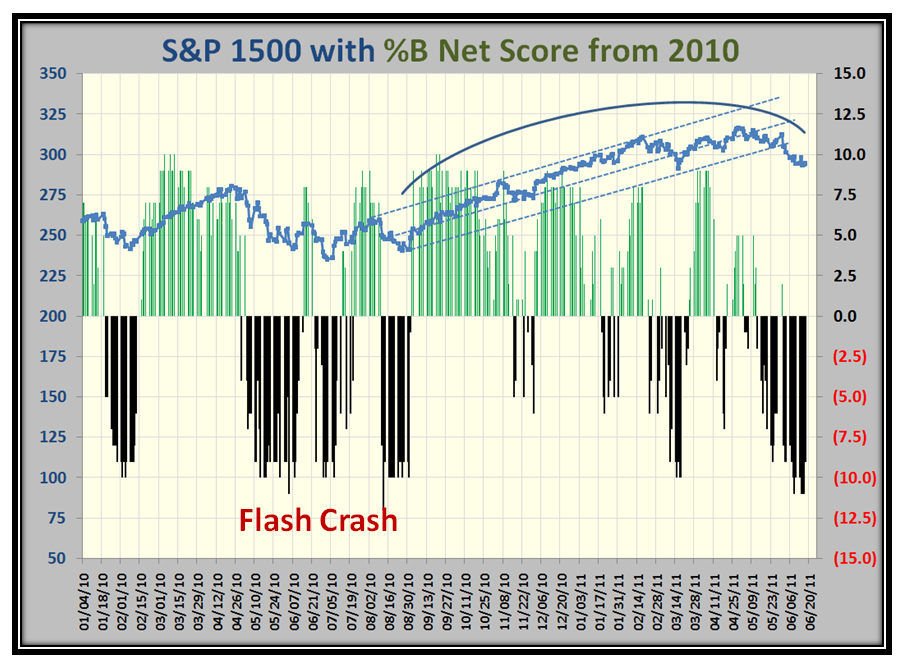
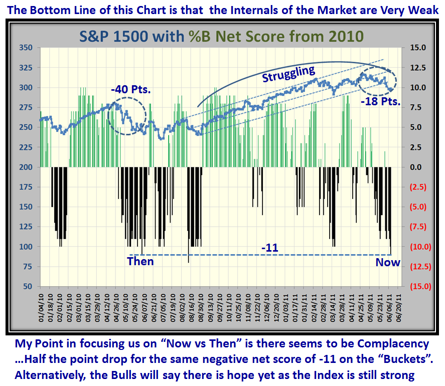
This next chart shows that we are in Correction at levels not unlike the Flash Crash a year ago, but we are still only about half the distance down from the recent high.  That’s the good news…the bad news is that the Market Internals are so weak that even a respectable Bounce Play will be suspect to a “Fakey” so don’t get too excited before any rally has shown its strong stripes to the upside:

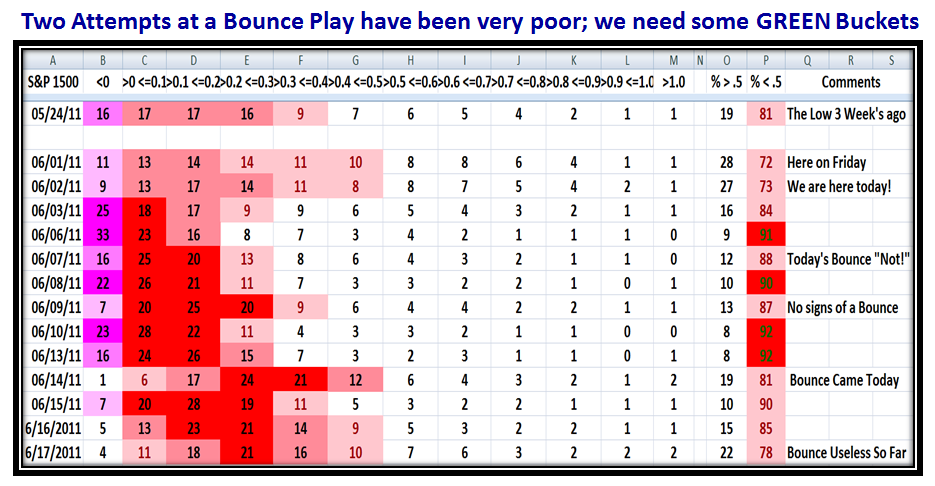
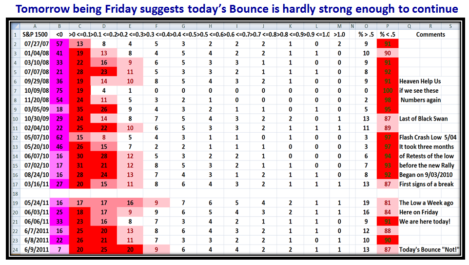
The Gloom and Doom of Bucketology continues to show the pitiful Oversold nature of this market…we badly need some “Green” Buckets:

One more picture to show that we are down at Flash Crash Levels…note the Bounce Play Fakey Green Bounce in June 2010 before it faded not once, but twice more:

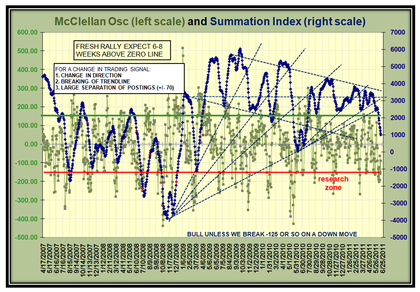
And those who avidly follow the McClellan Summation Index see that it has rolled over and now is setting up for “Large Separation of Postings”:

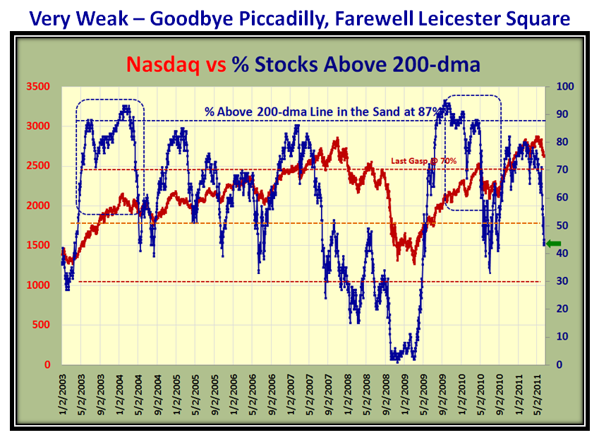
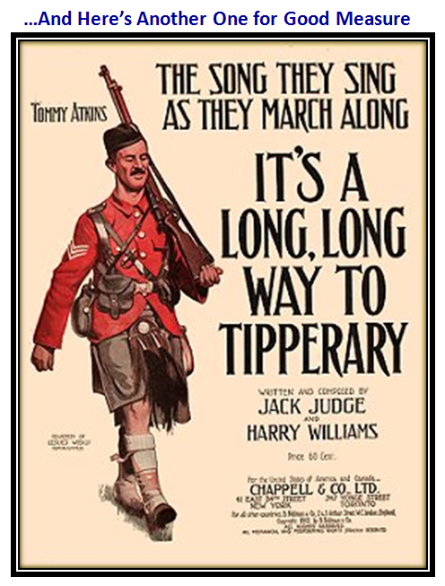
Last week I couldn’t resist showing a caption of “It’s a Long Way to Tipperary” as my grandfather taught me when I was a little fellow, meaning we have a long way to fight back through all the overhead supply  as the number of stocks above the 200-dma falls precipitously towards the red line of 30%:

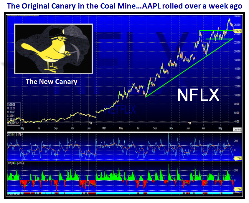
…And Finally, we have had to change the Canary in the Coalmine to NFLX since the original one, AAPL, rolled over a week ago.  Watch 230 like a hawk:


Now to enjoy watching the new Phenom Mcilroy win his first U.S. Open.  Keep your powder dry and don’t get “Fakeyed”!

Best Regards, Ian.


Stock Market: 401 Keg Time…Hot Investment tongue in cheek?

Friday, June 10th, 2011

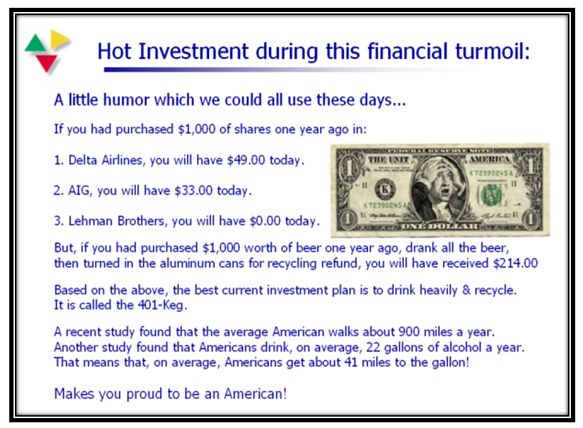
My friend David Steckler always signs off on Friday  on the HGS Yahoo bb with “Its Milluh Time”.  Today it is 401 Keg Time!  I had a couple of questions from RichardB and Charlie Willey which I answered in the “Comments” section, but I told them in the note that I planned to put the answers up here.  Since I mentioned the 401 Keg, I felt I should let you know that back on October 6, 2008 I had 5364 hits from around the globe on that day, the most by far ever, and I have been doing this blog for four years.  So, since most of you know I am NOT a Fearmonger, I hope you will accept this reminder of what a 401 Keg is with tongue in cheek:

You all know that Ron and I teach you to be your own guru’s, so although the UNDERLYING  message on my blogs may not always be obvious, those who know me well understand that I will lead you to water but you have to unravel what “that” message is when you drink.   With that said, I hope the following answers to Richard and Charlie’s questions will make you think…I do not spoon feed, but I felt it important for you to know where my head is at:

RichardB Says:
June 10th, 2011 at 6:10 am   edit
“Any further than this to the downside can do much damage to your 401K, so you know the drill by now”.
I’m sure the answer should be obvious, but what would the best drill be, please?
Thanks again so much for these blogs.

RB

Charlie Willey Says:
June 10th, 2011 at 7:32 am   edit
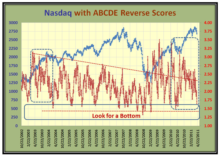
Ian – The chart NAZDAQ with ABCDE Reverse Scores is a very interesting chart. Just from a glance I am seeing a bit of Forwarned is Forarmed for anticipating bottoms as you have discussed.

You have a red dotted line drawn at about 1.40 on the Reverse Score column. Is the line drawn there to accomodate some risk value or do you think any penetration of the horizontal blue box will suffice as a warning?

Or am I off track here?

– Charlie Willey

Hi RichardB and Charlie:

As usual you are on the ball!

1.  Red dotted line at about 1.40…Worst Case Scenario ala Black Swan Days.  It suggests to me that although there should be a bounce at that level, the worst is not over, particularly if on the Bounce it can’t get above 2.25 on the score.  Note that it took four tries from that level of 1.40 together with a lot of pain before the doom and gloom had worked itself off.  So, the best one can do at that level is to be very nimble and essentially day trade or at most a few days to a week…Type 1 and 2 Types enjoy volatility, both long and short.

2.  Penetration of the Blue Box to the level of the blue dotted portion within that box suggests that we should sharpen our pencils for a Bounce Play, and the odds are that although the correction may not be over, the likelihood is that if it retests down to the 1.50 score level the chances are that we will be spared a BEAR MARKET. The worst we should expect is a Major Correction of between 16% to 20%, similar to the finish of the Flash Crash ultimate drop of ~17%.

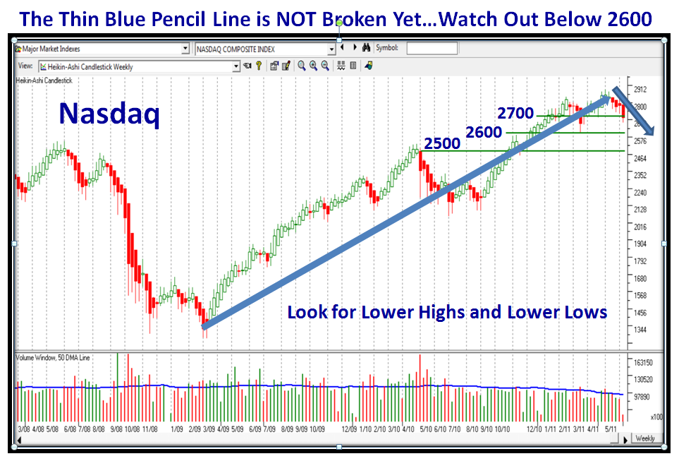
3.  Today’s action should take us into the blue dotted area within the blue box.  Where we go from there is in the lap of the gods and the Large Players…you and I know it is all a big game, but if it goes down further then the cushion we have is ~50 points to reach the Thin Blue Pencil Target of 2600 on the Nasdaq.

4.  We then have to watch for The Thin Blue Pencil Line Chart of  “Lower Lows and Lower Highs”, and if that is breached after a further tepid oversold bounce then we are headed for the red dotted line and you better take care of your 401K before it becomes a 401 Keg!

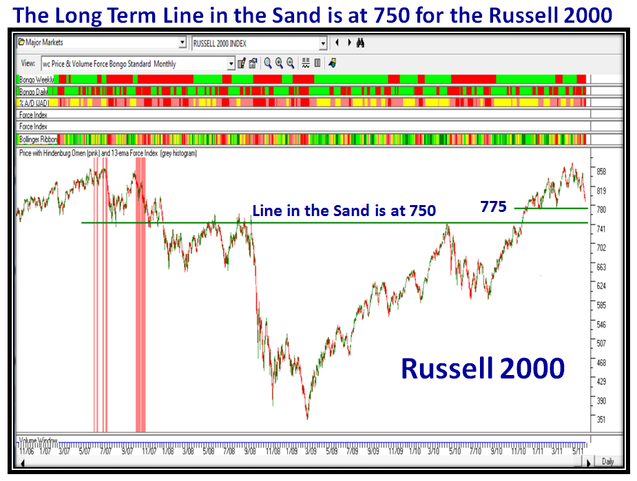
5.  Last but not least, I am NOT a Fearmonger, but there comes a time when commonsense over rules the heart and it is time to take action before there is a total downdraft…in which case it is invariably too late. When is that point you ask?  It is right there in the blog on the Russell 2000 chart.  If that beast breaks 750 it will for sure be 401 Keg time.

I aim to put your questions and this answer up on the Blog instead of hiding it here in the Comments which may be missed.
Best regards, Ian.


Stock Market: Weak Bounce Leaves Bears Dancing

Thursday, June 9th, 2011

I dug up an old favorite picture I use at times like this where the market is very “iffy”as to whether it can recoup:

…And then to give you perspective as to why, I have thrown in another theme for you to reflect on as to whether a long Pause to Refresh is due:

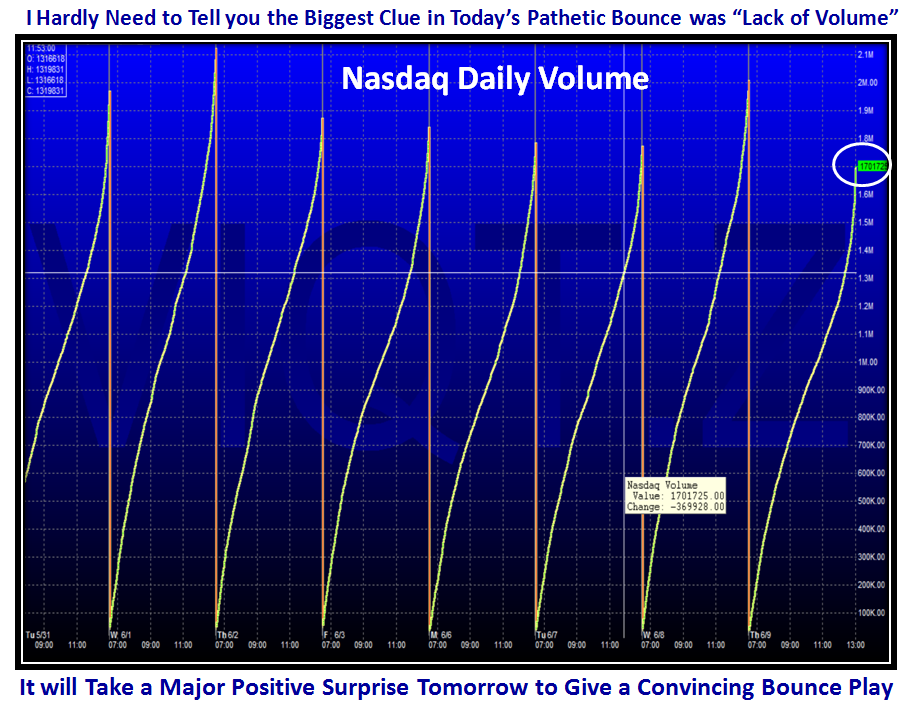
Here is the reason for my dismay in today’s feeble attempt at a Bounce Play.  It was due after six down days, but it tailed off in the last hour or so with rather pathetic volume overall despite that it finished up about 0.4% on the Nasdaq:

So, it is time to think about the Thin Blue Pencil Line to be aware of Lower Highs and Lower Lows:

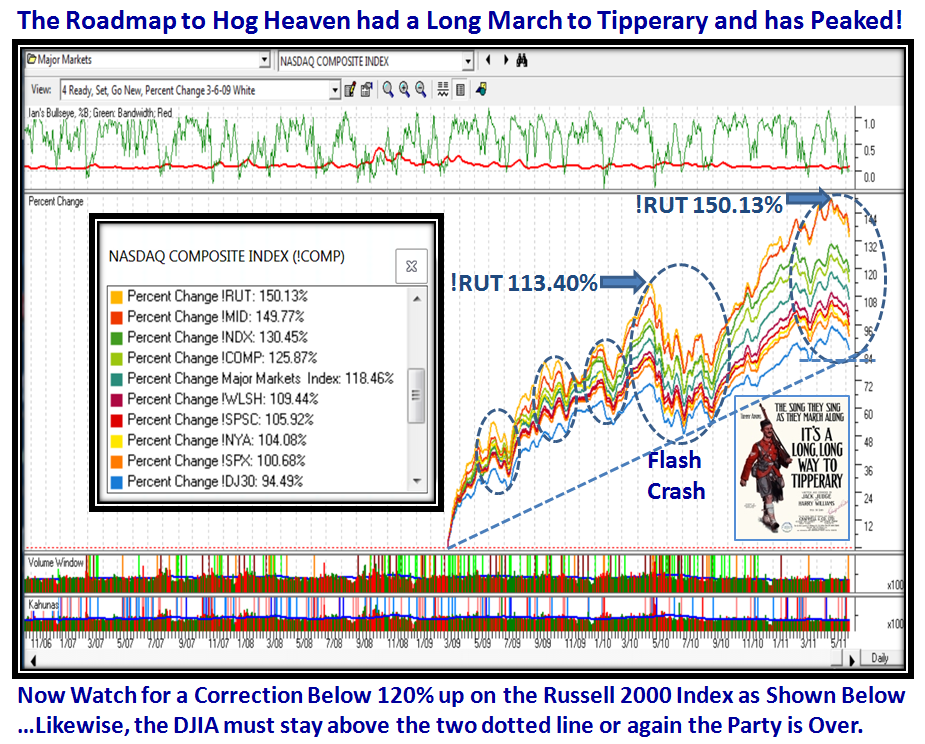
I have dusted off the Road Map to Hog Heaven Chart which was so helpful in 2009/2010 and it shows the Rally has come a long way on its March to Tipperary:

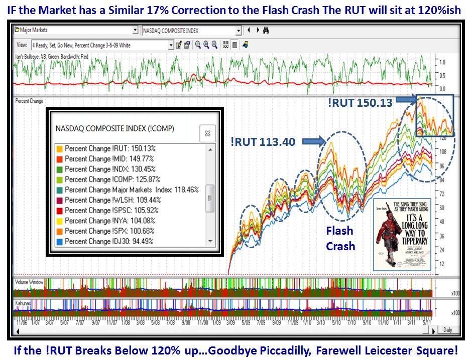
In the next chart I pull my usual trick of doing a “What If”, by looking back to the most recent big correction and pasting the chart pattern at the end of the chart as shown.  It won’t happen exactly like that if the market is to fall further, but you get the concept:

Any further than this to the downside can do much damage to your 401K, so you know the drill by now.  The Russell 2000 is a good chart to keep a beady eye on as if it gets below 750 we might look forward to serious damage:

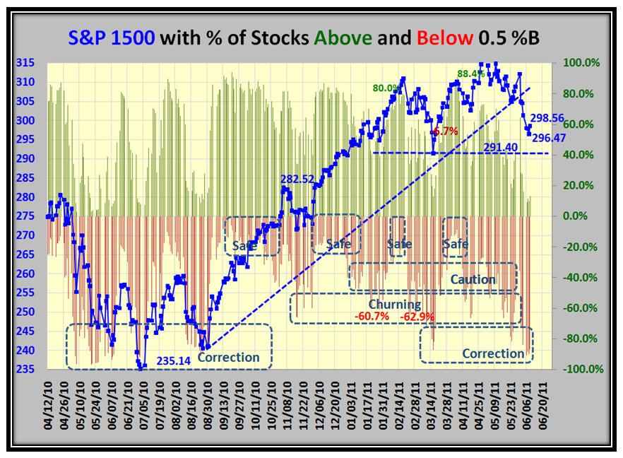
Understand there is more to this “Good Stuff” than Bucketology, but now for a dose of that to show the two go hand-in-glove.  We see we are now in “Correction” territory, and dangerously close to the Line in the Sand of 291.40 despite the bounce to 298.56:

Now here we have a conundrum and if you have any other bright ideas besides the scenarios I have postulated, let me know:

My concern is that with the anaemic bounce by the end of day which started off with a good deal of promise will not last long:

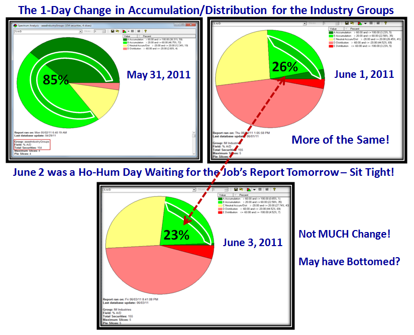
…And finally one chart on Learning your ABCDE’s that I have dusted off.  I learned this trick from a good “friend” I know as Billy whom I have never met but has taught me how to apply bias to the Industry Group count of Acc/Dist.  I tip my hat to his work:

You can see that the Industry Groups are getting weaker but have not reached bottom as yet.  Beware of Fakey’s when it comes to bounce plays.  Even past solid bounces that take %B up into the safe zone of 0.7 and above have been known to fail.  It is obvious that the general mood in the market has changed, and it will take a miracle to lift things up out of the mire from all the factors that are in play right now.  But, then again the market climbs a wall of fear so keep an eye on the few remaining stars like NFLX that now becomes the Canary in the Coal-Mine.

Best Regards, Ian.

Stock Market: Floodgates Partially Open…No Panic Yet

Monday, June 6th, 2011

This is a follow up to the long note I wrote over the weekend that laid out the Strategy, Process, and Targets for a Game Plan should the floodgates really open up to the downside.  The hour is late, so the following is self explanatory:

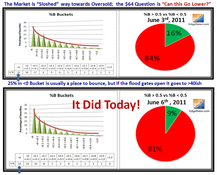
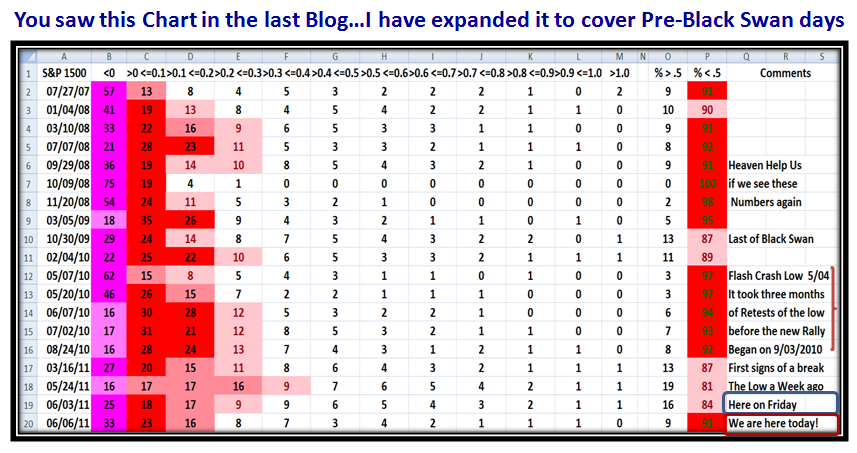
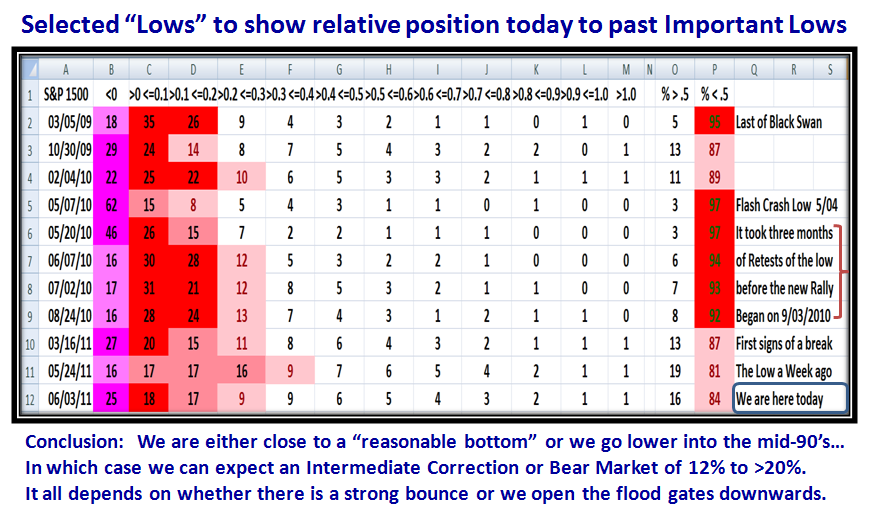
We have hit the dreaded 90’s on %B less than 0.5 for stocks in the S&P 1500.  The Bounce from here is Essential or else:

It’s no surprise that things are looking glum.  I added more to the next chart to cover the early days of Black Swan:

…And this is the only saving grace so far that PANIC has not set in with full force:

Good Luck.  Best Regards, Ian.

Stock Market: NO PANIC YET, but Watch for Open Floodgates

Saturday, June 4th, 2011

When we have a strong Phoenix Signal using the Arms Index parameters for unusual downward action with the -2.3% down move in the S&P 1500 and it is followed by another -1.0% down day two days later as we did yesterday, it is time to take stock of when the floodgates could open:

Let me make sure you understand there is by no means Panic yet, but it is best to have a plan while we still have a cushion that assures forewarned is forearmed.  Here are pieces I have put together to guide you with the What, the Why, the When, the How and the So What?

1.  The % down already from the high

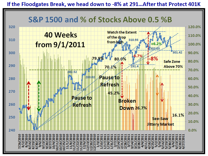
2.  How much “cushion” we have to get down to nervousness of -8% down

3.  How deep the “oversold situation” is relative to past history as a guide for what more may be in store on the downside

4.  The status of the Accumulation/Distribution for the Industry Groups

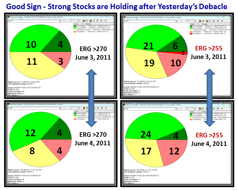
5.  The most recent behavior of Leading Stocks with ERG >255 and >270 to see if they are holding up or dying

6.  The reasonable targets for support and resistance

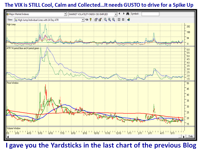
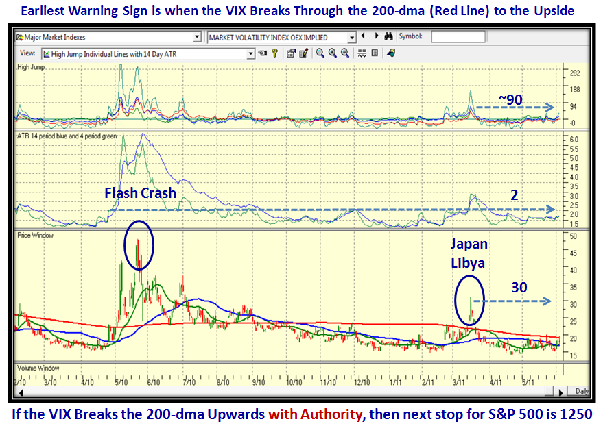
7.  The Go to Index of the VIX with ATR and High Jump for the earliest warning sign of the floodgates opening

Most of the charts are ones that you are accustomed to so the charts will speak for themselves, and where there is something new I will explain what to look for and its value in the scheme of things.

So let’s start with the % down from the high and the extent of the cushion to get to -8% which would take us to 291 on the S&P 1500:

…And here is the update of the damage to the Market Indexes which I previously showed with a 6 Bucket drop (0.61) for the S&P 1500:

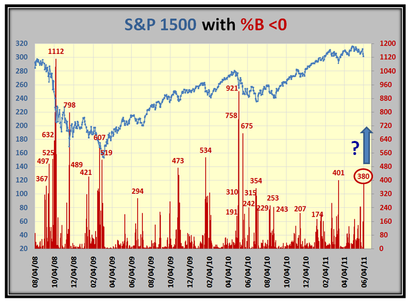
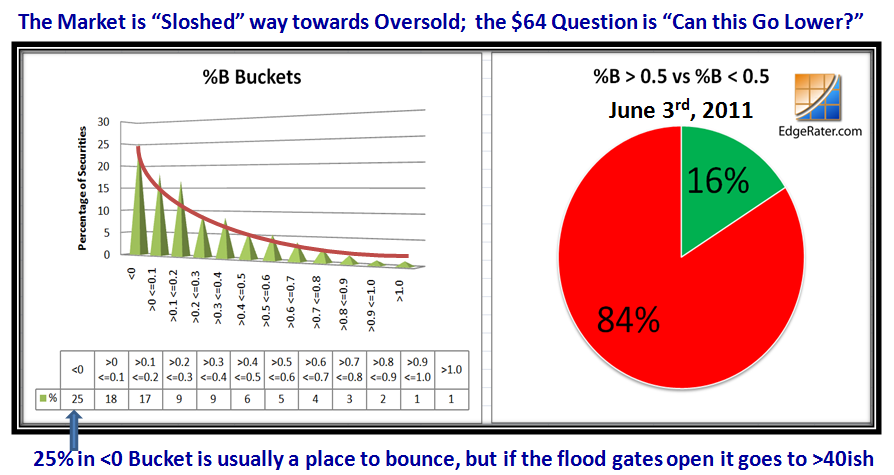
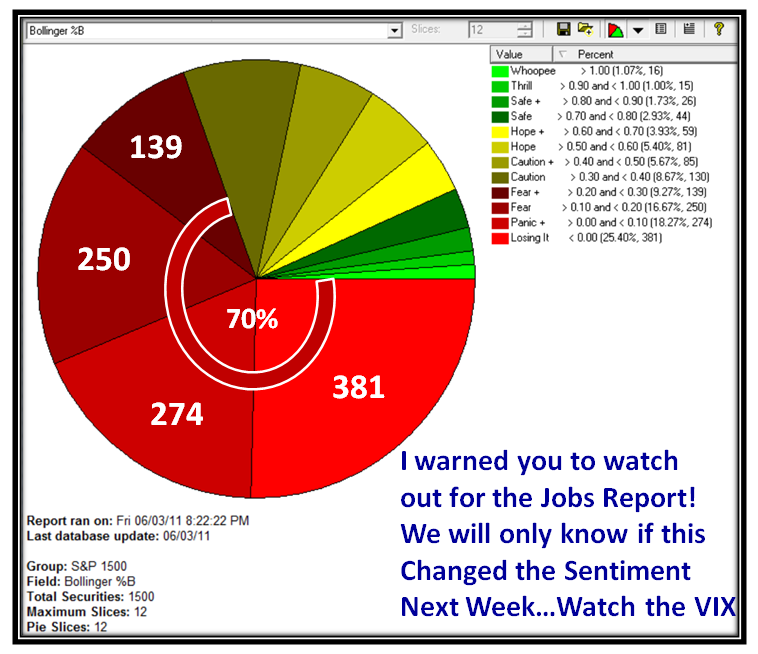
At times like these it is important to see the extent of the damage done by looking at the # of stocks in the S&P 1500 that are in Bucket <0.  We are up to 380 and as you can see from past history, anything higher in ensuing days can start a steady decline if prolonged downwards:

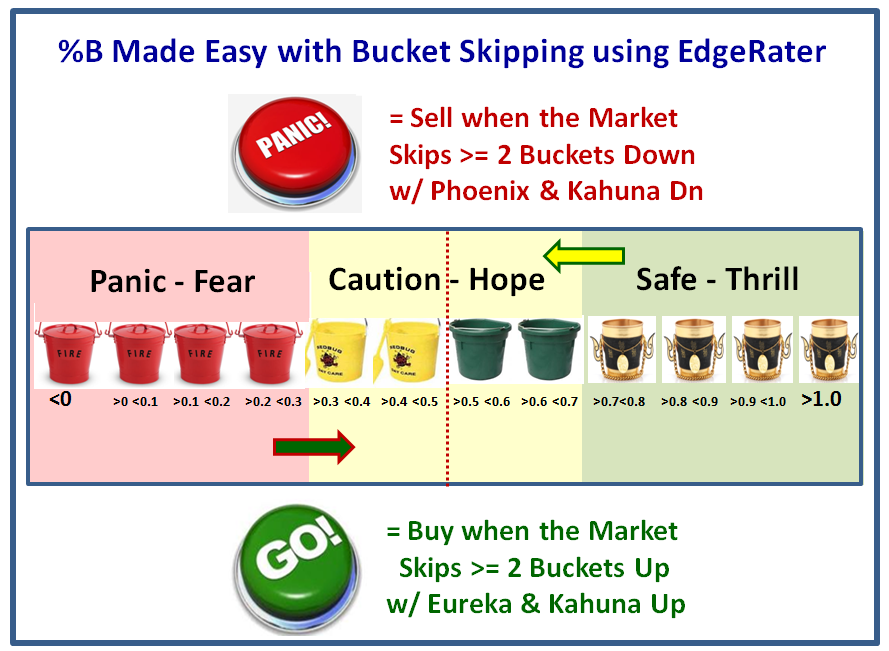
Now here is a reminder chart, especially for any new members, who are interested in following the value of “Bucketology” with %B:

Couple this with the need to never fall in love with a single scenario, but have at least understood three so that you can identify the tides of the market as it sloshes from Overbought (high) to Oversold (Low) and points in between (Stalemate between Bulls and Bears):

It goes without saying that we are currently sloshed to Oversold, but let’s try to understand the depth of the correction at this stage compared to recent past history of significant points in time we can immediately relate to.  The next two slides do that:

Last week I warned you to watch out for the Jobs Report, and it certainly caused a buzz to round off the week on that state of affairs:


It is never enough to just focus on the bad news.  It has a habit of feeding on itself.  The next two charts give some “hope” that all is not yet Gloom and Doom relating to what has transpired in the last two days.  Always turn your attention to how the Leadership is behaving:

The above relates to the Industry Groups in terms of Accumulation/Distribution and below we have a flavor for Leading Strong Stocks:

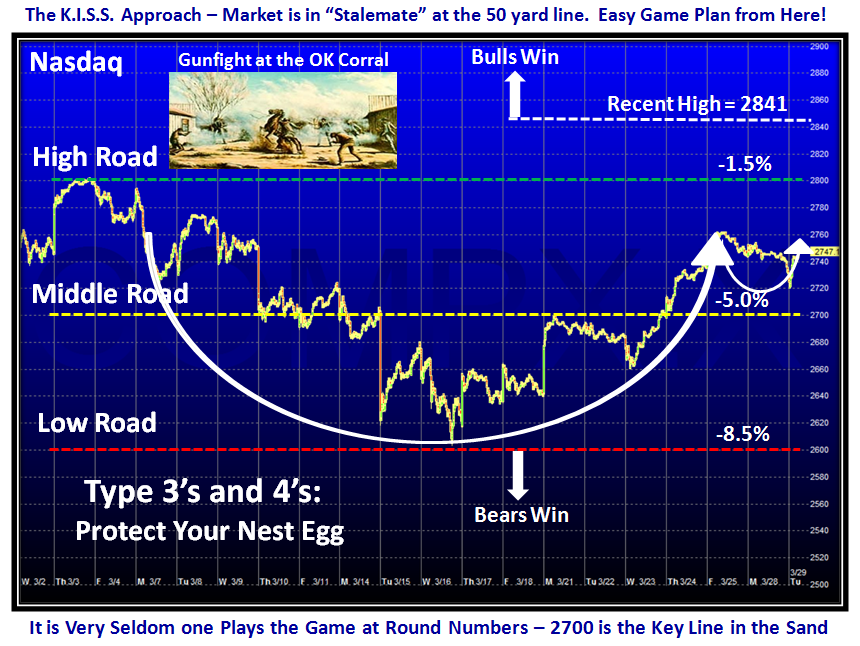
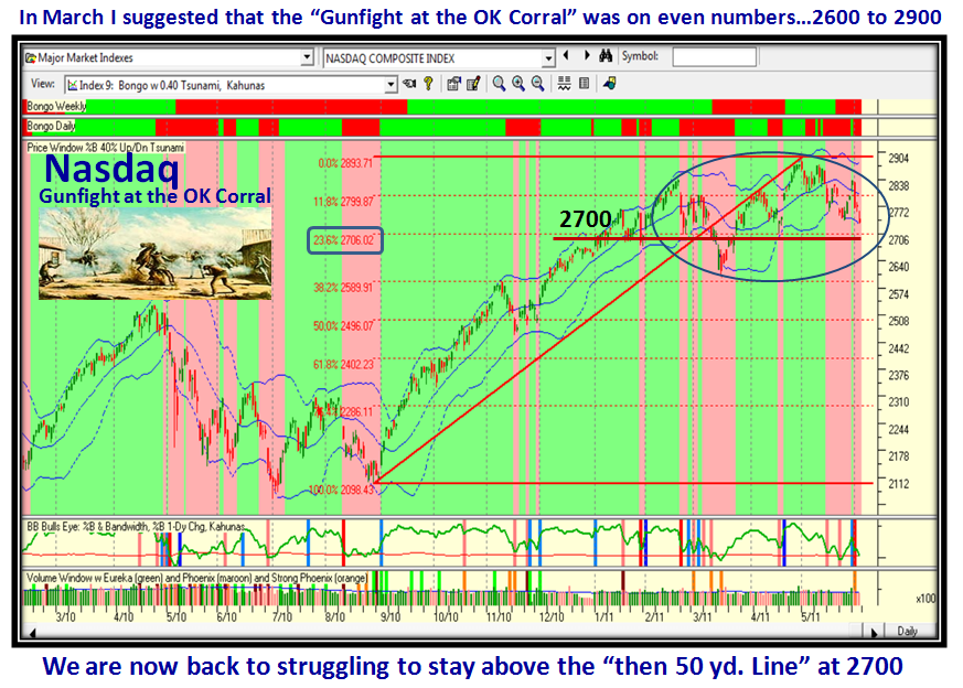
So let’s take two steps backward to come forward.  It is now all of three months ago since I suggested that the Gunfight at the OK Corral between the Bulls and Bears was being played between 2600 and 2900, with the 50-yard line at 2700.  That has held true so far but unfortunately we are now losing the cushion we had in the 2800’s on the Nasdaq and we are ominously back to retesting 2700:

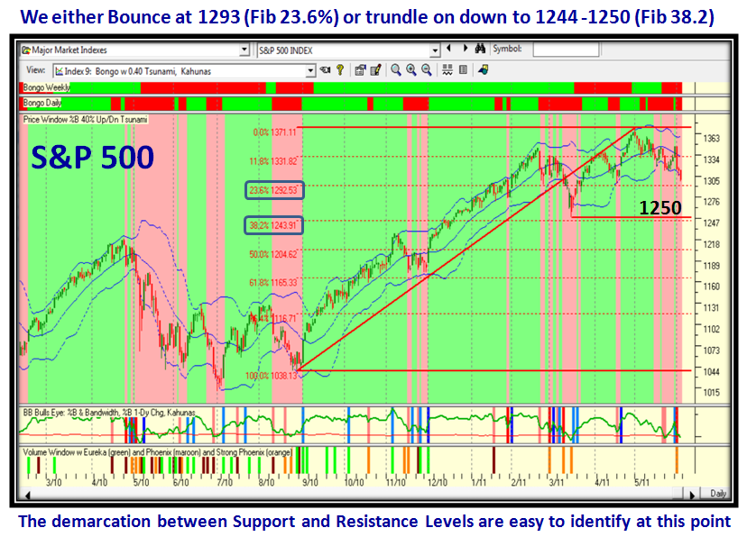
…And here is the S&P 500 for good measure.  What we immediately see is that Fibonacci Lines come into play as well:

So given all of that, what one item will give us the earliest clue short of an obvious run for the floodgates of an early warning?  The VIX:

Good luck.  Best Regards, Ian.

Copyright © 2007-2010 Ian Woodward
Disclaimer: Commentaries on this Blog are not to be construed as recommendations to buy or sell the market and/or specific securites. The consumer of the information is responsible for their own investment decisions.