Ian Woodward's Investing Blog

Archive for the ‘Market Analysis’ Category

Stock Market: Let’s Get Ready to Rumble
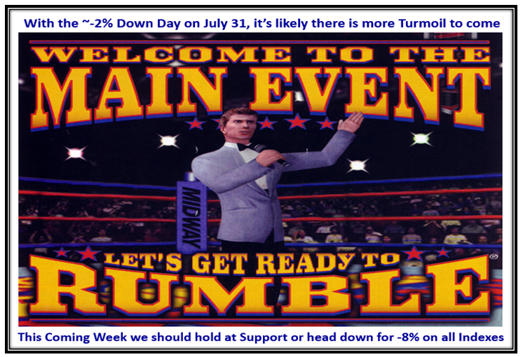
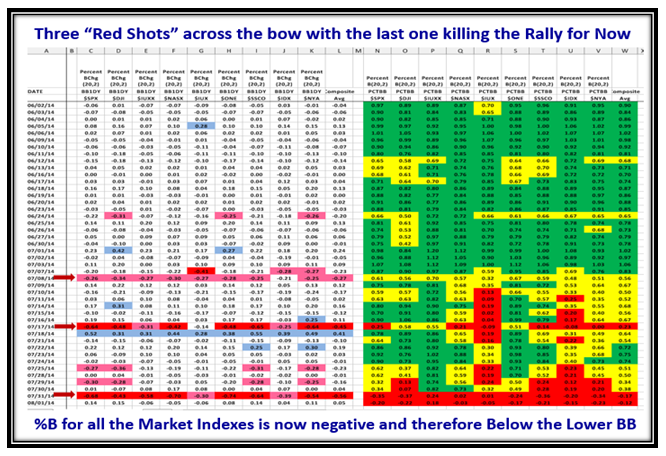
Sunday, August 3rd, 2014

With three Major Shots across the bow in the last month and the last big one only a few days ago on Thursday 07/31/20114, we are probably in for some big fights between the Bulls and the Bears as they get ready to rumble!

Rumble Picture

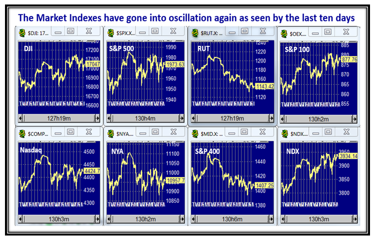
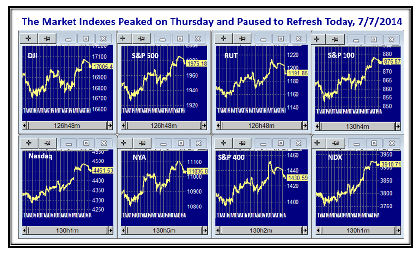
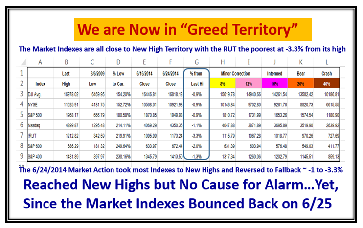
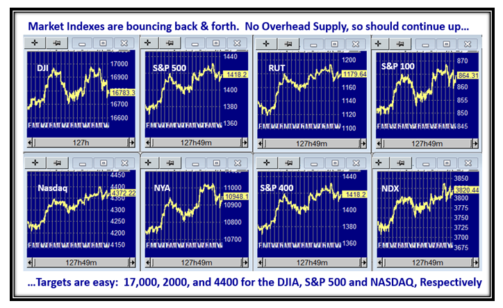
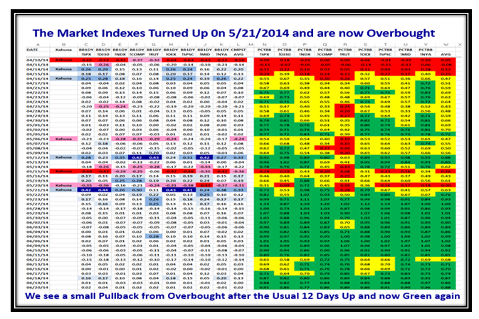
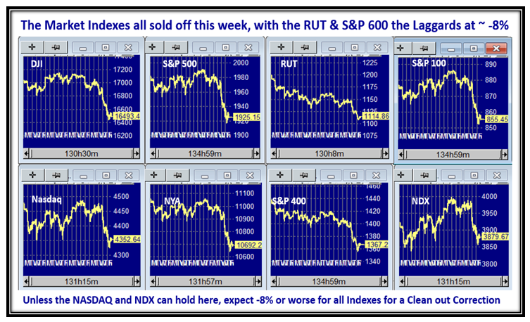
The Market Indexes sold off this past week and we are now at the Caution level with the NASDAQ & NDX holding up best of all with only 3% down from their highs.  The RUT and S&P600  are worst at ~-8% down:

Rumble Indexes

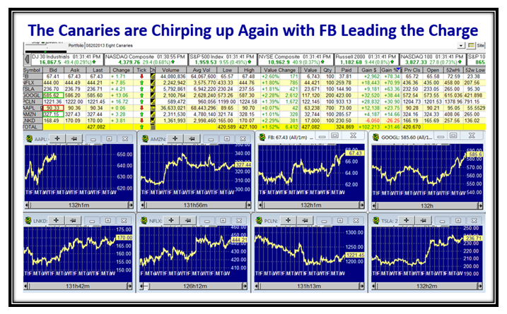
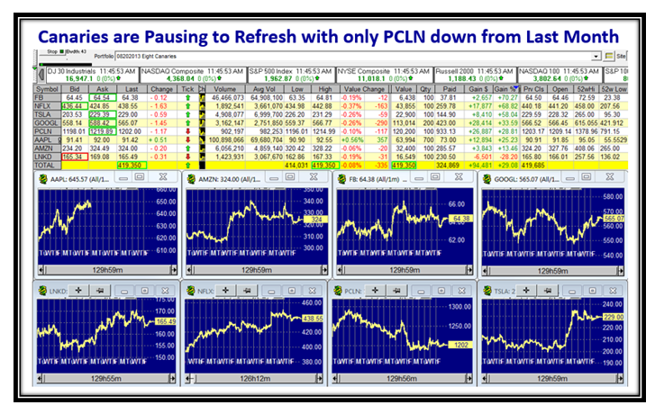
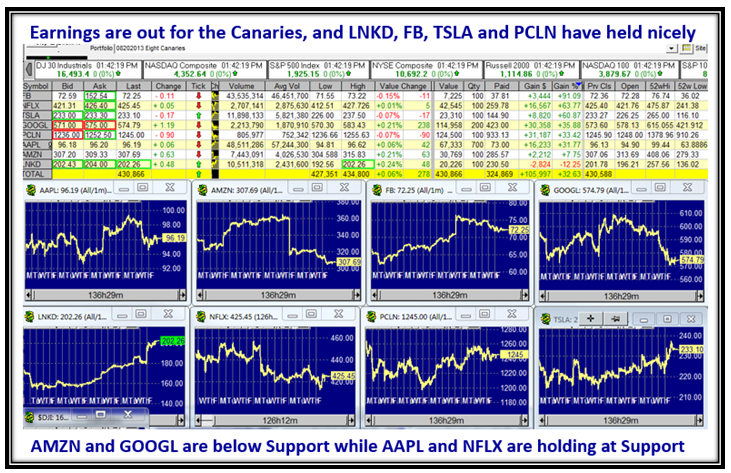
With Earnings out for the Canaries, they are looking respectable though they have given up some ground:

Rumble ICanaries

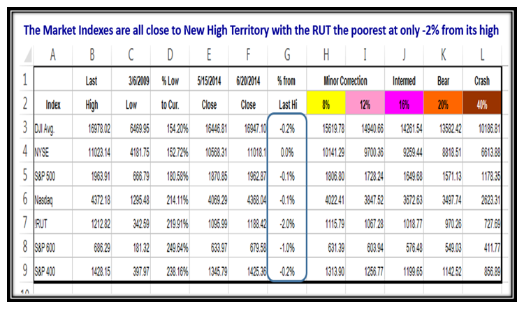
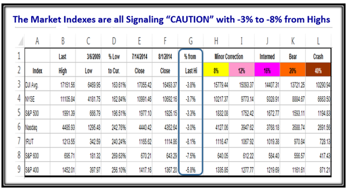
But now comes the bad news…the Market Indexes are all below -3% from their highs with the RUT and S&P600 as the laggards.

Rumble Indexes2

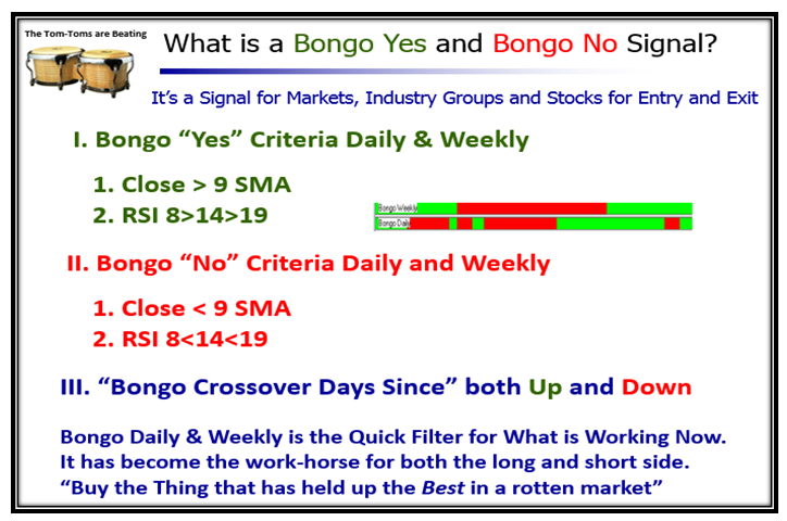
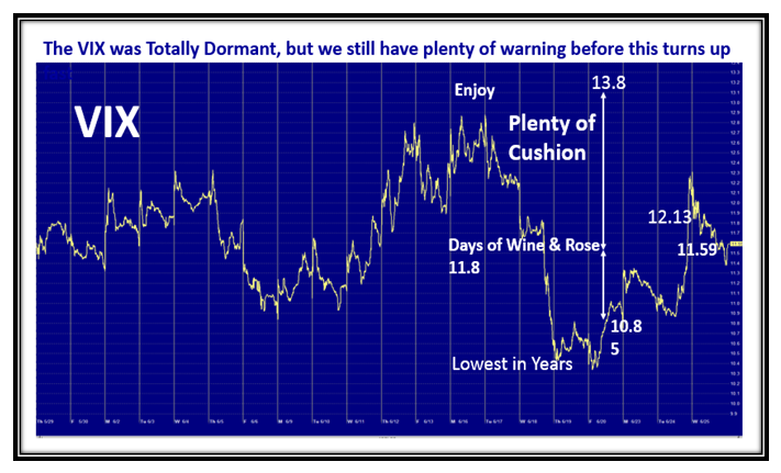
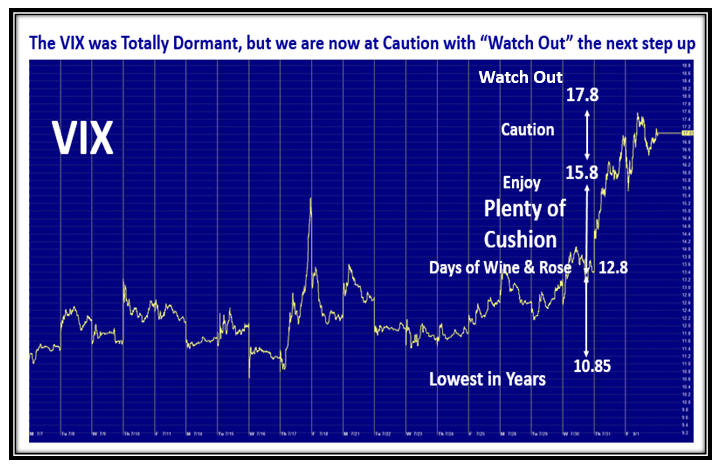
The VIX has run out of cushion and is now on the borders of going into Oscillation, so watch this carefully:

Rumble VIX

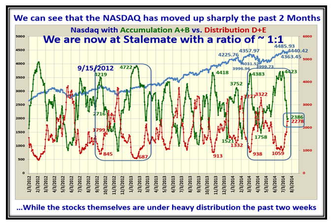
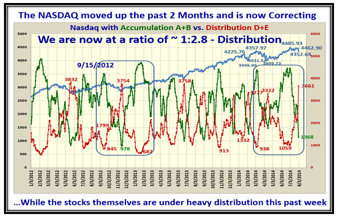
Internals are rotten with Distribution well underway.  Not far from extreme capitulation so look for a bounce:

Rumble abcde

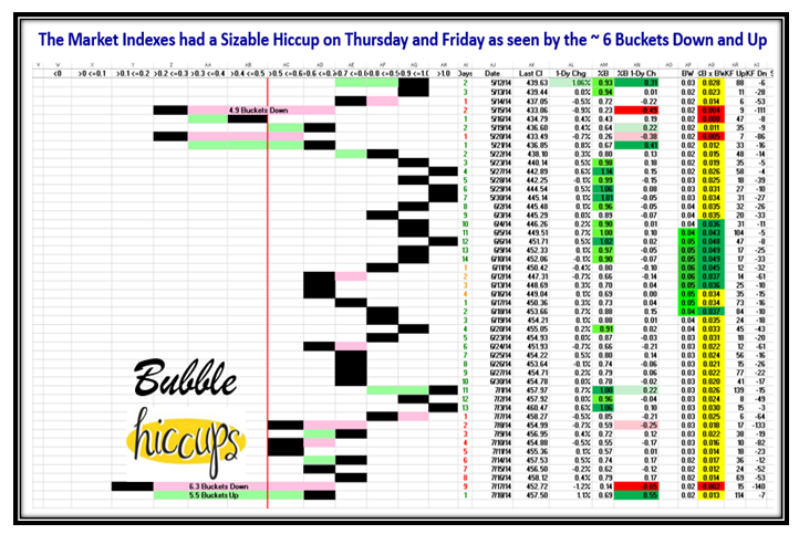
This last big red day on Thursday killed the Rally for now and it will take time to repair:

Rumble indexes3

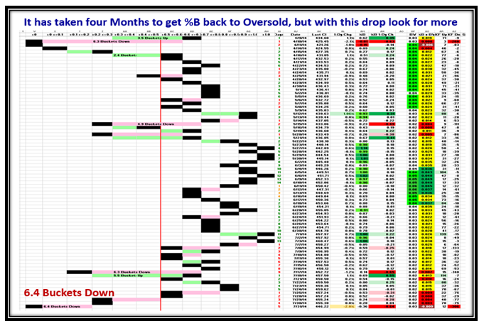
…And here is the -6.4 Buckets down in %B to prove the Market is in deep doo-doo!

Rumble Pat

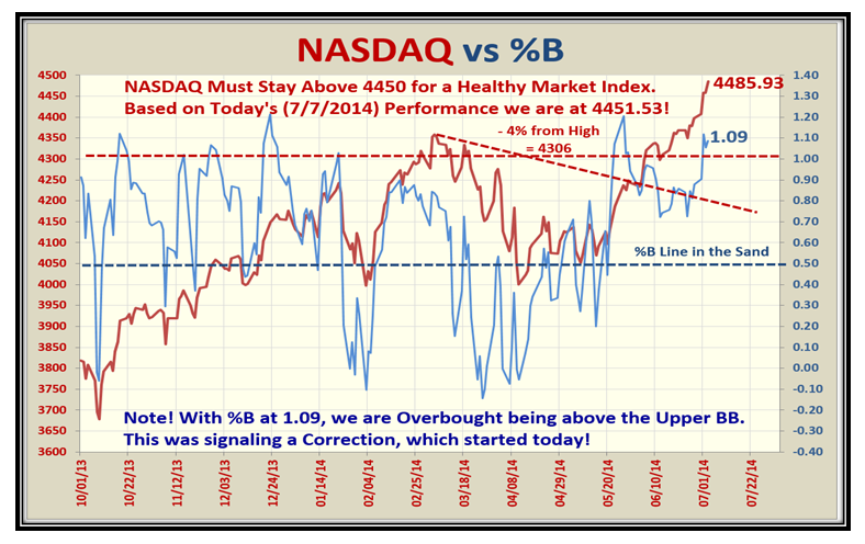
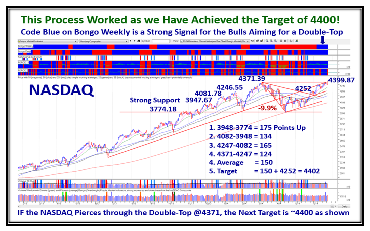
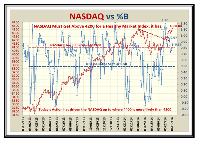
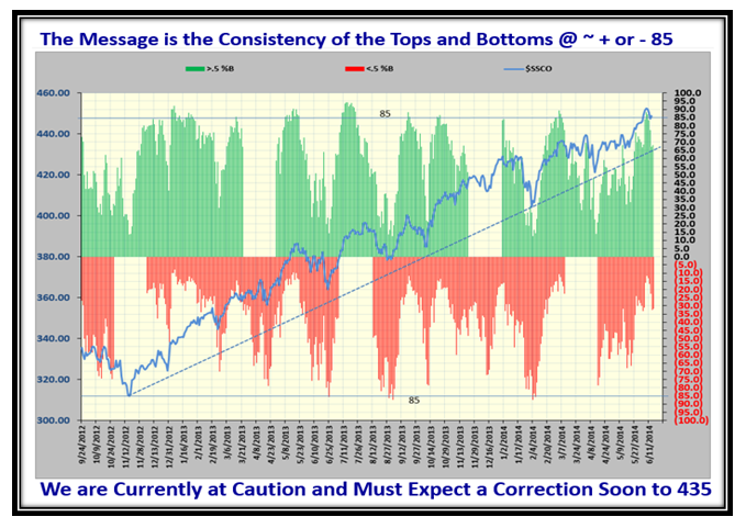
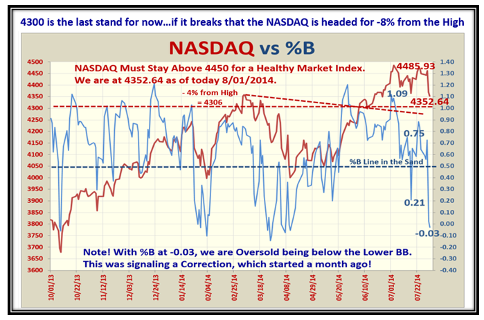
4350 was key Support for the NASDAQ and it held, which was a good sign.  However the last call is 4300 otherwise we head down with a vengeance:

Rumble Nasdaq2

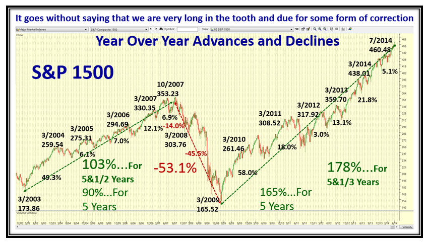
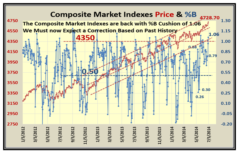
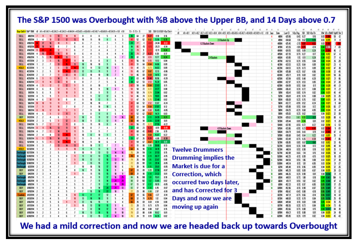
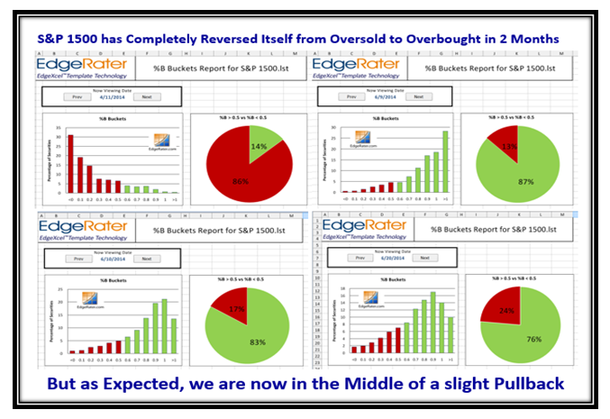
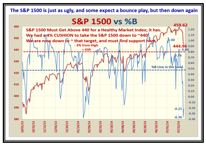
…And here is the picture for the S&P 1500.  My guess is it will take a while to right itself:

Rumble 1500

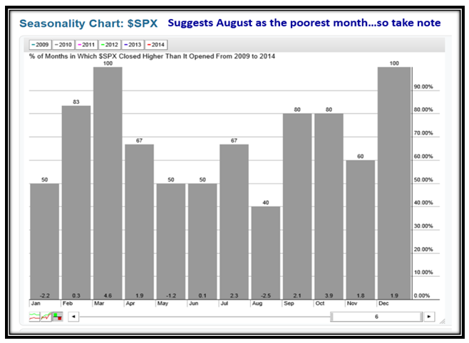
The latest vogue is “Seasonality” so here is the picture from 2009 forward for the S&P 500, which shows that August is the poorest month for these last six years:

Rumble Seasonality

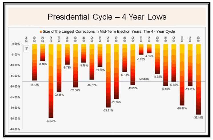
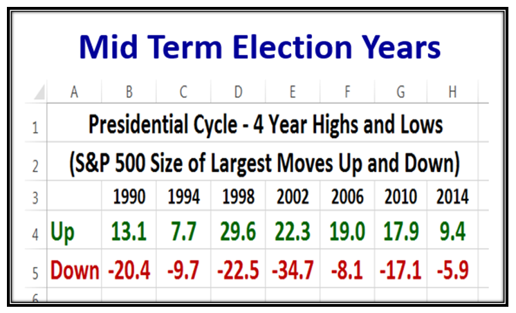
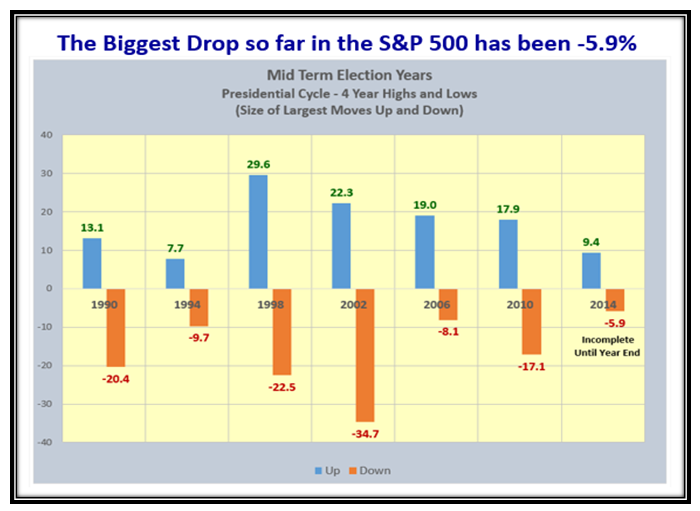
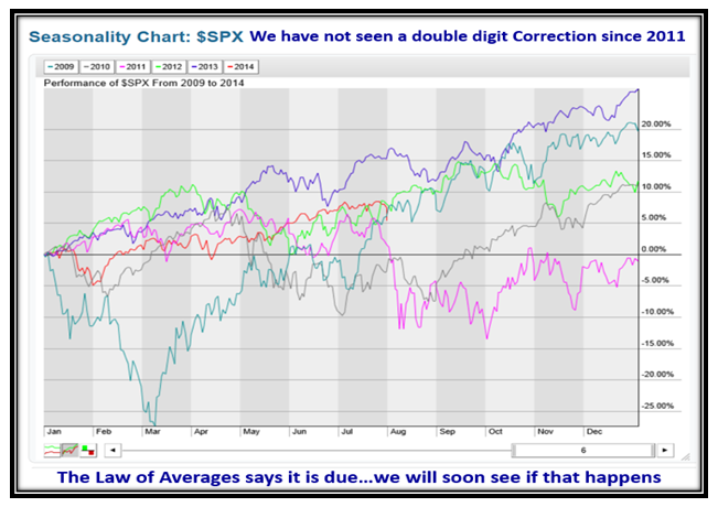
We are due for a double digit correction, since we haven’t had one these past 18 months:

Rumble Seasonality2

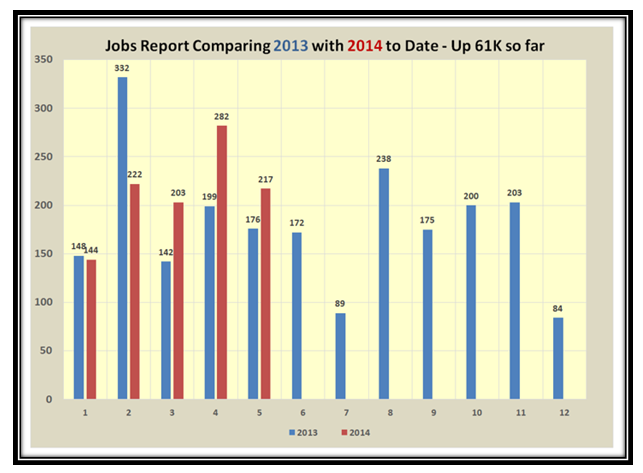
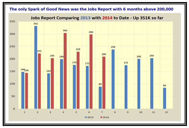
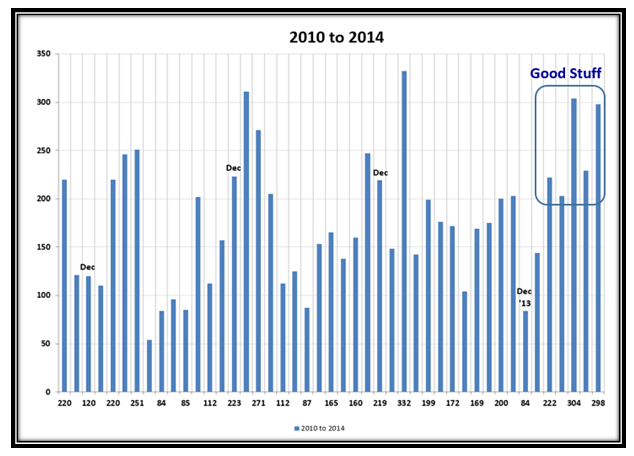
We continue to have good news on the Jobs Report scene with yet another month of >200,000 Jobs posted:

Rumble Jobs

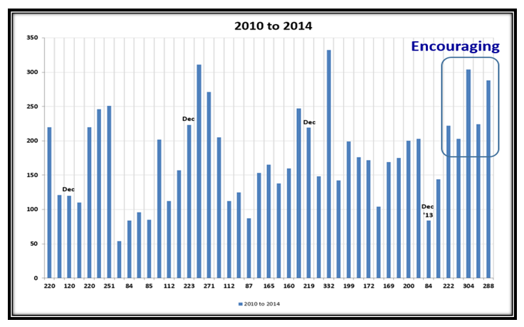
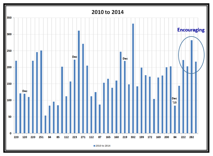
…And here is the long term picture which is very encouraging:

Rumble Jobs2

Well, there you have it with a long blog note this time while watching Rory McIlroy take the lead in the golf.  Keep your powder dry and next week should give us a clue if we are in for more trouble or get out of being Oversold.

Best Regards,

Ian

Stock Market: Bubble Continues Upwards with Hiccups

Tuesday, July 22nd, 2014

The big guns are playing games with usuns yanking the Market Indexes around.  Most have decided to stay this round out unless they are very adept at very short term plays both upwards and downwards.  Look what just happened a few days ago when the S&P 1500 dropped 6.3 buckets down in one day only to go up 5.5 the very next day…net result is game playing.

Hiccups Picture

The RUT, Midcap, and Small Cap stocks have taken the brunt of the hit and are the laggards, but the DJIA, S&P 500 and NASDAQ are still near new highs, i.e., we continue to have a biforcated market:

Hiccups Indexes

However, the tell-tale news is that the Accumulation : Distribution Ratio A+B:D+E has deteriorated to Stalemate:

Hiccups abcde

Our Favorite picture shows the Bubble Hiccup very well and it has been two months since we had a similar fracas:

Hiccups Pat

…And the twin picture to the above also shows the long rally of close to two months before the Knee-Jerk occured:

Hiccups Pat2

Now for some “New Good Stuff” relating to the Mid Term Presidential Cycle.  Here is a neat picture of the Largest Corrections from 1930 onwards for the Mid-Term Election Years…the 4 Year Cycle, which my good friend Bob Meagher unearthed for me.  It shows that the Median Correction is -17.12% and no wonder the pundits make a song and dance everytime this rolls around.  There have been nine times when the number has been less and 12 times where it has been greater, with the heaviest damage in 2002 of -34.69% after the bubble:

Hiccups Presidentialpng

Now let’s look at the last 24 years for both Largest Ups and Downs of more than 4% in each of those years:

Hiccups Presidential2

…And here is a plot of that same picture to give you a feel for what the chart looks like:

Hiccups Presidential3

I’m sure you are scratching your heads and saying “So What, Ian, is there a pony in here?”  Well, you know me in that my first answer is that the result is in the lap of the gods.  But I never shy away from a challenge so my next answer is that we should certainly see a -8% correction for all of the reasons I have given you in the past.  Then what?  Unfortunately, that answer depends on the state of the world in the next 3 months or so…Wars, Mexican Border, Economy and Jobs, Healthcare…the usual stuff on our plate these days.  My short response is that if it is worse than -12% who cares, as for sure most of us would have prudently hunkered down and protected our nest eggs long before then.

Chew on this fodder and if you have any bright ideas let me know what you think.

Best Regards,

Ian.

Stock Market: The Bubble Continues Upwards and Onwards

Monday, July 7th, 2014

The Stock Market remains strong and continues to move upwards and onwards.  Yes, we had a pull back today with a pause to refresh, but there does not seem to be any signs of fatigue:

Upwards Picture

Looking back over the history of the S&P 1500 since March 2003, it became evident for the purpose of our needs that measuring from March to March rather than the usual Calendar Year gives us a handy picture, since both Key Market Lows were in March of 2003 and 2009, and most highs before a correction have also been in March!  Anyway, the numbers are nicely summarized for you:

Upwards History

It doesn’t take two minutes to see that we are very extended, but play along with one eye on the exits and tight stops.  We had a pullback today, but until we see a 2% drop in one day will there be any sign that there is a start to the correction in earnest:

Upwards Indexes

The Acc/Dist Ratio remains strong at 4:1, but is showing signs of peaking and is at Historical highs:

Upwards abcde

Grandma’s Pies also confirms we are in overbought territory, and it was expected we were on borrowed time for a pullback:

Upwards pies

We have had a long run of five weeks where the bulls have led the way, and today we had a pullback as we would expect:

Upwards pat

Here’s a new chart for you to digest which demonstrates that the normal cycle for %B up, down or sideways is between 12 and 16 days:

Upwards drummers

The NASDAQ almost reached its next target of 4500 before the pullback today which held at 4451.53:

Upwards Nasdaq

This next slide shows the same parameters but this time for the Composite of ALL eight Market Indexes which also shows that %B is above the Upper Bollinger Band at 1.06.  We can also see that this is the area where things peak and we are due to correct:

Upwards Composite

Now for a change in topic…the Jobs Report which is looking a lot better of late, and maybe a sign of a Better Economy to come:

Upwards Jobs

…And here is the History for the monthly Jobs Report since October 2010, which shows the recent reports are encouraging:

Upwards Jobs2

Good luck and Best Regards,

Ian

Stock Market: Protect and Grow Our Nest Eggs

Thursday, June 26th, 2014

At times like these, I like to remind my supporters that my aim with this blog is to Provide Insight at Market Extremes of Fear and Greed to Protect and Grow our Nest Eggs.  We are now at an Extreme which can go up further but it is time to take stock of where we are and to show you how I manage such times:

Greed Picture

An earlier Blog Note gave you the target for the next step up in the NASDAQ of 4400, and by jove we did it:

Greed Nasdaq

For those of you who are not familiar with the term “Bongo Weekly or Daily” here are the definitions:

Greed Bongo

This next chart is worth its weight in gold, as it shows the percentages for various types of Corrections:

Greed Indexes

To simplify chart patterns, I work essentially with three basic types as shown below:

Greed Charts

Here are four examples showing entry points based on Code Blue as shown below:

Greed ACT

Greed AKRX

Greed FB

Greed TSLA

The Market Indexes have been a bit jittery these last few days both up and down, and here is a snapshot I took earlier in the day before the market closed:

Greed Indexes2

The Canaries were chirping up strongly yesterday and here is that snapshot…down a bit today.

Greed Canaries

The VIX is still behaving quiet and we have plenty of Cushion:

Greed VIX

The A+B : D+E Ratio peaked at 4.1 and has backtracked these last three days, but still strong:

Greed abcde

One of these days the markets will take a whacking, but for now they are still striving and struggling to go higher and as I showed you we are now well into Greed Territory, so play things close to your chest with tight stops.

Best Regards,

Ian.

Stock Market: Will Soon Be Reaching “Bubble” Territory

Saturday, June 21st, 2014

I just couldn’t resist showing you how the Market behaved as Ms. Janet Yellen was pontificating to the Senate despite all the turbulence around us with concerns of the situation in Iraq uppermost on our minds:

Bubble Picture

The Market Indexes have all reached double tops, so we either pull back again or burst out upwards next week:

Bubble Indexes

The Canaries have behaved relatively well during this period, but pausing to refresh at the moment with PCLN lagging:

Bubble Canaries

This next chart is worth its weight in gold and summarizes where the Markets stand relative to the New Highs they have just made and when you need to have taken some form of action if they all drop violently towards -8% Corrections:

Bubble Big Foot

As we would expect the Accumulation: Distribution ratio of A+B:D+E has now reached a comfortable 4:1. so good cushion:

Bubble abcde

The Markets have settled down again with %B for the Indexes all in Green Territory, with only a minor correction last week:

Bubble Indexes2

Likewise the picture of the behavior of the S&P 1500 looks equally good as we once again rise towards Overbought territory:

Bubble Pat

Grandma’s Pies Confirm the see-saw action of two months ago and the current strong performance of the last few weeks:

Bubble Pies

We are a long way from being at the lows of %B with a reading of 0.86, but when the rot sets in, it trots down fast:

Bubble Nasdaq

…And here is a similar picture for the S&P 1500…the value is in the Consistency of the Tops and Bottoms, so we can act:

BubbleS&P1500

Now for the Jobs Report of a week ago, where at least they are encouraging with the past four months above 200,000/mo:

BubbleJobs 1

…And here is the comparison to last year.  Since the next two months for last year are low, there is hope!

BubbleJobs 2

I trust all of this was worth waiting for?!  Enjoy.

Ian.

Copyright © 2007-2010 Ian Woodward
Disclaimer: Commentaries on this Blog are not to be construed as recommendations to buy or sell the market and/or specific securites. The consumer of the information is responsible for their own investment decisions.