Ian Woodward's Investing Blog

Archive for the ‘HGS Principles’ Category

Stock Market Climbing a Wall of Fear

Sunday, June 17th, 2012

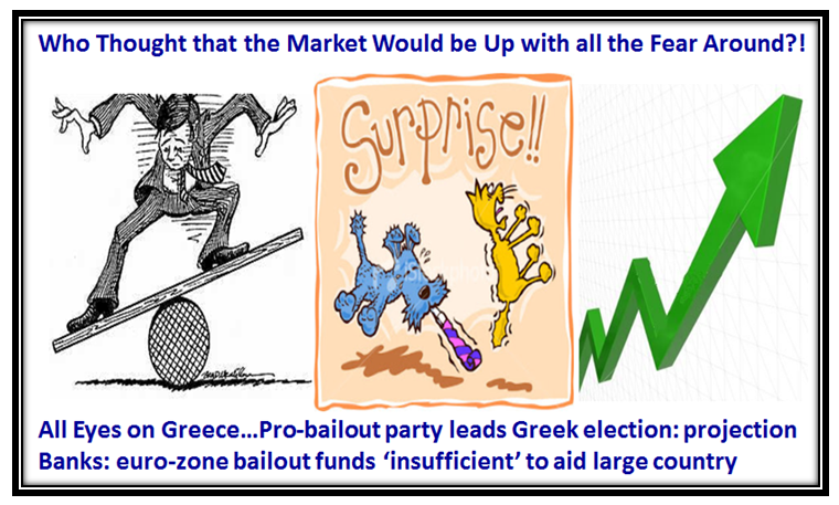
With all the Fear and Uncertainty who would have thought the Market would be climbing up a Wall of Fear?  We shall see what today’s Greek Elections bring and as I write this the Late Breaking News is that “Greeks Back Bailout Party, and the New Democracy is the Projected Winner”.  It holds a narrow lead over antiausterity Syriza; they are expected to attempt to form parliamentary coalition, possibly with socialist PASOK party, projected to finish third.  Such a coalition could ease global tensions  by accepting bailout austerity, staying in euro zone.

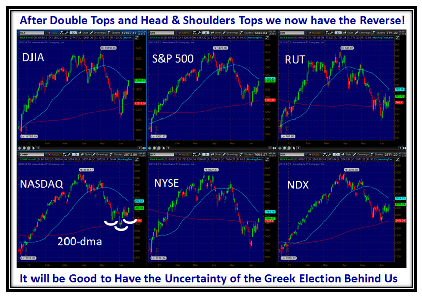
The Market Indexes finished strong on Friday despite Options Expiration and all the uncertainty swirling from Europe.

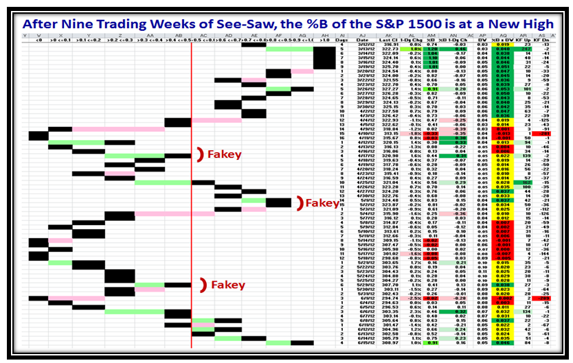
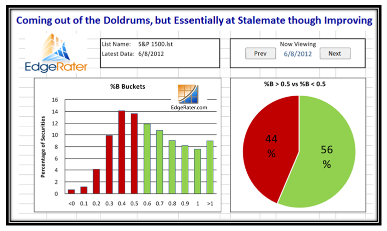
At long last after three “Fakey’s” where the %B of the S&P 1500 has been turned back from reaching back up to the “Top Buckets” with strength for most of last week:

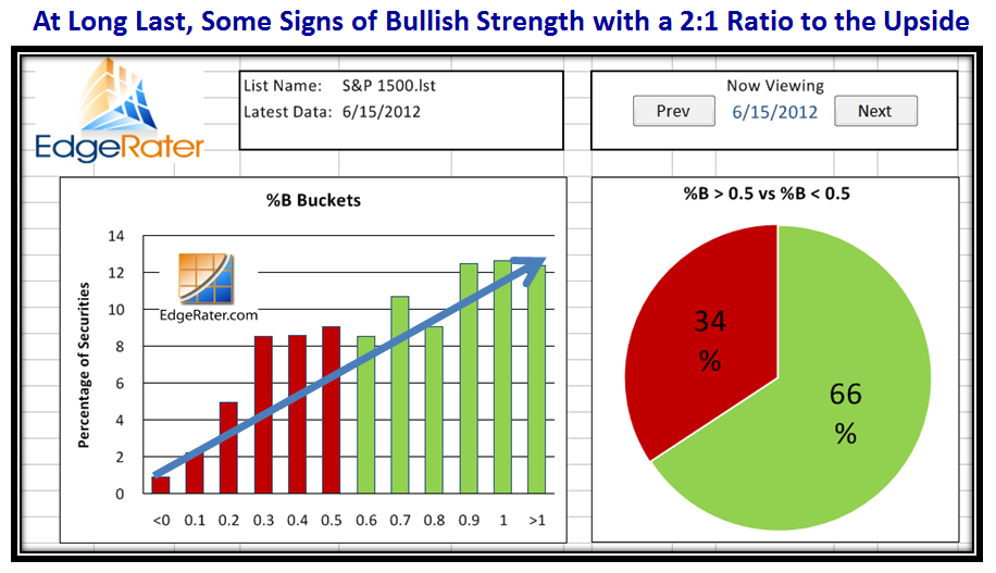
We immediately see signs of life in Grandma’s Pies after being in the doldrums for nine trading weeks:

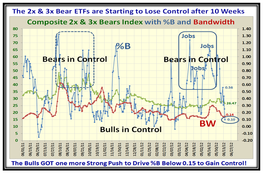
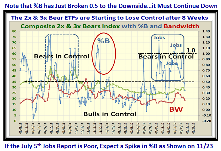
This next chart is a relatively new one which is proving to be worthwhile.  I have focused on the 2x and 3x Bear ETFs for the last few Blog Notes to gain insight for an early clue as to which way the wind is blowing.  As you would expect, when the news is in favor of the Bears as it has been recently with four bad jobs reports in as many months, the %B spikes into High Ground Territory.  Conversely, when the Bulls are in control, %B for these ETFs drops BELOW the Bandwidth, and there it is shown ringed after Friday’s action:

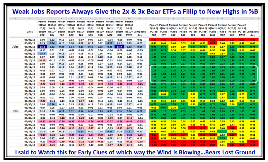
Unless there  is a major negative surprise, the picture suggests that the Market will remain positive with %B holding below the Bandwidth red line for a while.  Below we have the twin picture that shows the Bears have lost ground with two days in the red:

Well that’s it for now as I turn my full attention to the U.S. Open where Tiger has faded and all my US and International golf friends are glued to the screen cheering on their respective favorites to win.

Best Regards,

Ian.


Stock Market: Stalemate with Slight Edge to Bulls

Sunday, June 10th, 2012

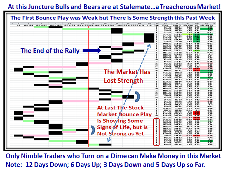
The Stock Market is neither Fish nor Fowl, waddling back and forth this past month with 12 Days down, 6 Days up, 3 Days down and 5 Days up so far…Only nimble Traders who are quick to turn on a dime may make money in this Market.

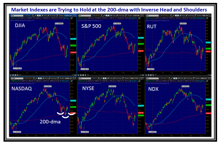
The Market Indexes are on a Cliff Edge waiting for either good or bad news…primarily from Europe this week with both Spain and Greece to contend with.  The Indexes are trying desperately to hold around the 200-dma with Inverse Head and Shoulders patterns to form before the hope is a New Dawning with a decent rally.

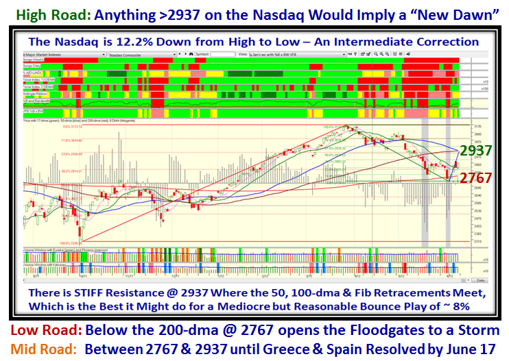
The Bulls cannot get too excited as seen by the next Chart.  Even if the Nasdaq breaks back up above the 2900 mark, there is stiff resistance where the 50 and 100-dma Moving Averages are joined by the respective Fibonacci Retracements at 2937, just a mere 8% up from the recent low…nothing to crow about!

The High, Middle and Low Road Scenarios are shown below:

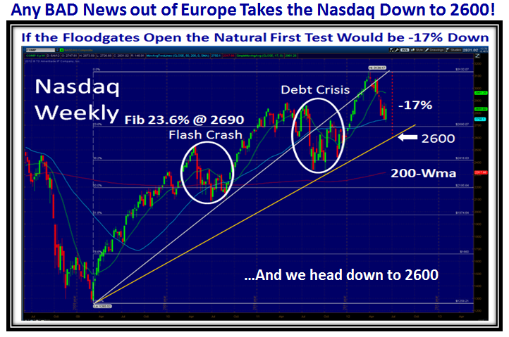
I note that my new found Taiwanese Friends are enjoying the blog this weekend and leading the Worldwide audience, and hopefully appreciating how to get to what matters in terms of knowing which way the wind is blowing here in the United States of America.  They know full well that with at least two black clouds over our heads from Greece and Spain, any whiff of Bad News will open the floodgates downwards and send the Nasdaq towards 2600 for a -17% drop from its high as we had in Flash Crash and Debt Crisis days:

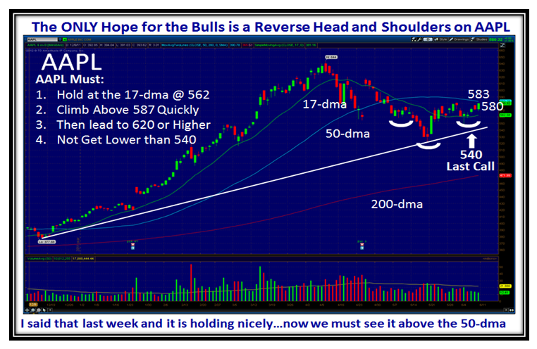
Last week I gave you the Game Plan for AAPL, and so far it is behaving well and according to Plan.  This week we need to see it break up through the 50-dma and then head for at least a double-top at 644:

The count in Trading Days up and down tells you how treacherous this market has been the last month, but there seems to be signs of life to the upside these past 5 days with hopefully a follow through day to come:

At long last we see some signs of life in the movement to the right of the Stocks into the green buckets.

…And on that strong up day on last Thursday we have a healthy 134 Kahuna Force Stocks UP showing signs of life:

This week we see the 2x and 3x Bear ETFs losing ground with three in the red zone as shown on the bottom right:

Here’s another view showing the 2x and 3x Bears have lost ground.  We have another three weeks of breathing room before we see the next Jobs Report on July 5th.

…And that’s my Story for this Week!

Best Regards,

Ian

Stock Market: “It’s Jobs, Jobs, Jobs, Stupid”

Sunday, June 3rd, 2012

I am sure you remember the slogan back in the President Clinton era of “It’s the Economy Stupid”.  Sad to say we are back in the mire with a twist to “It’s Jobs, Jobs, Jobs, Stupid” and I will show you why the Stock Market is beating to that drum!

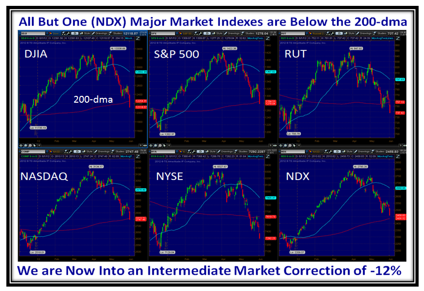
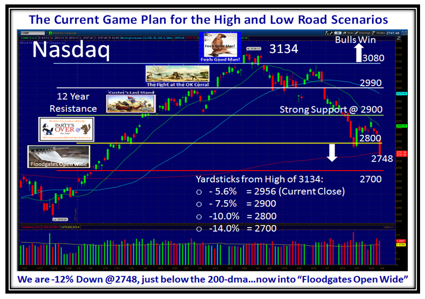
Slowly but surely the Bears have eaten away at the precious cushion we had by bursting through the twelve year barrier of 2900 on the Nasdaq and peaking at 3134 back on the week of March 26, 2012.  Seminar attendees will recall that was the last day of a fruitful learning experience where we developed a list of Leaders that would potentially give us an early warning of a peak in the market.  They are now believers as it happened that very week!  My friends Kevin and Robert from Qatar and Switzerland will know that from when they attended previous seminars that drove that point home…Well this Market has Nasal Catarrh from the drip-drip process:

The chart above speaks for itself as we can now see the drip-drip process we have endured each month at the beginning of the month when the US Jobs Report comes out, and that is the theme for this Blog.  With only the NDX hanging on by a thread we are now in an Intermediate Correction of -12% down from the highs of March.

The floodgates, Price-wise but not Volume as yet, opened wide on Friday with the miserable Jobs Report, and all signs point to a follow through on Monday with hopefully a fully oversold situation and then a Bounce Play.  At times like these, it pays to look at a Long Term Weekly Chart to see where long-term support might be:

We find that by using a Long Term Trend-line from the Low of March 2009 that support is at 2600, which is comparable to the drops in Flash Crash and Debt Crisis of ~-17%.  Heaven help us if we trot down to Black Swan proportions.   My motto is to never jump too far ahead…have three scenarios, never fall in love with one, and always let the Market tell you which one it is on.  However, one must evaluate the underlying clues for Fear and Greed so that one knows when to run for cover depending on your stomach, not mine.  They are different.

Let’s now look at the Underlying Clues to establish the theme we are Marching to…Jobs, Jobs, Jobs!

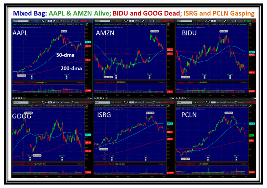
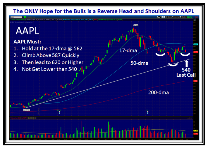
Pretty miserable.  There comes a time when the Market falls of its own weight, and although the Surrogate for the Market is AAPL, that slogan has now got a trifle stale, unless there is some miracle of GOOD and FRESH News to prop the entire market up, not just AAPL.  But for my friend Becky who is an avid AAPL follower and promised me her first million when she made her third which she is working on, here are the “Must Have’s”:

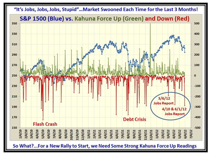
Now for those “Underlying Clues of Fear and Greed”, I will show you that the first week of the month is the most important and it is the day that the US Jobs Report comes out.  The next four charts demonstrate the underlying theme of the grip the Market is in with the Monthly Jobs Report.  You short term intra-day type 1’s might make a note of this winky-winky:

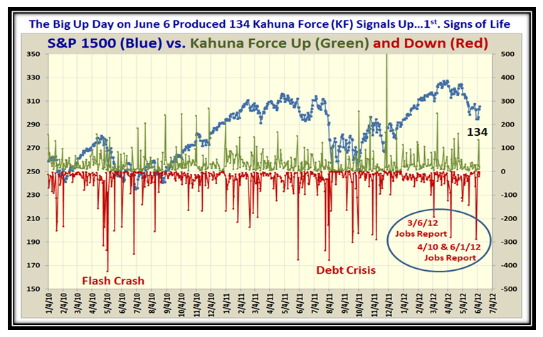
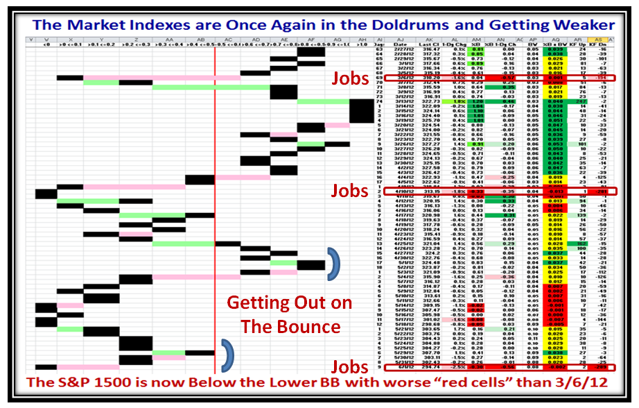
That’s a new chart where my good friend and Partner Ron Brown and I are joined at the hip with a Dash of Bollinger and Elder to lean on.  You oldies know that our whole concept is to measure Fear and Greed through Impulse Indicators.  The stronger the signal the more the meaning.  Well, with my good friend Chris White of EdgeRater fame, I have the tools to measure the extent of Fear and Greed through using the Kahuna Force Indicator which Ron and I have developed.  What we see on the chart above is Kahuna Force Up signals in Green and conversely KF Down signals in Red plotted against the S&P 1500.

The readings are daily KF Up and Down, respectively, and it doesn’t take one two minutes to see the most recent big “down counts” were on Jobs Report Days!   A reading of -300 (say) means that 20% of the S&P 1500 had a major down day.  This past Friday was ugly.  Compare the readings now to Flash Crash and Debt Crisis and you can see that until we see similar signals to the upside indicating strength, we will wallow around in the mire.

Here is an oldie you haven’t seen for sometime.  It shows the same situation:

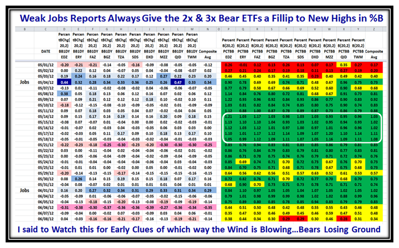
Now here is a new idea and picture.  It uses the 2x and 3x BEAR ETFs to show how things have changed between the intervals of the Monthly Jobs Reports.  Since this is a chart for the BEAR ETFs the colors are topsy-turvy.  When the colors are Red, the BULLS are in control and when they are Green the Bears have it.  Don’t worry about the numbers…it is the impression you get with the colors that make the point.  We have gone from Bulls in Control to Bears in Full Control:

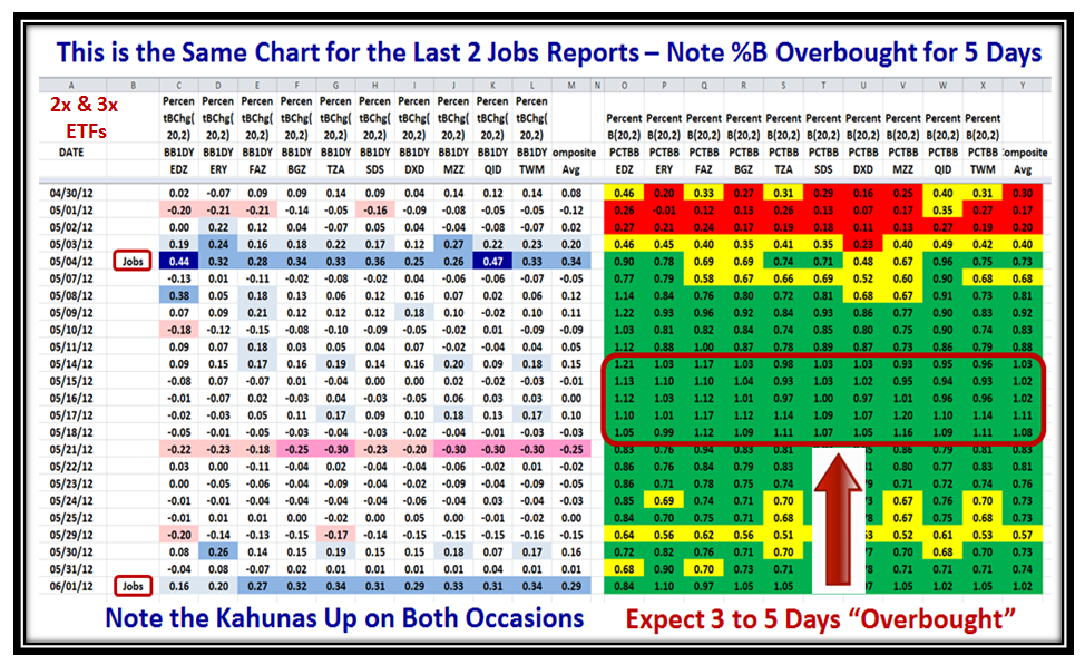
A picture of the 2x and 3x BULL ETFs produces the reverse picture and both should be watched for the quickest clue that change is in the wind.  Now for those who are numbers oriented, here is a closer view of the last two Jobs reports and this picture gives one a further clue.  Once the BEAR ETFs are essentially all above the Upper Bollinger Band, it takes 3 to 5 days for the euphoria to wear off to the downside, so watch for this affect this time around.  The symbols for the ETFs I used are shown at the top of this next chart:

Please note that we now have 31% of the S&P 1500 Stocks in %B Bucket <0 and we are Oversold to say the least:

The rest is up to you depending on your stomach:  Foxhole, Short, Dabble, but wait for the QUALITY of the Bounce if you are already out, using these concepts to stay on the right side of the Market.  Don’t forget we need Eurekas and Kahunas to the upside.  No excuse now after my last blog note of a Glossary of Terms used.

I haven’t heard from Akiva in Israel of late, but I am sure he is lurking in the wings.  Many thanks to all the US Followers who gave me words of encouragement who appreciate this “Good Stuff”, which I write while watching Tiger try to find his old winning form.

Best Regards,

Ian.

HGSI Glossary of Terms

Tuesday, May 29th, 2012

I am reminded by Tim, a friend and supporter of the HGSI Software who gave me good and encouraging advice in his feedback to my previous blog note of terms Ron and I use from time to time that new readers may come across which are unfamiliar to the casual reader.  This Blog Note is to help such readers with a brief description of some of the terms I use from time to time.  I encourage you to go to the Highgrowthstock.com website for additional articles on many of the concepts we have developed to keep us on the right side of the market.

Our approach recognizes that there is no silver bullet of an Indicator, but find that two are better than none and sometimes four are better than two.  You will find that our emphasis is on Managing Fear and Greed through “Impulse Indicators” which are triggered at Oversold and Overbought times in the Market, where most of one’s nest egg is either made or lost. 
Glossary of Investing Terms

High Growth Stock Investor has some very unique features that are characterized by names that are unique to those features.  This glossary provides a brief explanation.

%B

%B is derived from the formula for Stochastics and tells you where you are in relation to an upper Bollinger Band and a lower Bollinger Band.
%B = (Last Close – Lower Bollinger Band) / (Upper Bollinger Band – Lower Bollinger Band)

Base Low
The Base Low is the lowest price a stock has based at in the last six to 12 months. It can be determined on both individual stocks as well as market indexes and can be used to measure stage breakouts as well as extension, i.e. risk. For more information, read the Base Low Concept discussion.

Bingo
A Bingo signal indicates an oversold condition in a minor or intermediate correction and many more lead to capitulation in a Bear Market. A Eureka signal will usually follow a Bingo signal within 15 days. With a minor or intermediate correction, there will usually only be one or two Bingo signals before a Eureka signal. With a Bear Market, expect several Bingo signals, with the last Bingo being capitulation.

Bollinger Bands
Bollinger Bands can be used to measure the highness or lowness of the price relative to previous trades. The purpose of Bollinger Bands is to provide a relative definition of high and low. By definition, prices are high at the upper band and low at the lower band. Prices moving closer to the upper band indicate a more overbought market, whereas the closer the prices move to the lower band, the more undersold the market is.

Bongo (Bongo Yes and Bongo No)
The Bongo indicators are a signal for markets, industry groups and stocks for entry and exit.
The Bongo Yes criteria (daily and weekly) are as follows:
1. Close > 9 SMA
2. RSI 8>14>19
The Bongo No criteria (daily and weekly) are as follows:
1. Close < 9 SMA
2. RSI 8<14<19

Cha-Cha-Cha Stocks
These types of stocks have strong fundamental and technical credentials and usually small- to mid-range capitalization from $100 million to $1 billion. They often make large moves up very quickly and can make just as dramatic reversals – hence the phrase “buy rockets, sell rocks.”

Eureka Signal
A Eureka signal identifies early up turns in the NYSE Index.  It compliments 1-Day changes in %B of Bollinger Bands to signify the volatility – both up and down. This is a major indication to either a turn-around day after a market bottom or a follow through day(s) soon thereafter.  It also gives an occasional warning to signify irrational exuberance near the end of a strong rally.

Eureka signals use the ARMS or TRIN Index Components for the NYSE.  Eureka signals are infrequent – there have been 38 Eurekas in 7 years (usually 5 to 7 a year, depending on market conditions). Some components of the Eureka signal are as follows:
• It signals a very strong Bullish Up Day in the NYSE Market
• Advancing Issues to Declining Issues Ratio is greater than or equal to 3-to-1
• Advancing Issues to Declining Issues Volume Ratio is greater than or equal to 5.4-to-1
• ARMS Index is less than or equal to 0.9

Follow Through Day (FTD)
The concept of a Follow Through Day can be used to signal a rally.  It is an indication of a potential change of trend in place. After the market has made a new low and a rally has been attempted, a follow through day is identified when a major index (Nasdaq, S&P 500 or DOW) closes up 1.7% or more for the day with an increase in volume from the day before.  Look for follow through days to occur between four and seven days from a potential bottom.

Gas in the Tank
The concept of Gas in the Tank is a simple approach for judging how far a stock might advance when it has paused to refresh for a quarter or more after a recent positive move up in price. “Gas” refers to increasing earnings coming into a stock while it is basing (moving sideways), i.e. the P-E is coming down with increasing earnings to create value. A projected target price can be established by using the difference in the current and next quarters earnings from that of a year ago, multiplied by a P-E range. This difference is the amount of “new gas,” while the P-E is analogous to the miles per gallon. For more information, read the Gas in the Tank article.

High Jump Indicator
A technique used to establish when a stock is extended and due for a correction. There are three elements used to determine when a stock is fully valued:

1. The current price from the 17-day moving average (MA)
2. The current price from the 50-day MA
3. The current price from the 200-day MA

Hindenburg Omen
The Hindenburg Omen is a strong warning signal for a market top. Named after the crash of the German zeppelin in 1937, it is a technical analysis that attempts to predict a forthcoming stock market crash. The traditional definition of a Hindenburg Omen has five criteria:

1. That the daily number of NYSE new 52 Week Highs and the daily number of new 52
Week Lows must both be greater than 2.2 percent of total NYSE issues traded that day.
2. That the smaller of these numbers is greater than 79.
3. That the NYSE 10 Week Moving Average is rising.
4. That the McClellan Oscillator is negative on that same day.
5. That new 52 Week Highs cannot be more than twice the new 52 Week Lows (however it
is fine for new 52 Week Lows to be more than double new 52 Week Highs). This condition
is absolutely mandatory.

A confirmed Hindenburg Omen occurs if a second (or more) Hindenburg Omen signals during a 36-day period from the first signal.

Kahuna (Little and Big)
The Kahuna indicator measures volatility and momentum by looking at the one-day change in %B. The Big Kahuna is a 1-day change in %B of plus/minus 0.40. A Little Kahuna is a 1-day change in %B of plus/minus 0.24. Big Kahunas are signs of strong momentum (either up or down) and work well with the Eureka signal to identify tops and bottoms.

Limbo Bar
The Limbo Bar is the inverse of the High Jump Indicator. It is used to test stock valuation by looking at negative numbers below the 200 day moving average (DMA), the 50 DMA or the 17 DMA.

Mattress Stuffers
Mattress Stuffers are large cap stocks with solid earnings credentials. They have earnings stability – dependable earnings growth of 15% to 25% year after year. The stock’s chart pattern rises steadily, but not as fast as Cha-Cha-Cha Stocks. These slower growth stocks can be held much longer, thus earning their moniker.

Nine Box Matrix
The Nine Box Matrix is a simple chart used to identify stocks that have a better chance of growing faster in price.  It uses Annual Earnings % growth rate over the past five years in combination with Current Earnings % growth rate for the last two quarters compared with the same quarter a year ago.  For more information, read the Concept of the Nine Box Matrix article at the HGSI Website.

Phoenix

The Phoenix is the reverse of the Eureka and signals potential downturns in the NYSE.  It is a Heads Up on a bad day in the Market.  Two or more of this signal in a week coupled with a “Down” Kahuna or two says “Watch out below” and the Bears are now in Control.

Tsunami
Confirms the ebb and flow for the Kahuna and Eureka signals.

VIX
VIX is the ticker symbol for the Chicago Board Options Exchange Volatility Index. It is a popular measure of the implied volatility of the S&P 500.  Sometimes referred to as the “investor fear gauge,” the VIX is a commonly used measure of market risk.

Wolf Pack
Wolf Pack refers to the idea that stocks move in groups, like a pack of wolves.

I hope this helps, and many thanks to you all for your continued support.

Best Regards,

Ian

Stock Market: All Eyes on Greece

Sunday, May 27th, 2012

While we here in the USA look forward to Memorial Day tomorrow, the rest of the World will have all eyes on Greece and the potential skids of the impact of exiting the Euro fast coming to a head.

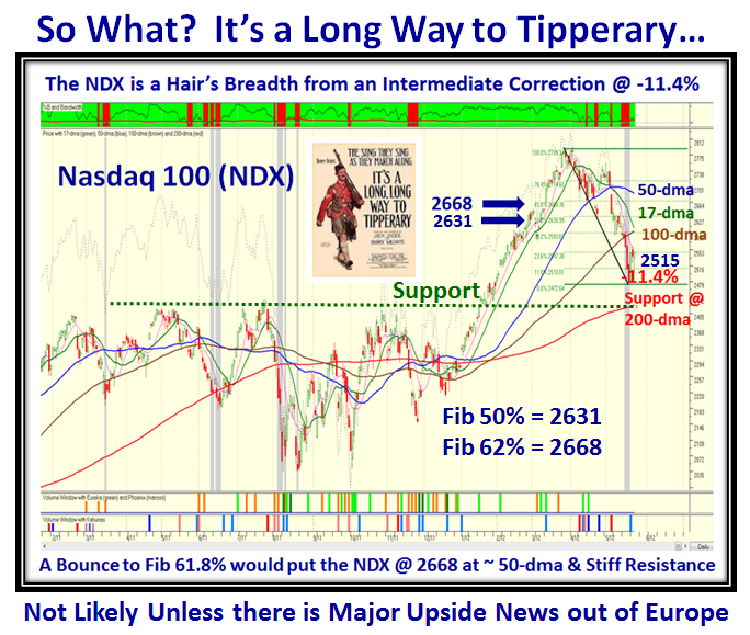
Although the Major Market Indexes have grudgingly given up ground to the point where they are essentially at or close to their 200-dma, there are underlying signs of hope that with the majority of the Quarterly Earnings Reports behind us there is a fresh set of leaders rising as a result.  Let’s first look at the Gloom and Doom Scenario.  This time I have chosen the Nasdaq 100 (NDX) since these are the Big Cap Leaders we usually focus on to show us which way the wind is blowing for the overall market:

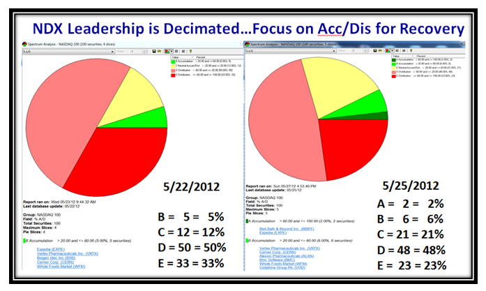
As the Chart above shows we are already within striking distance of the 200-dma and into an Intermediate Correction of 12% to 16%, if there is no recovery from here.  Even an 8% Bounce Play would only get us back to around 2668, where the NDX will encounter stiff resistance at the 50-dma.  To fully understand how weak this Group of 100 stocks is at this stage, I chose to look at the Accumulation/Distribution picture of learning your ABCDEs as I have addressed many times previously.  Note that on 5/22/2012 there were ZERO stocks with “A” Accumulation and only 5 with “B”…hence the Market is essentially Leaderless if we focus only on these Big Cap Stocks:

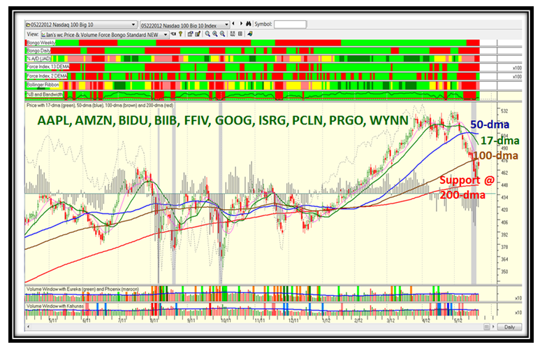
Big Cap Stocks that are representative of this group are the usual suspects which are shown below, and as the Index shows for these ten stocks the picture is essentially identical to the one above.  Only two stocks…AMZN and BIIB are above their 50-dma, and the Blood Red on the extreme Right Hand Side of the Chart together with the three days of a grey bar line (Bingo) suggests utter weakness.  As you well know by now, we need a couple of Eureka (green) and Kahuna (blue) lines within a week for us to have any confidence that we at least can enjoy a Bounce Play.

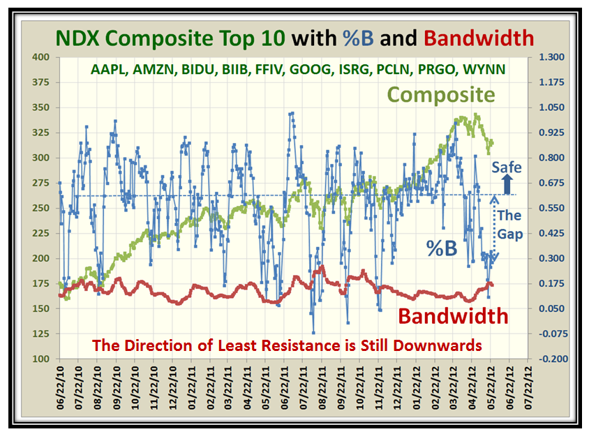
To give us a measure of how far away we are from a decent bounce play, leave alone a Rally, the next chart shows the Gap to the “Safe” zone for %B of the Composite Average of these ten stocks.

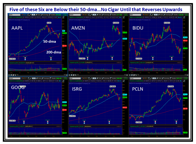
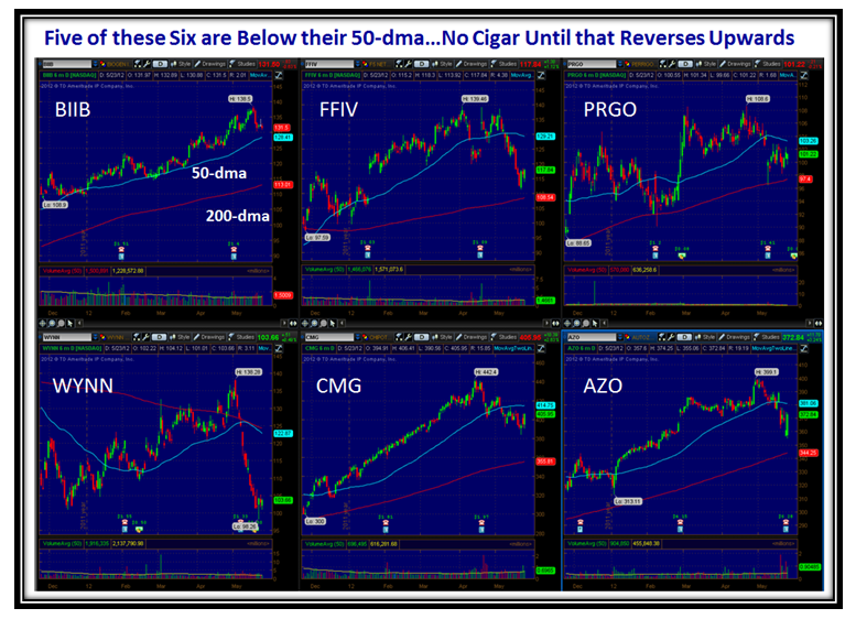
As I mentioned only two stocks…AMZN and BIIB are above their 50-dma and here are the pictures for the ten plus two more stocks which are all greater than $100 in price.  That has to change quickly if there is to be a Summer Rally.  We are fighting the “Go Away in May” syndrome where most are occupied with Graduations, Weddings and Vacations:

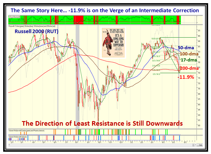
If that is not enough to convince you that we are on the edge of a Major Correction here is the picture for the Small Cap Russell 2000 Index.  The picture is even a shade worse, and so “It’s a Long Way to Tipperary” to recover:

Well enough of all this Gloom and Doom Picture…now for “Hope Springs Eternal”.  As I mentioned above, we are essentially at the end of the Quarterly Earnings Season, and this is the time to sharpen your pencils and make note of those Companies that have come through with stellar earnings.  This provides Gas in the Tank for the next leg up and is invariably shown by a few important points to note from the recent chart action:

1.  There will invariably be a recent Gap Up in price

2.  That will usually be accompanied by at least a Small Kahuna (light Blue line) and more often a Dark Blue one

3.  The Quarterly Earnings will be higher and sometimes as much as 100% for the quarter.

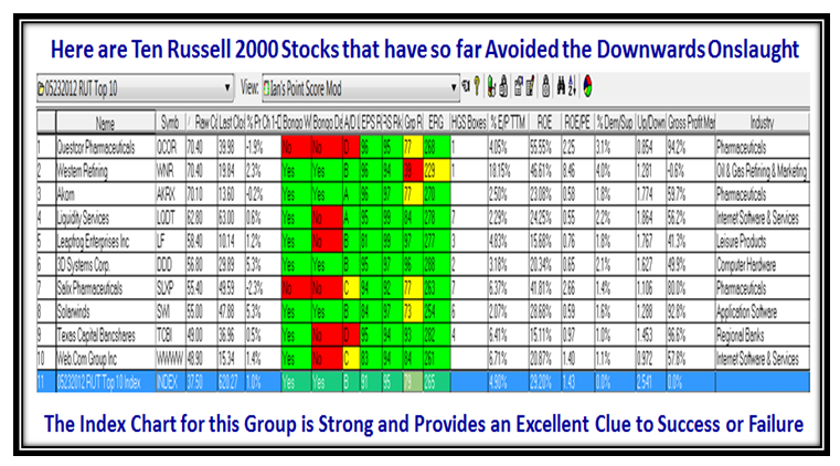
Having shown you an ugly Russell 2000 Chart, now let’s look at these 10 which are Leading Stocks from that lot:

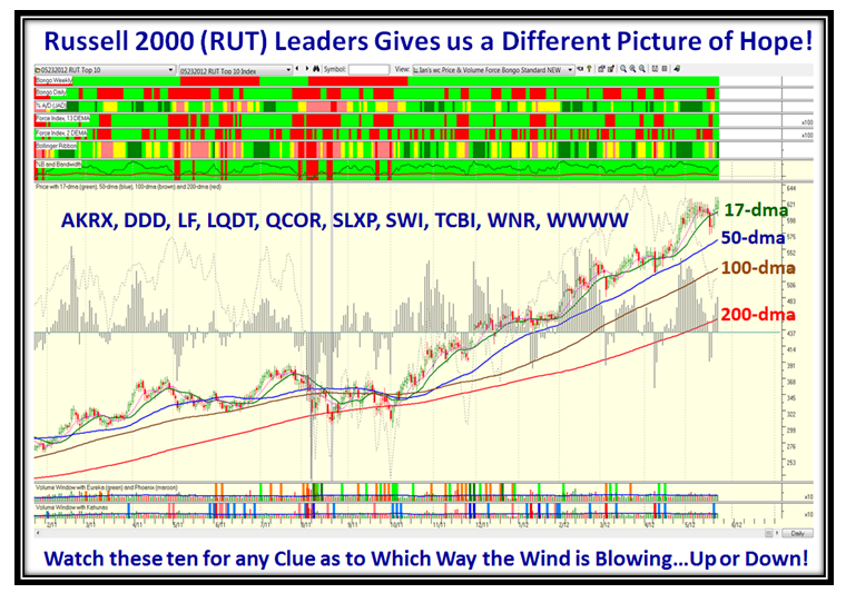
…And here is the resulting Composite Chart pattern for these ten stocks.  By the way, the HGSI software is the only one that I know of which can provide this feature of showing the Index for any group of stocks your heart desires:

…And in this case, unlike the other, they are all at or above their 50-dma!

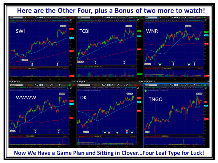
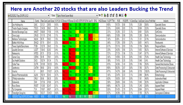
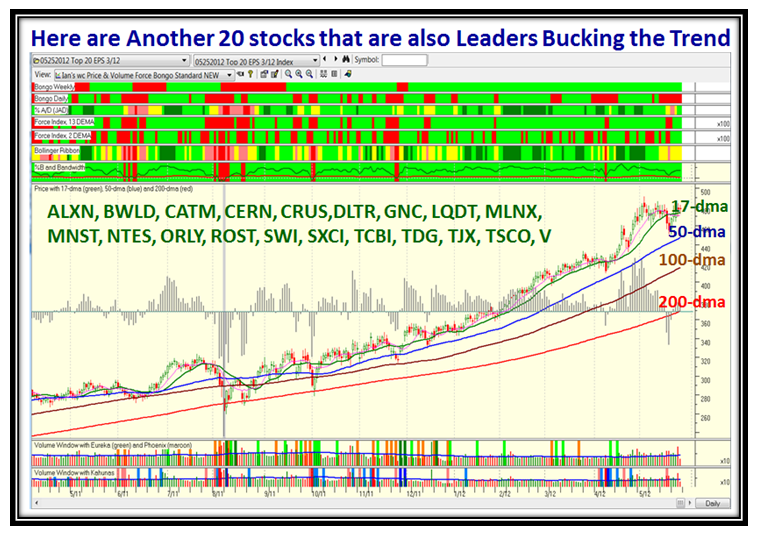
Here for good measure are another list of twenty stocks that are also Leaders bucking the trend:

…And here is the corresponding chart with the symbols on it for you to see more clearly:

So What’s the Message?  We have a Game Plan with two different scenarios to guide us; on the one hand the laggard big and small cap stocks and on the other the stocks already showing amazing strength in a rotten market.  We can use these two sets to get a sense of whether we just head on down further or the laggards get new life to pull the whole Market up with the ones already on their way going higher.

I am delighted to see that my Worldwide clientele is growing with leaps and bounds as a percentage of the total following on this blog.  I trust these messages are of value to you on the pulse of the market and that you have a sense of direction of what to watch for to keep you on the right side of the market.  I don’t recommend stocks but show you where the fish pond is from time to time.  Please send us a comment or tell a friend if you like what you see.  That goes for my regular clients on this side of the pond.  I need your encouragement and feedback.  Just write a comment below this note.

Best Regards,

Ian

Copyright © 2007-2010 Ian Woodward
Disclaimer: Commentaries on this Blog are not to be construed as recommendations to buy or sell the market and/or specific securites. The consumer of the information is responsible for their own investment decisions.